


OVERVIEW
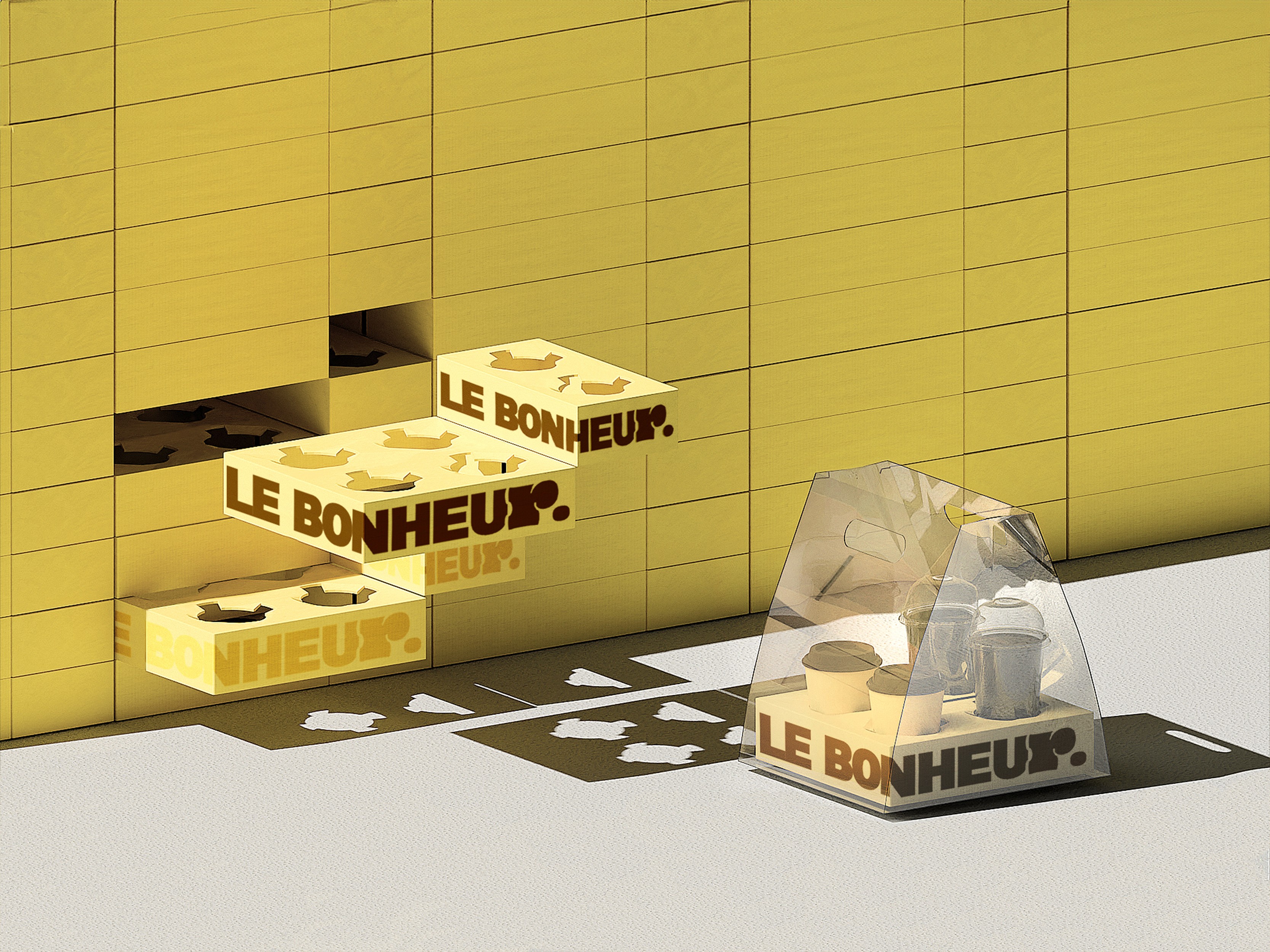
Last winter, we worked on a branding project with LE BONHEUR, a café located in Sandong eup, Gumi.
The project covered the brand logo, color system, and package design, spanning from verbal identity to the offline brand experience. Through interviews conducted before the branding process, we identified a clear message at the core of LE BONHEUR. This message reflected the owner’s strong philosophy.
"Not recharge. Savor. That is what coffee is.
And that is why good coffee matters."
What LE BONHEUR wants for its customers is simple. To enjoy a proper cup of coffee, even if it is just one. Rather than simply satisfying hunger with coffee and dessert, the brand hopes customers leave feeling that their gloomy day has been completely lifted.
CLIENT
YEAR
2024
SCOPE
SCOPE
2D Graphics
3D Modeling
3D Rendering
3D Scenes
3D Texture & Mapping
Brand Experience
Brand Identity
Brand Strategy
Editorial
Ideation
Logo
Packaging
Prints & Materials
2D Graphics
3D Rendering
3D Texture & Mapping
Brand Identity
Editorial
Logo
Prints & Materials
3D Modeling
3D Scenes
Brand Experience
Brand Strategy
Ideation
Packaging
2D Graphics
3D Texture & Mapping
Editorial
Prints & Materials
3D Modeling
Brand Experience
Ideation
3D Rendering
Brand Identity
Logo
3D Scenes
Brand Strategy
Packaging
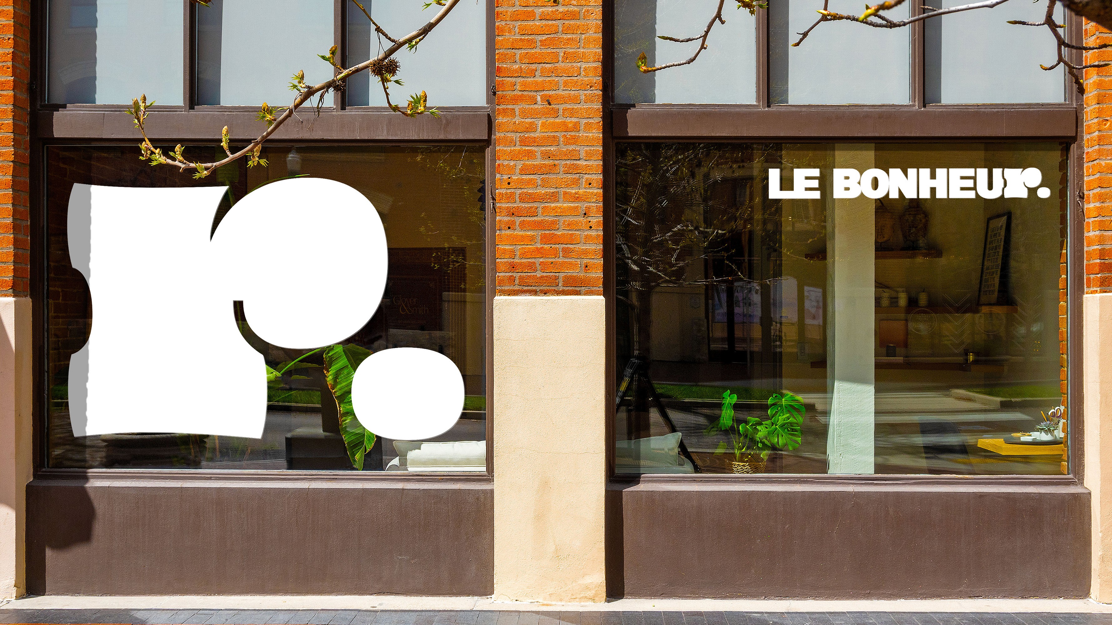
LE BONHEUR
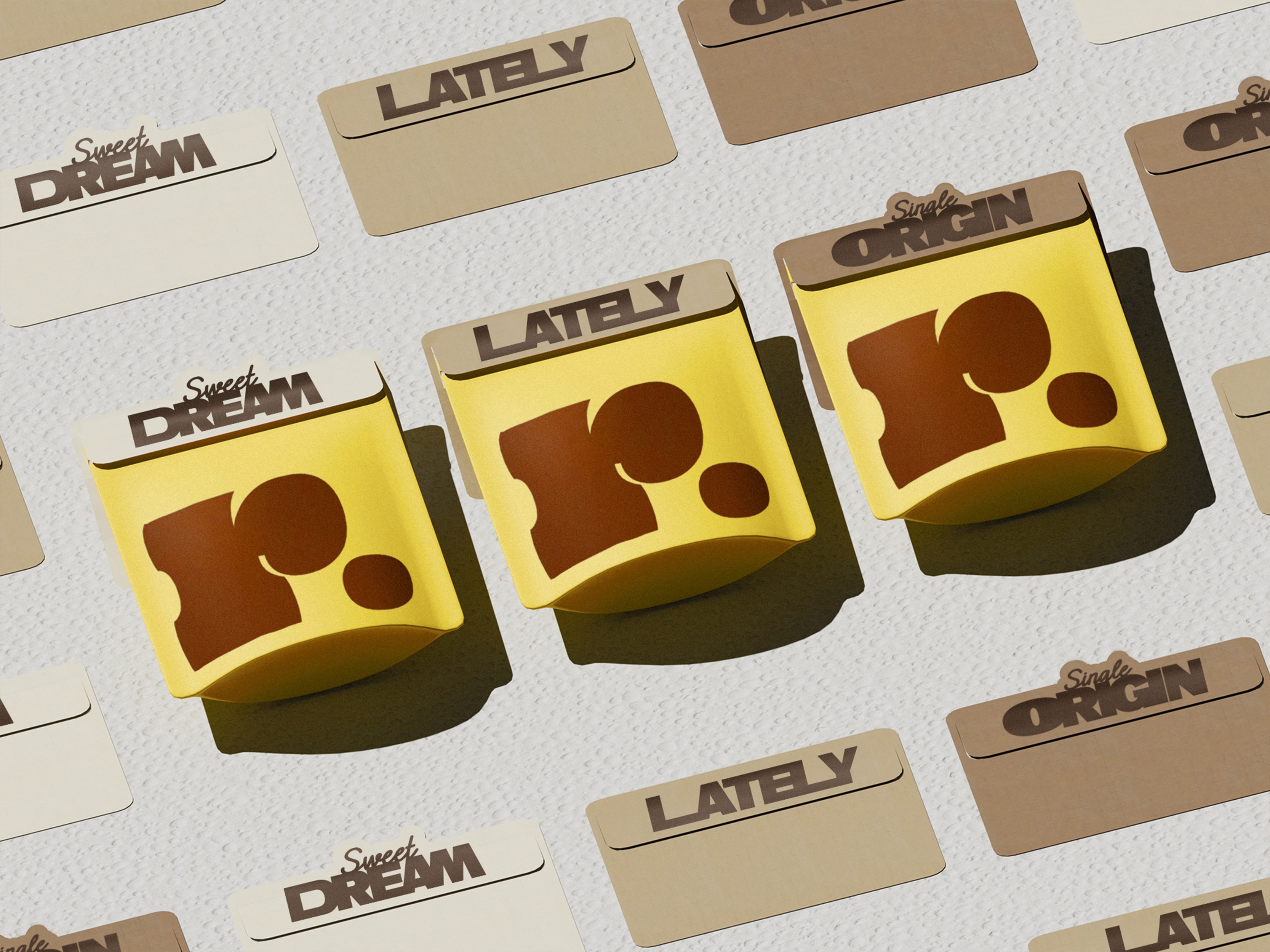
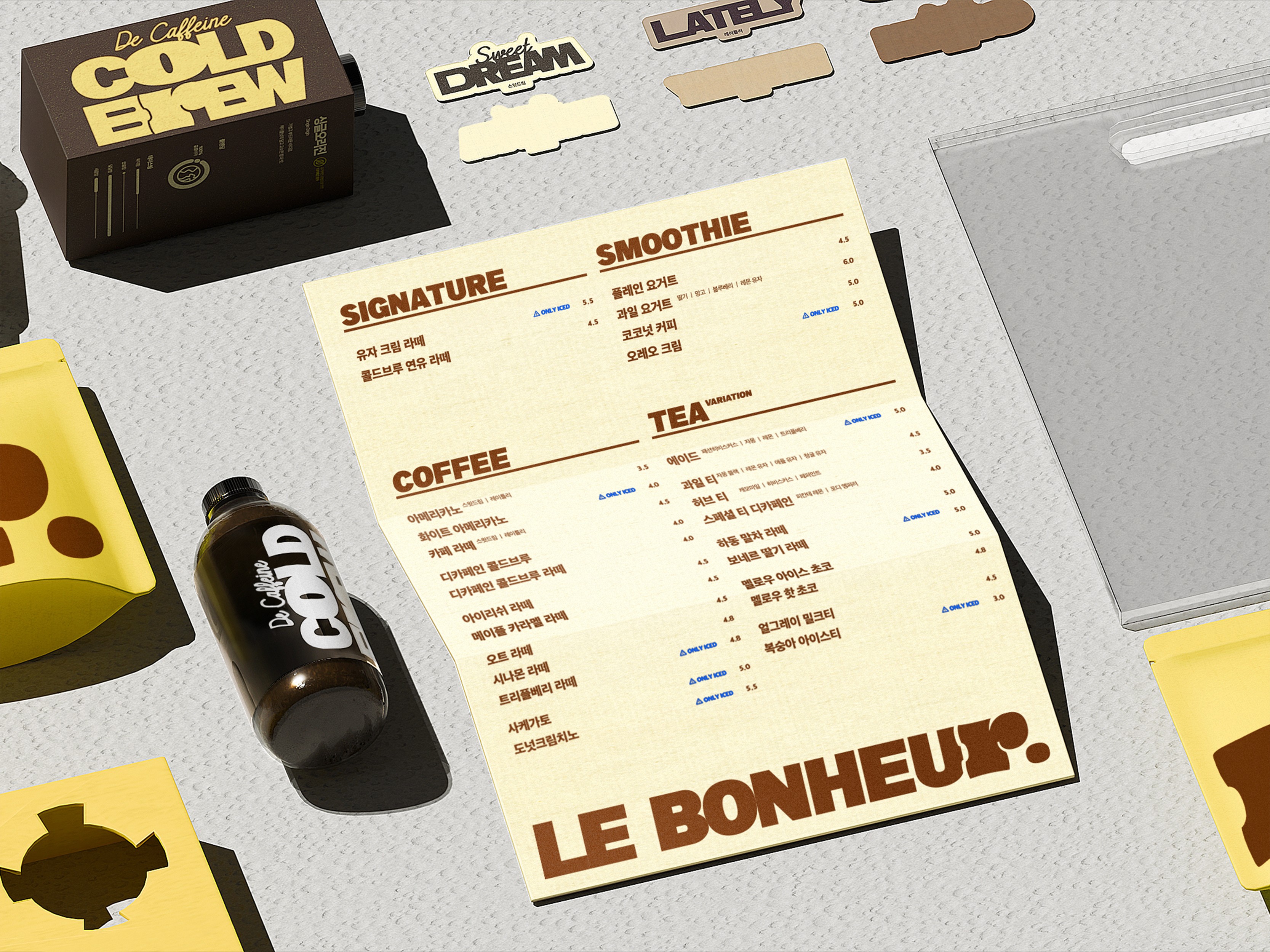
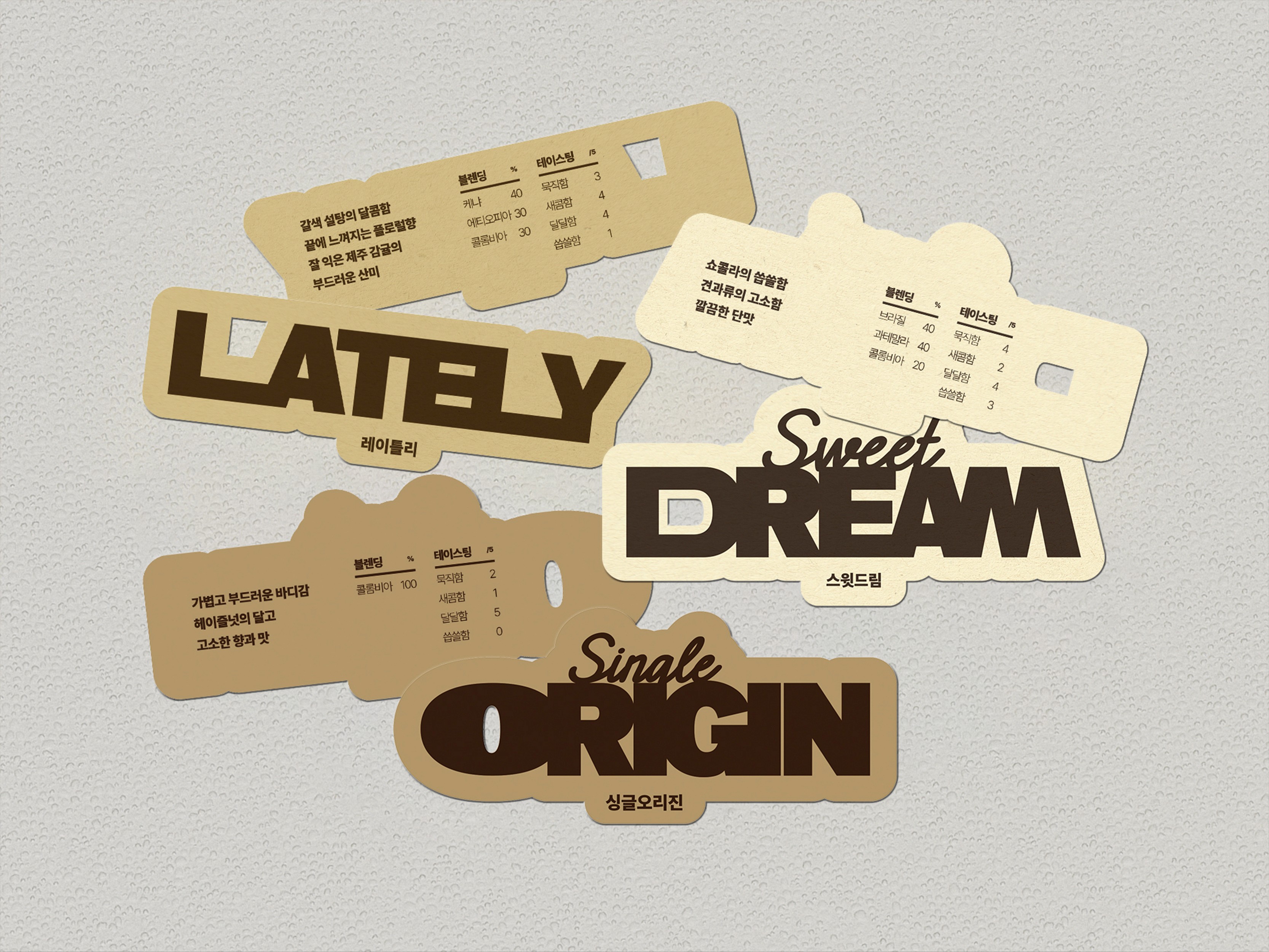
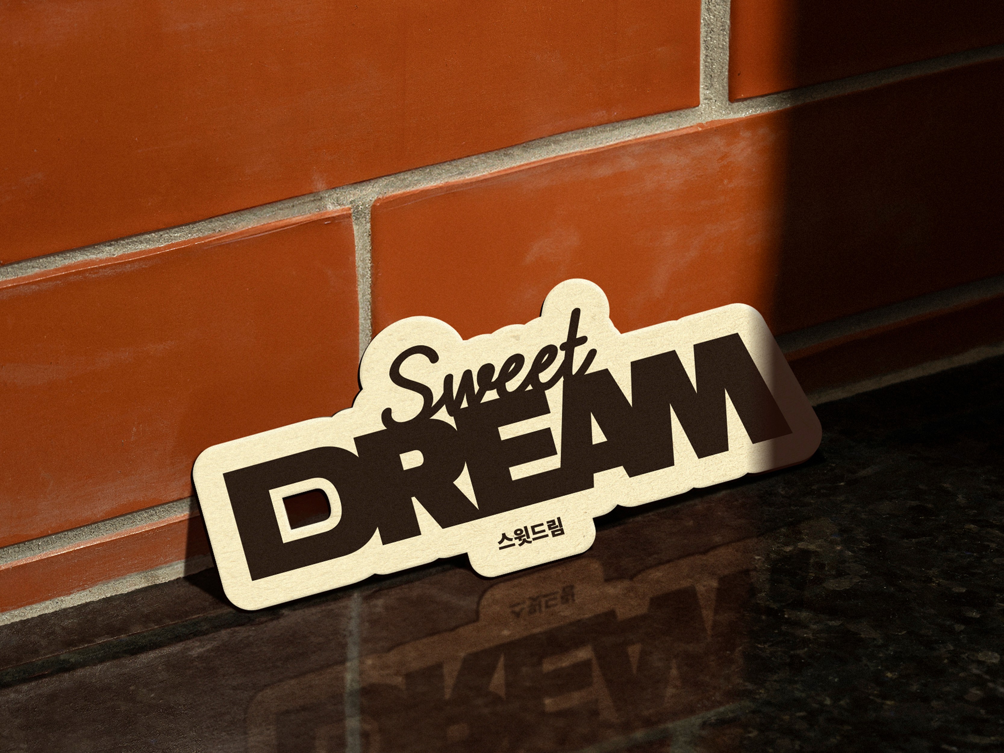
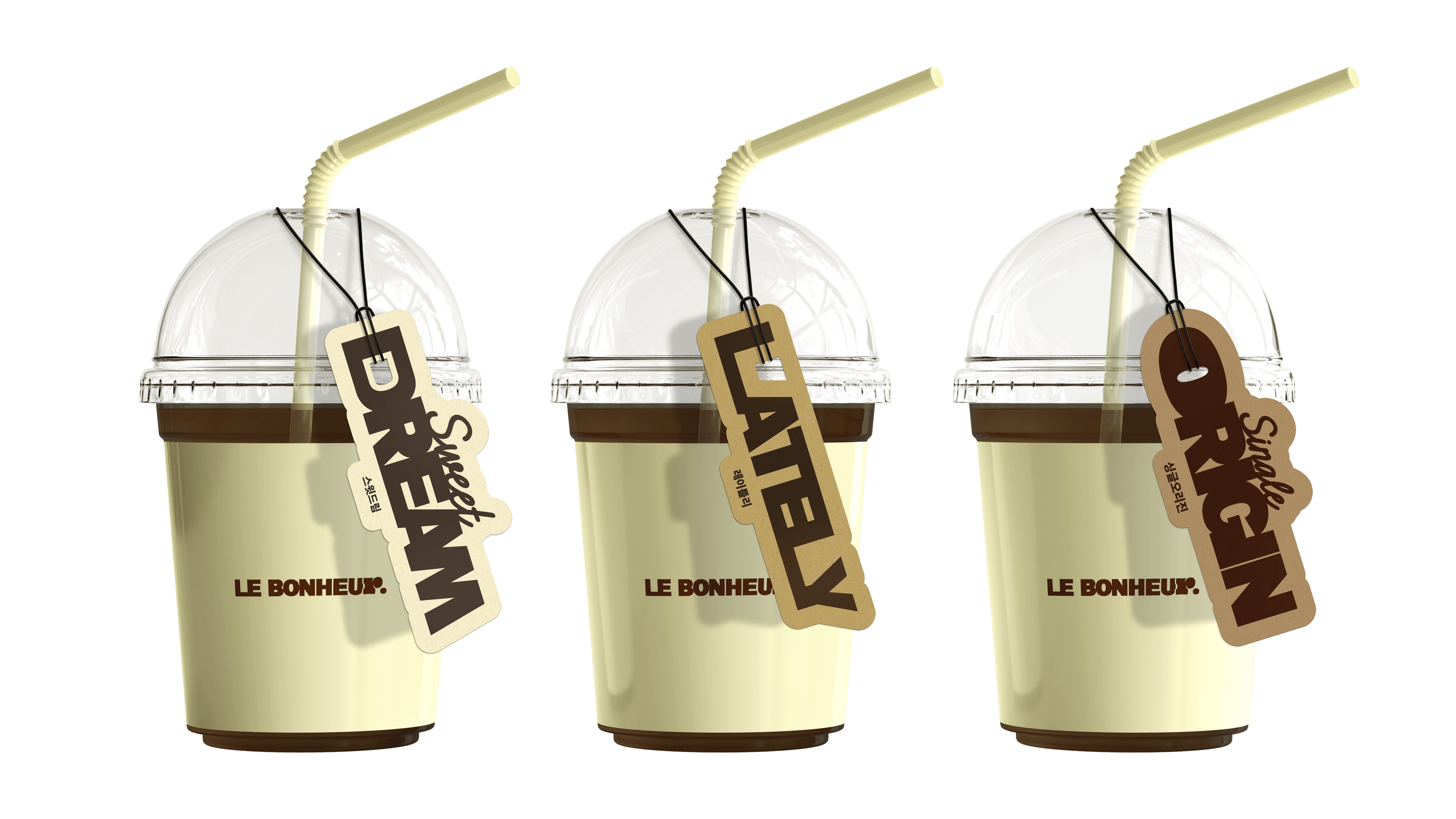
3 TYPES OF COFFEE BEANS WITH CHARACTER & PUDDING CAKE
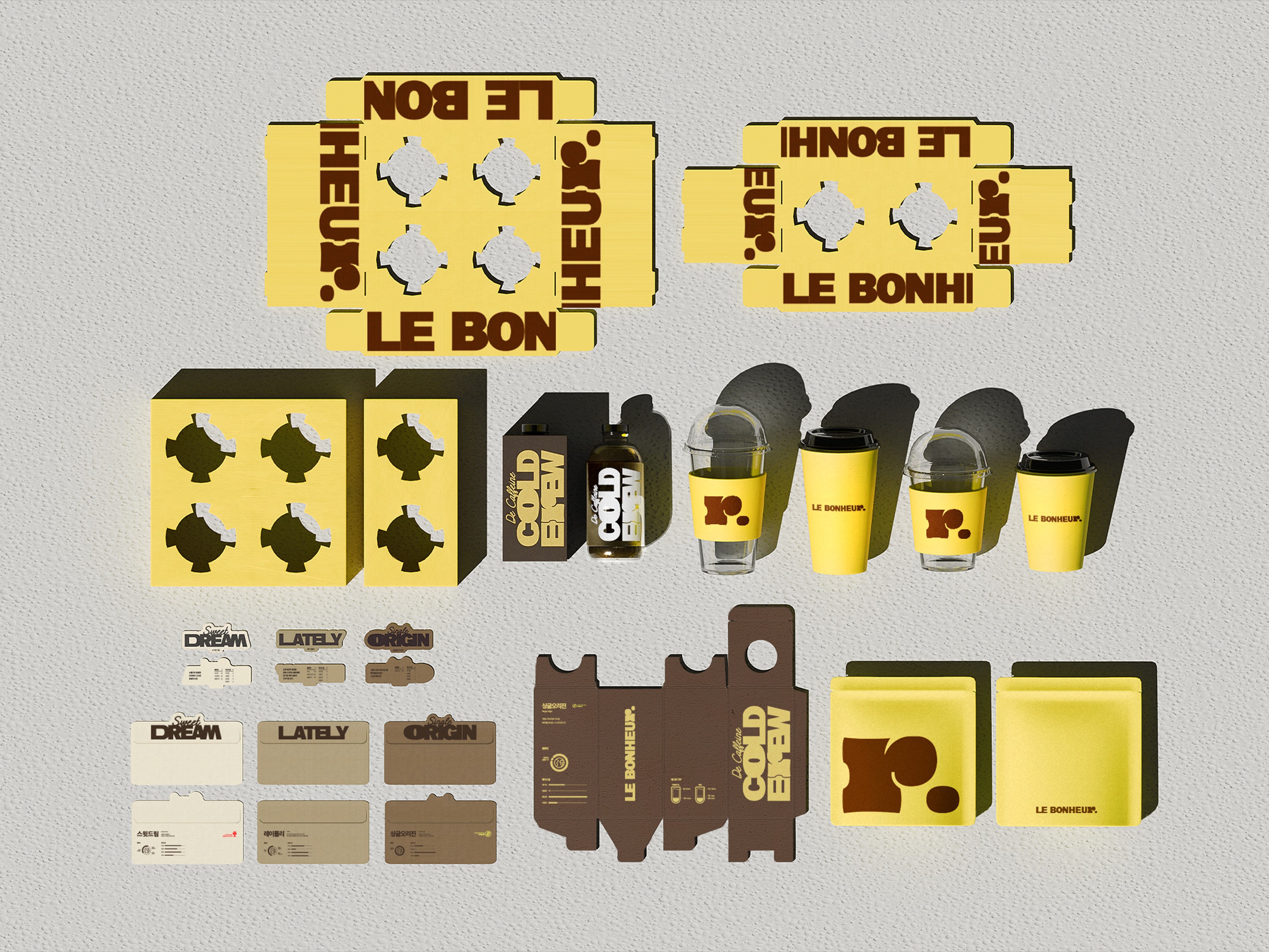
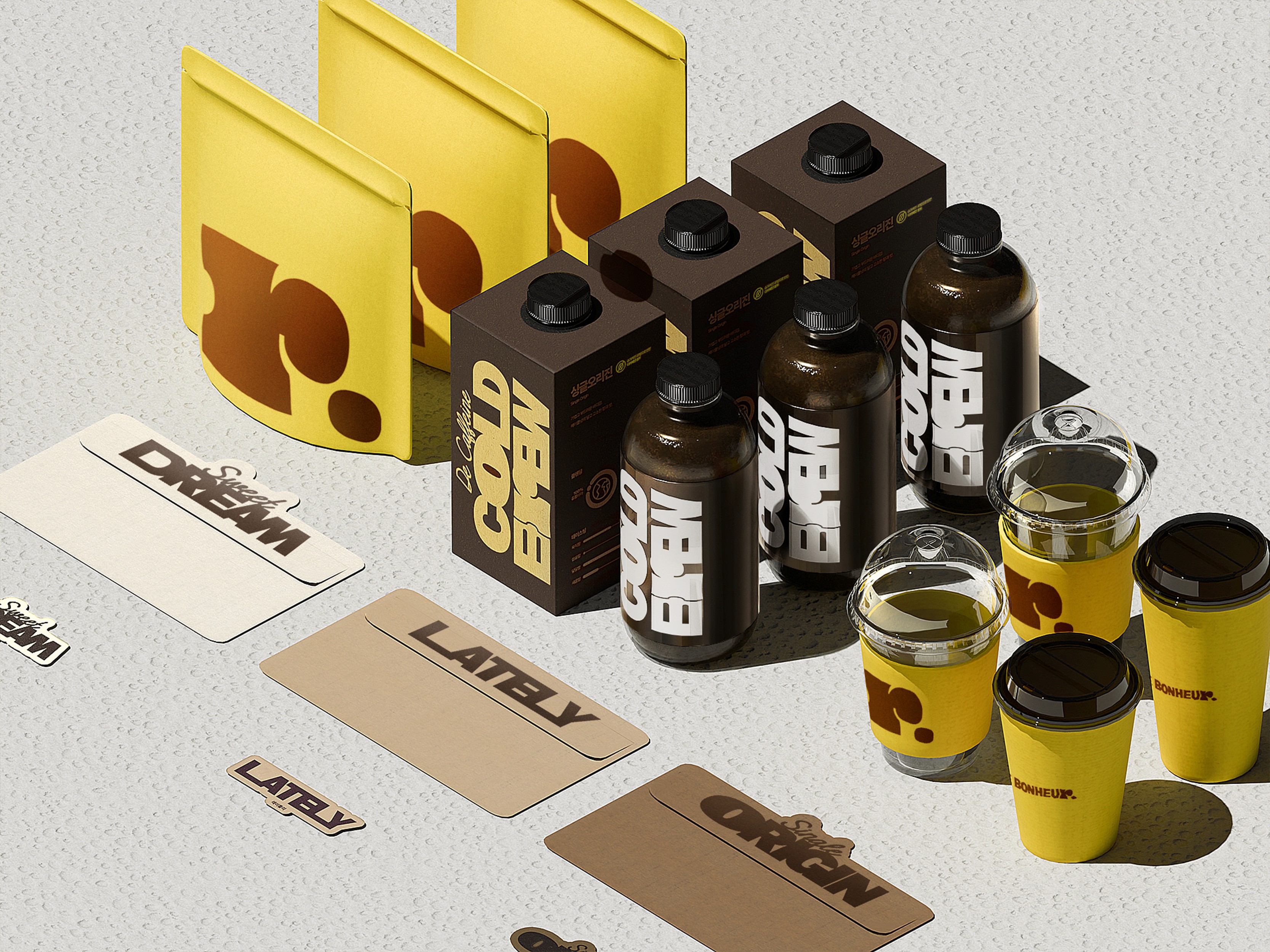
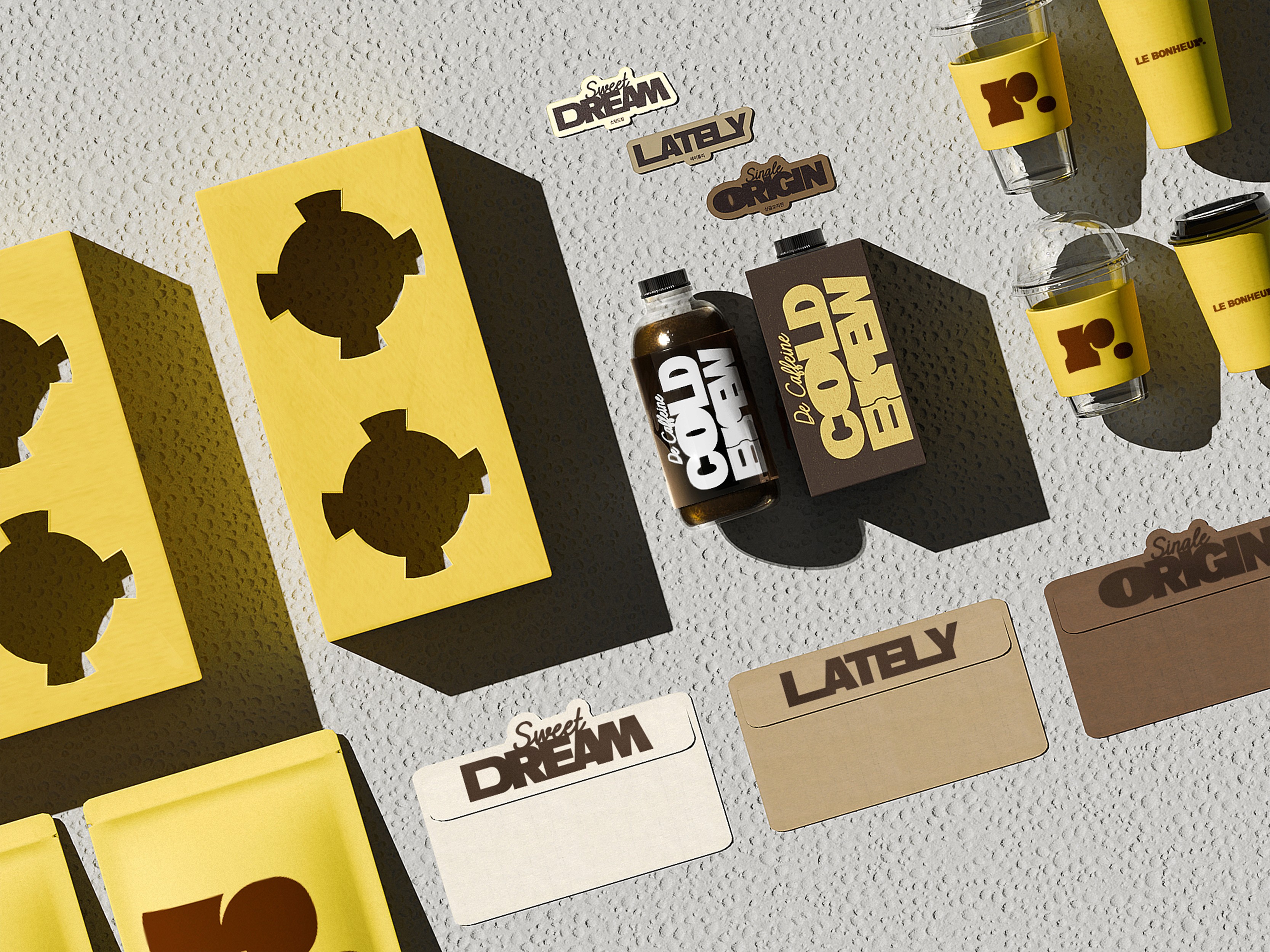
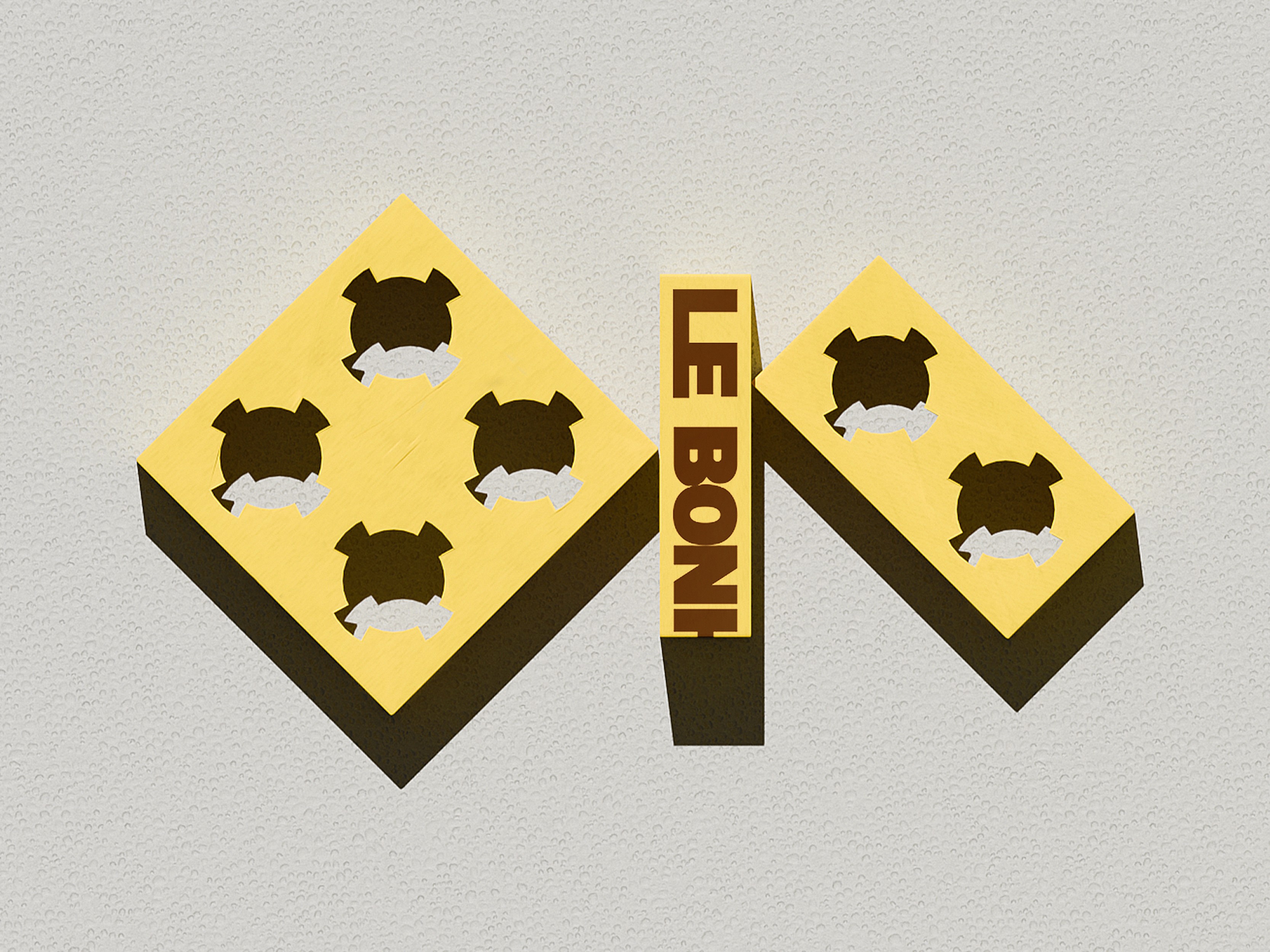
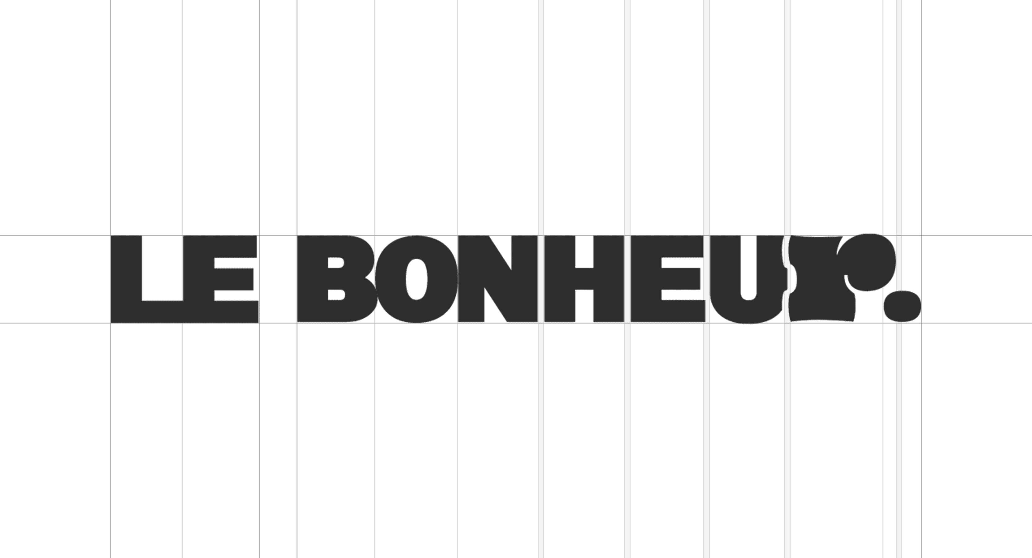
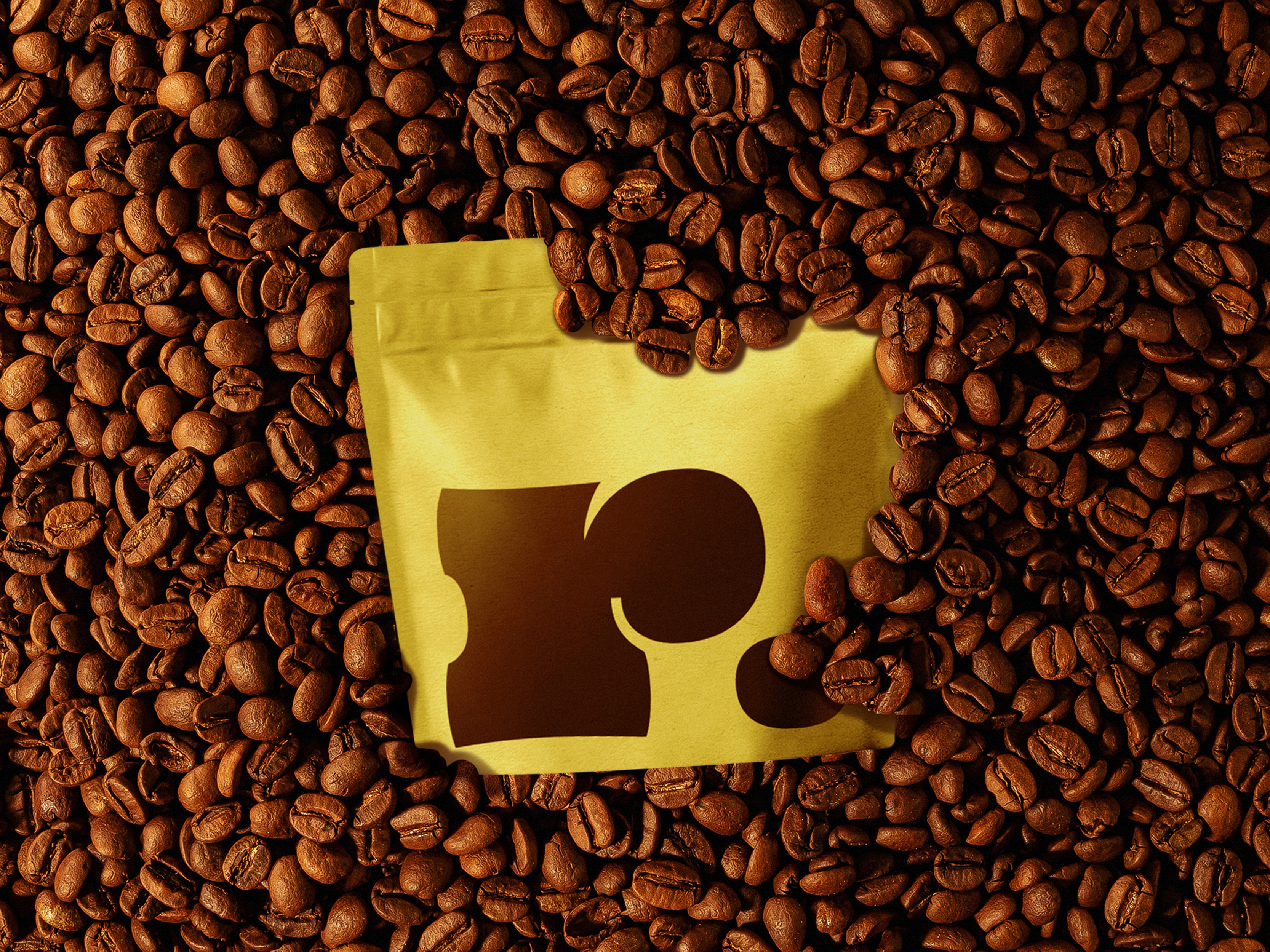
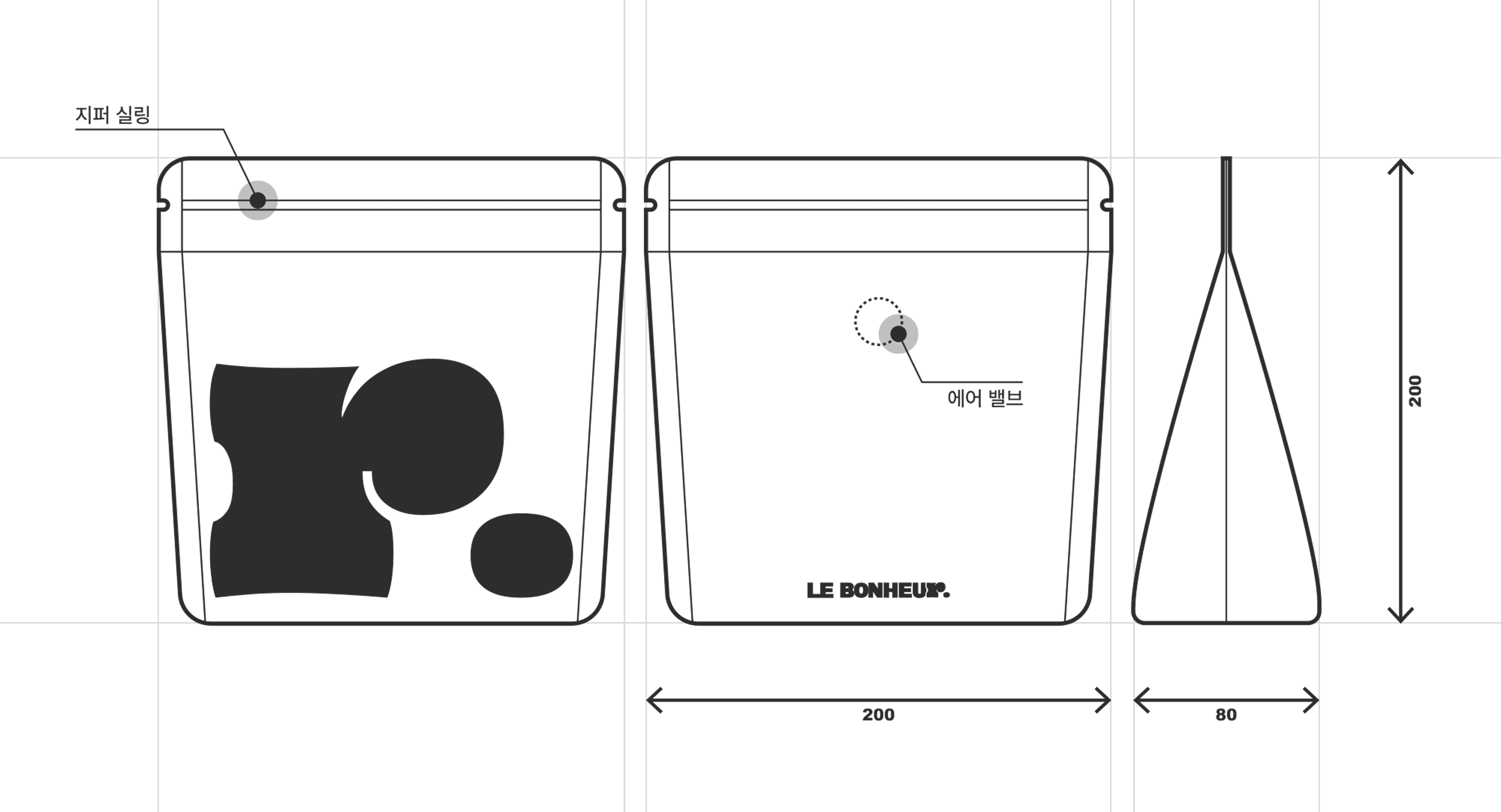
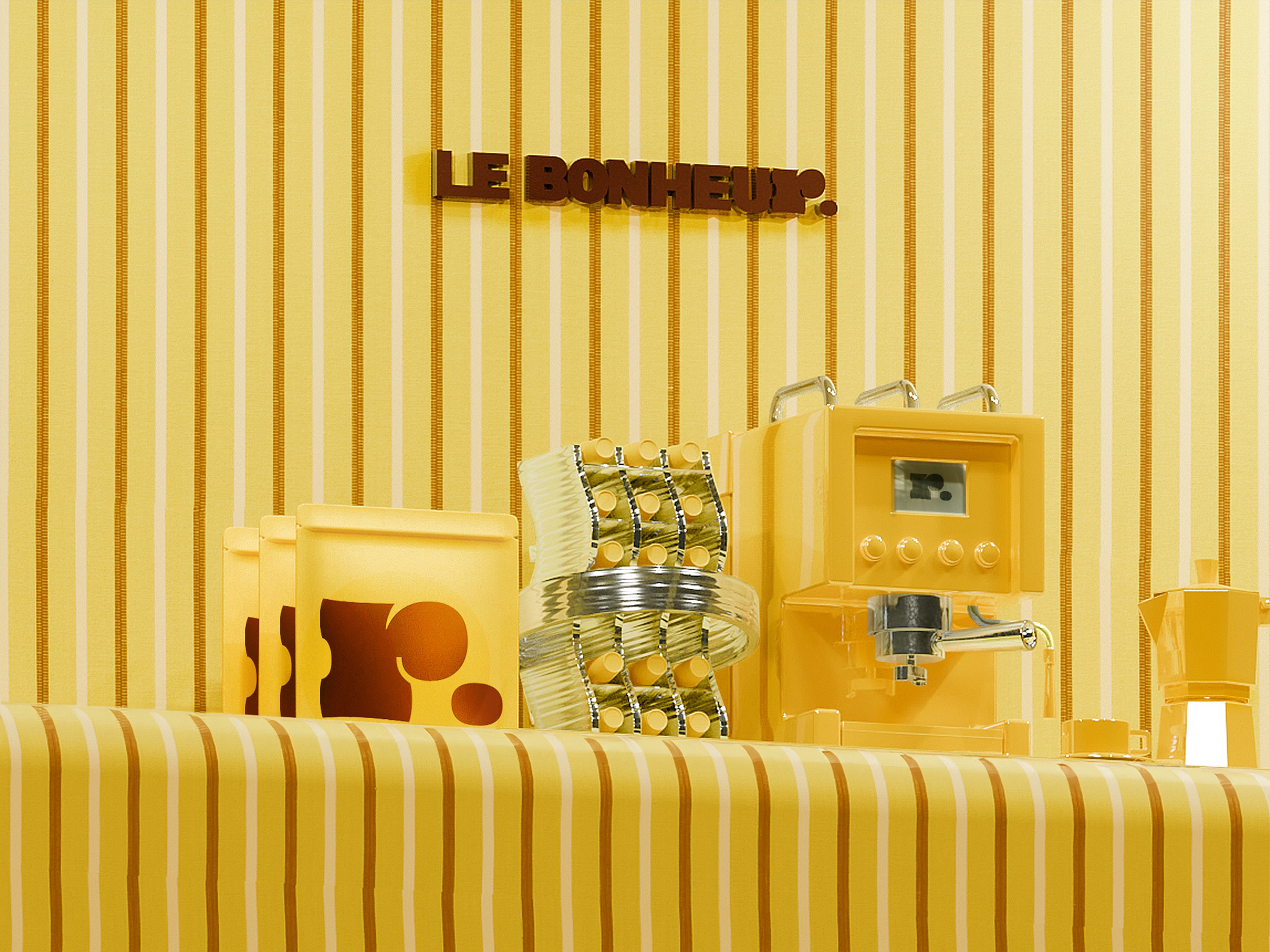
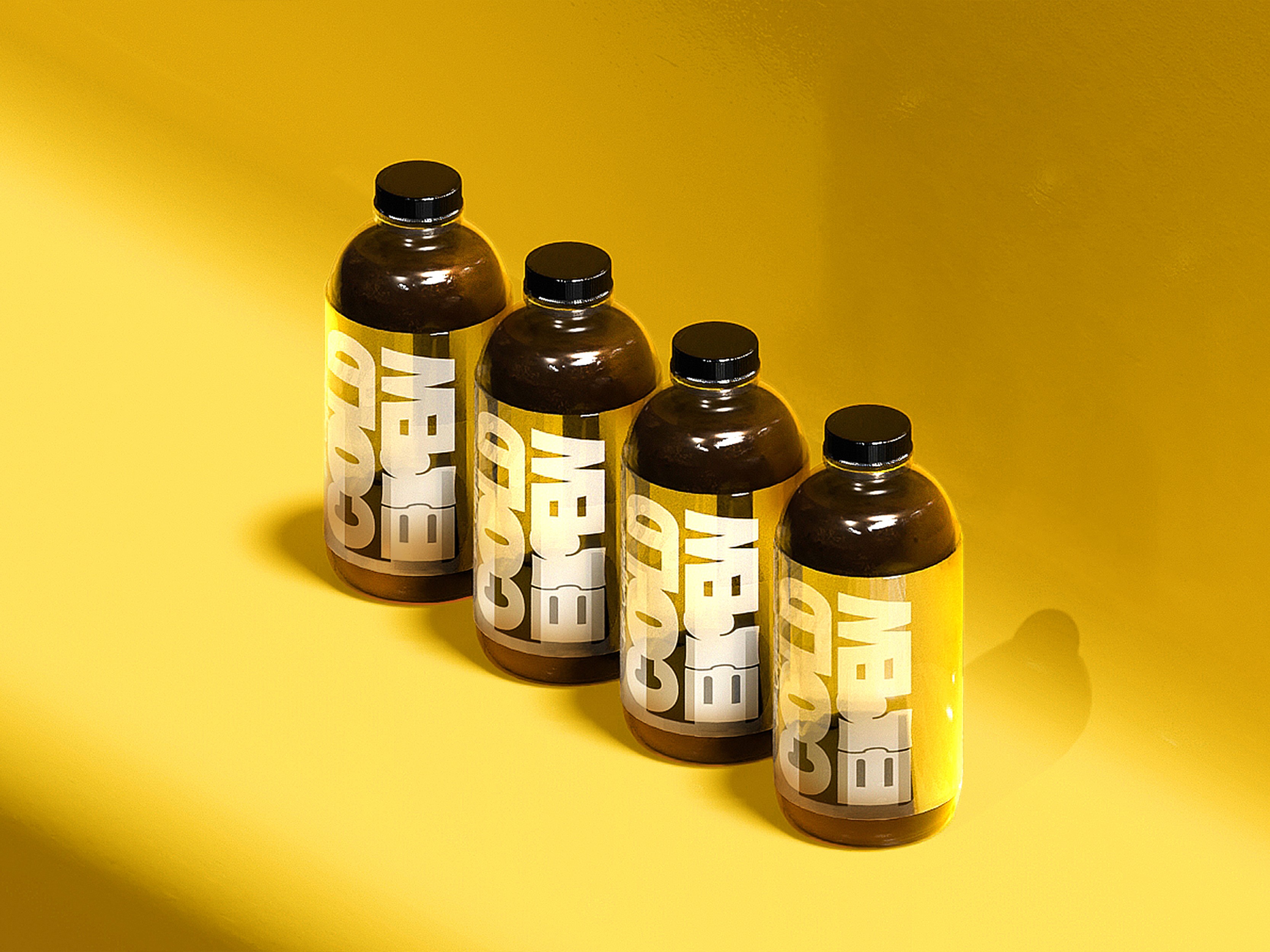
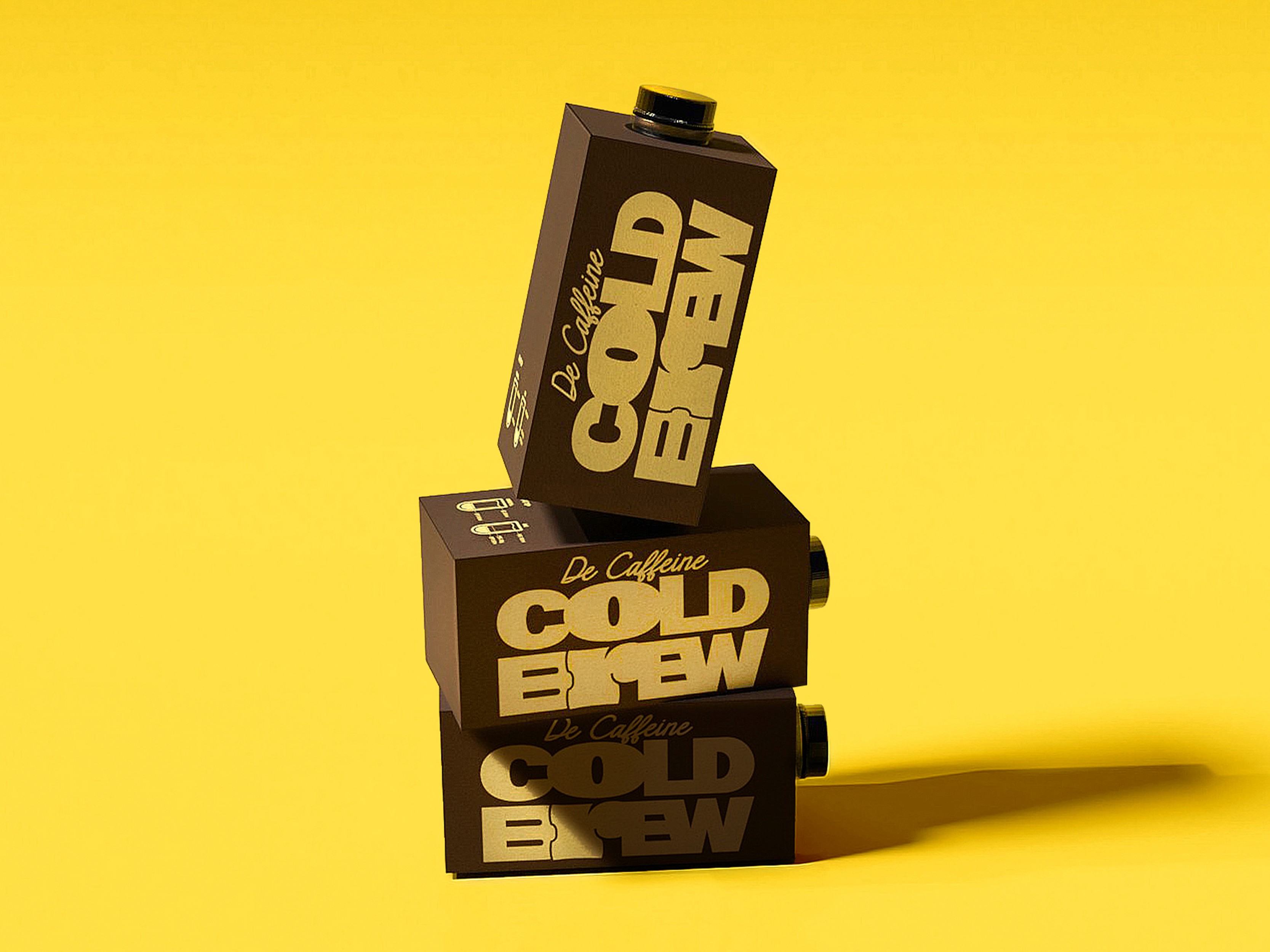
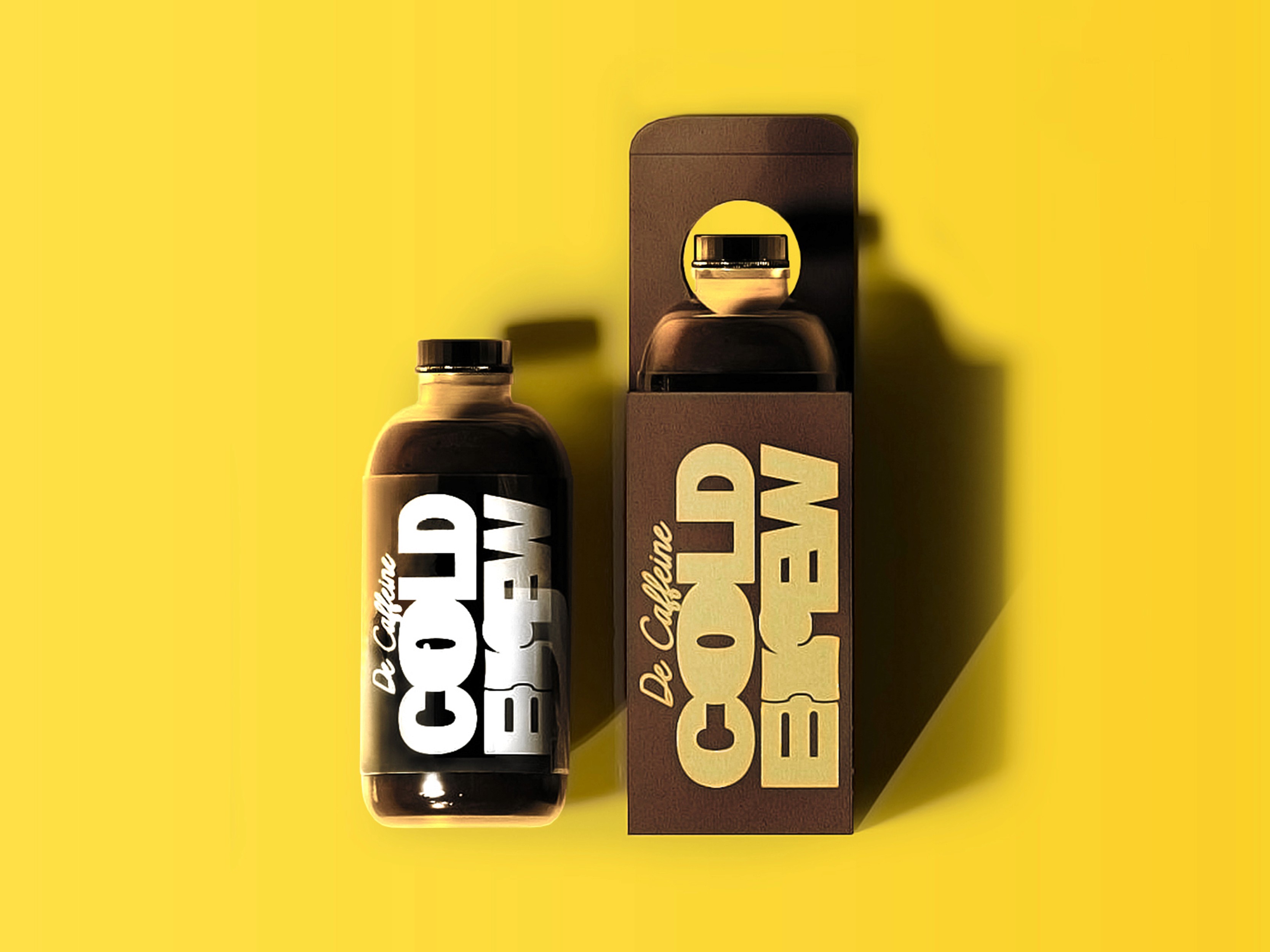
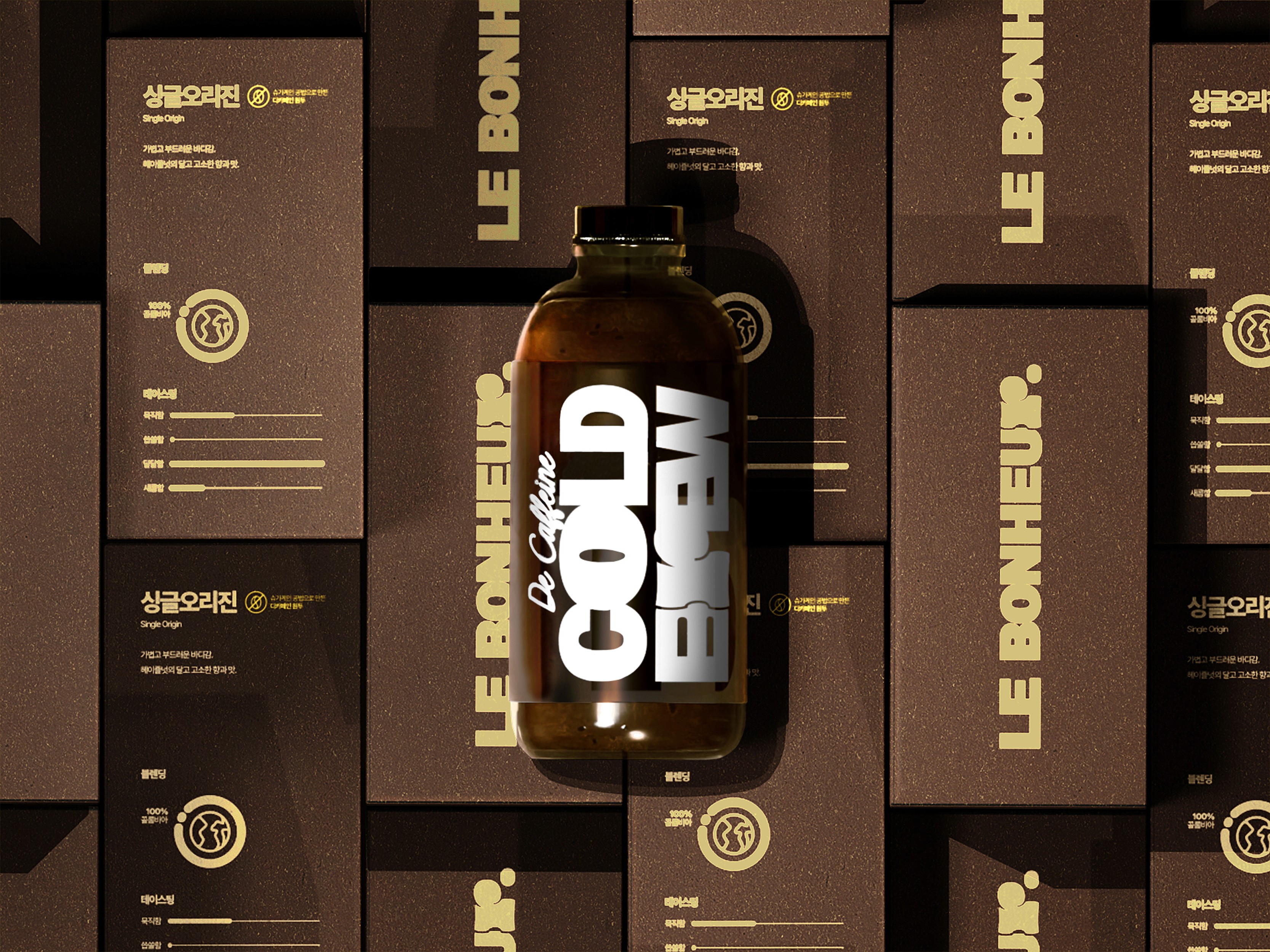
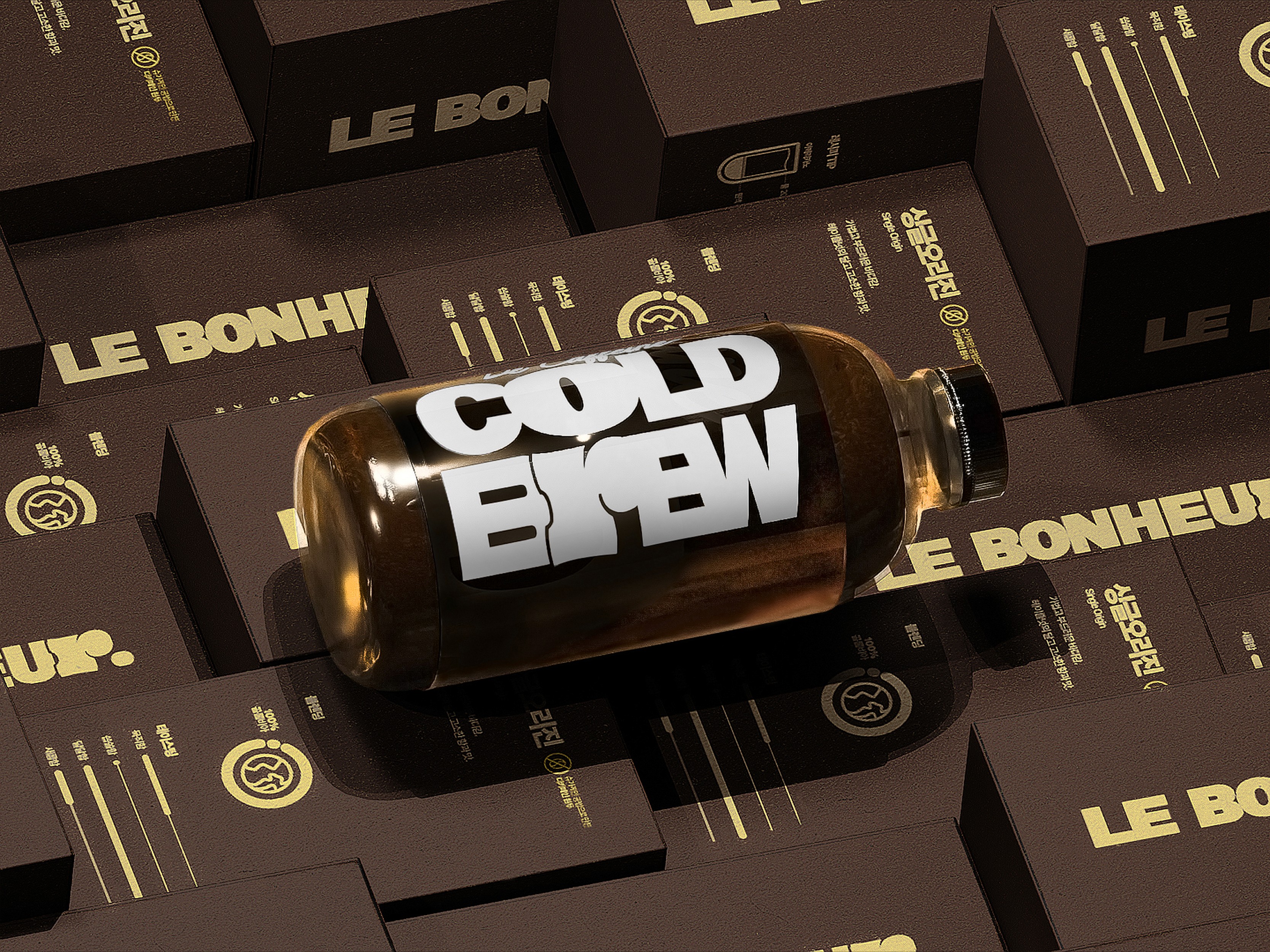
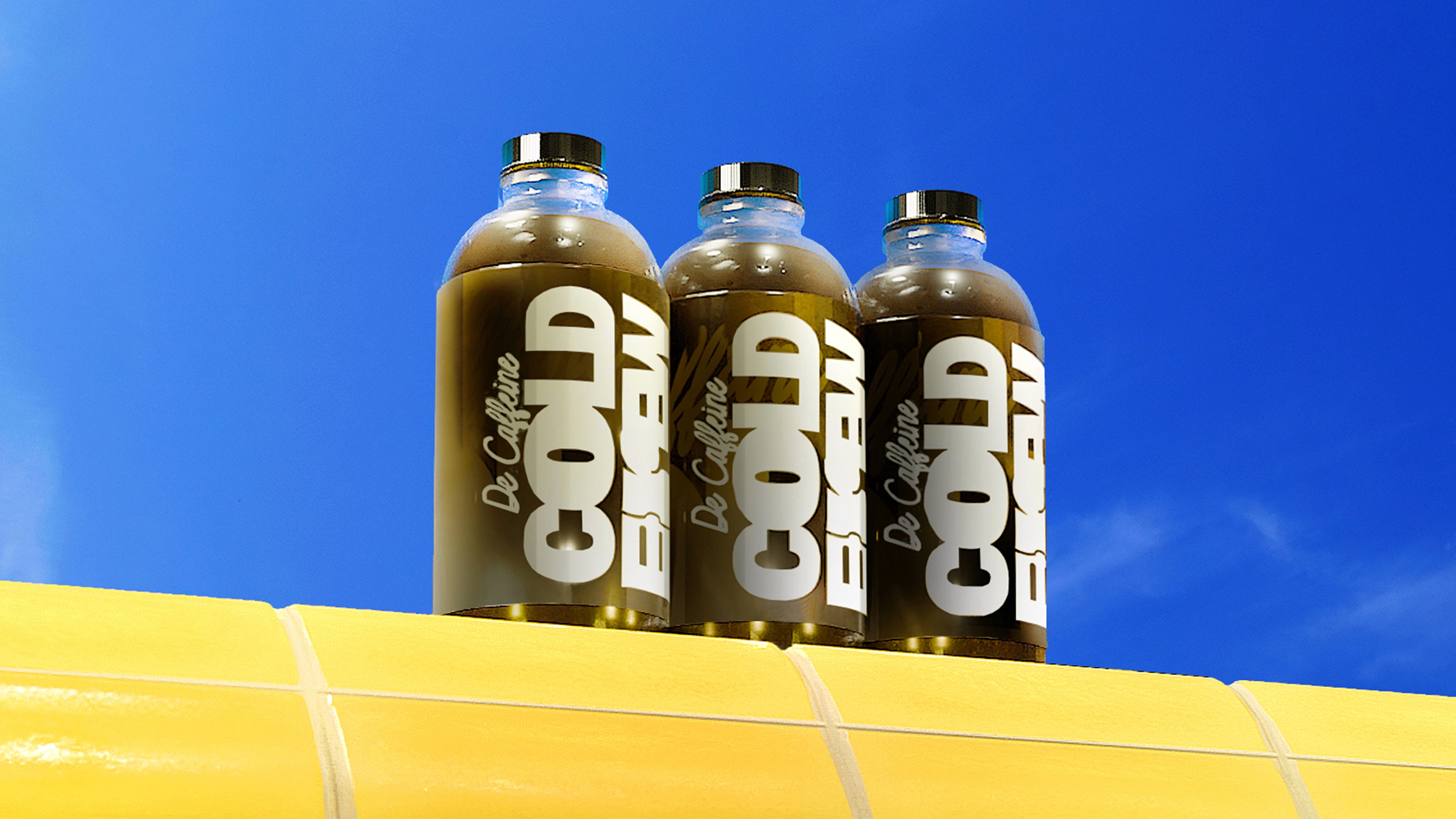
We approached the brand identity by focusing on LE BONHEUR’s signature menu. Instead of eye catching visuals, the brand needed to feel soft and understated. For this reason, we selected a light yellow tone as the main color. We designed a symbol logo based on the letter R, inspired by the softness of the pudding cake and the oval shape of coffee beans. This symbol was actively applied across the logotype and package design.
NOT ACIDITY, BUT 'A FRESH TANG'. (산미(酸味) 대신 '새콤함'.)
NOT BODY, BUT 'DEPTH'. (바디감 대신 '묵직함'.)
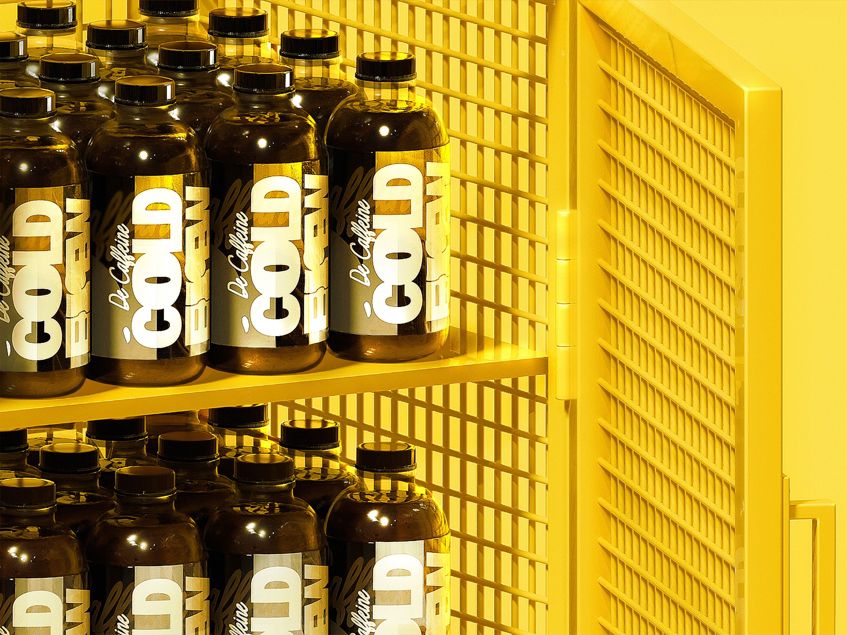
We then designed cold brew packaging and tasting notes that include detailed information such as tasting profile, blending, and origin. To make the content easier to read, even for those unfamiliar with coffee, we avoided commonly used English terms and Chinese characters often found in tasting notes, and instead used clear, everyday Korean. Illustrations and icon designs were added to improve readability and visual clarity.


OVERVIEW
Last winter, we worked on a branding project with LE BONHEUR, a café located in Sandong eup, Gumi.
The project covered the brand logo, color system, and package design, spanning from verbal identity to the offline brand experience. Through interviews conducted before the branding process, we identified a clear message at the core of LE BONHEUR. This message reflected the owner’s strong philosophy.
"Not recharge. Savor. That is what coffee is.
And that is why good coffee matters."
What LE BONHEUR wants for its customers is simple. To enjoy a proper cup of coffee, even if it is just one. Rather than simply satisfying hunger with coffee and dessert, the brand hopes customers leave feeling that their gloomy day has been completely lifted.
CLIENT
YEAR
2024
SCOPE
SCOPE
2D Graphics
3D Modeling
3D Rendering
3D Scenes
3D Texture & Mapping
Brand Experience
Brand Identity
Brand Strategy
Editorial
Ideation
Logo
Packaging
Prints & Materials
2D Graphics
3D Rendering
3D Texture & Mapping
Brand Identity
Editorial
Logo
Prints & Materials
3D Modeling
3D Scenes
Brand Experience
Brand Strategy
Ideation
Packaging
2D Graphics
3D Texture & Mapping
Editorial
Prints & Materials
3D Modeling
Brand Experience
Ideation
3D Rendering
Brand Identity
Logo
3D Scenes
Brand Strategy
Packaging
LE BONHEUR
3 TYPES OF COFFEE BEANS WITH CHARACTER & PUDDING CAKE
We approached the brand identity by focusing on LE BONHEUR’s signature menu. Instead of eye catching visuals, the brand needed to feel soft and understated. For this reason, we selected a light yellow tone as the main color. We designed a symbol logo based on the letter R, inspired by the softness of the pudding cake and the oval shape of coffee beans. This symbol was actively applied across the logotype and package design.
NOT ACIDITY, BUT 'A FRESH TANG'. (산미(酸味) 대신 '새콤함'.)
NOT BODY, BUT 'DEPTH'. (바디감 대신 '묵직함'.)
We then designed cold brew packaging and tasting notes that include detailed information such as tasting profile, blending, and origin. To make the content easier to read, even for those unfamiliar with coffee, we avoided commonly used English terms and Chinese characters often found in tasting notes, and instead used clear, everyday Korean. Illustrations and icon designs were added to improve readability and visual clarity.