


OVERVIEW
From A KNACK to KNACKU
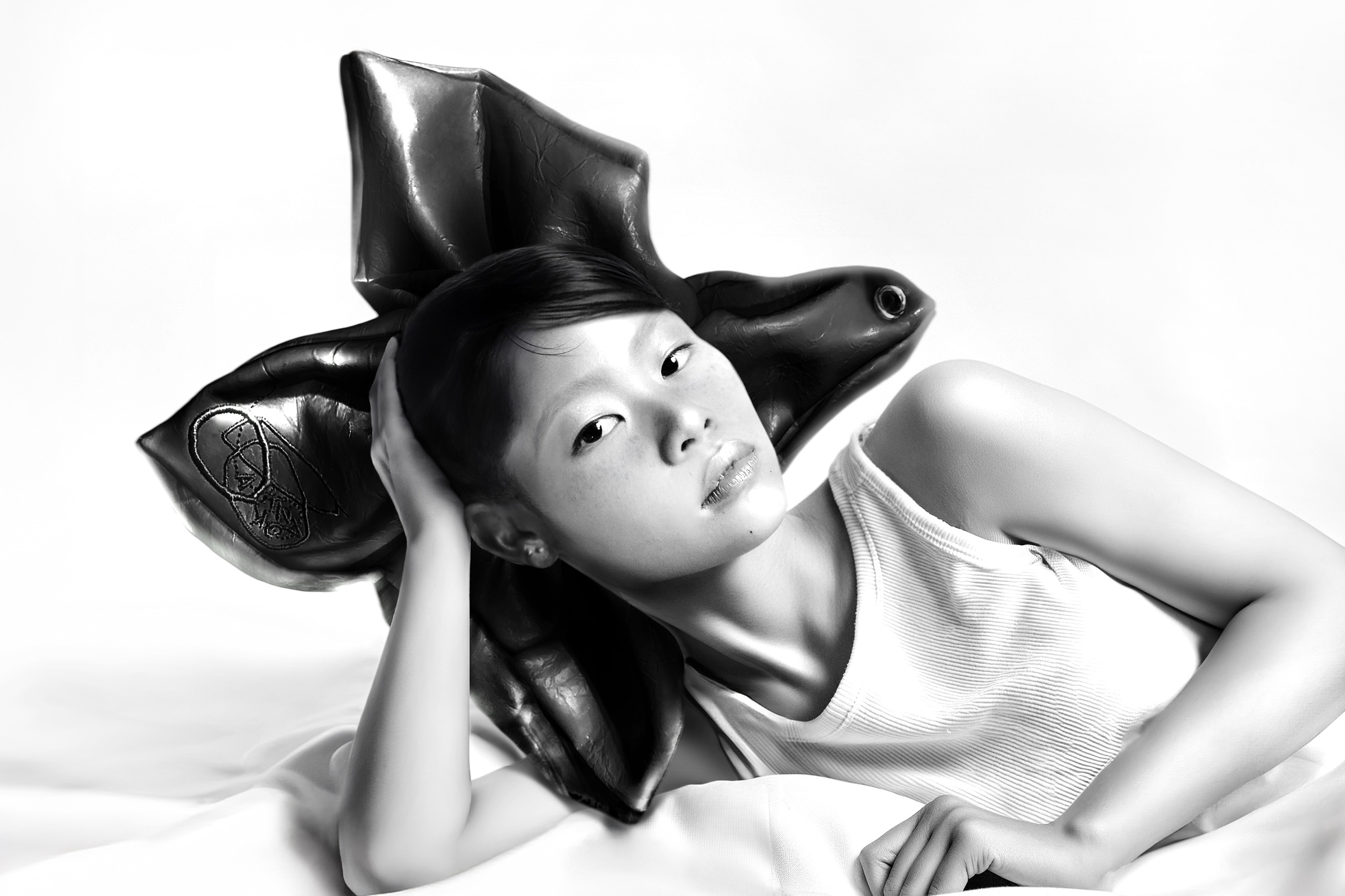
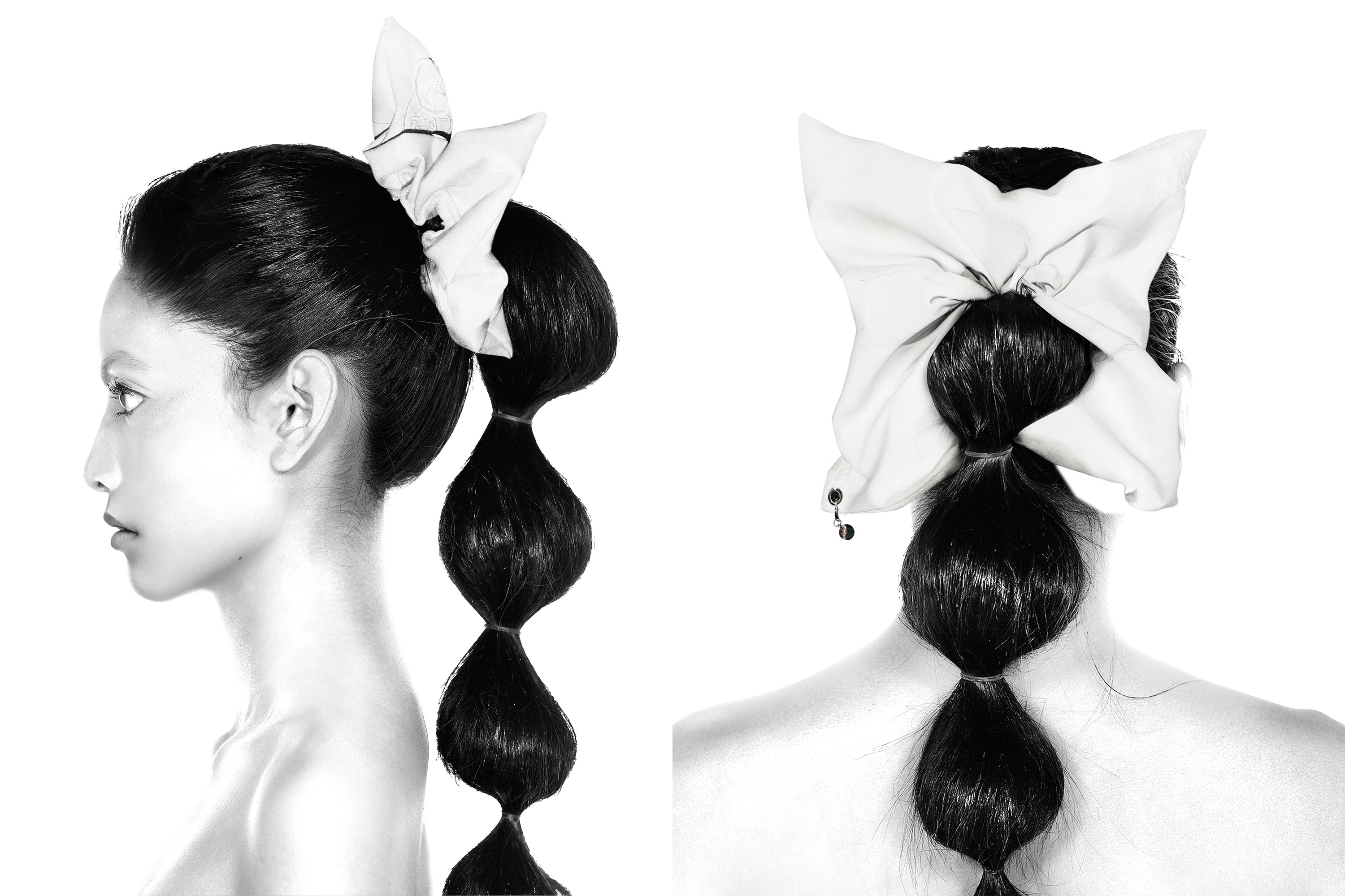
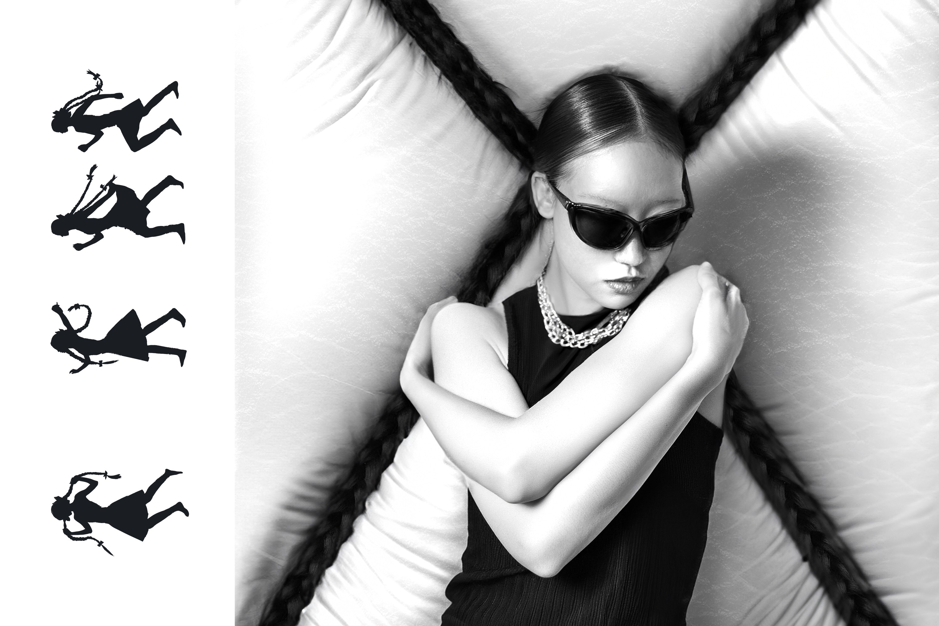
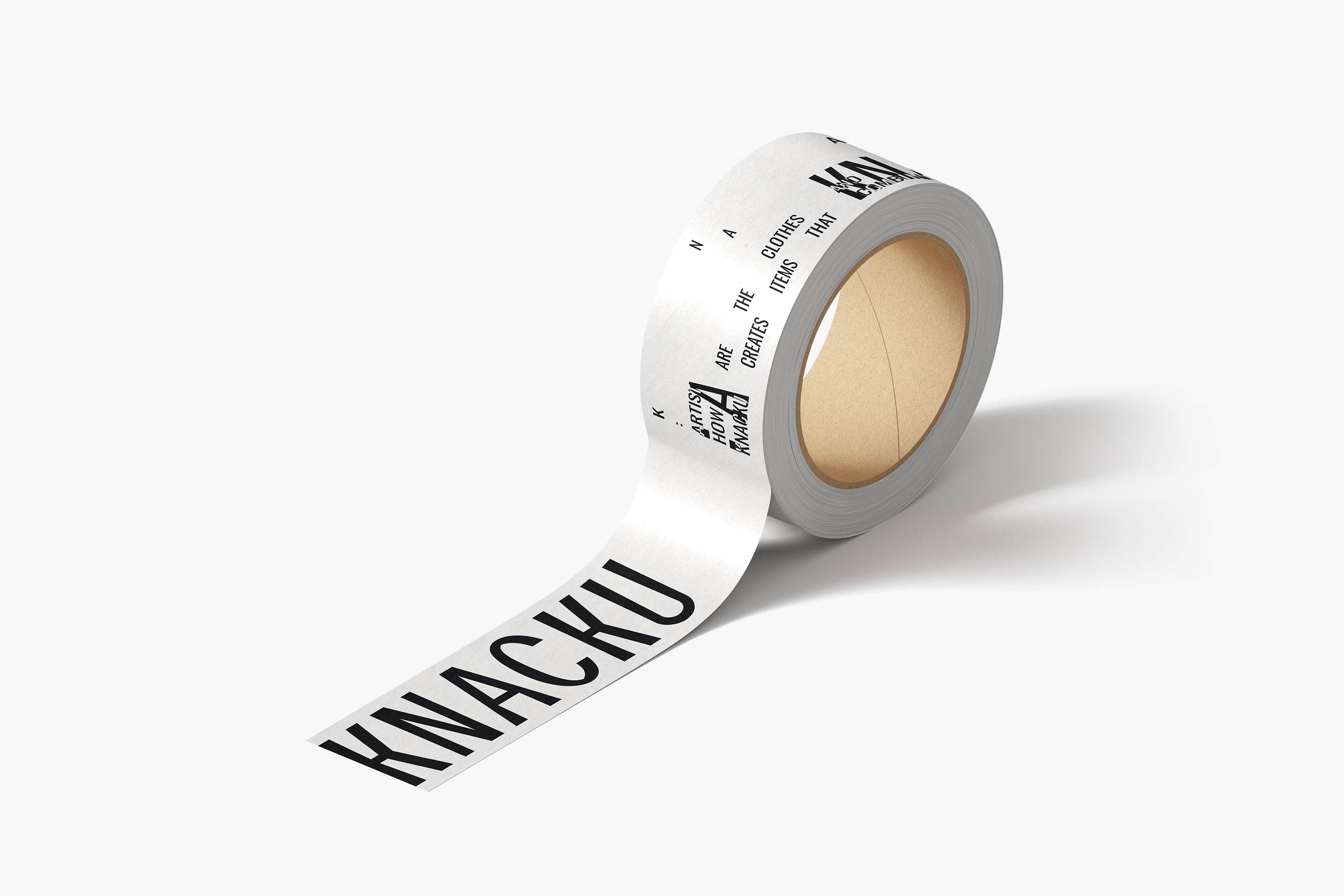
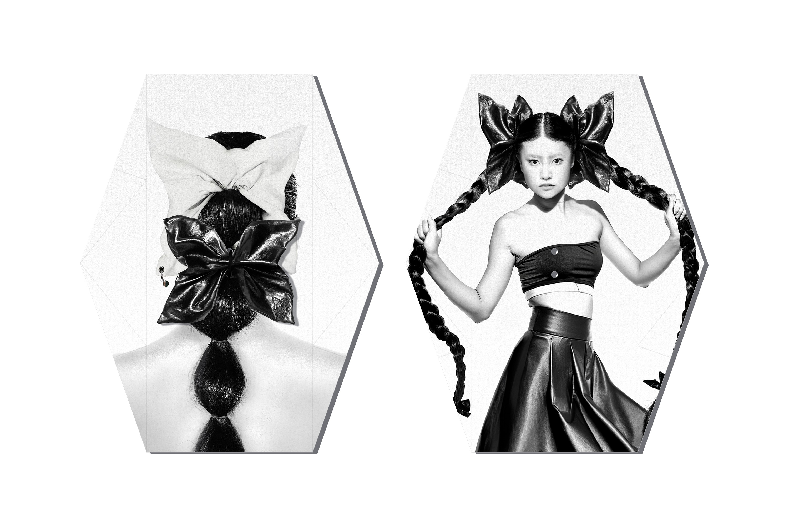
A KNACK, based in Seongsu-dong and Cheongdam-dong, has launched a new brand, KNACKU. We worked closely with the team throughout the launch process, handling the packaging and secondary materials design, as well as the ideation images. KNACKU carries forward A KNACK’s identity while unfolding artistic items inspired by the director and creators behind the brand. The way their aesthetic sensibility and personal style translate into products is particularly compelling. Going beyond simple hair-related items, KNACKU proposes objects where the hair designer’s perspective and the brand’s philosophy come together—positioning itself as a true craft-driven brand.
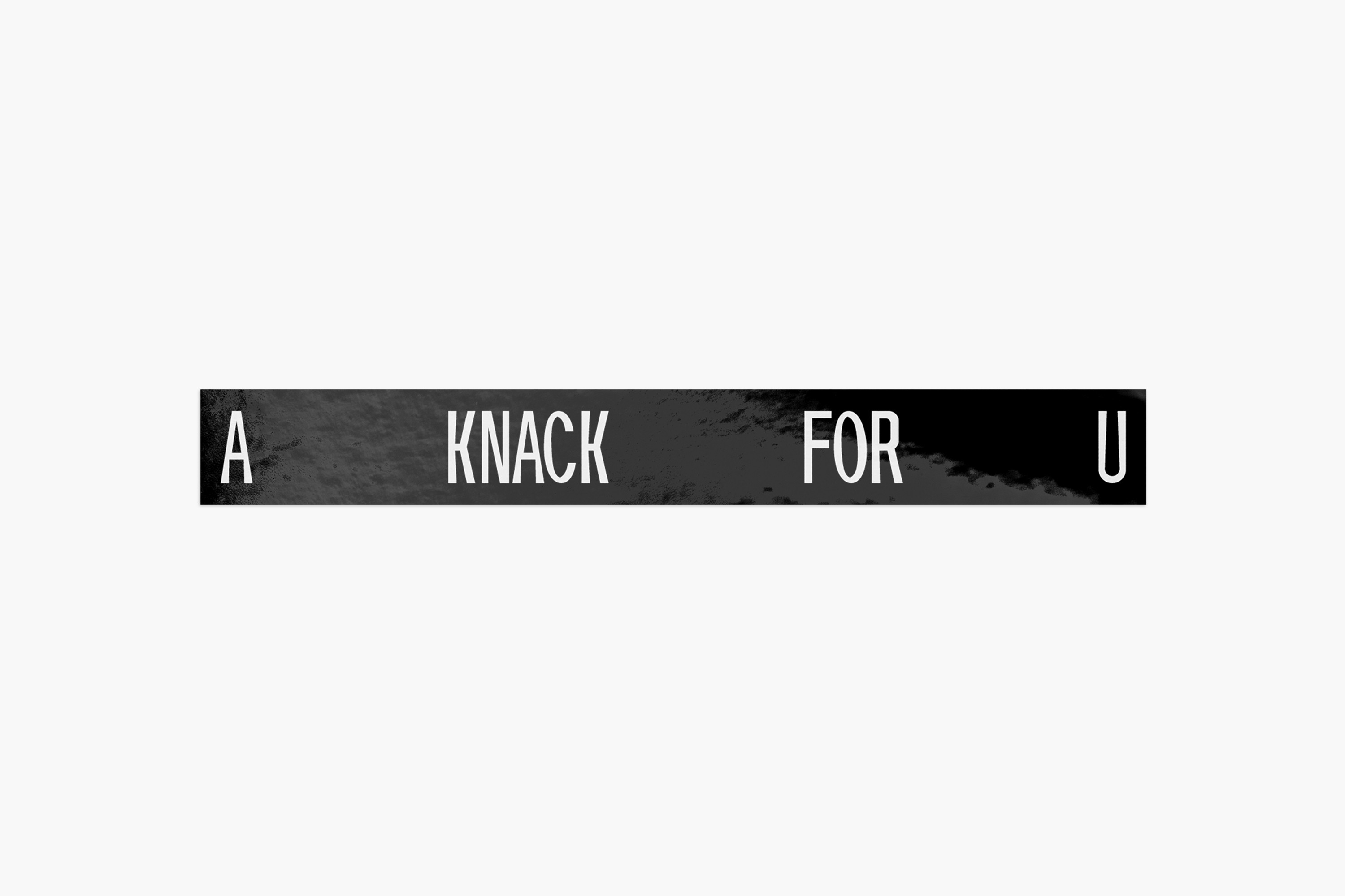
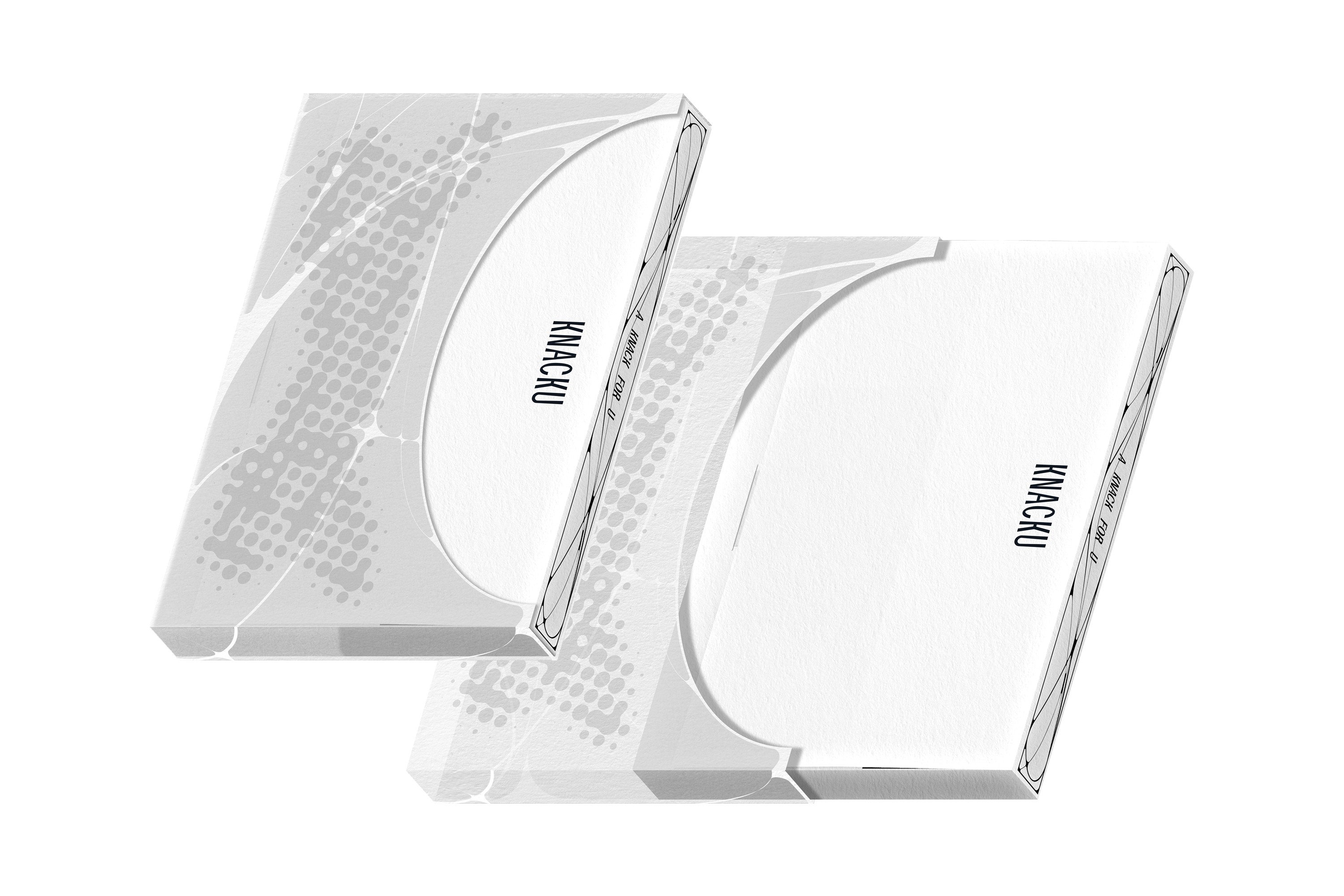
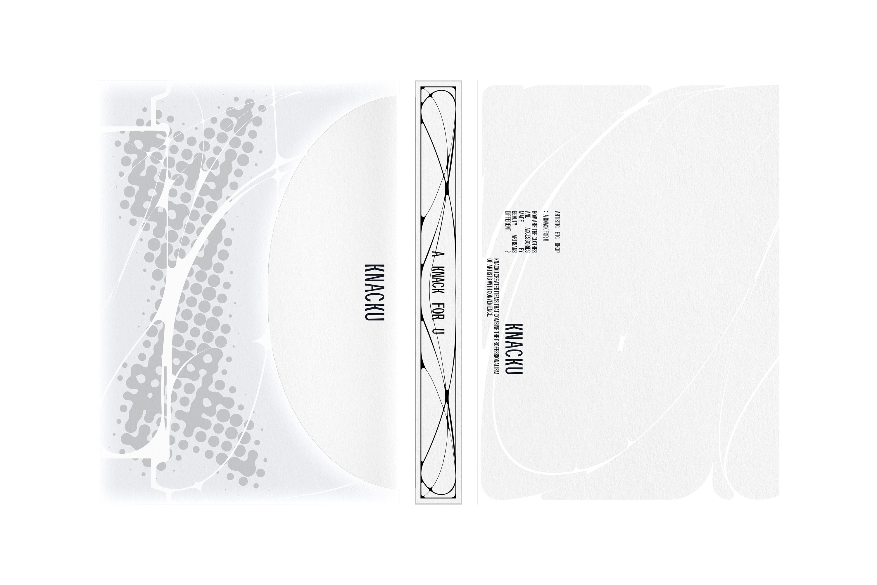
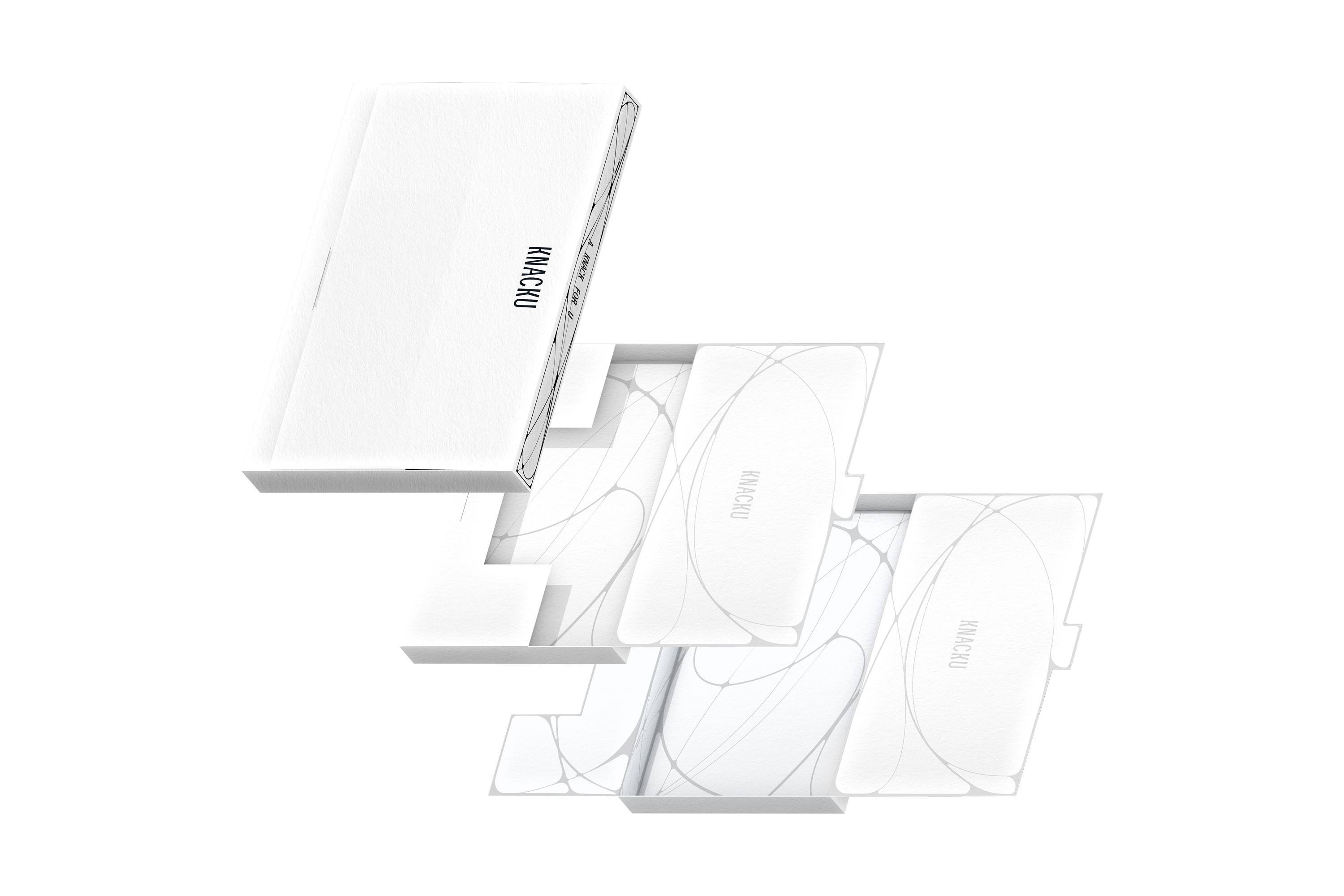
A KNACK FOR U: Our craft, for you.
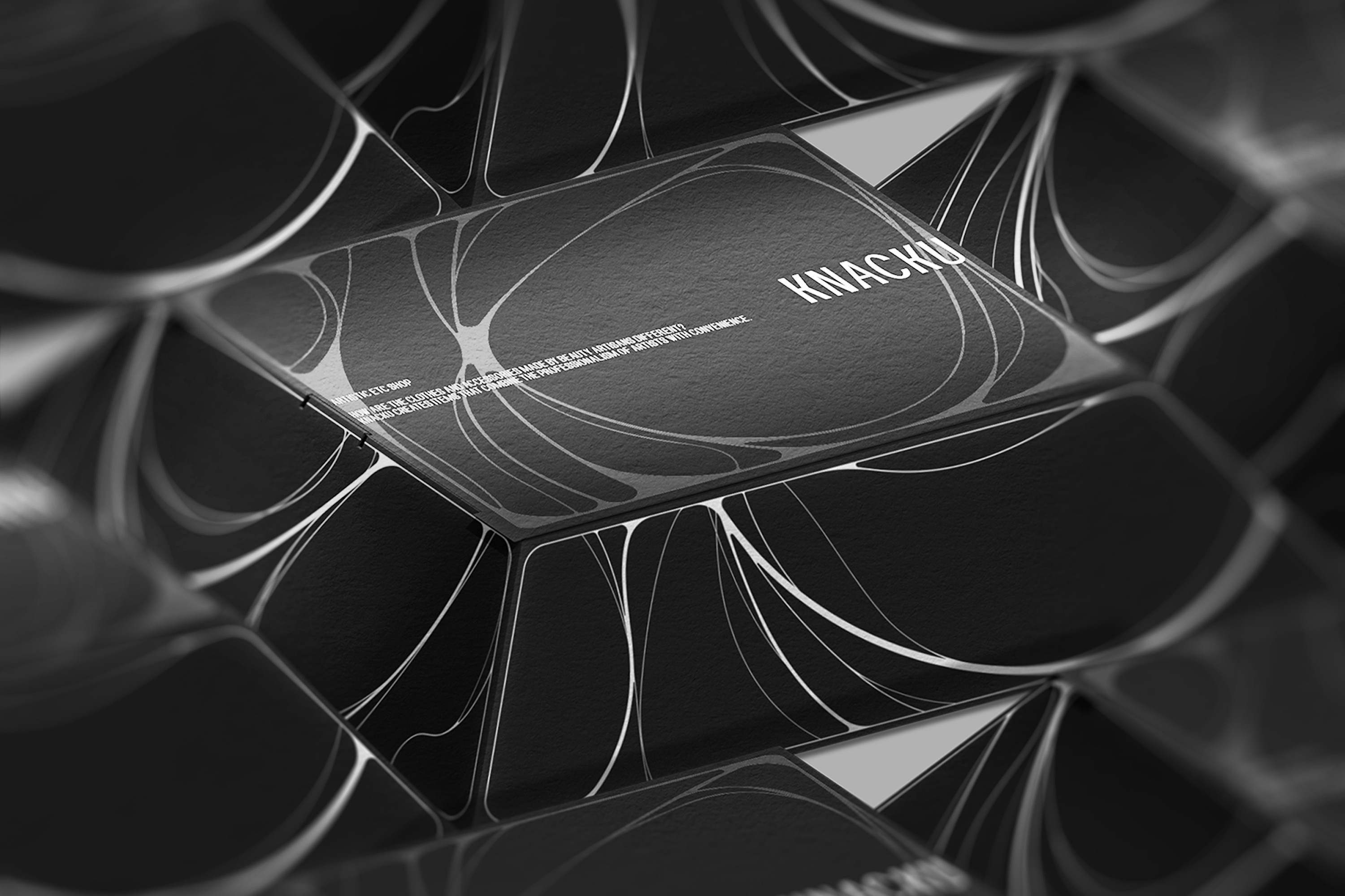
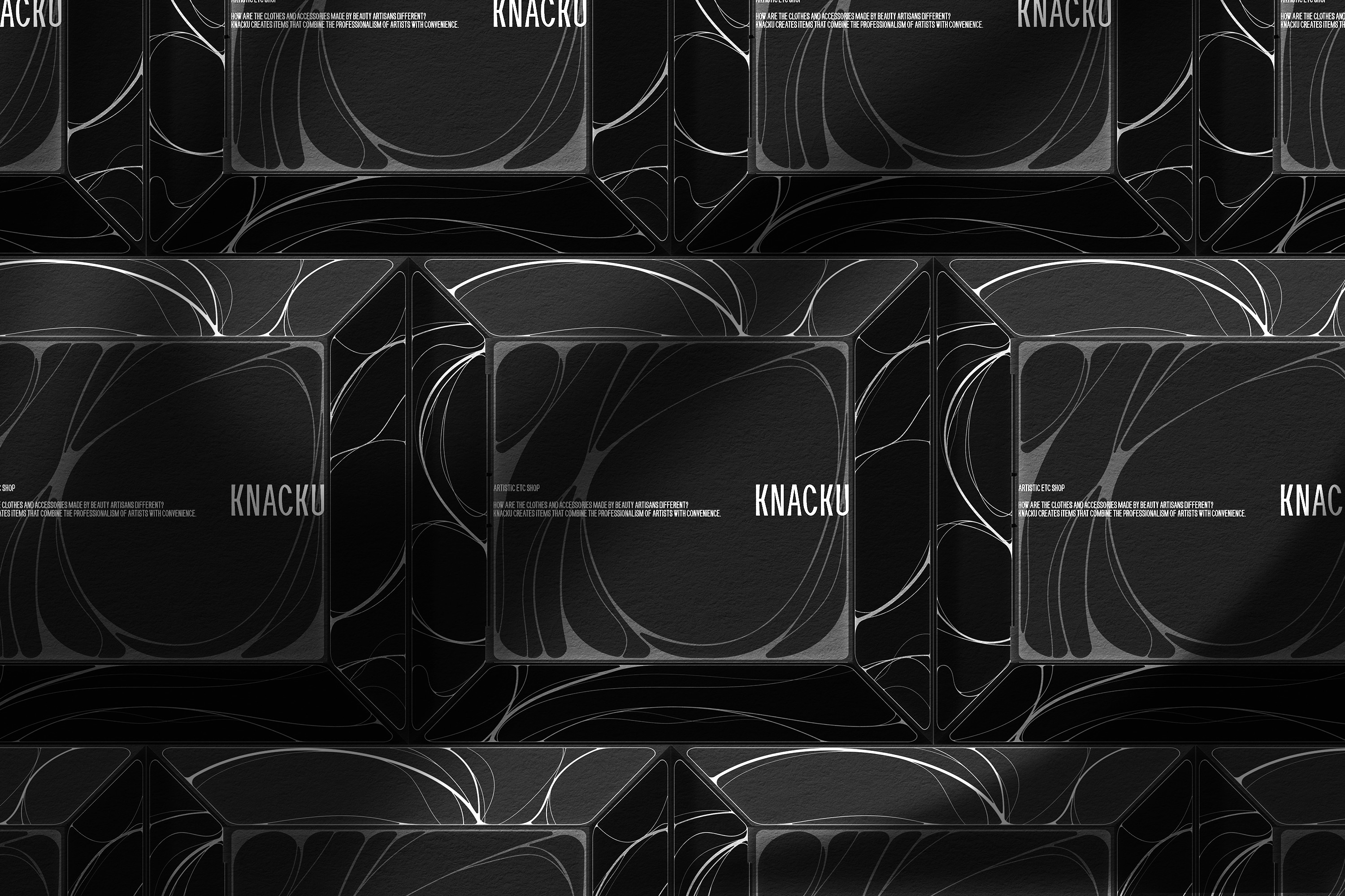
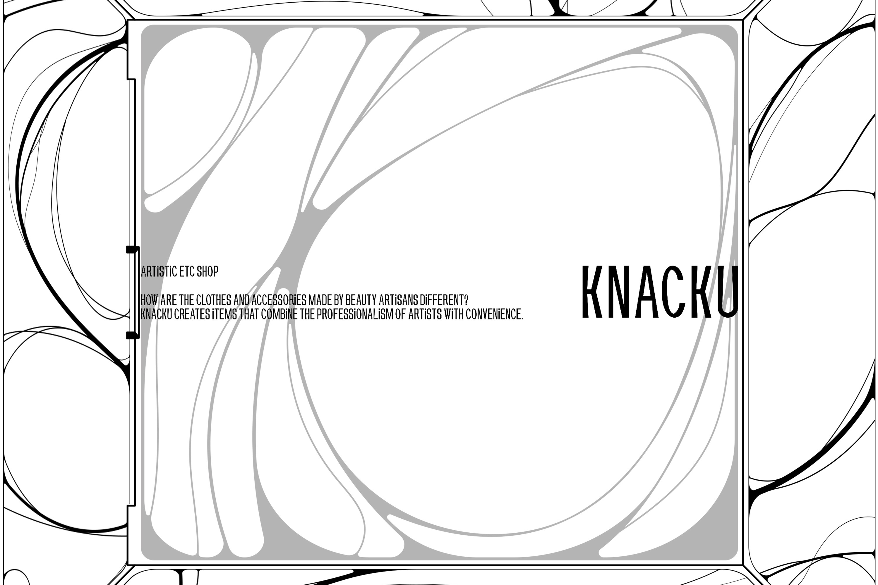
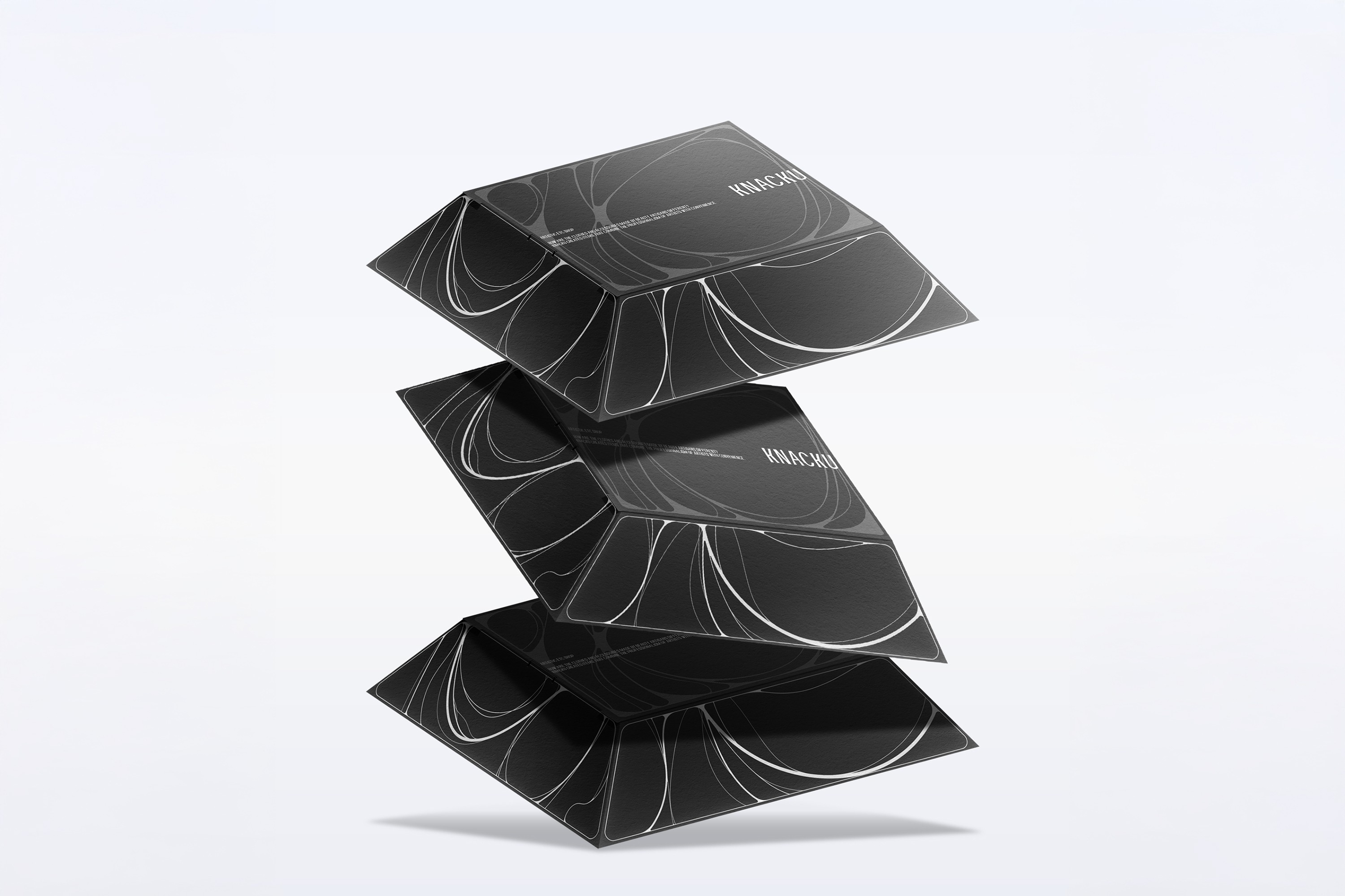
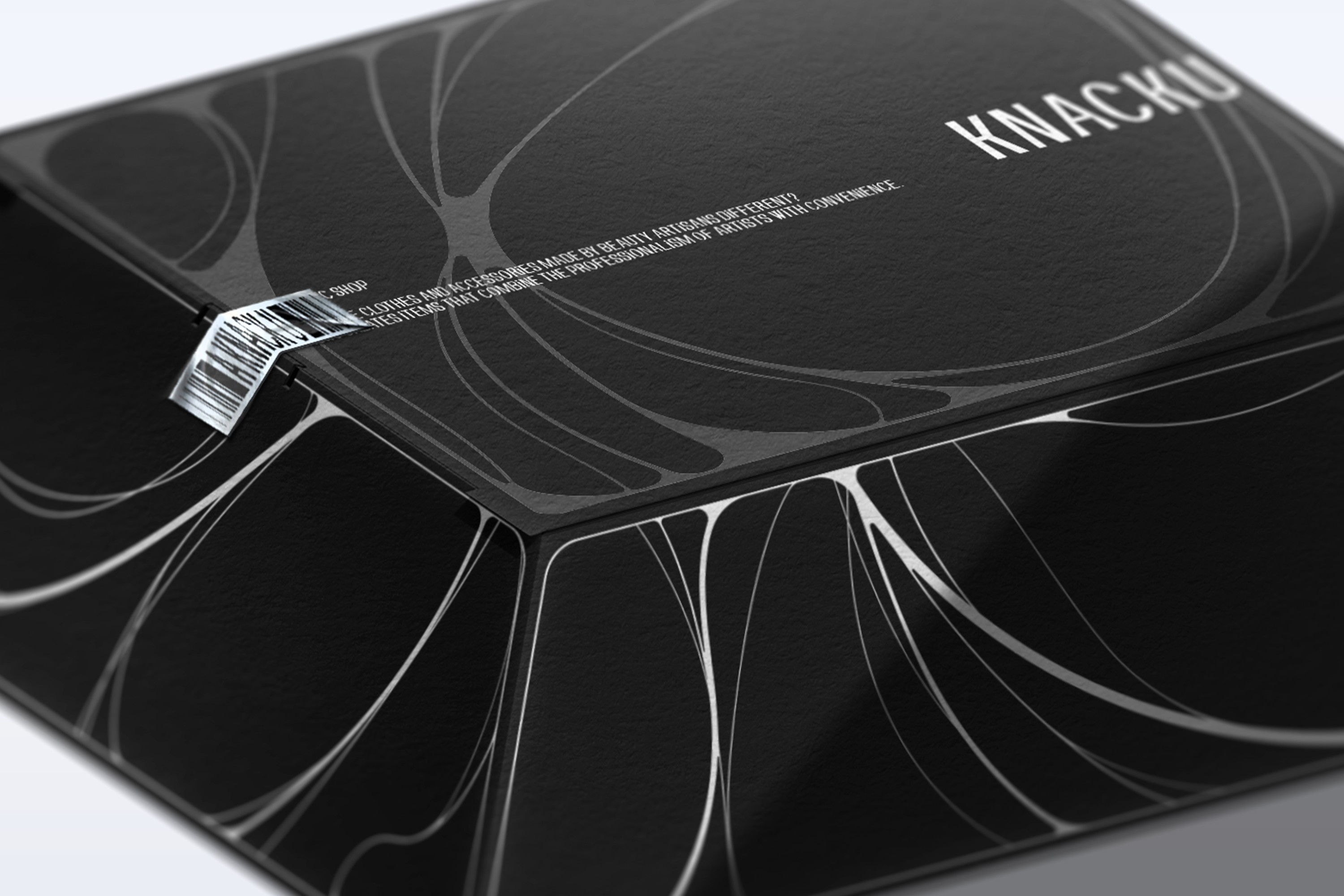
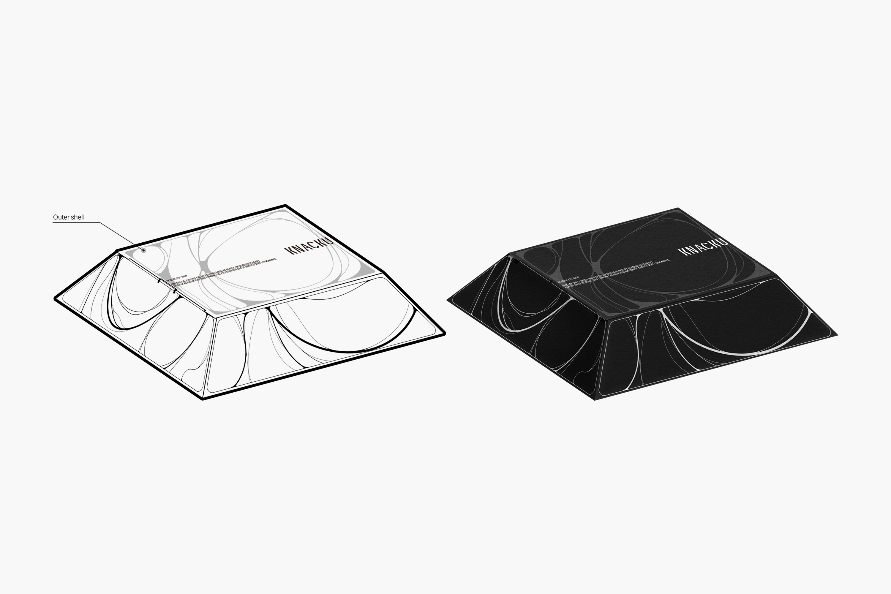
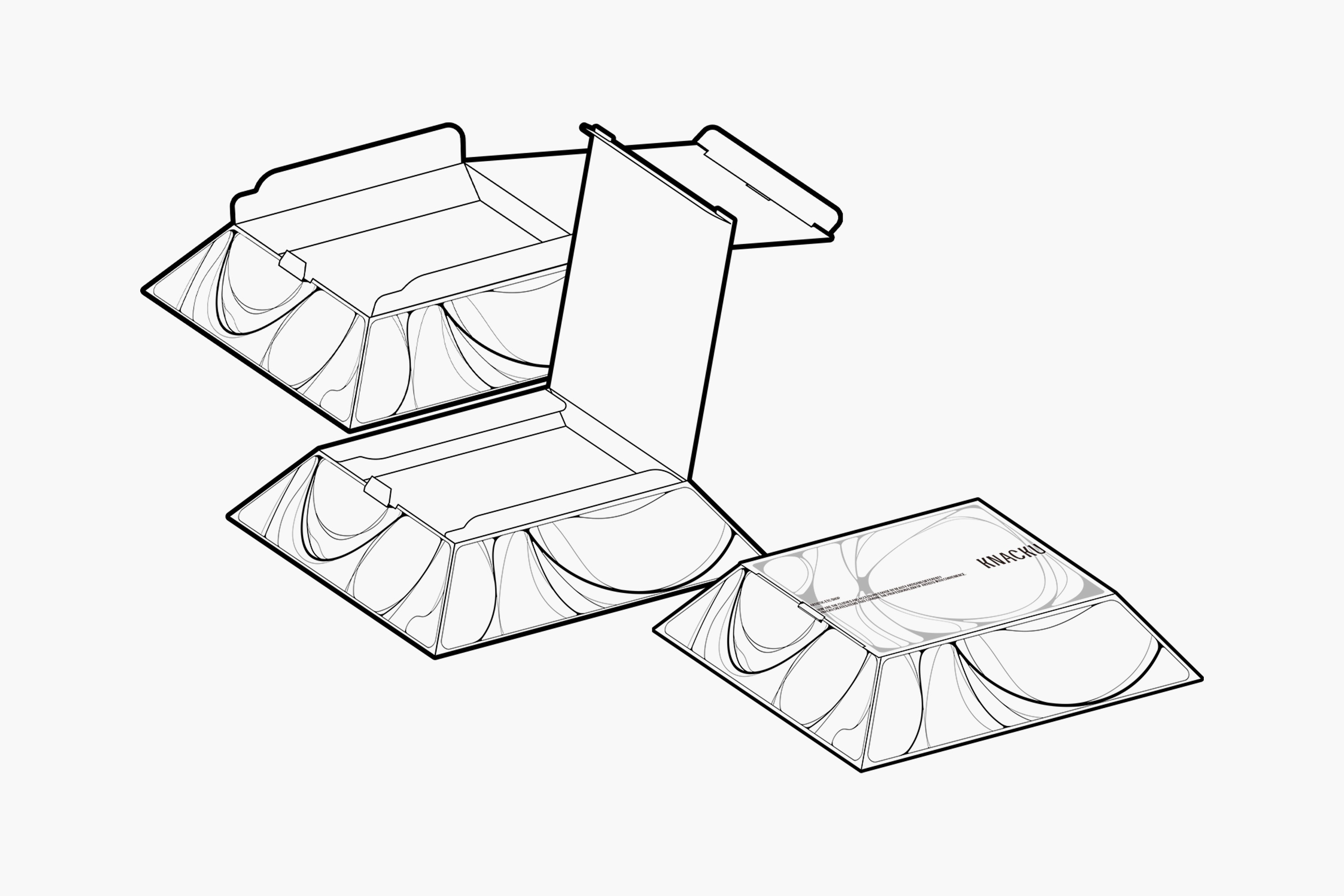
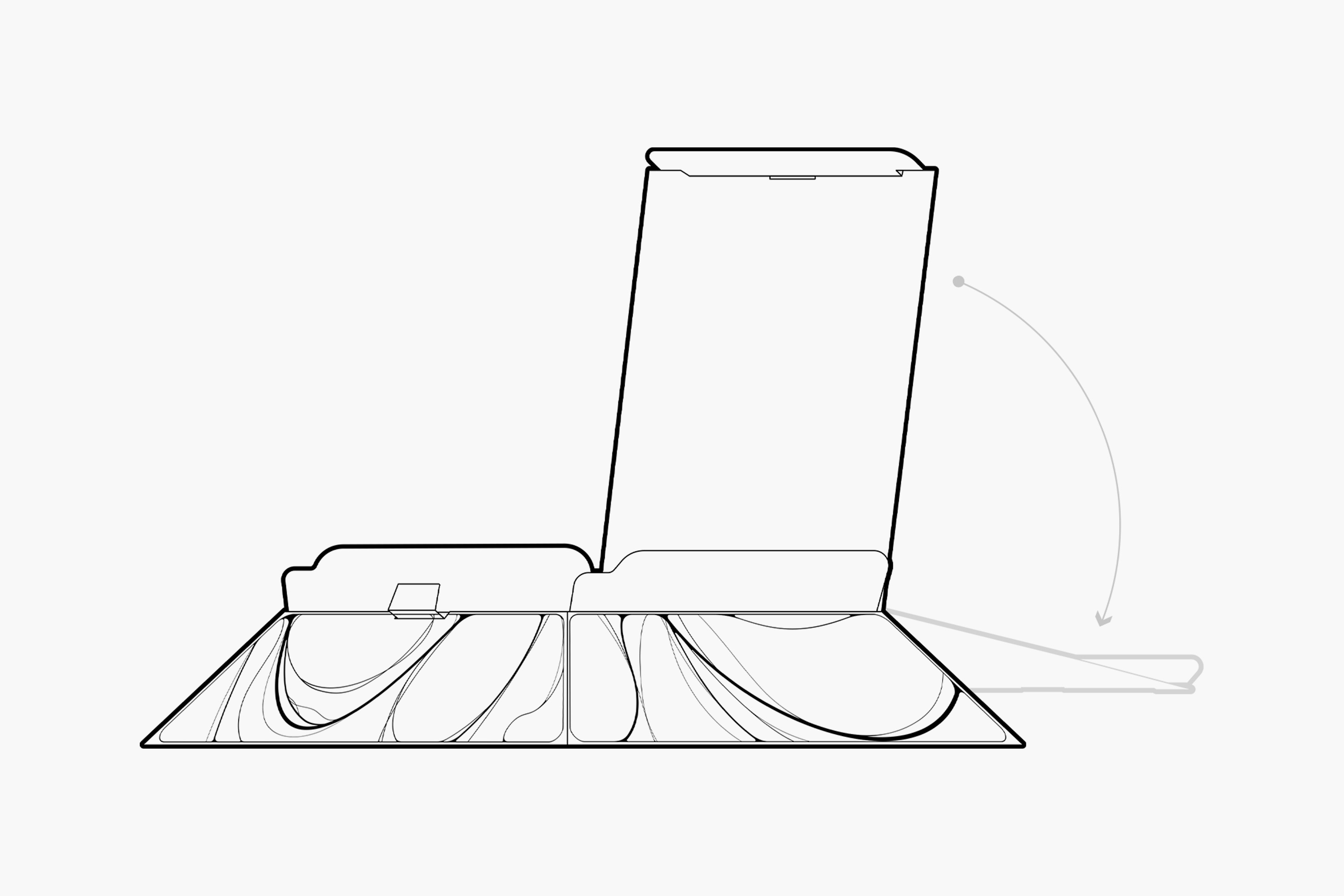
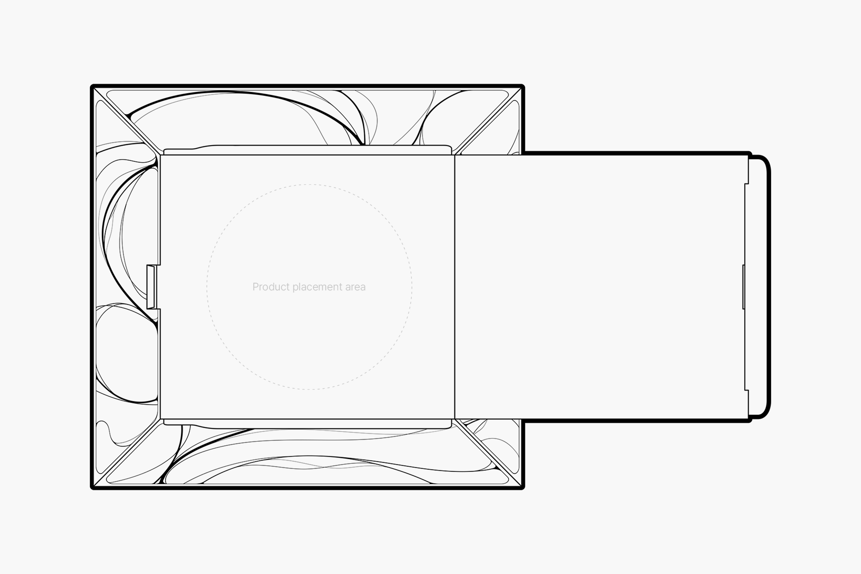
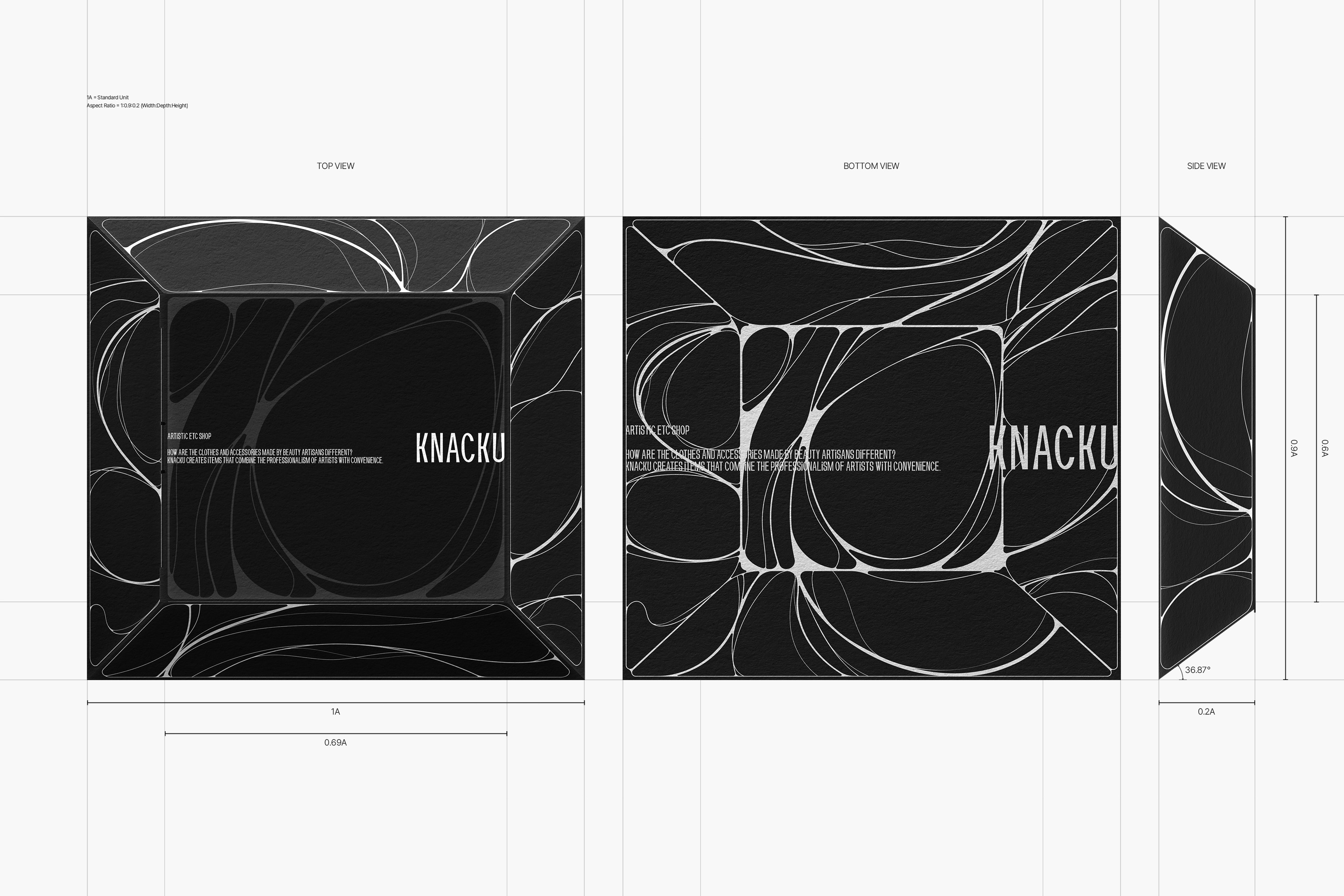
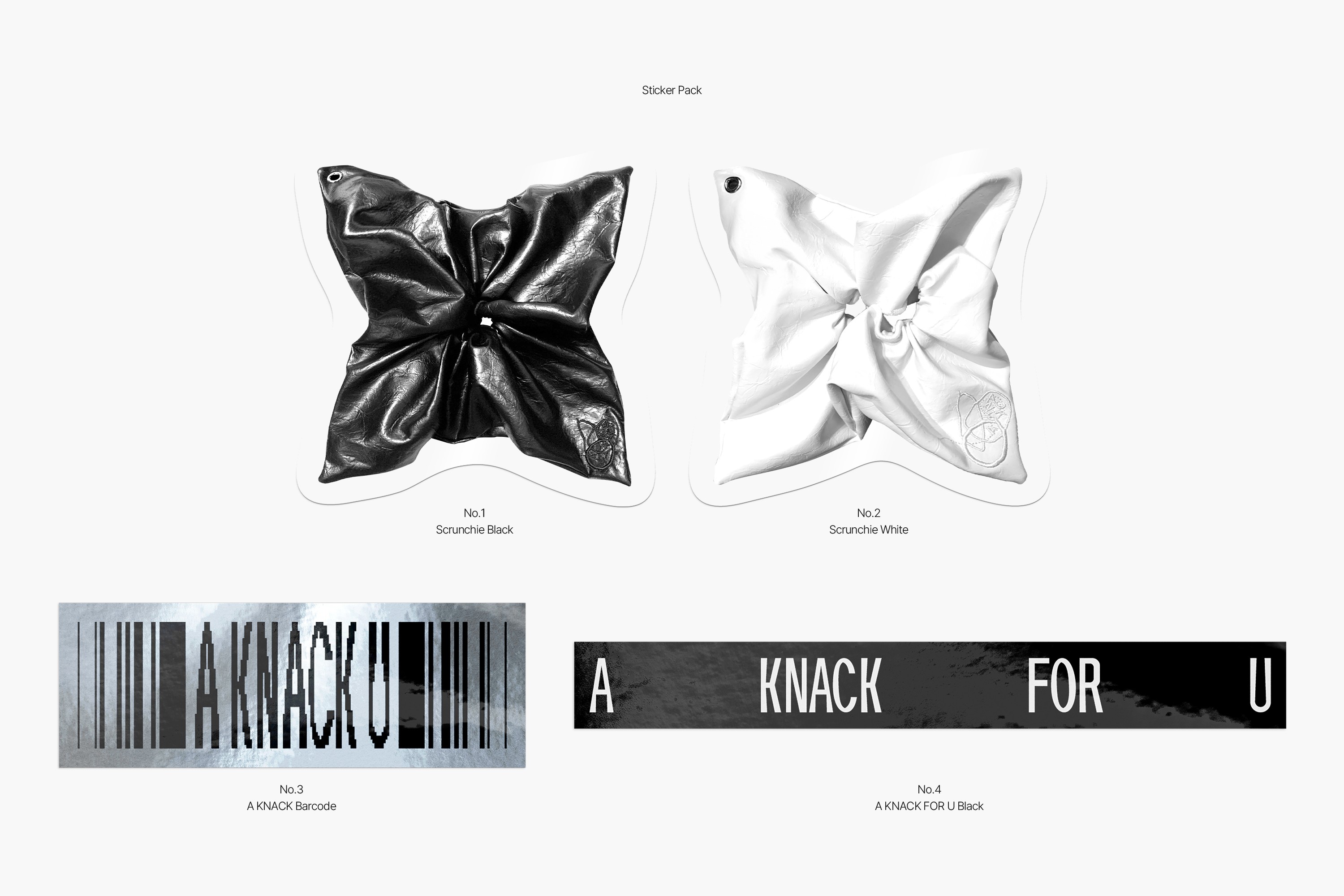
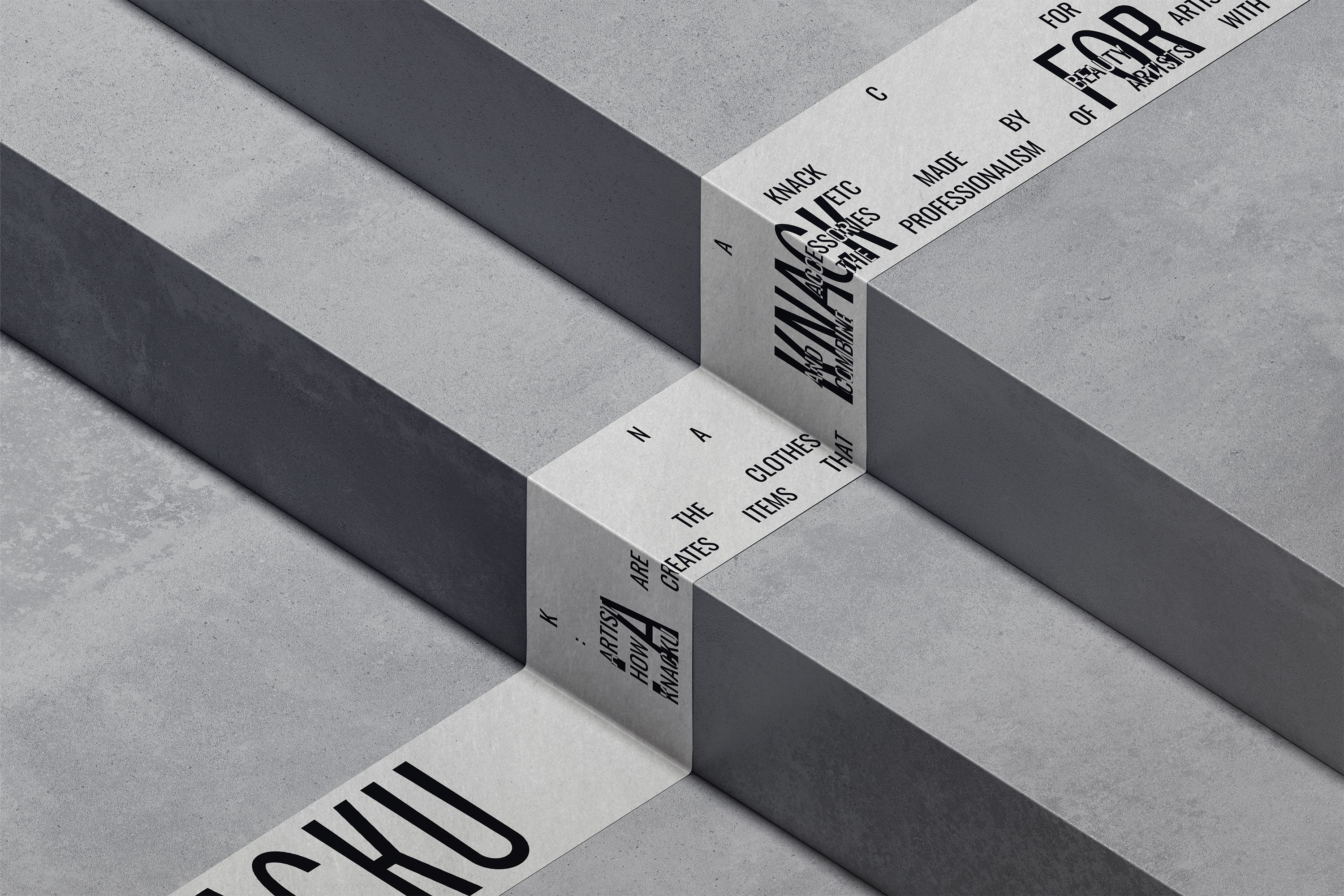
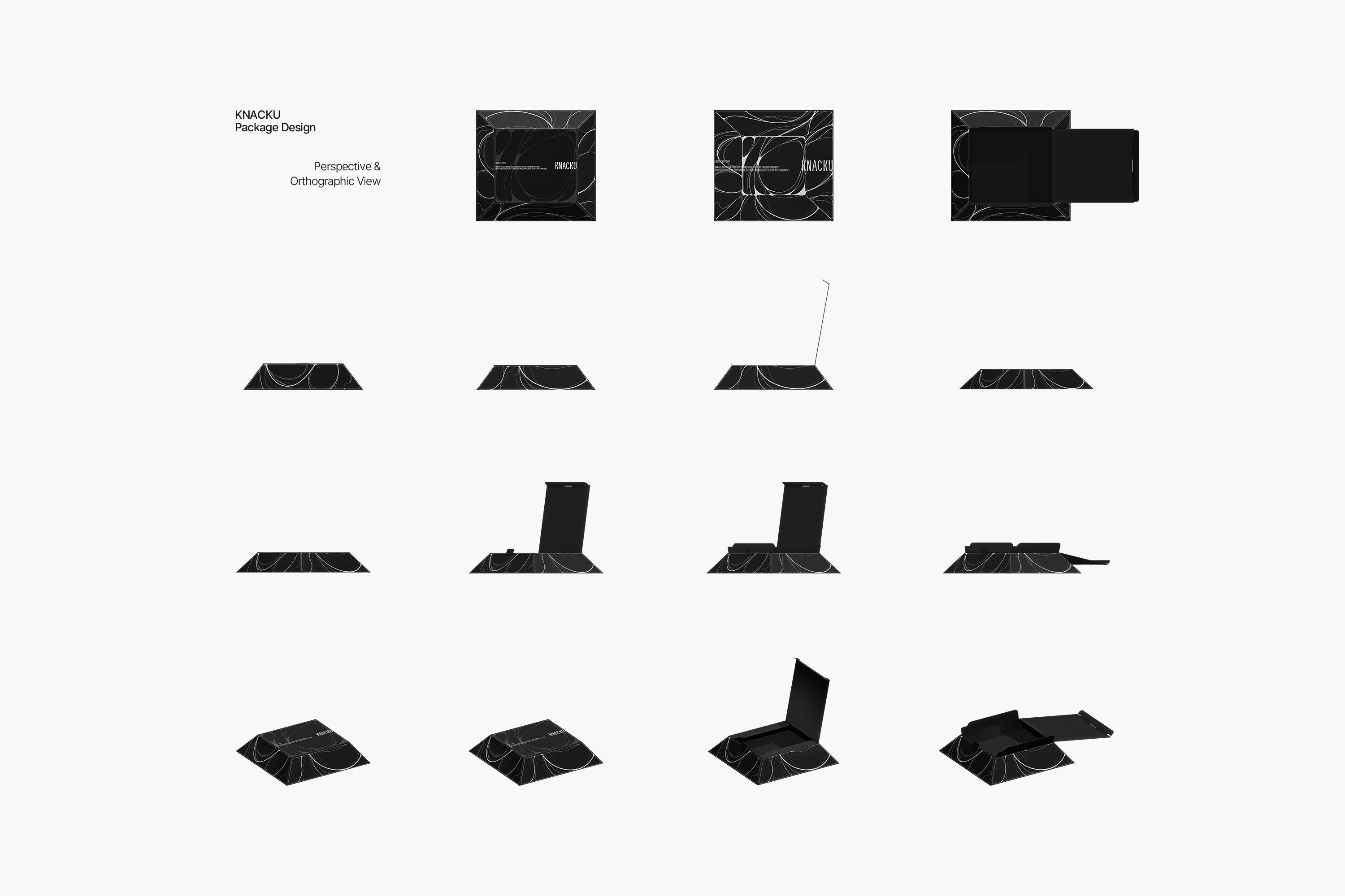
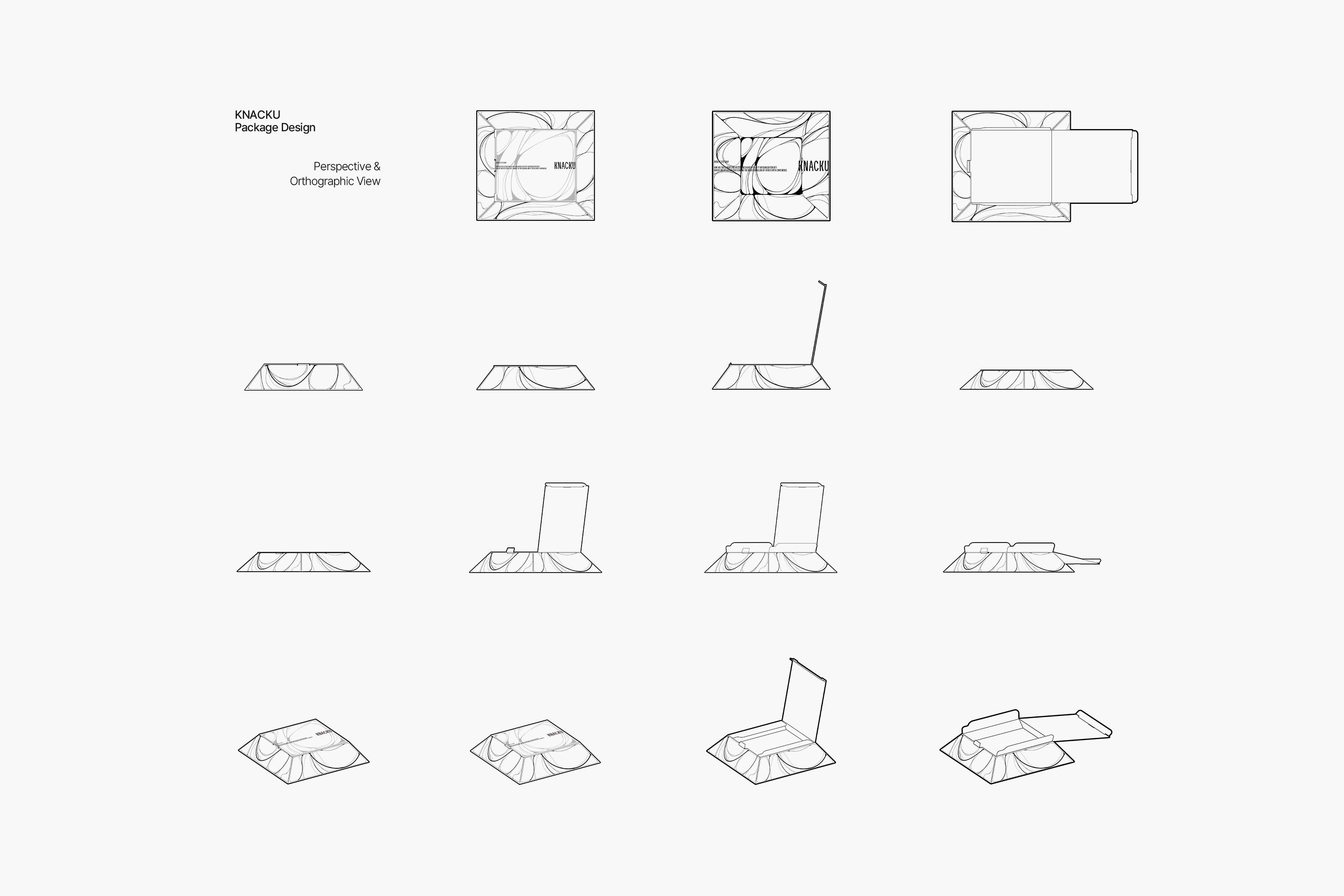
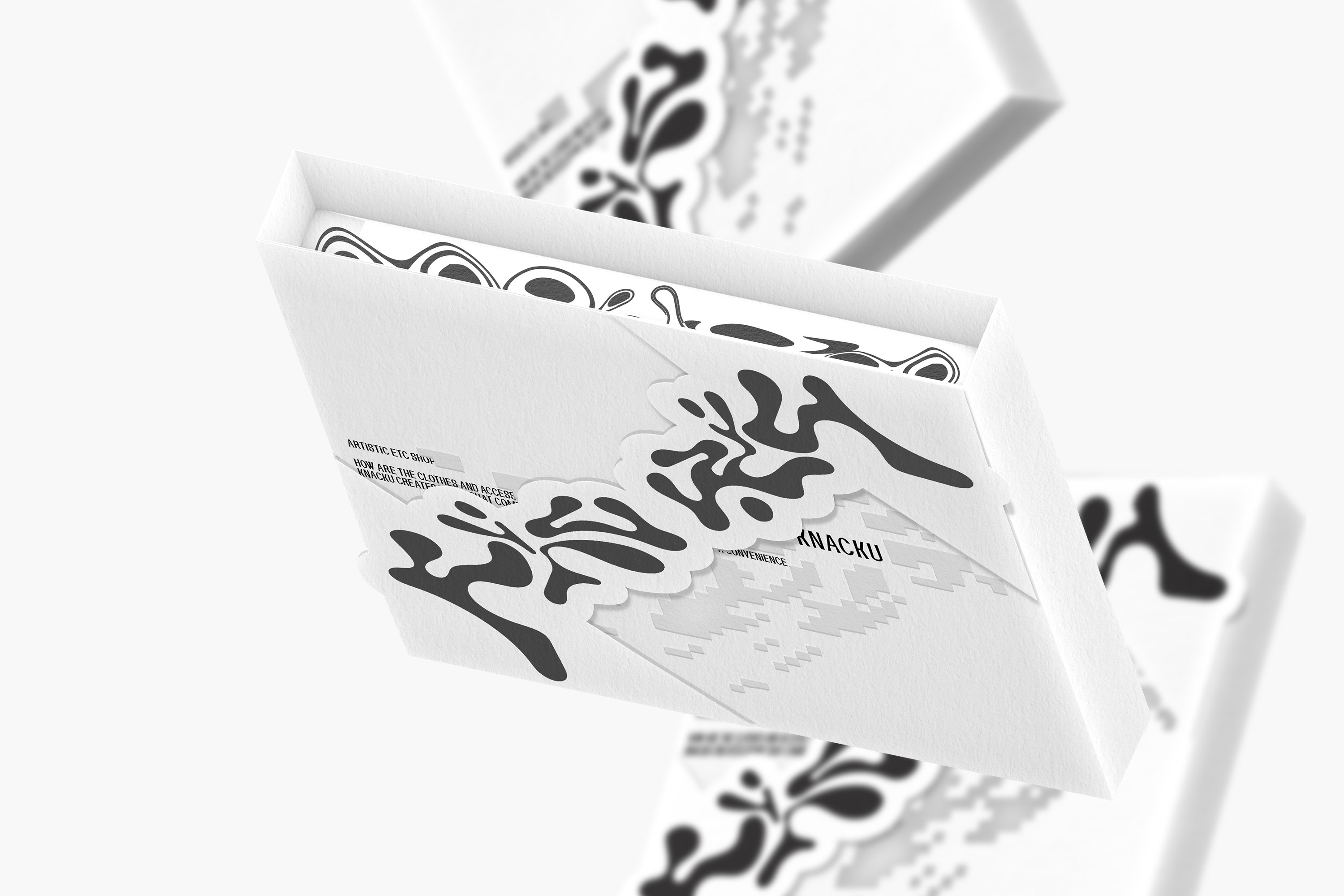
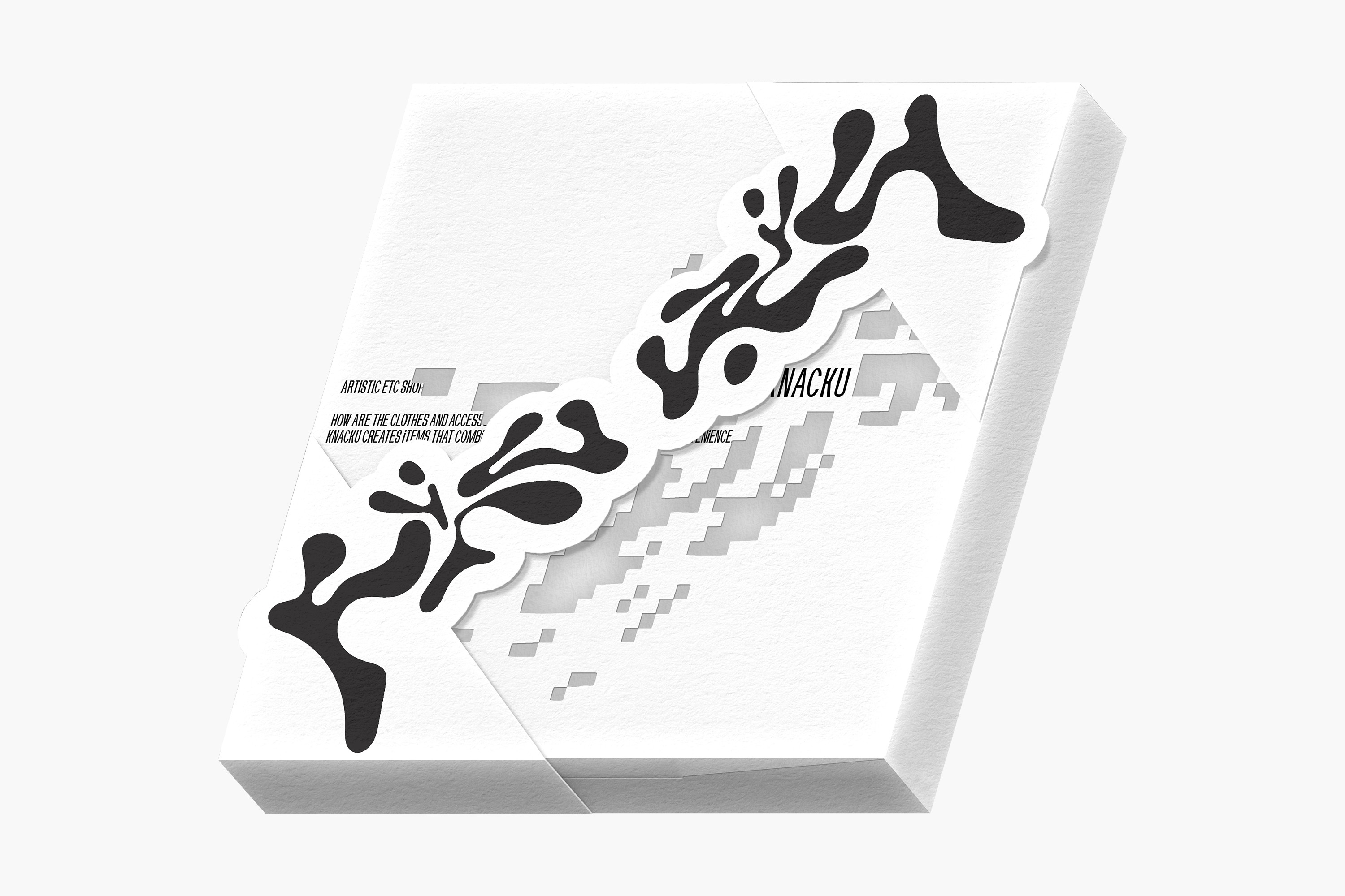
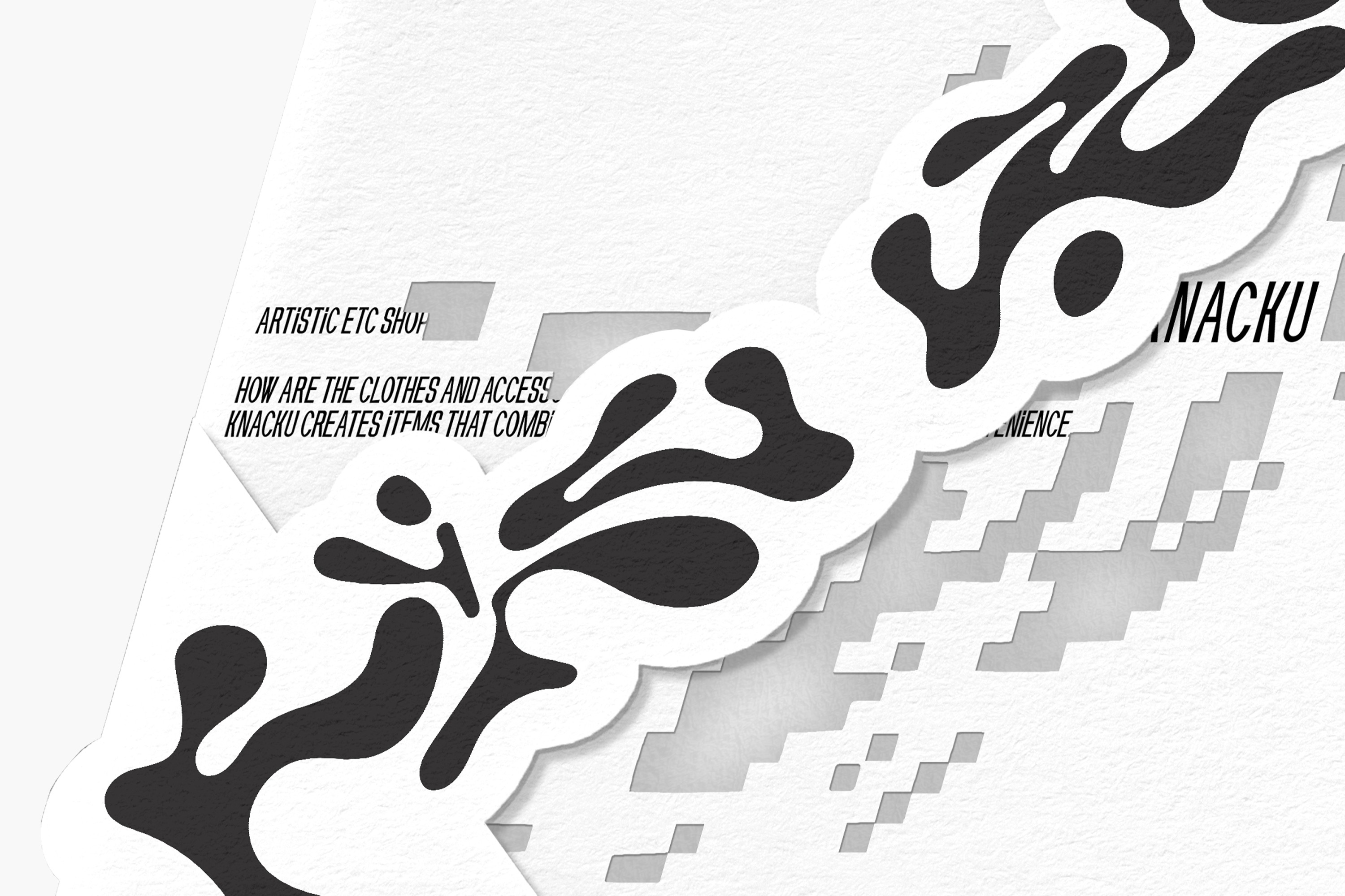
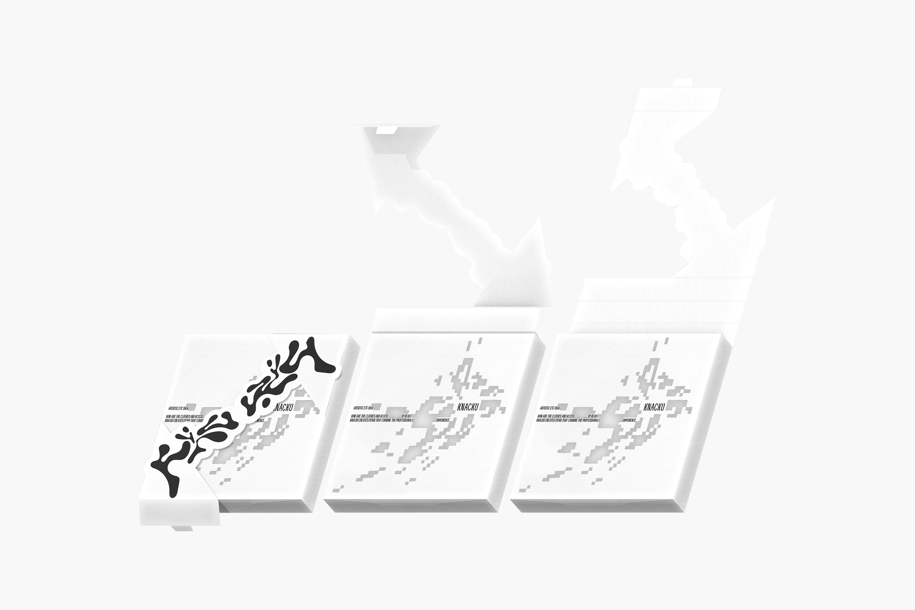
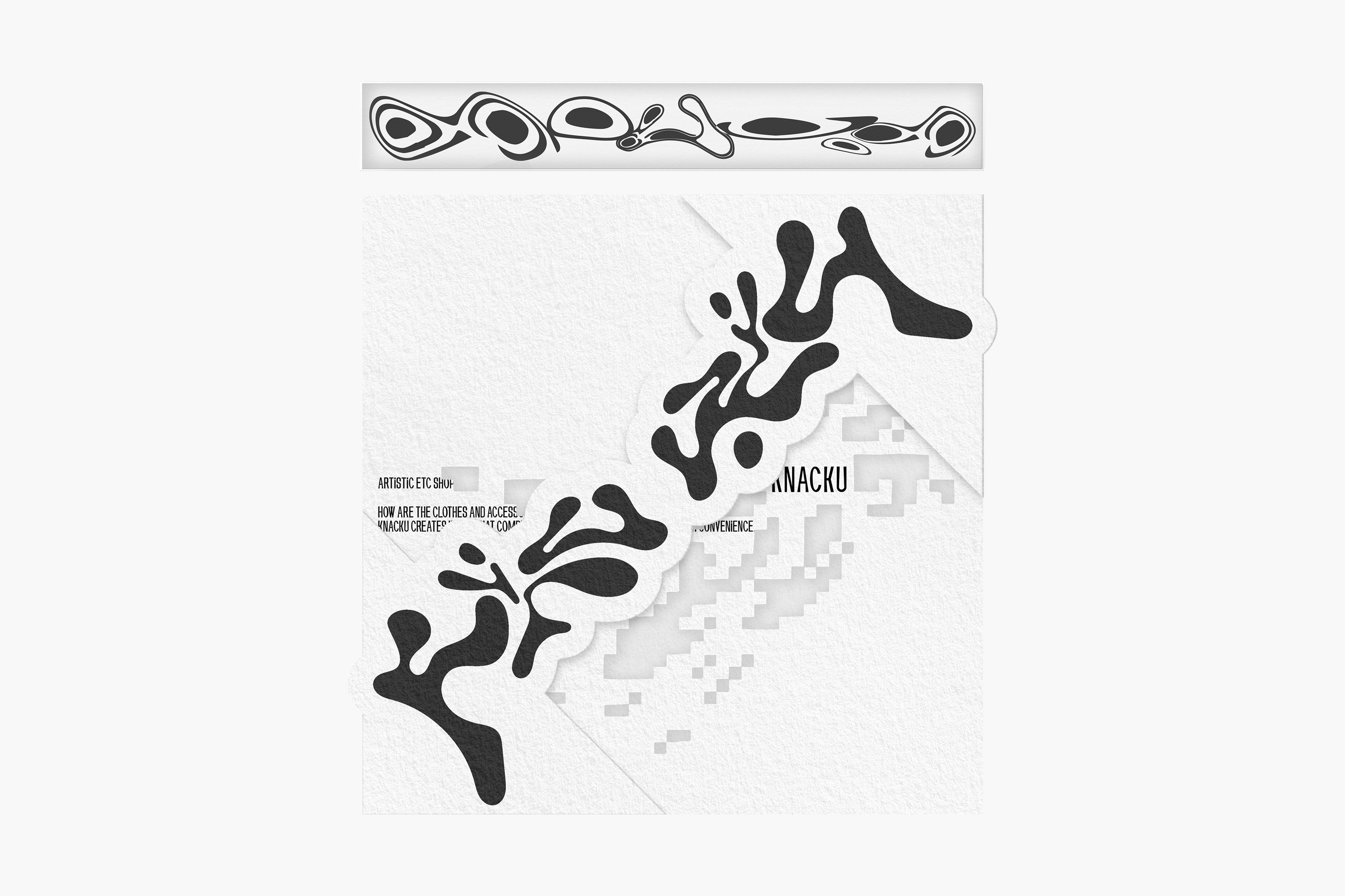
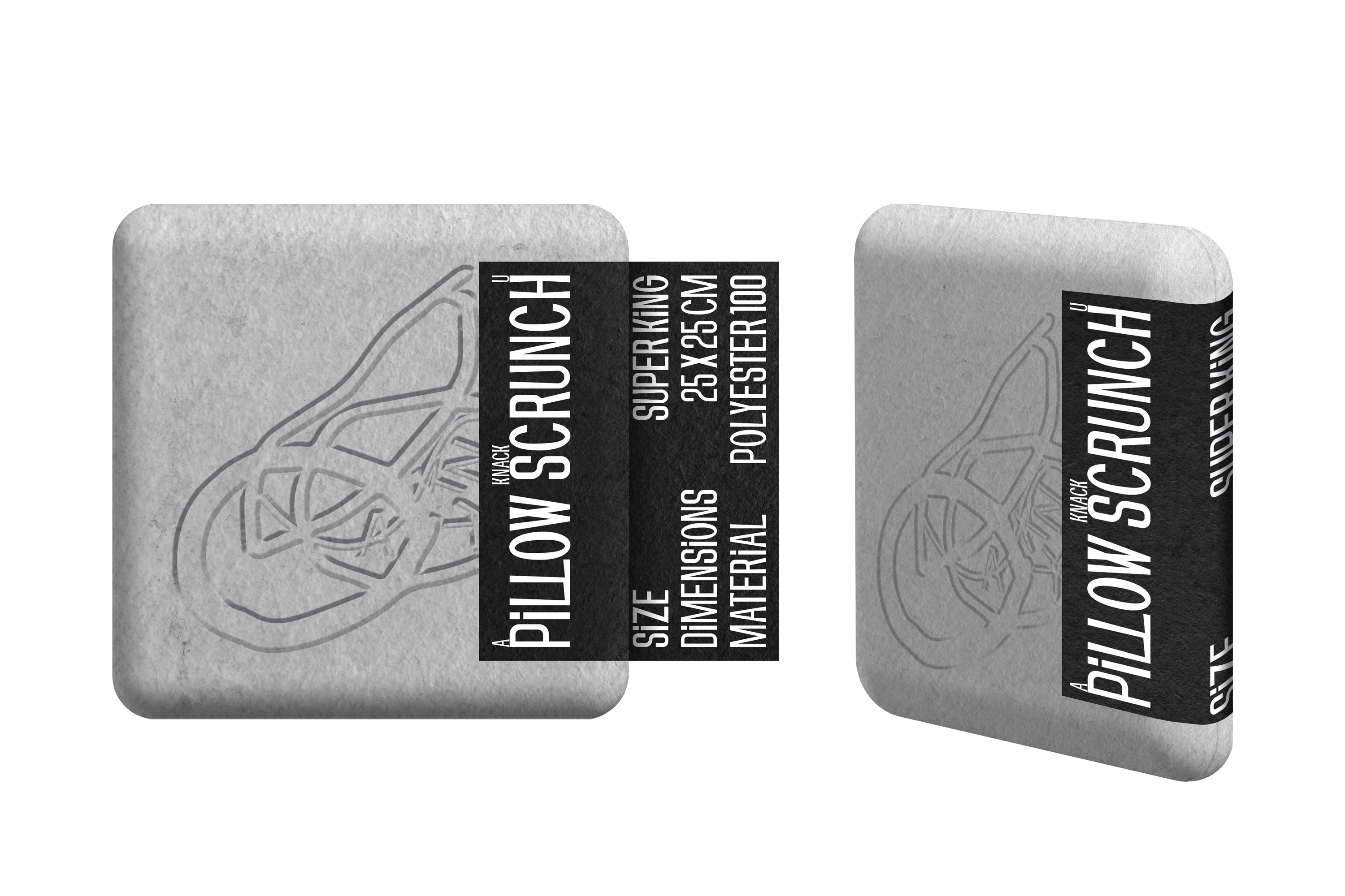
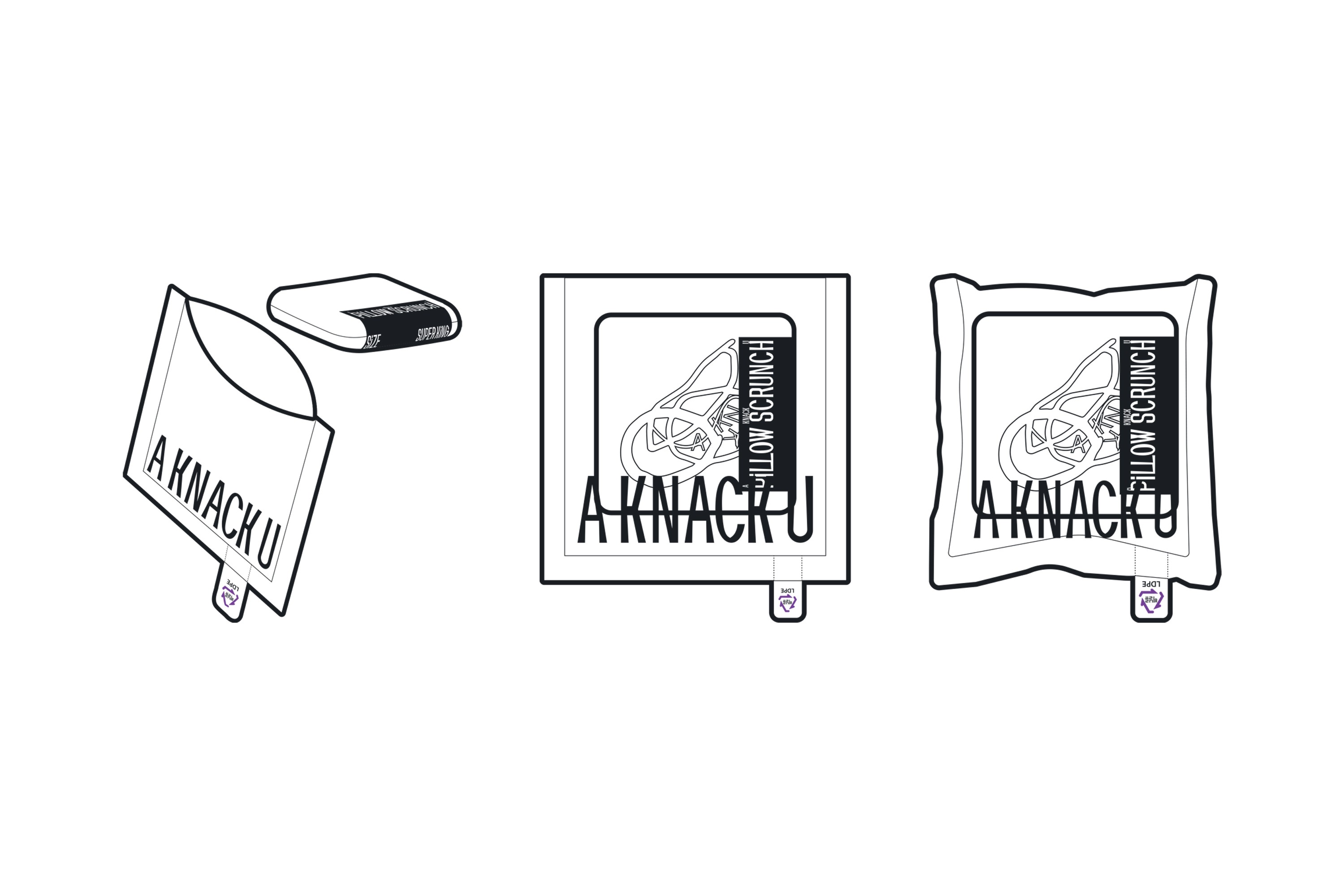
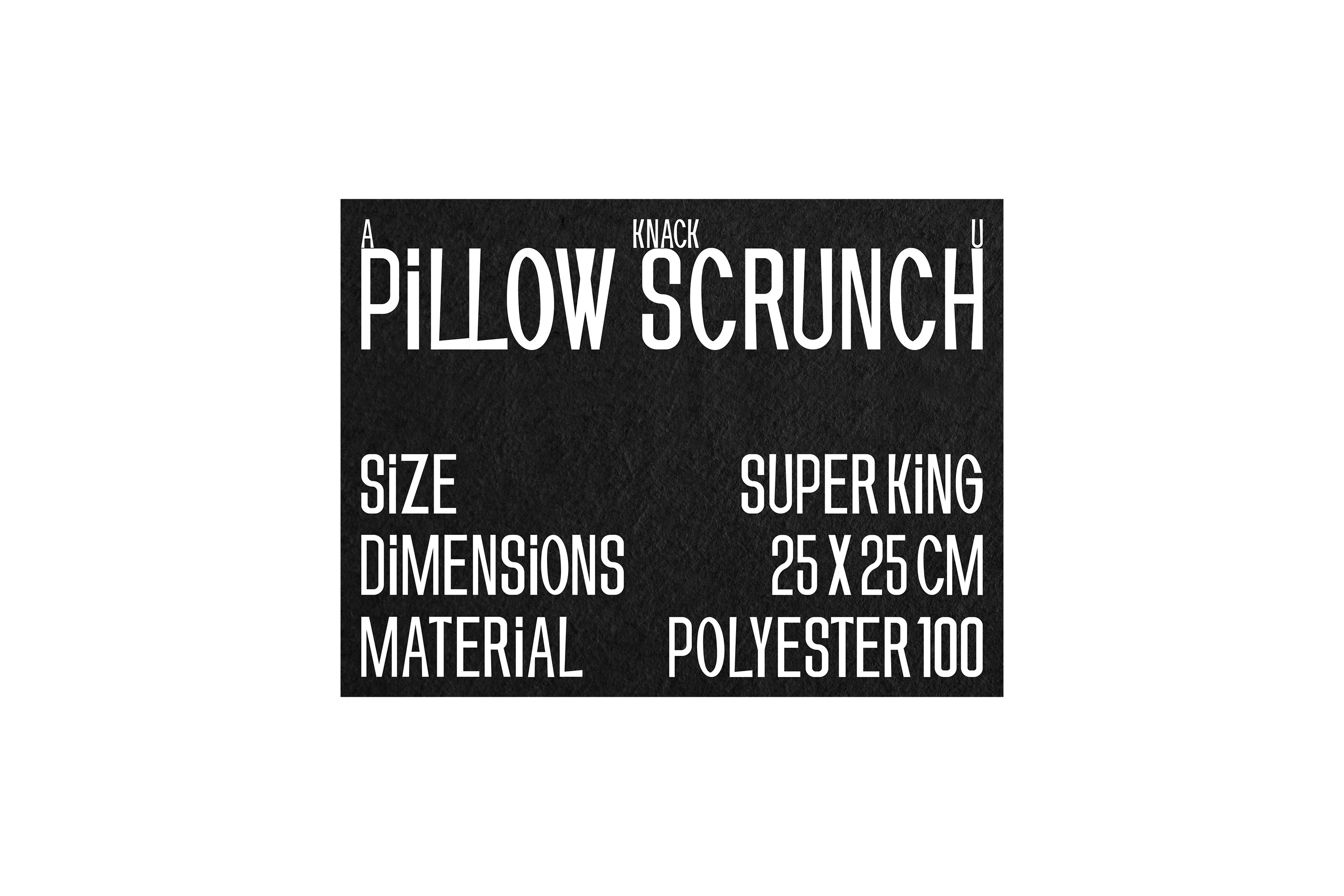
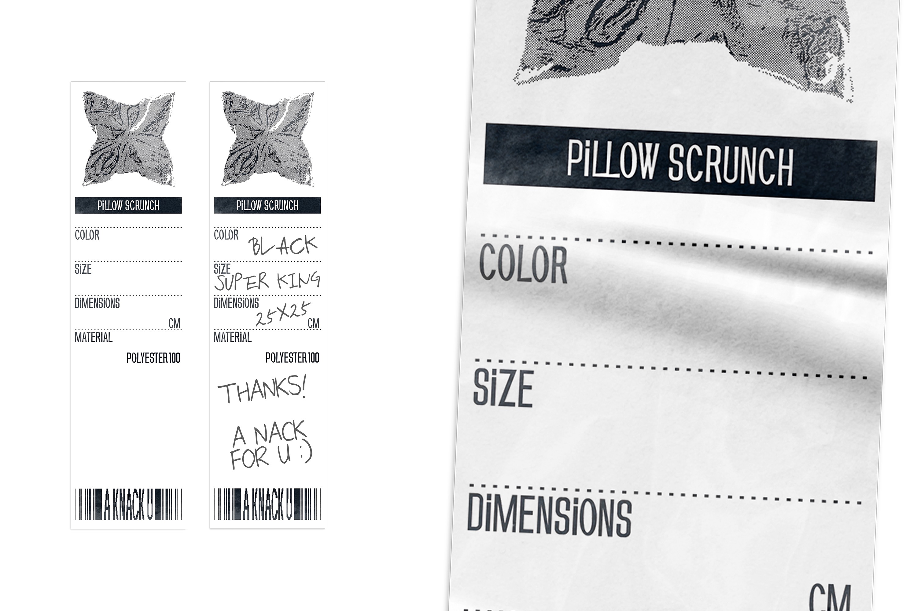
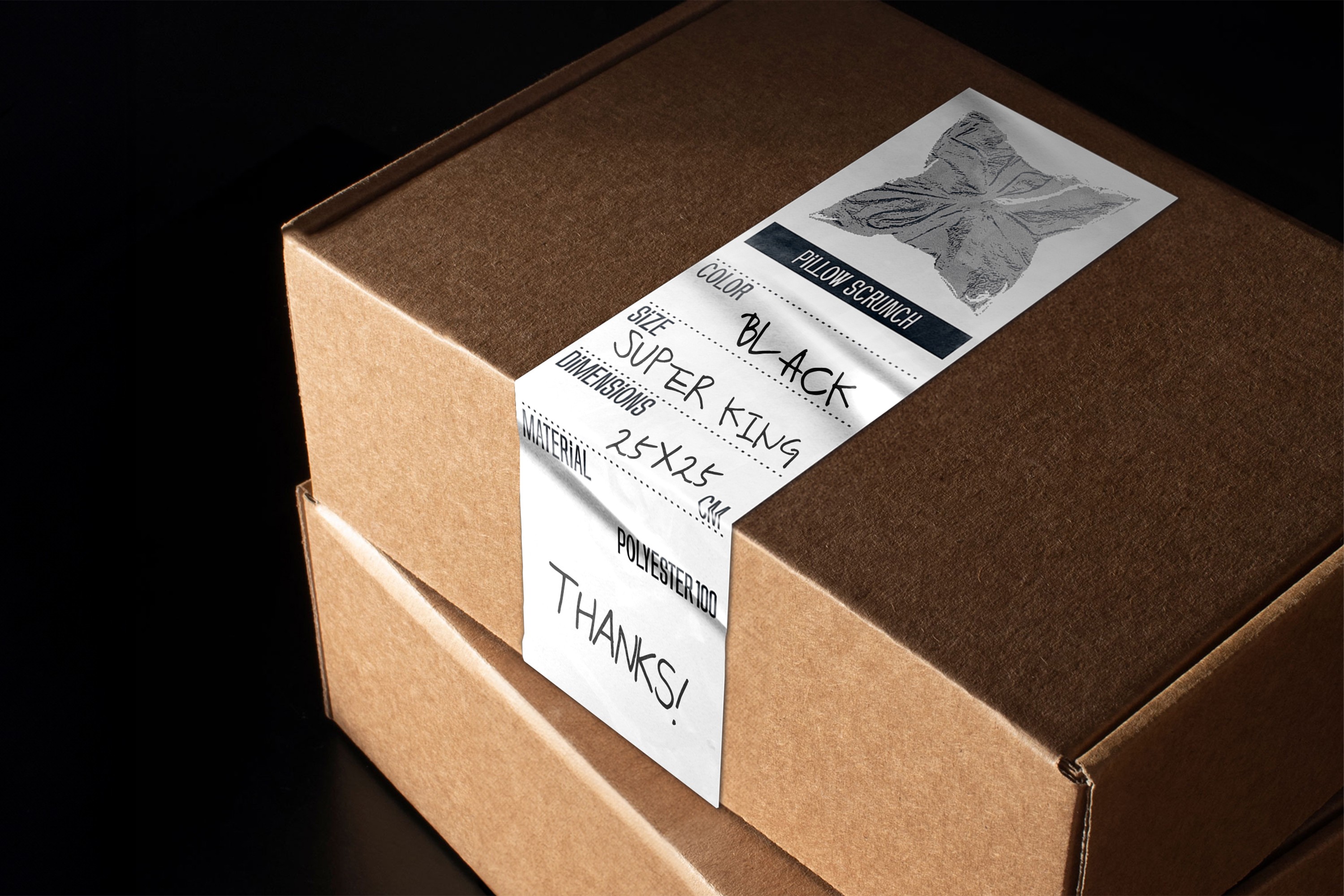
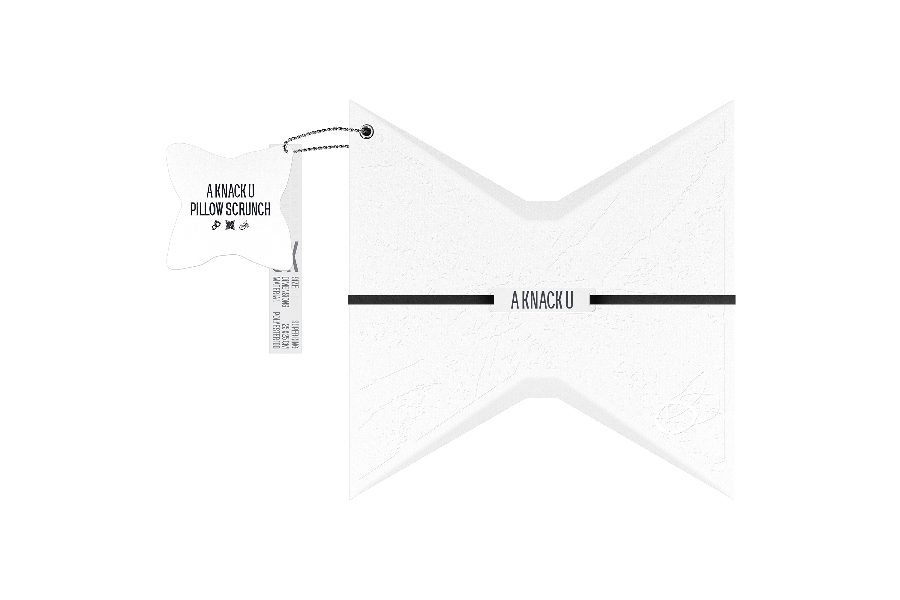
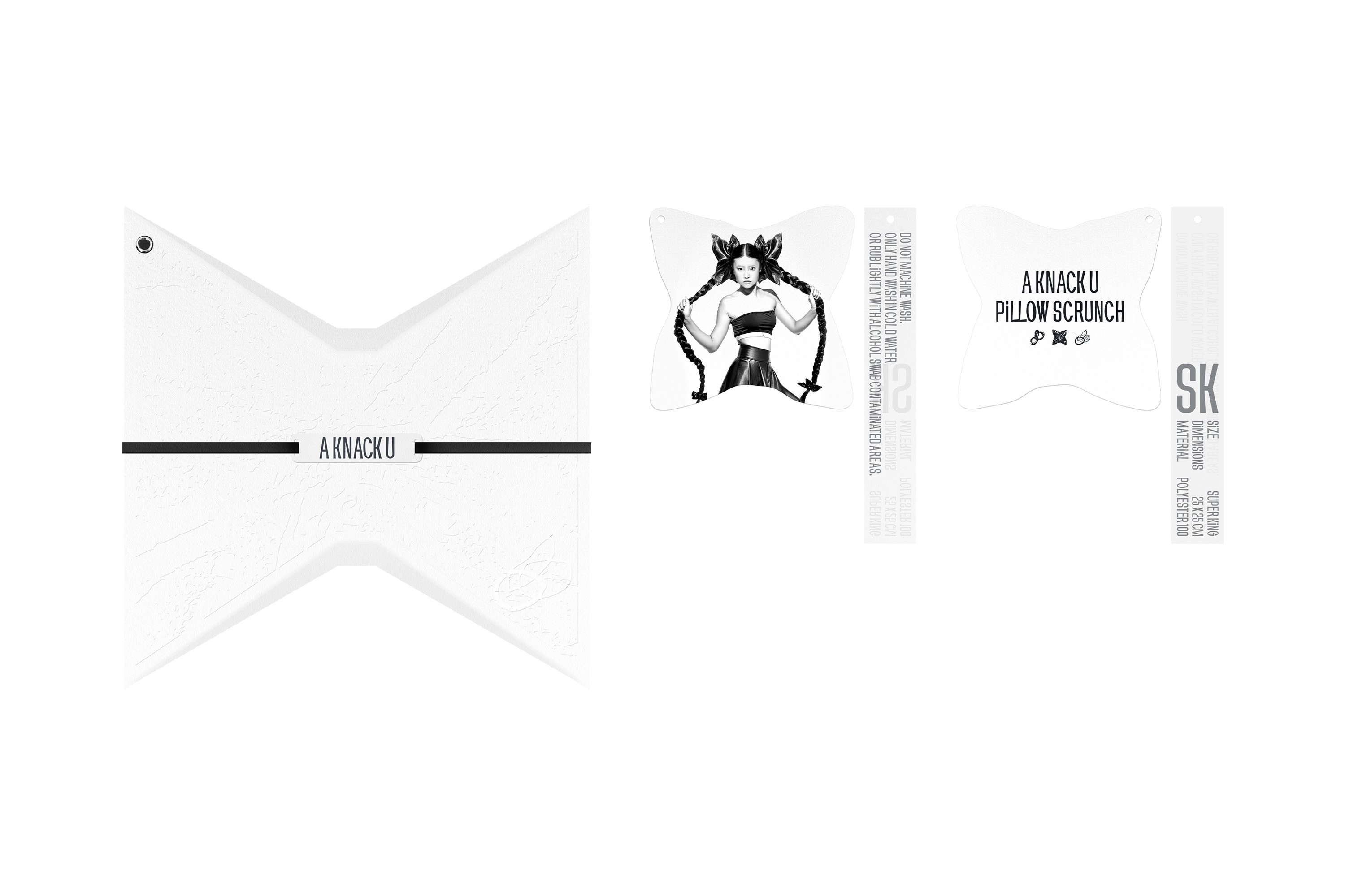
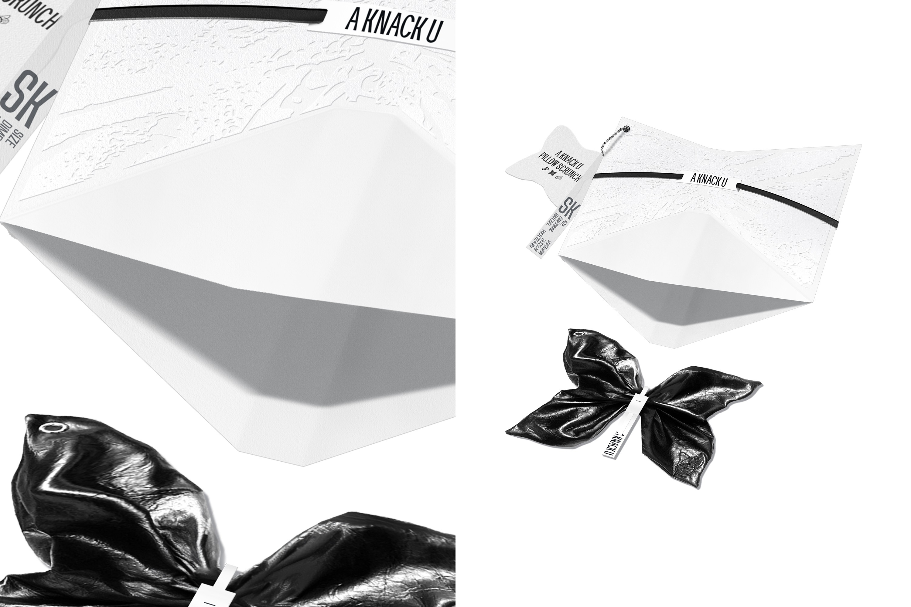
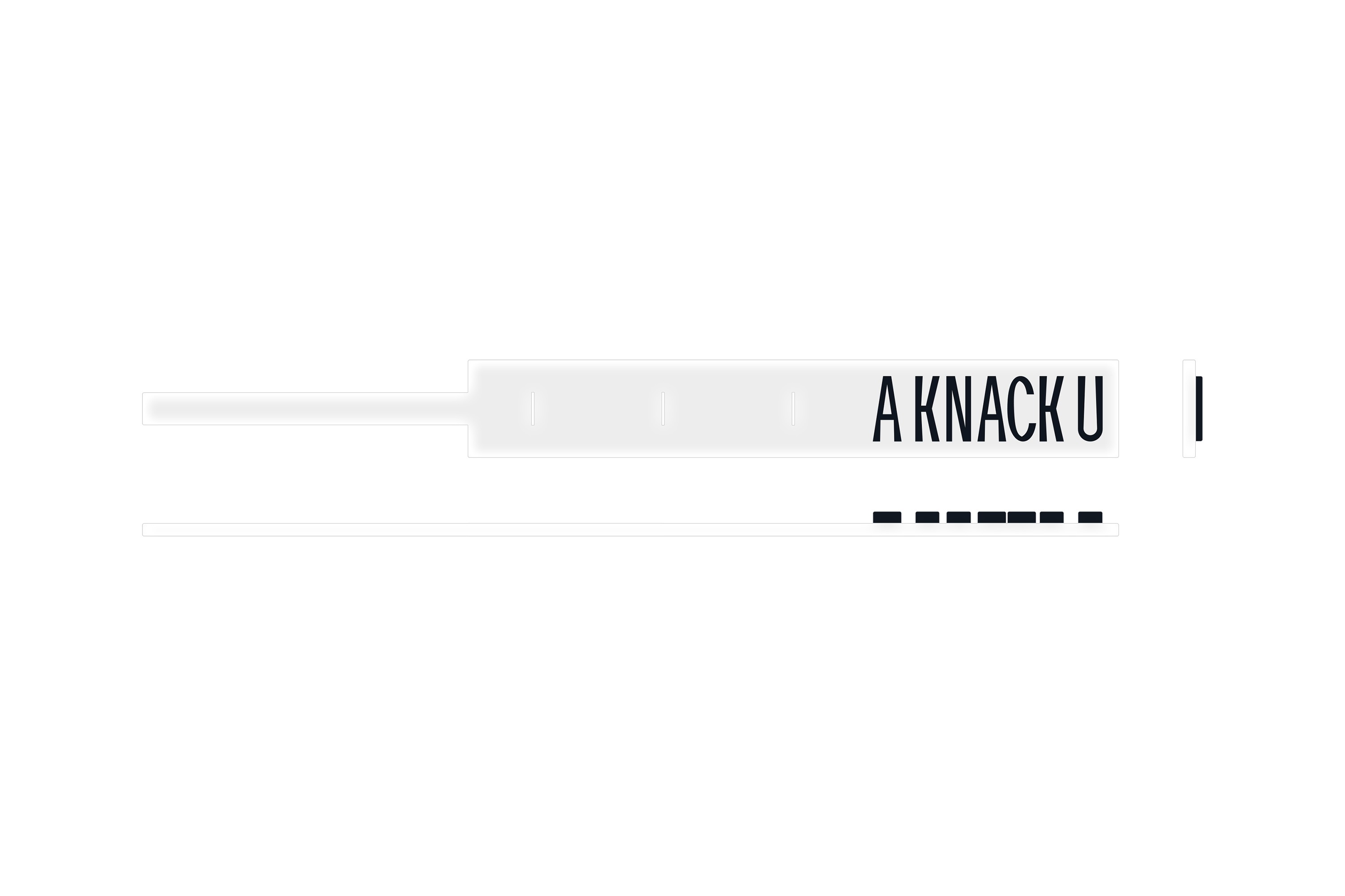
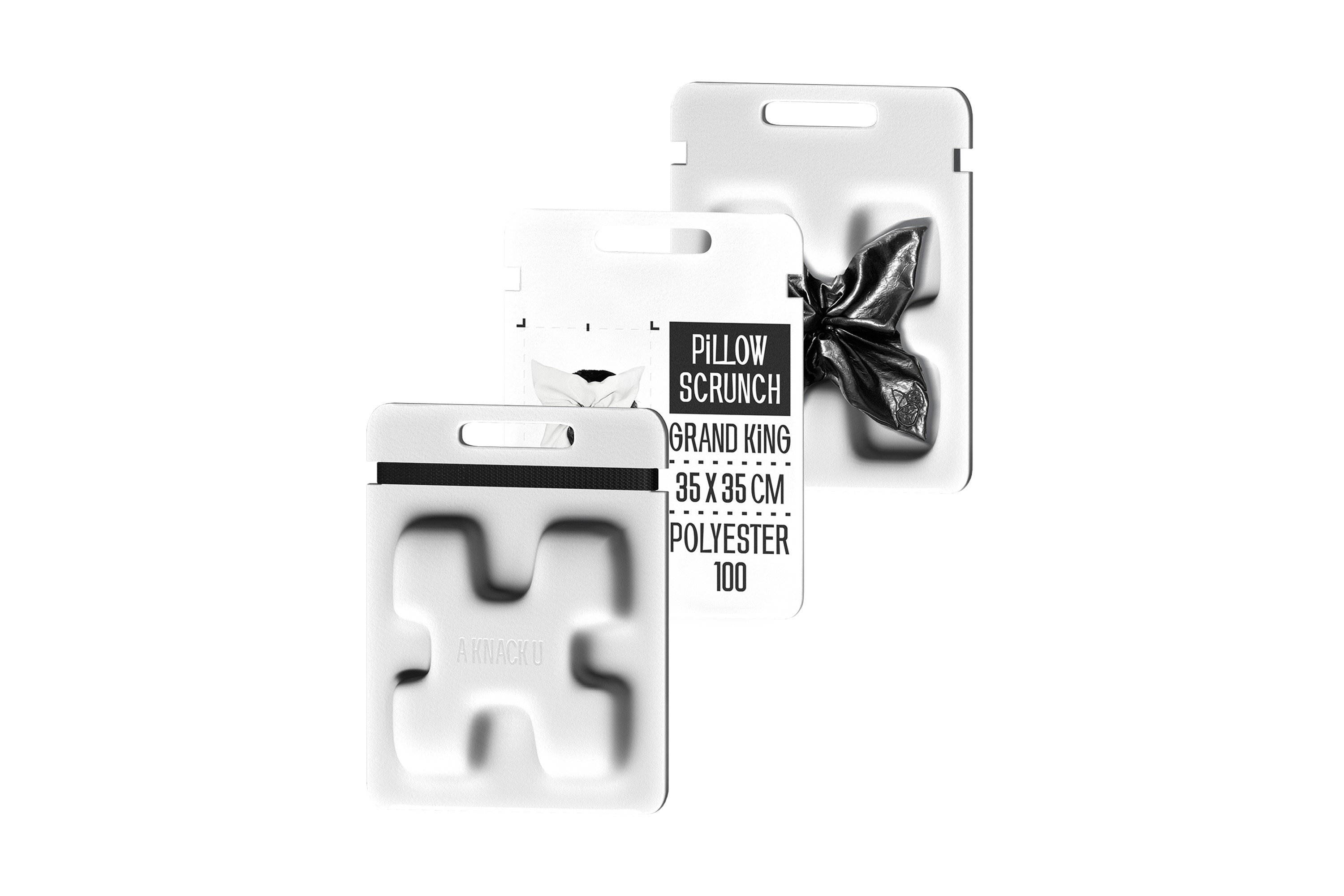
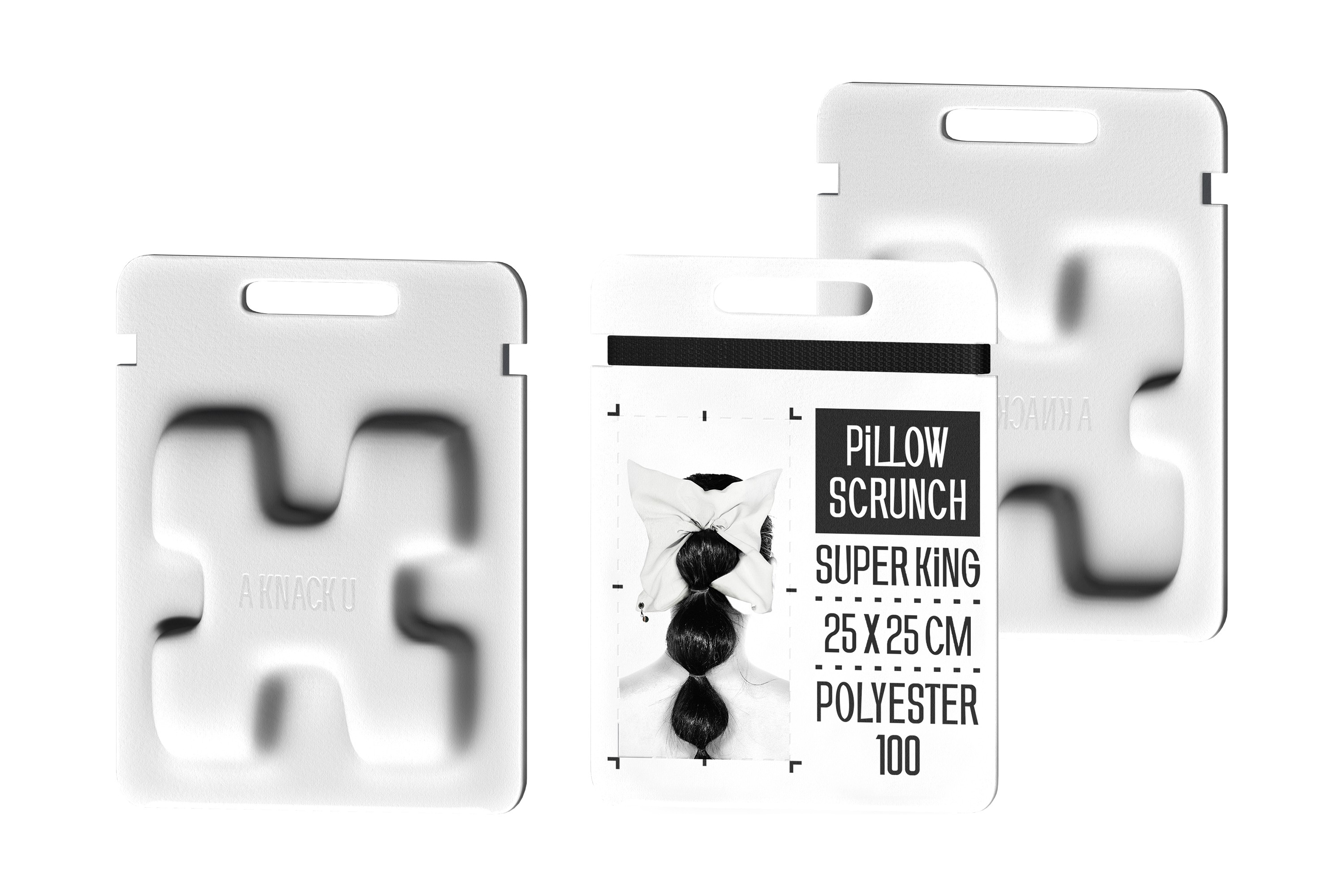
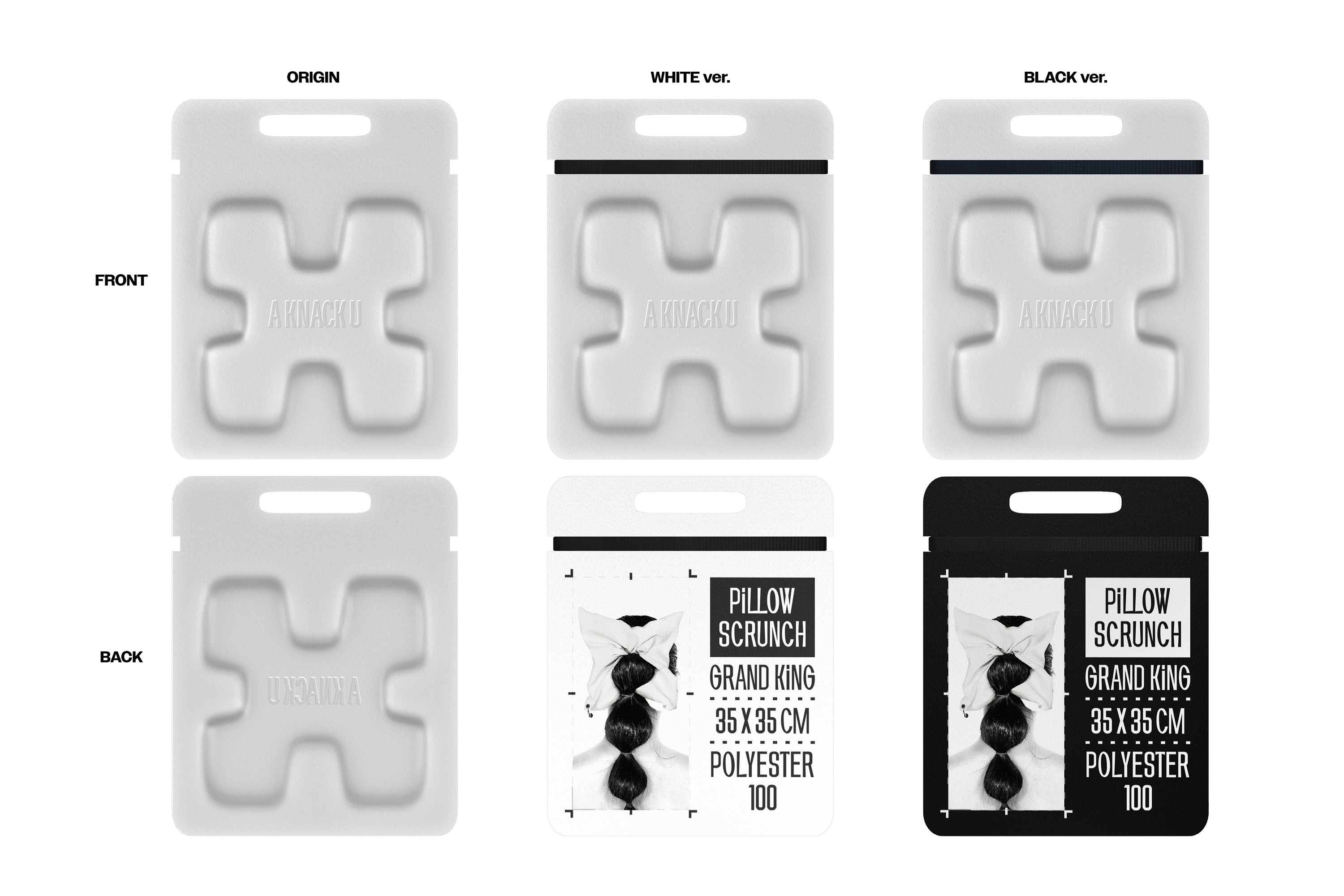
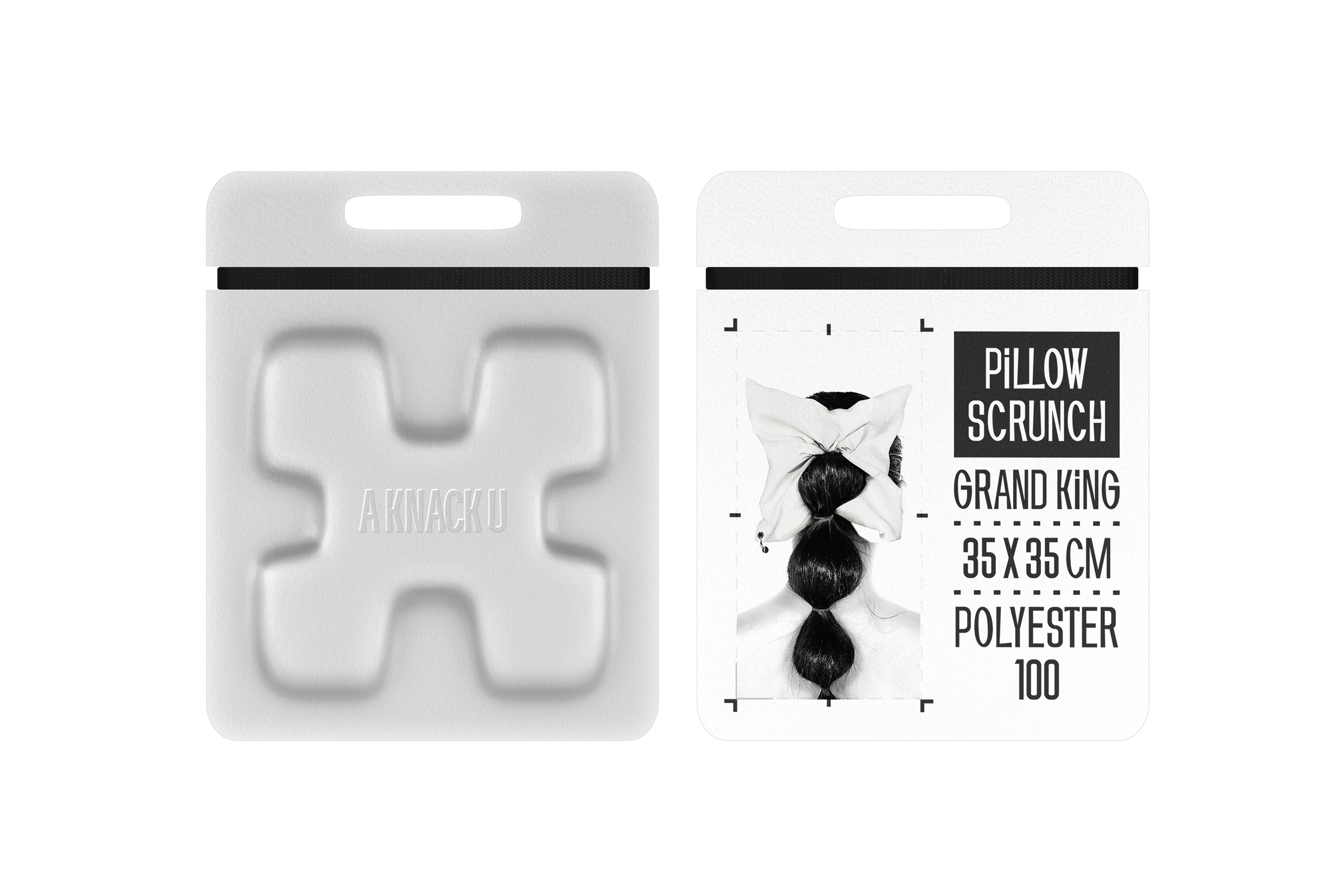
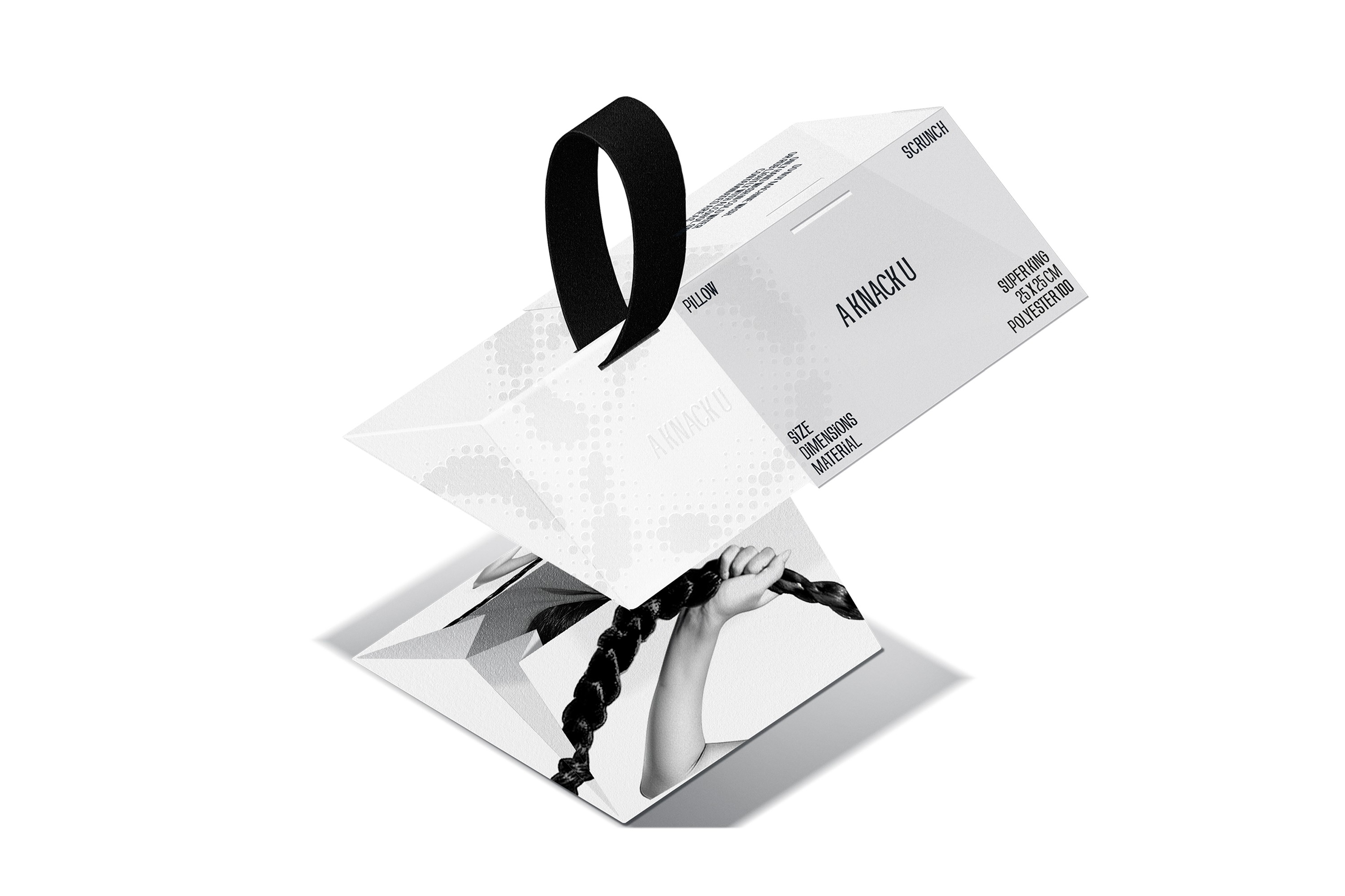
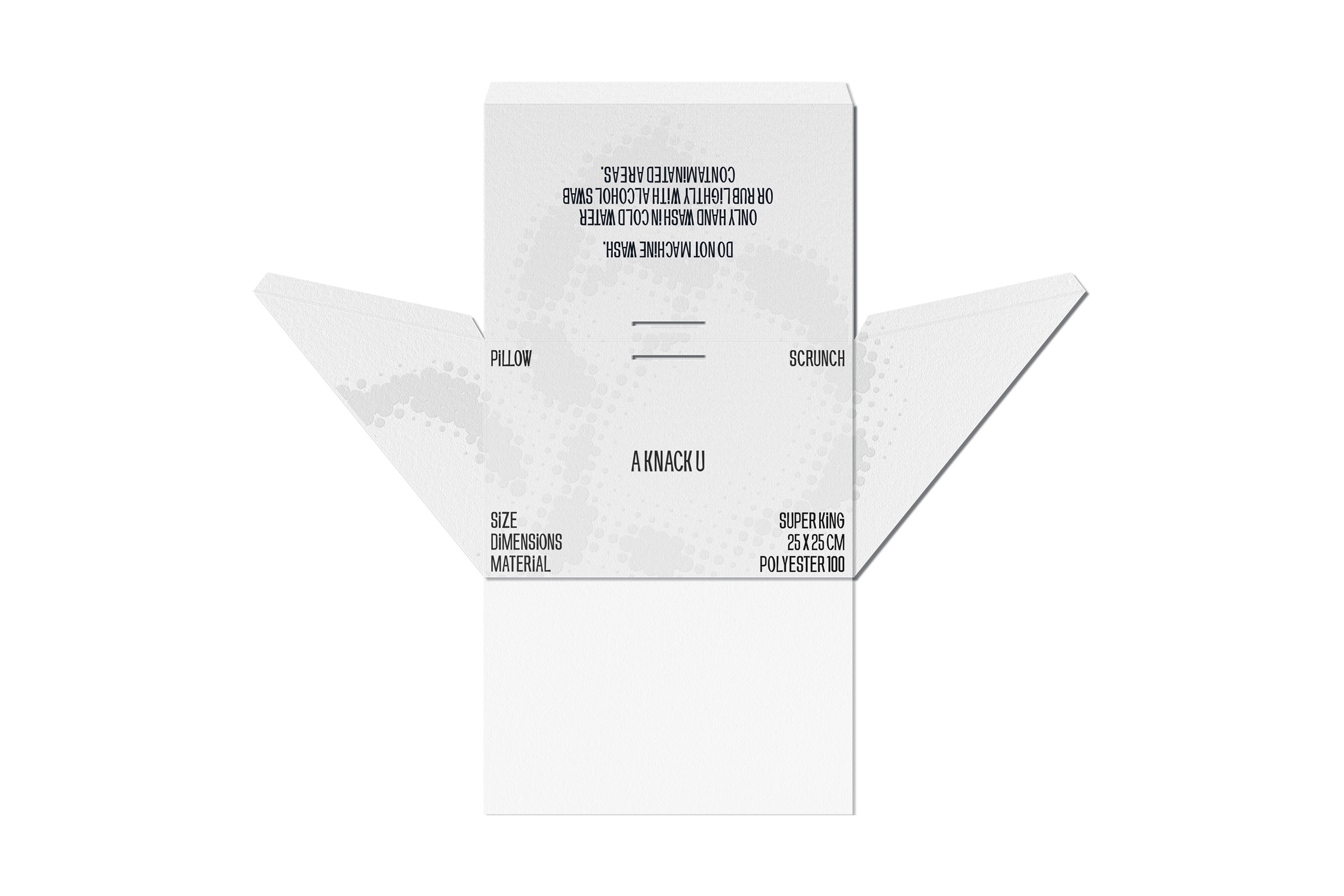
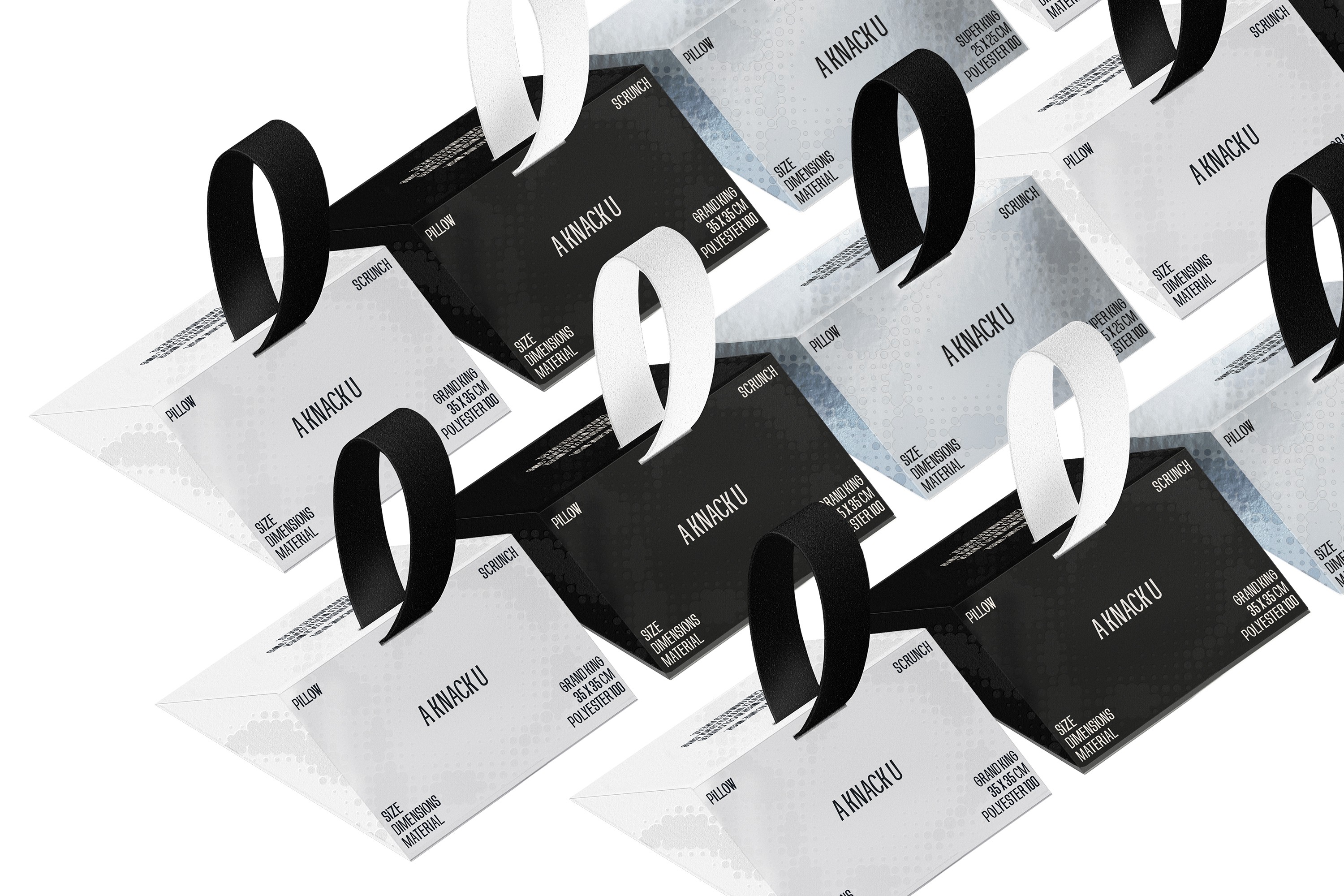
KNACKU firmly inherits the identity of A KNACK, and this was something we fully immersed ourselves in. The packaging needed to act as a medium that clearly conveys the brand’s sensibility and philosophy. Moving away from the standardized structure of off-the-shelf boxes, we visually expressed KNACKU’s identity through fluid curves and flowing graphic elements unique to the brand. The package was developed as a three-dimensional form that feels solid yet emphasizes structural beauty, while maximizing the aesthetics of a monochromatic palette. Above all, the goal was to allow people to experience the brand identity directly through the physicality of the packaging itself.
CLIENT
YEAR
2024
SCOPE
SCOPE
2D Graphics
3D Scenes
Brand Experience
Ideation
Packaging
Prints & Materials
2D Graphics
Brand Experience
Packaging
3D Scenes
Ideation
Prints & Materials
2D Graphics
Packaging
3D Scenes
Prints & Materials
Brand Experience
Ideation
SELECTED DESIGN
NON-SELECTED DESIGNS (ARCHIVED)
TYPE A
TYPE B
TYPE C
TYPE D
TYPE E
TYPE F


OVERVIEW
From A KNACK to KNACKU
A KNACK, based in Seongsu-dong and Cheongdam-dong, has launched a new brand, KNACKU. We worked closely with the team throughout the launch process, handling the packaging and secondary materials design, as well as the ideation images. KNACKU carries forward A KNACK’s identity while unfolding artistic items inspired by the director and creators behind the brand. The way their aesthetic sensibility and personal style translate into products is particularly compelling. Going beyond simple hair-related items, KNACKU proposes objects where the hair designer’s perspective and the brand’s philosophy come together—positioning itself as a true craft-driven brand.
A KNACK FOR U: Our craft, for you.
KNACKU firmly inherits the identity of A KNACK, and this was something we fully immersed ourselves in. The packaging needed to act as a medium that clearly conveys the brand’s sensibility and philosophy. Moving away from the standardized structure of off-the-shelf boxes, we visually expressed KNACKU’s identity through fluid curves and flowing graphic elements unique to the brand. The package was developed as a three-dimensional form that feels solid yet emphasizes structural beauty, while maximizing the aesthetics of a monochromatic palette. Above all, the goal was to allow people to experience the brand identity directly through the physicality of the packaging itself.
CLIENT
YEAR
2024
SCOPE
SCOPE
2D Graphics
3D Scenes
Brand Experience
Ideation
Packaging
Prints & Materials
2D Graphics
Brand Experience
Packaging
3D Scenes
Ideation
Prints & Materials
2D Graphics
Packaging
3D Scenes
Prints & Materials
Brand Experience
Ideation
SELECTED DESIGN
NON-SELECTED DESIGNS (ARCHIVED)
TYPE A
TYPE B
TYPE C
TYPE D
TYPE E
TYPE F