


OVERVIEW
This spring, we met PIXPIERCE. PIXPIERCE is a brand that aims to redefine the norms and boundaries of beauty within the unfamiliar category of men’s metal nail accessories. Based on the brand’s powerful items, we expanded its philosophy visually and built it into a functioning system.
CLIENT
YEAR
2025
SCOPE
SCOPE
2D Graphics
3D Modeling
3D Rendering
3D Scenes
3D Texture & Mapping
3D Video
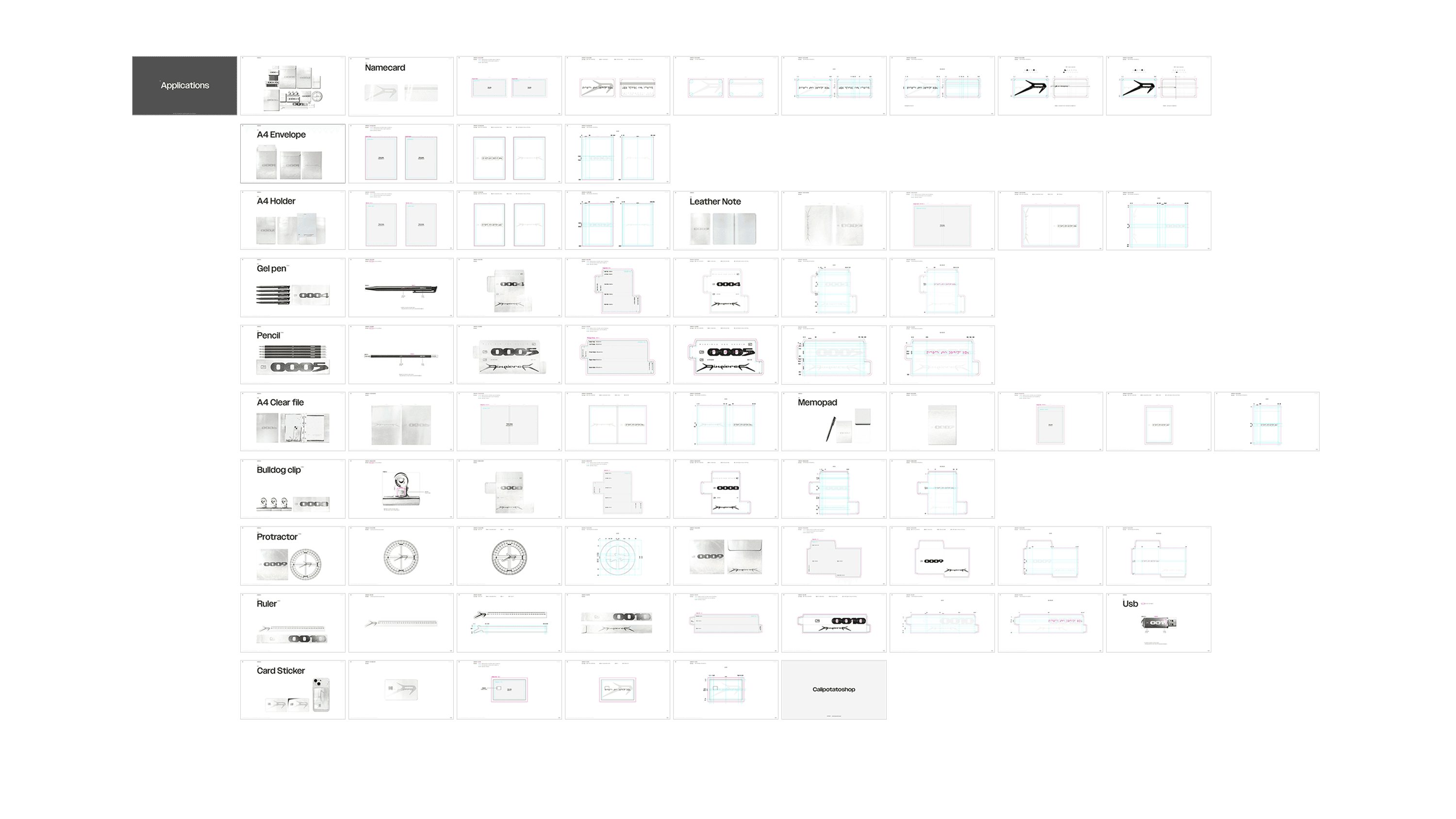
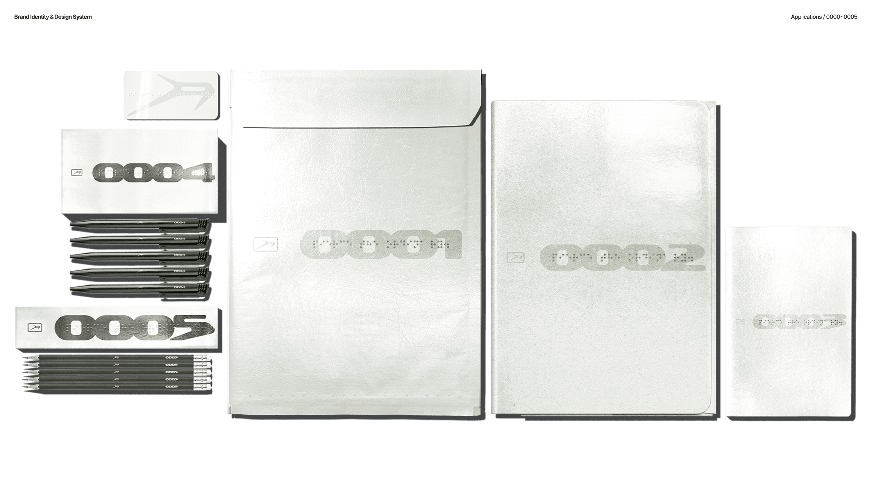
Applications
Brand Assets Usage Guide
Brand Experience
Brand Identity
Brand Strategy
Consulting & Direction
Logo
Packaging
SNS Contents
Systemization of Design Assets
Typeface
Web Design
2D Graphics
3D Rendering
3D Texture & Mapping
Applications
Brand Experience
Brand Strategy
Logo
SNS Contents
Typeface
3D Modeling
3D Scenes
3D Video
Brand Assets Usage Guide
Brand Identity
Consulting & Direction
Packaging
Systemization of Design Assets
Web Design
2D Graphics
3D Texture & Mapping
Brand Experience
Logo
Typeface
3D Modeling
3D Video
Brand Identity
Packaging
Web Design
3D Rendering
Applications
Brand Strategy
SNS Contents
3D Scenes
Brand Assets Usage Guide
Consulting & Direction
Systemization of Design Assets
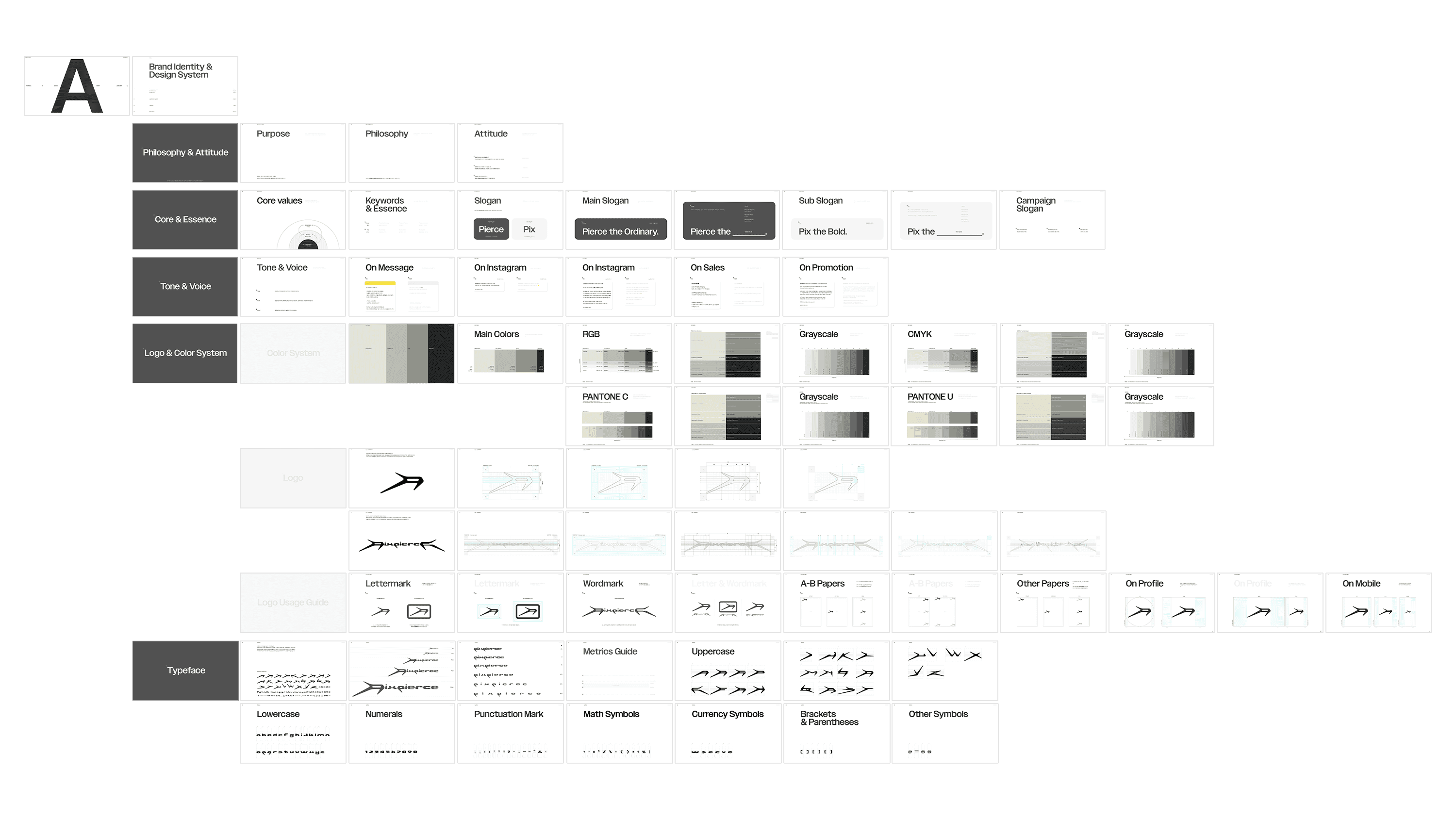
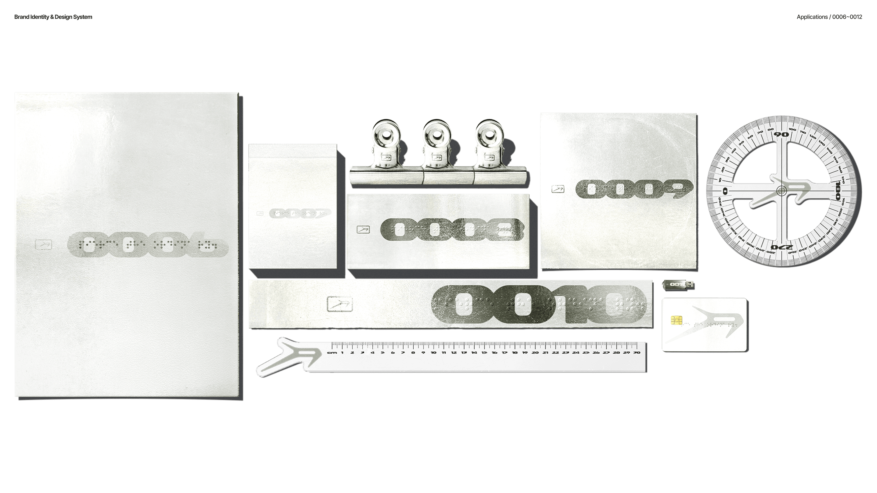
01 BRAND IDENTITY & DESIGN SYSTEM
BRAND PHILOSOPHY & CORE, ESSENCE
PIXPIERCE’s philosophy consists of the following: ¹Detachment (Emotional restraint), ²Ferocity (Raw honesty), ³Intentionality (Deliberate attitude). These three Core Values form the pillars of the brand and the starting point of every visual language. We divided this philosophy into the two keywords “Pierce” and “Pix(Fix),” interpreting them as the act of piercing through what is ordinary (Pierce) and the convictions one must hold (Pix). Based on this, we established the slogan “Pierce the Ordinary.”
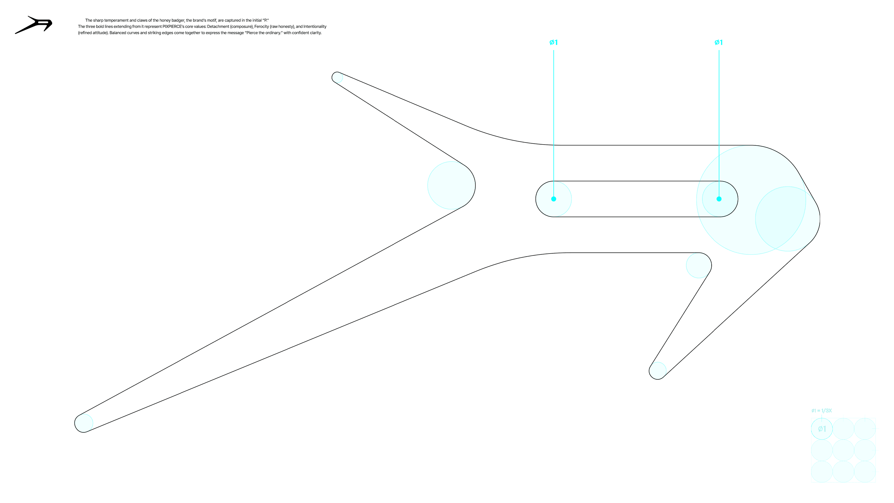
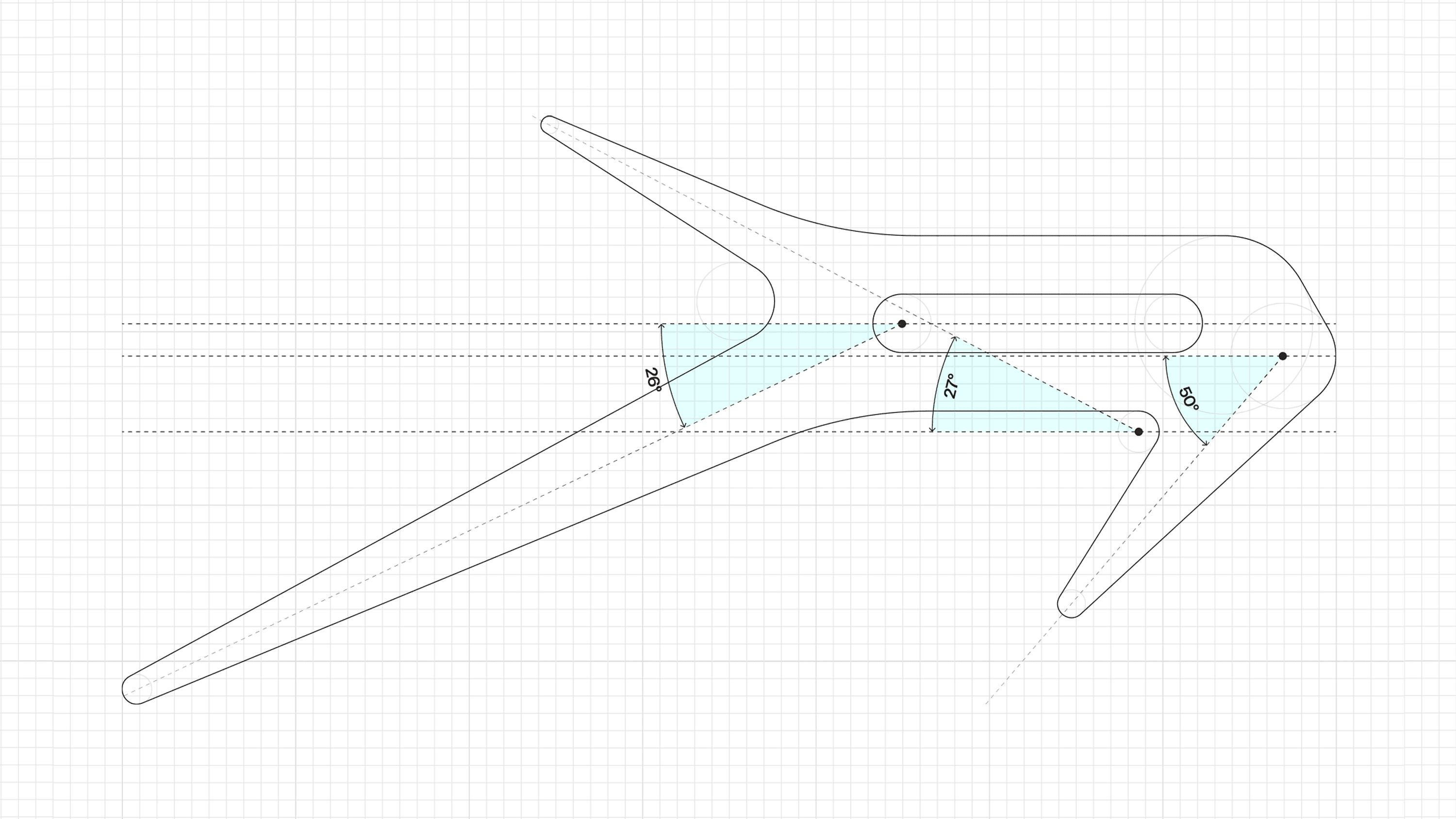
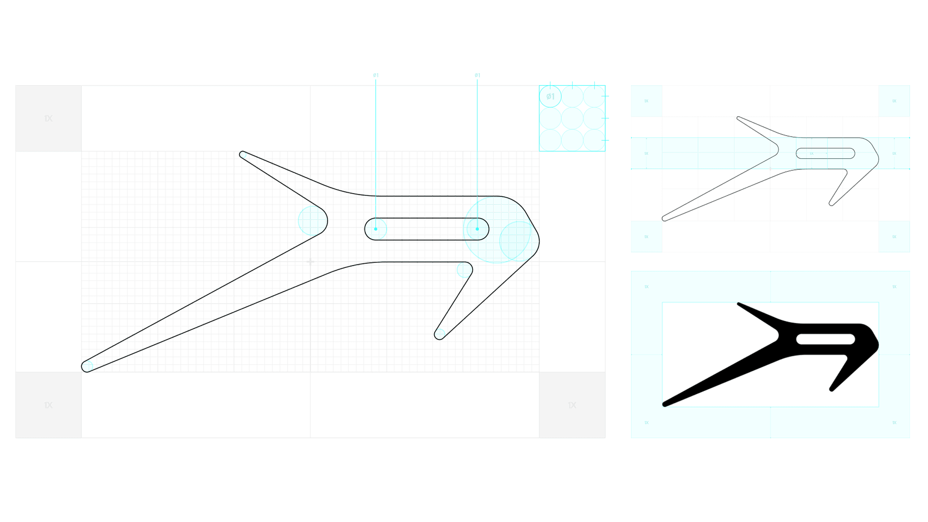
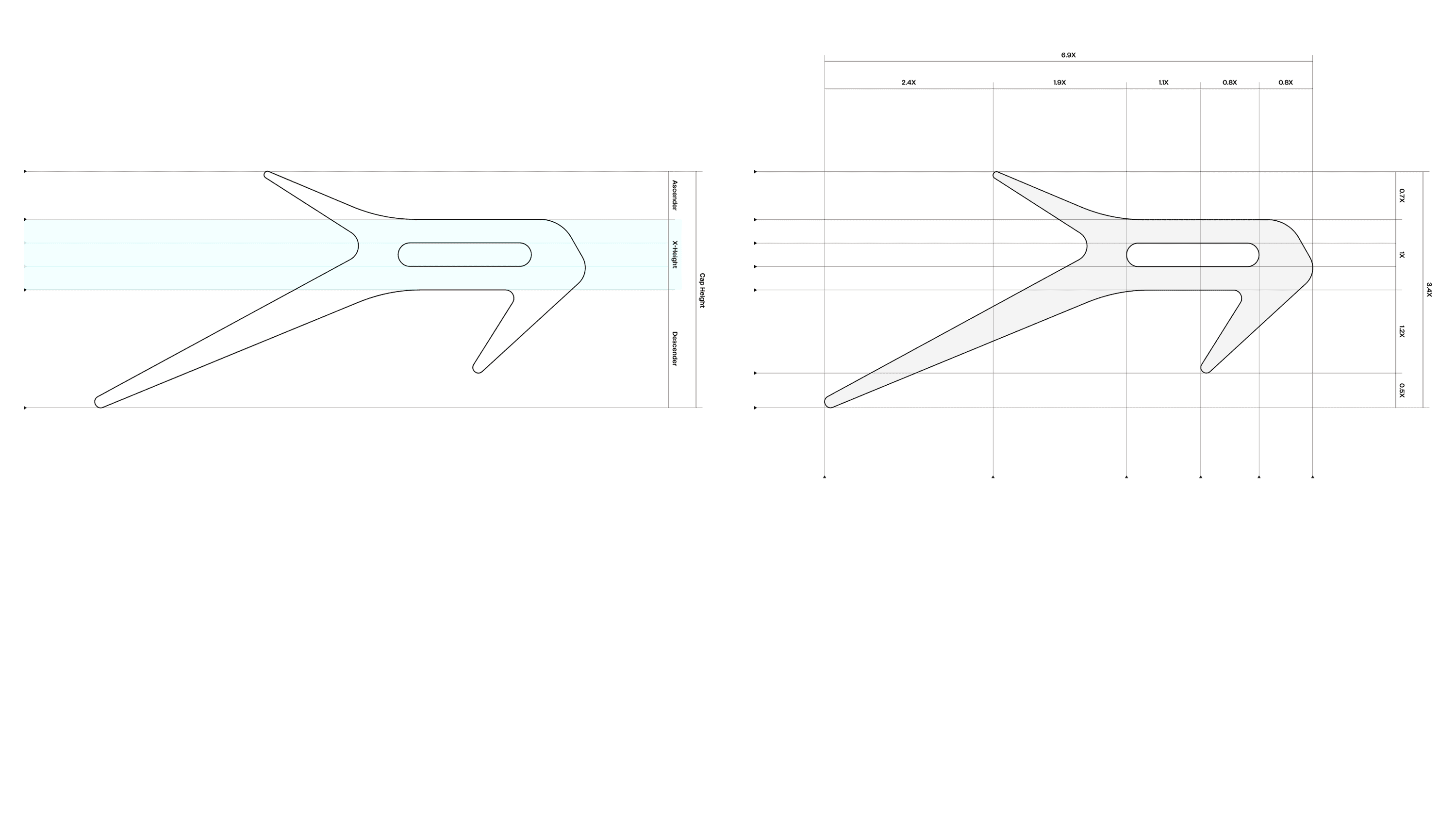
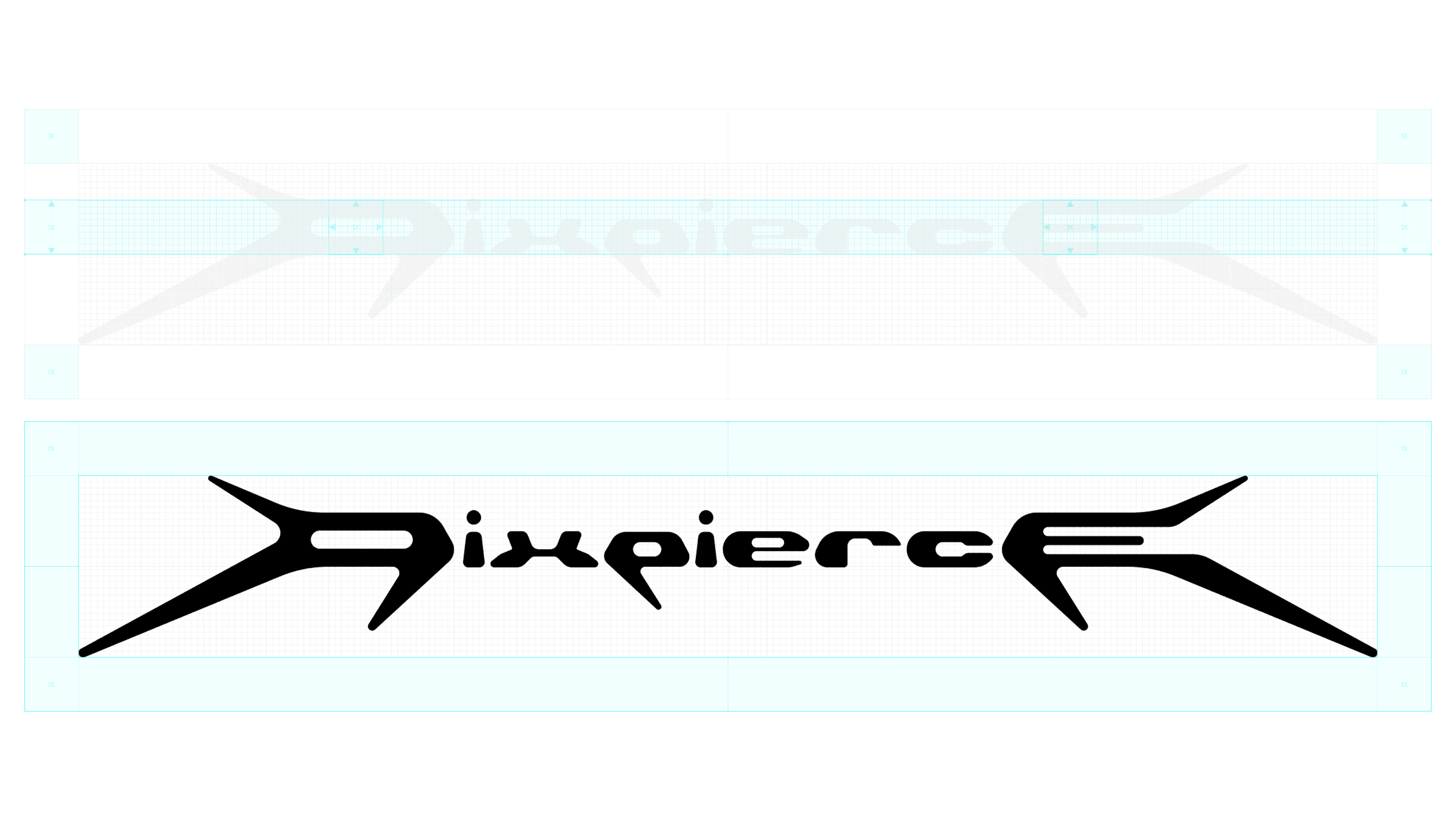
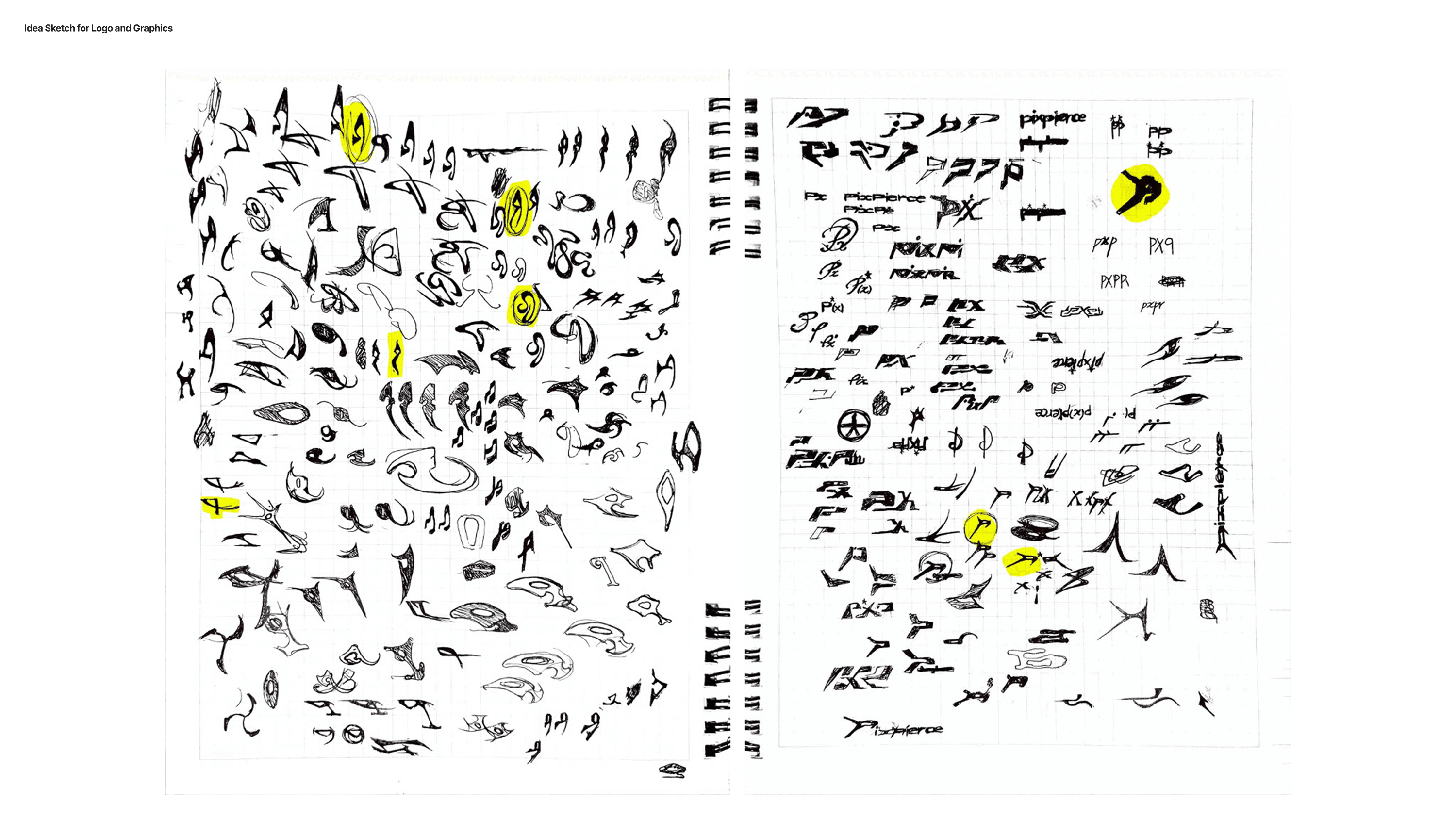
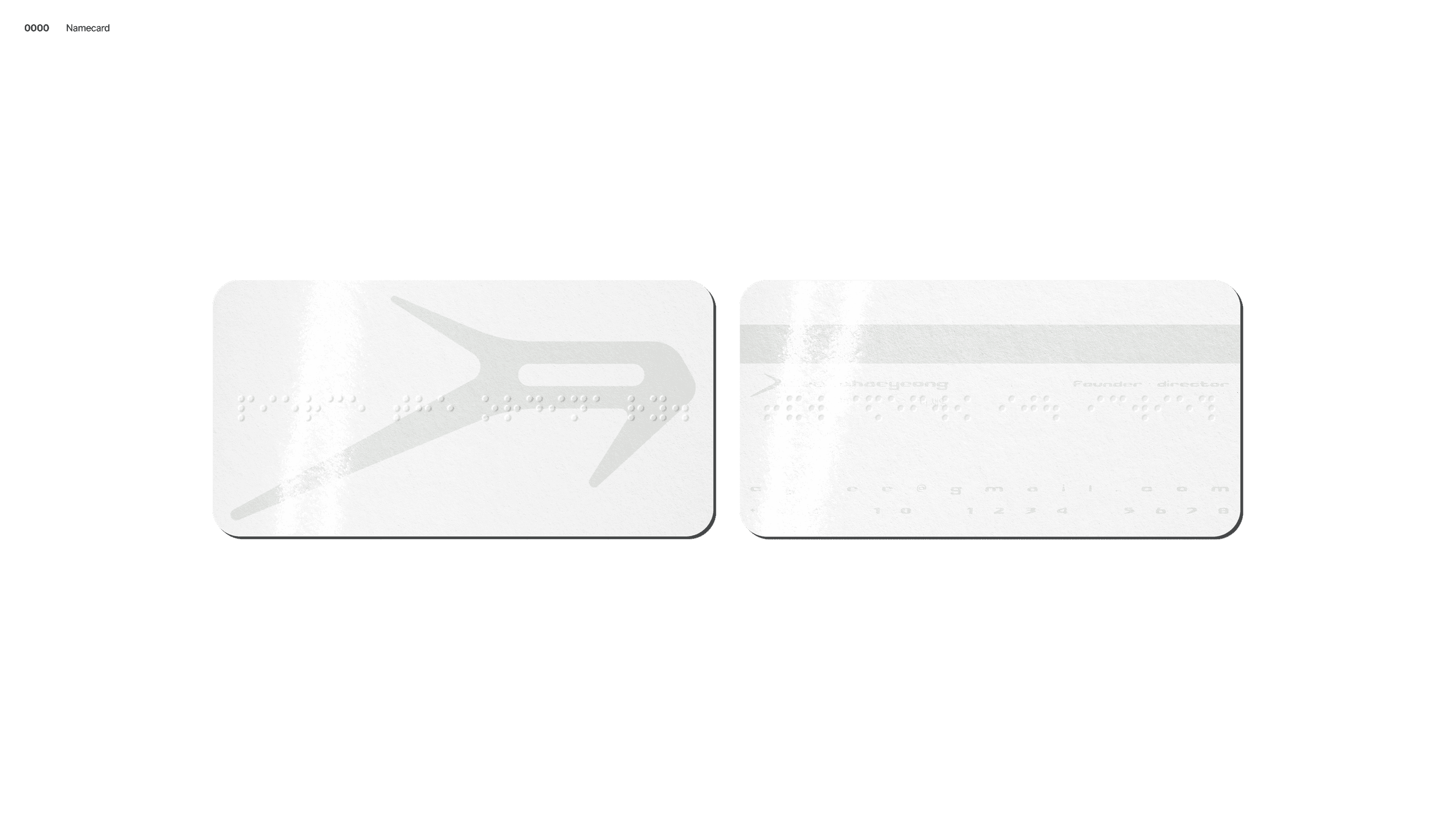
LOGO IDEATION & DESIGN
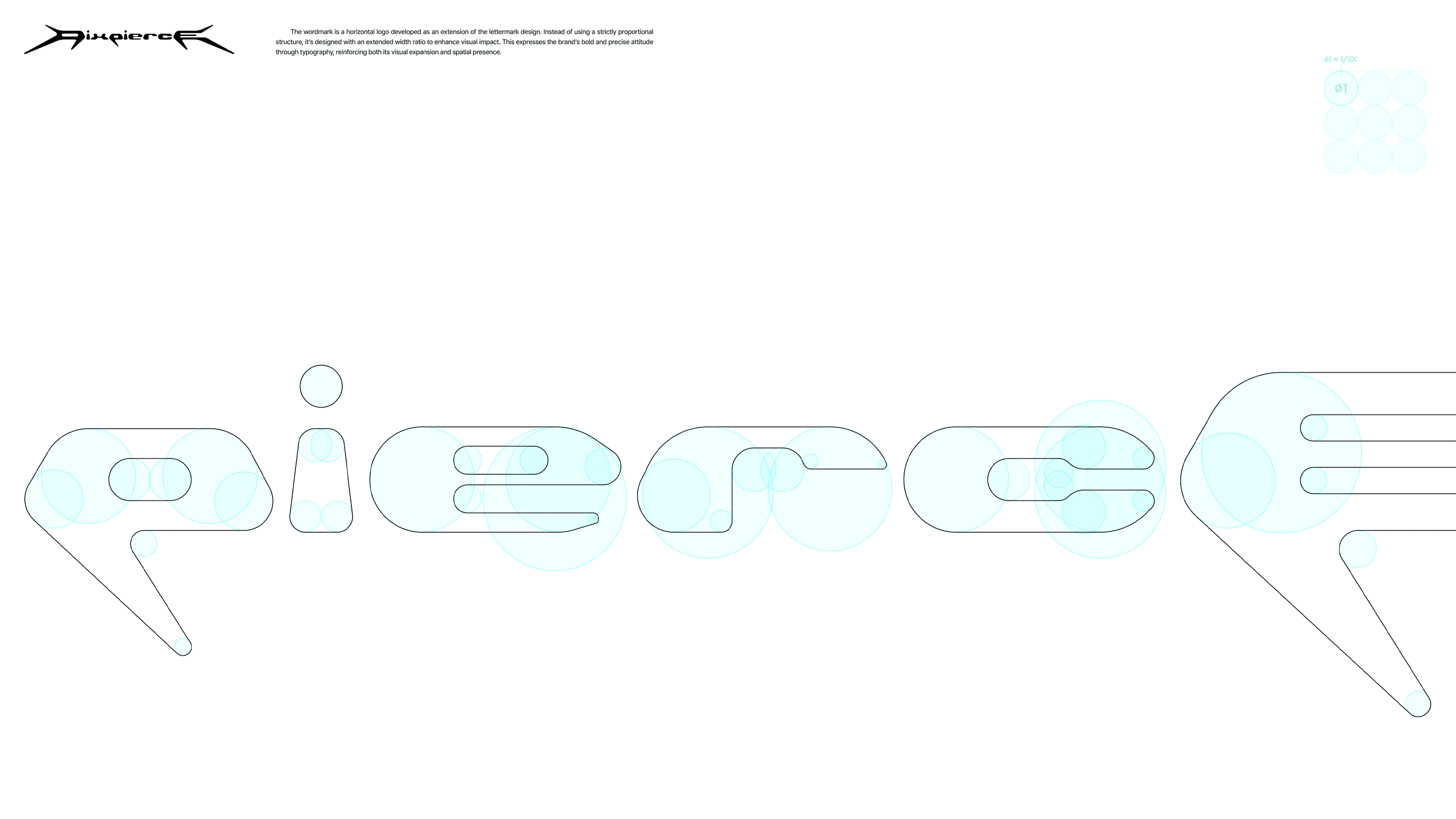
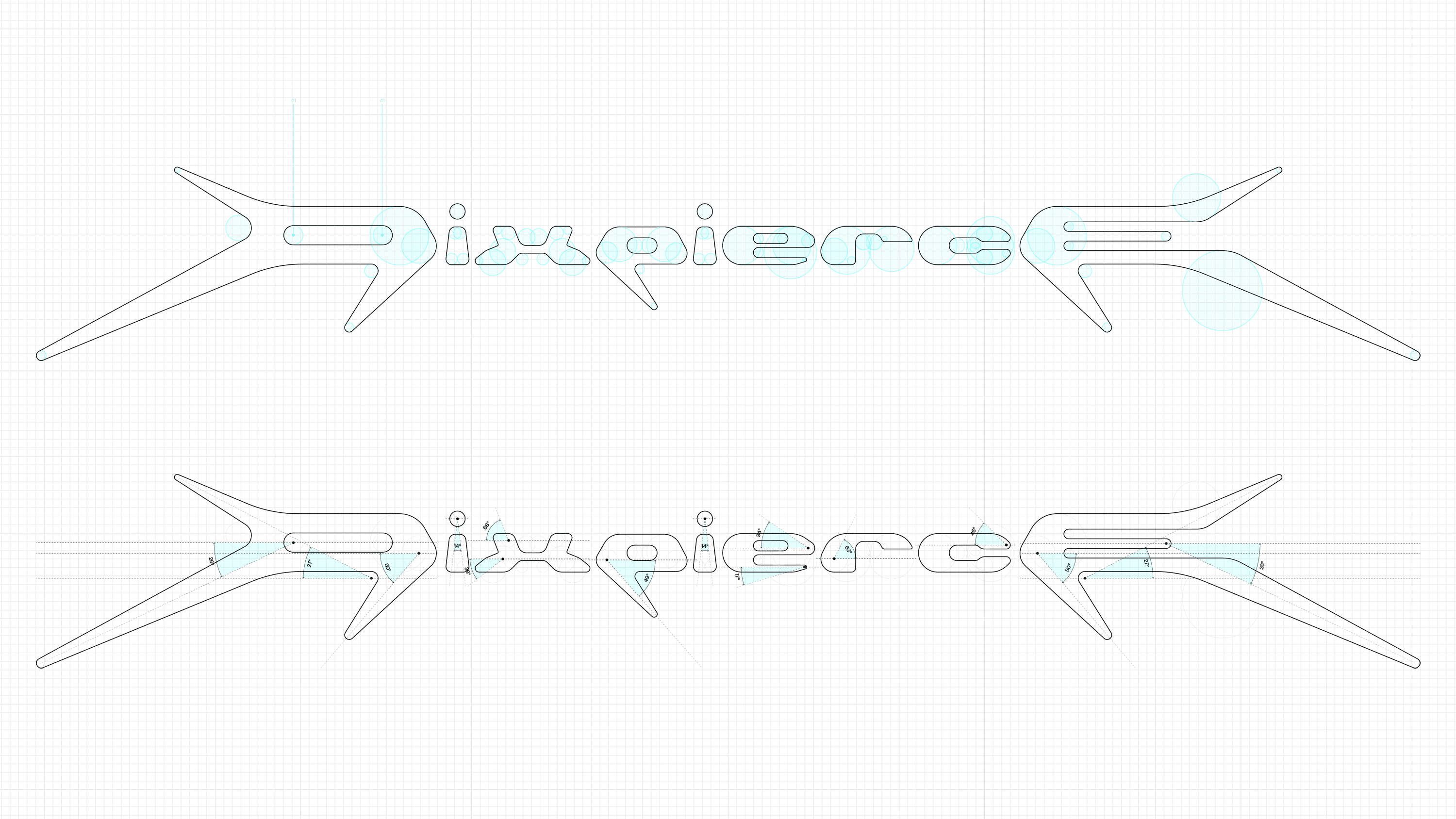
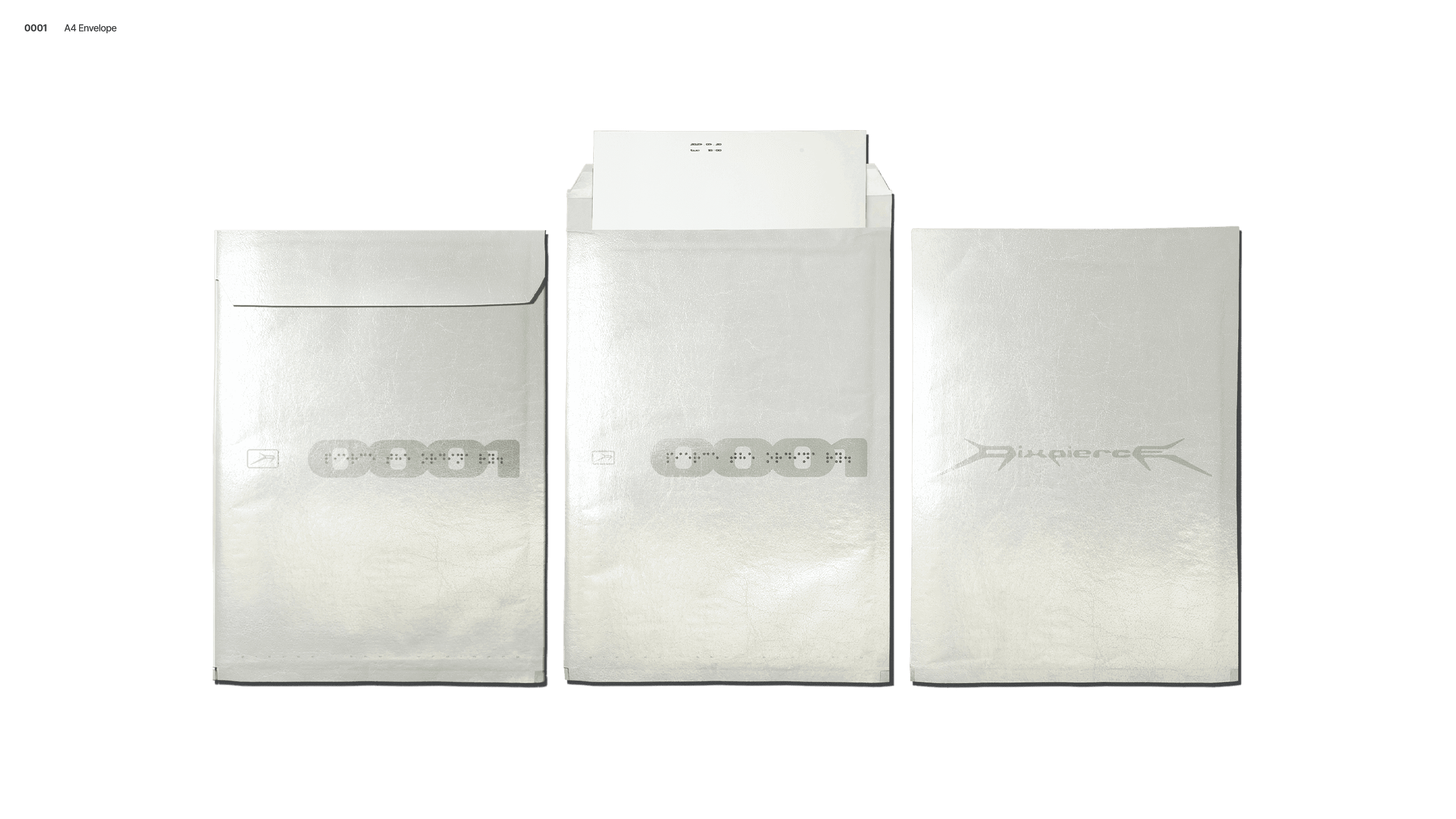
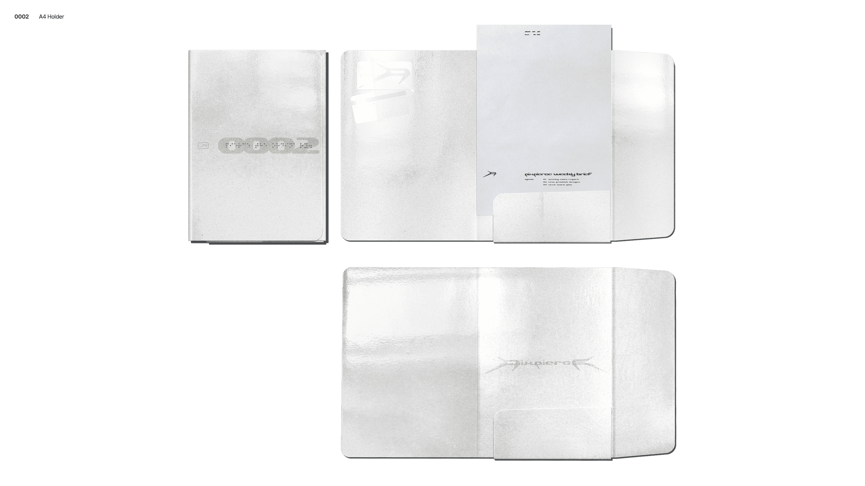
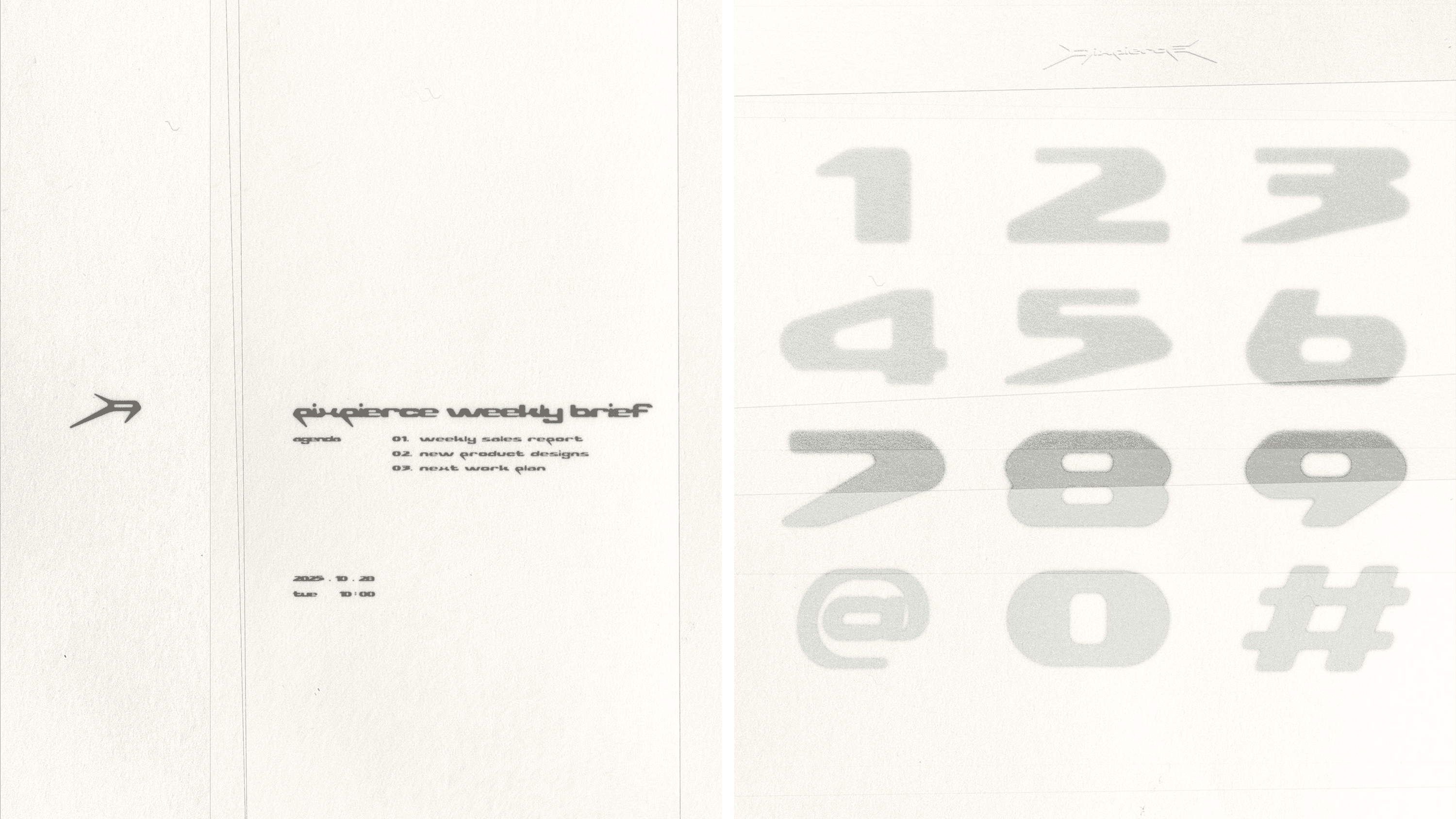
The logo designing began with the wild character of the honey badger, which served as the foundational inspiration for PIXPIERCE at its establishment. We sketched its instinctive and aggressive movement into a three-branch linear form shaped as the letter “P,” completing an initial lettermark representing the Core Values. The coexistence of restrained curves and sharp edges compresses the brand’s slogan “Pierce the Ordinary.” into a visual form. A matching horizontal wordmark was developed accordingly, and both the initial lettermark and wordmark were designed to maintain a consistent impression across different environments.
SLOGAN
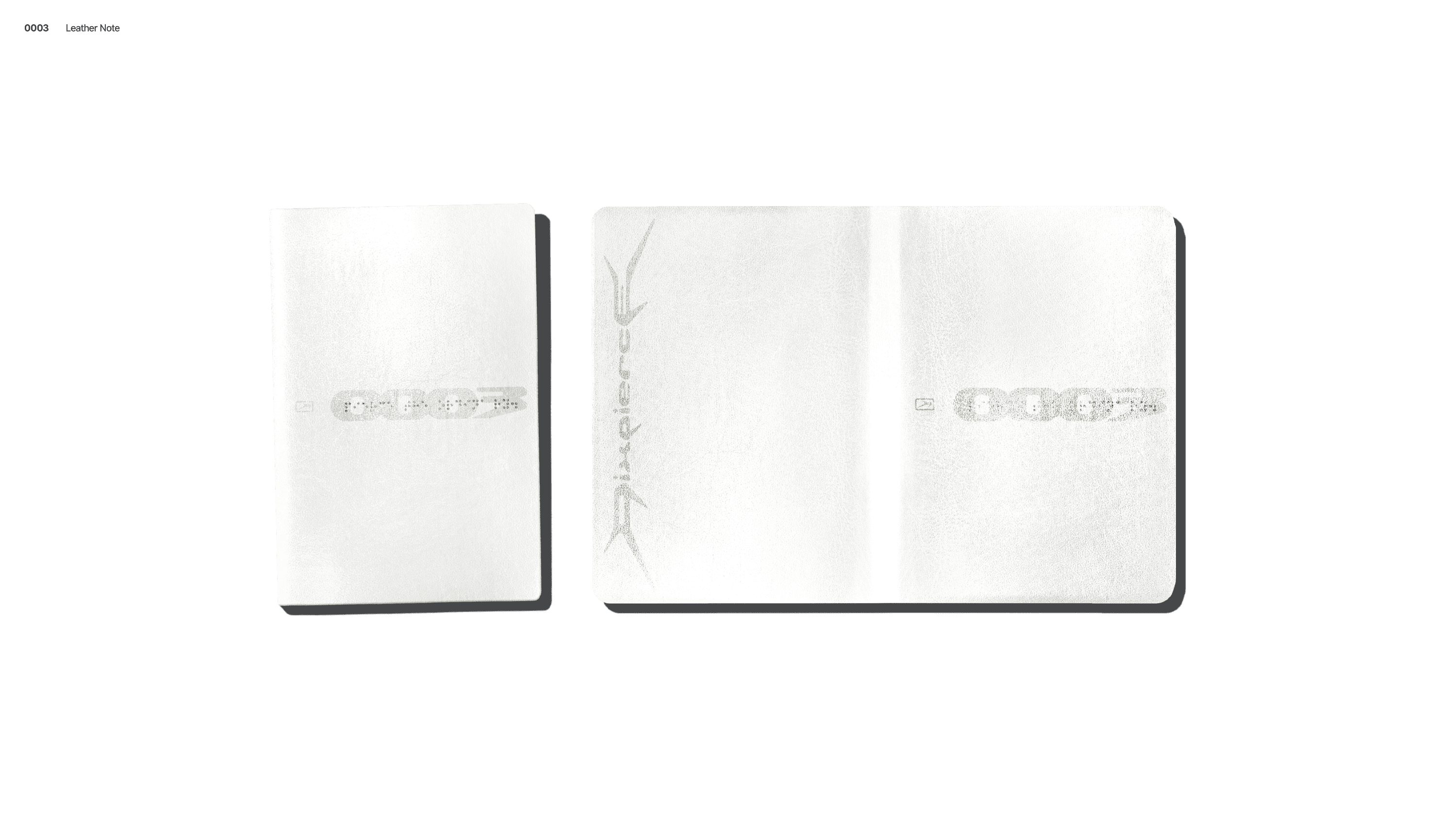
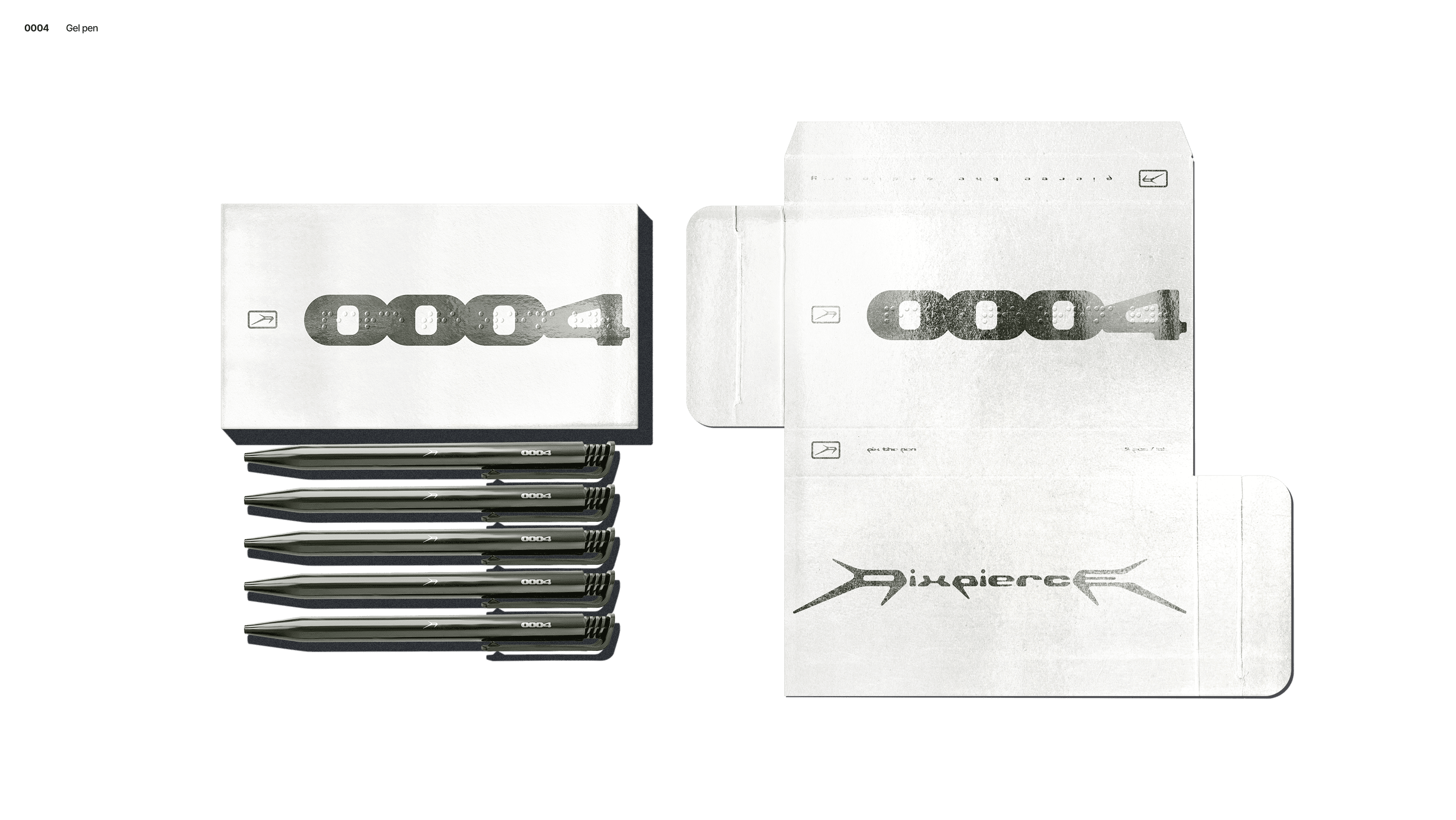
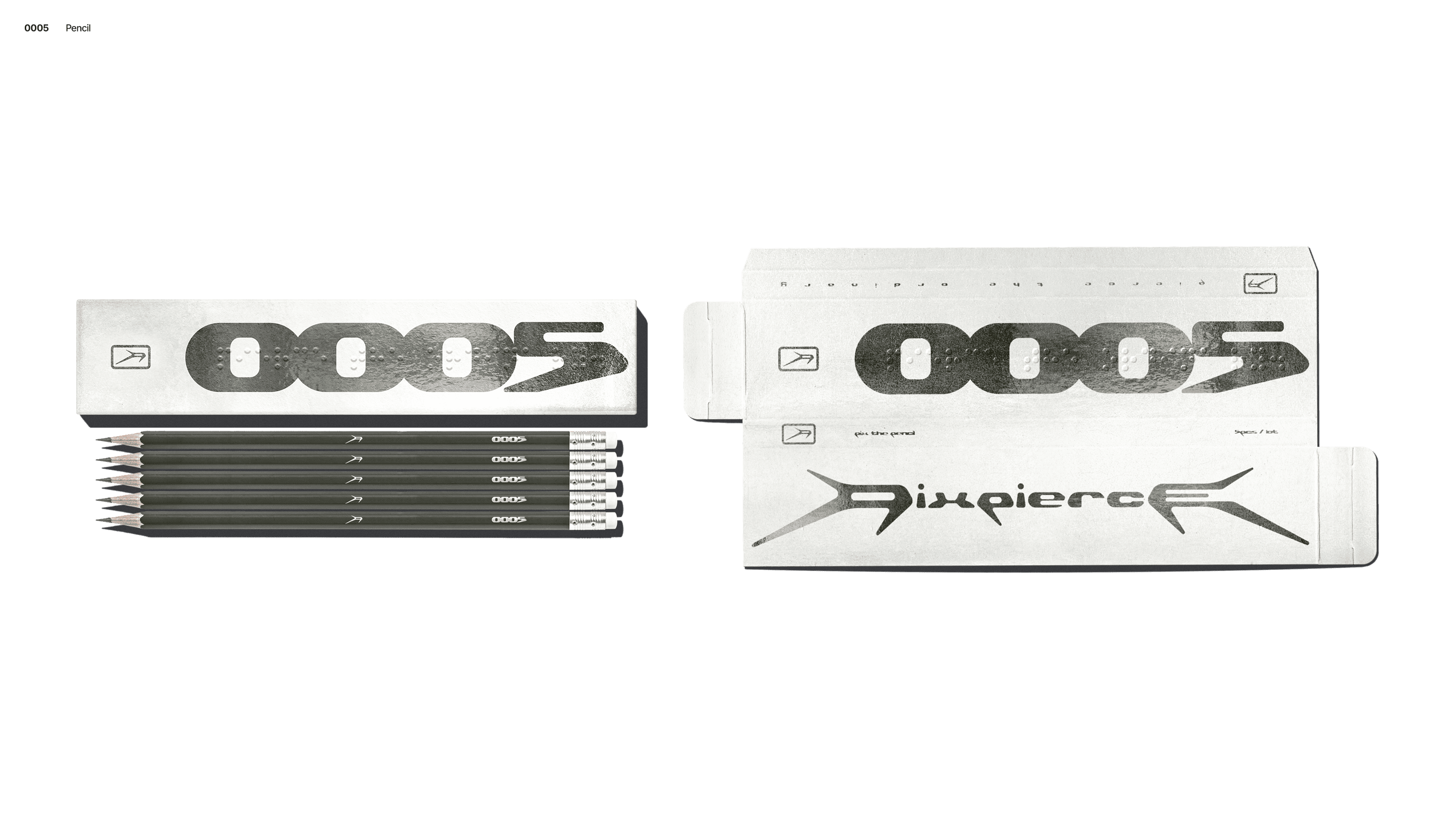
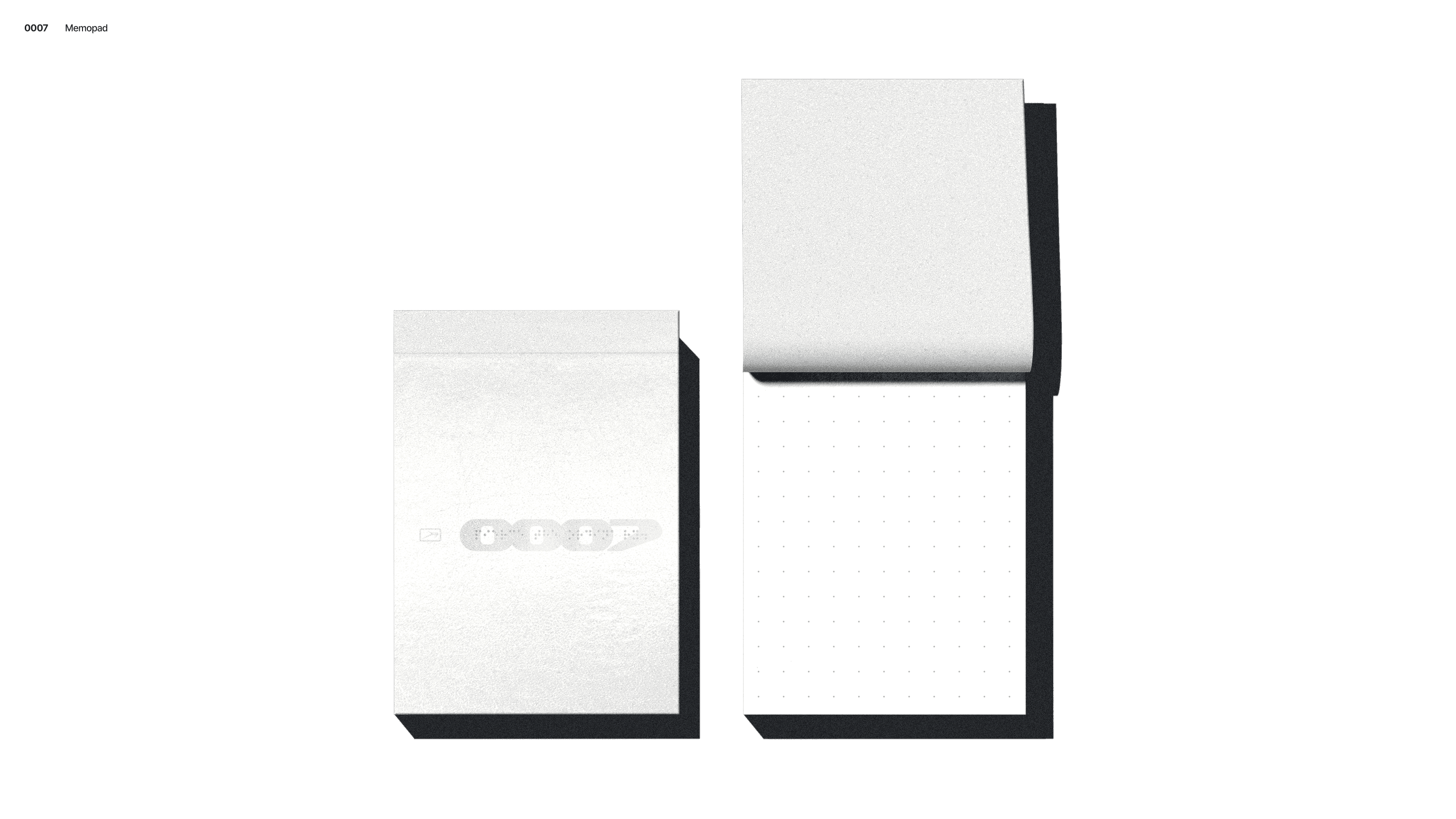
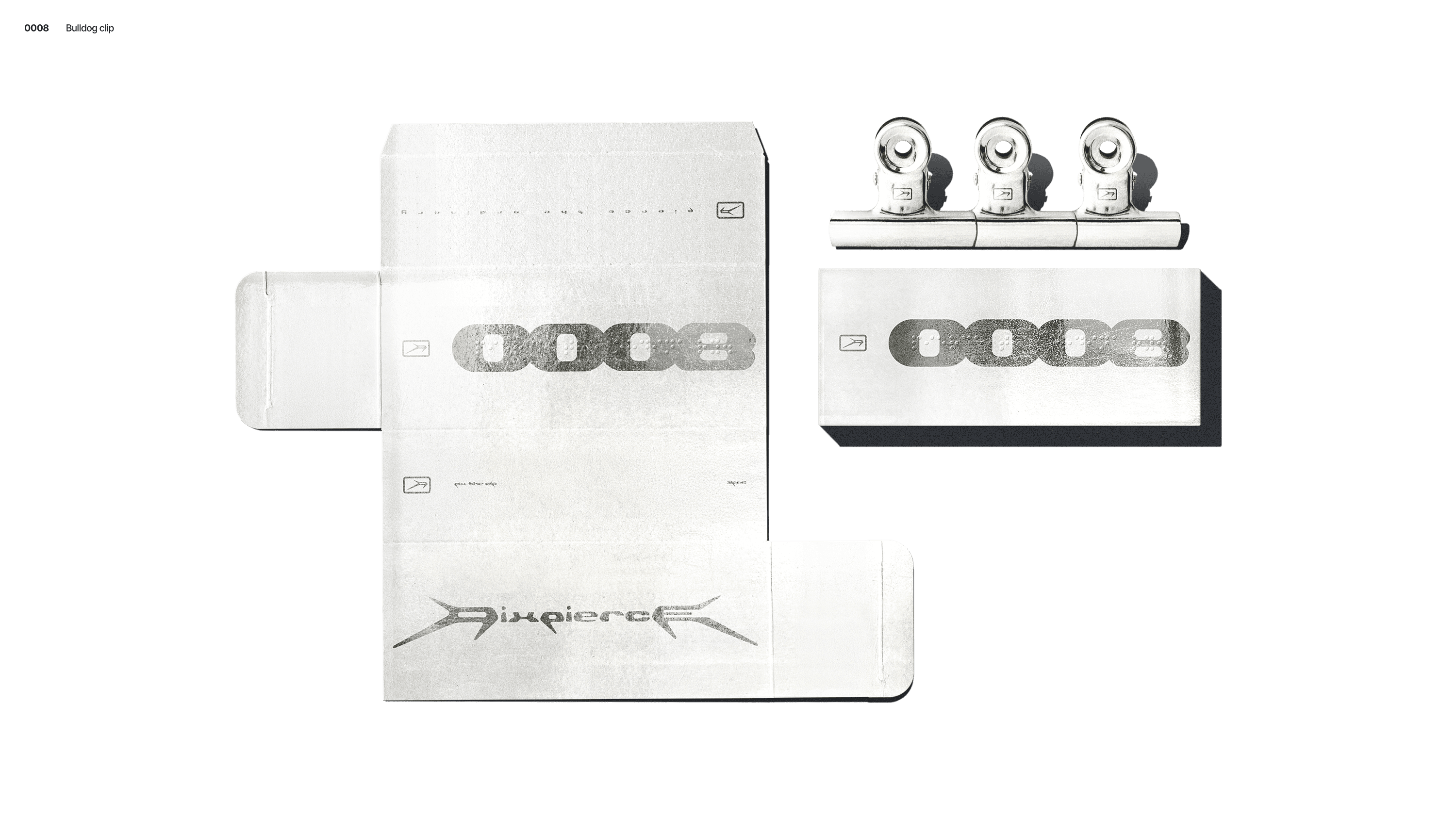
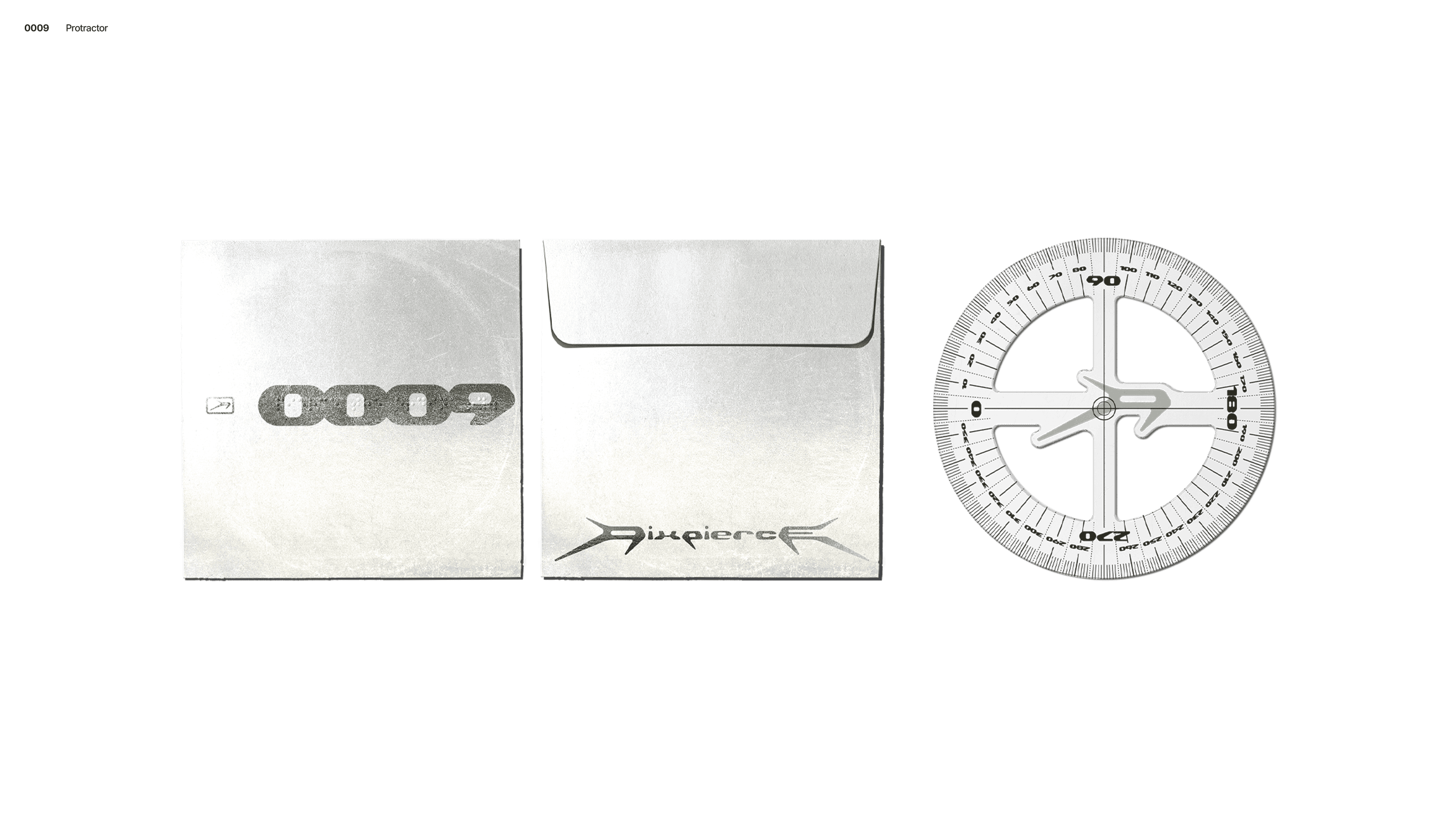
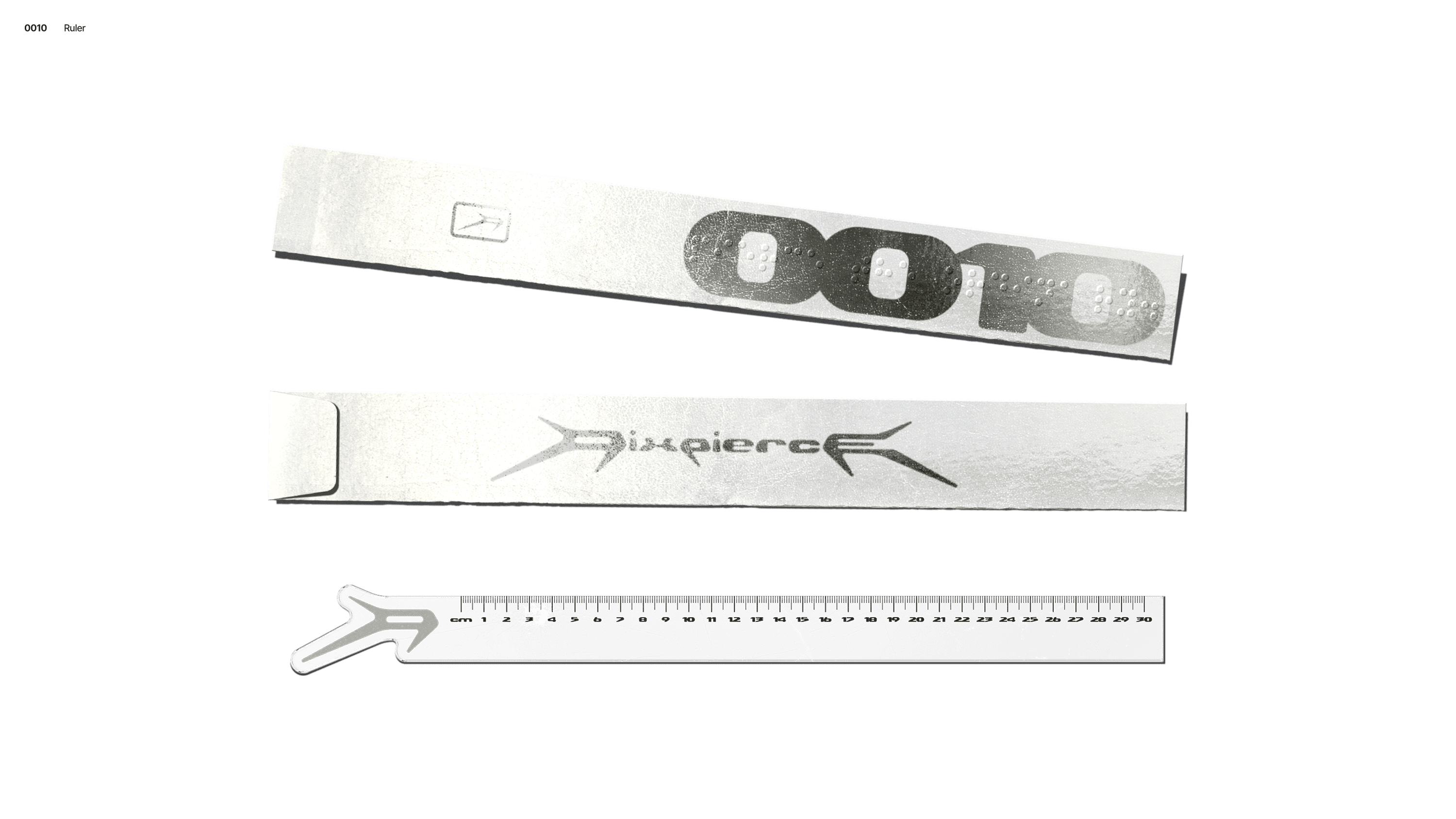
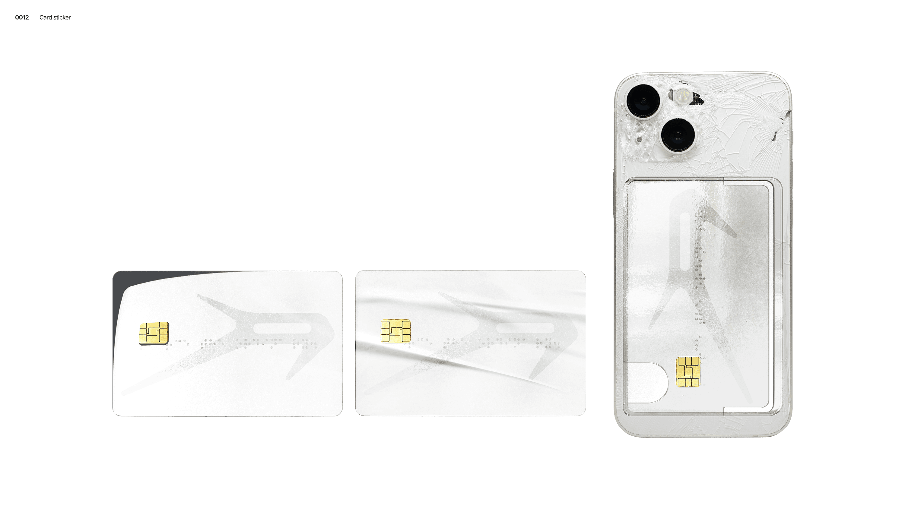
The slogan “Pierce the Ordinary” was converted into a Braille pattern and applied as embossed graphics on print materials. This approach allowed the slogan to function beyond text, extending into the tactile realm.
COLOR SYSTEM
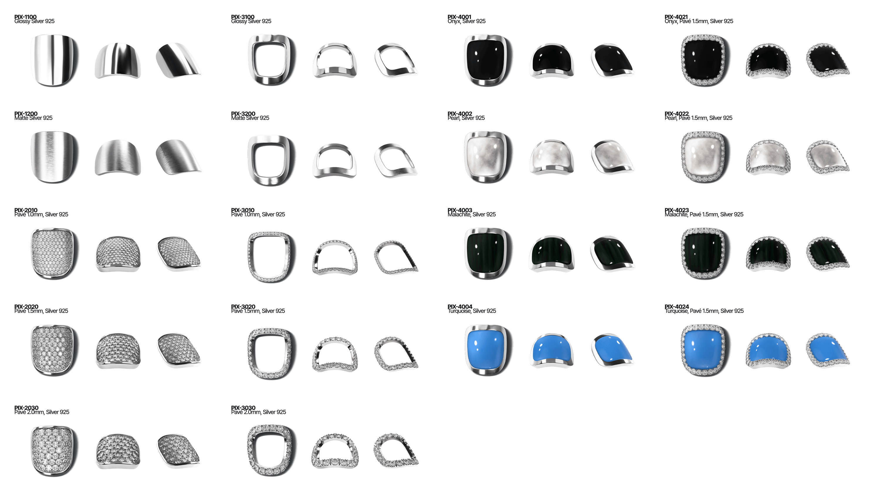
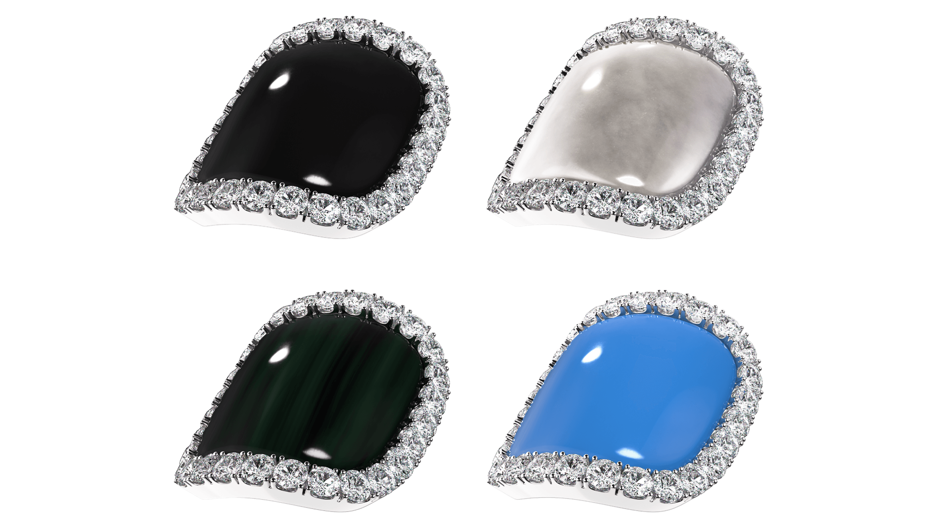
The color system plays a crucial role in defining the brand’s impression. The palette [Light Khaki, Khaki, Black Khaki] captures the subtle balance between the coldness of silver metal and the warmth of skin. Each color was precisely divided and standardized using RGB, CMYK, and PANTONE values to ensure consistent use across print and digital environments.
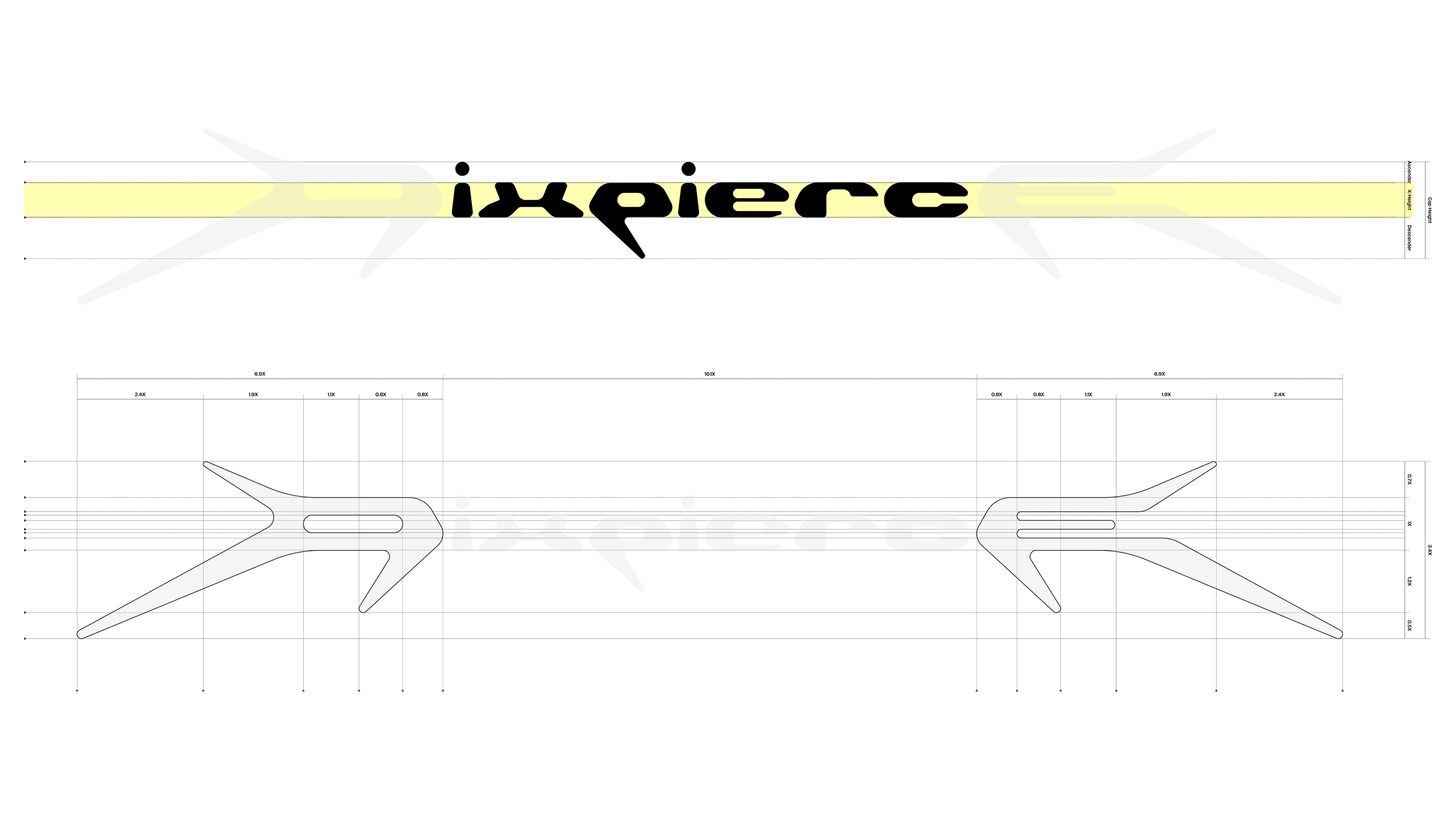
TYPEFACE
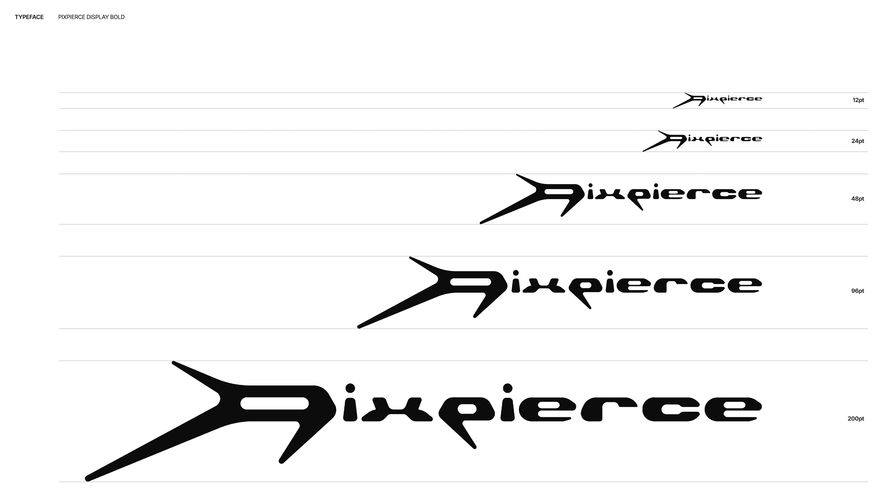
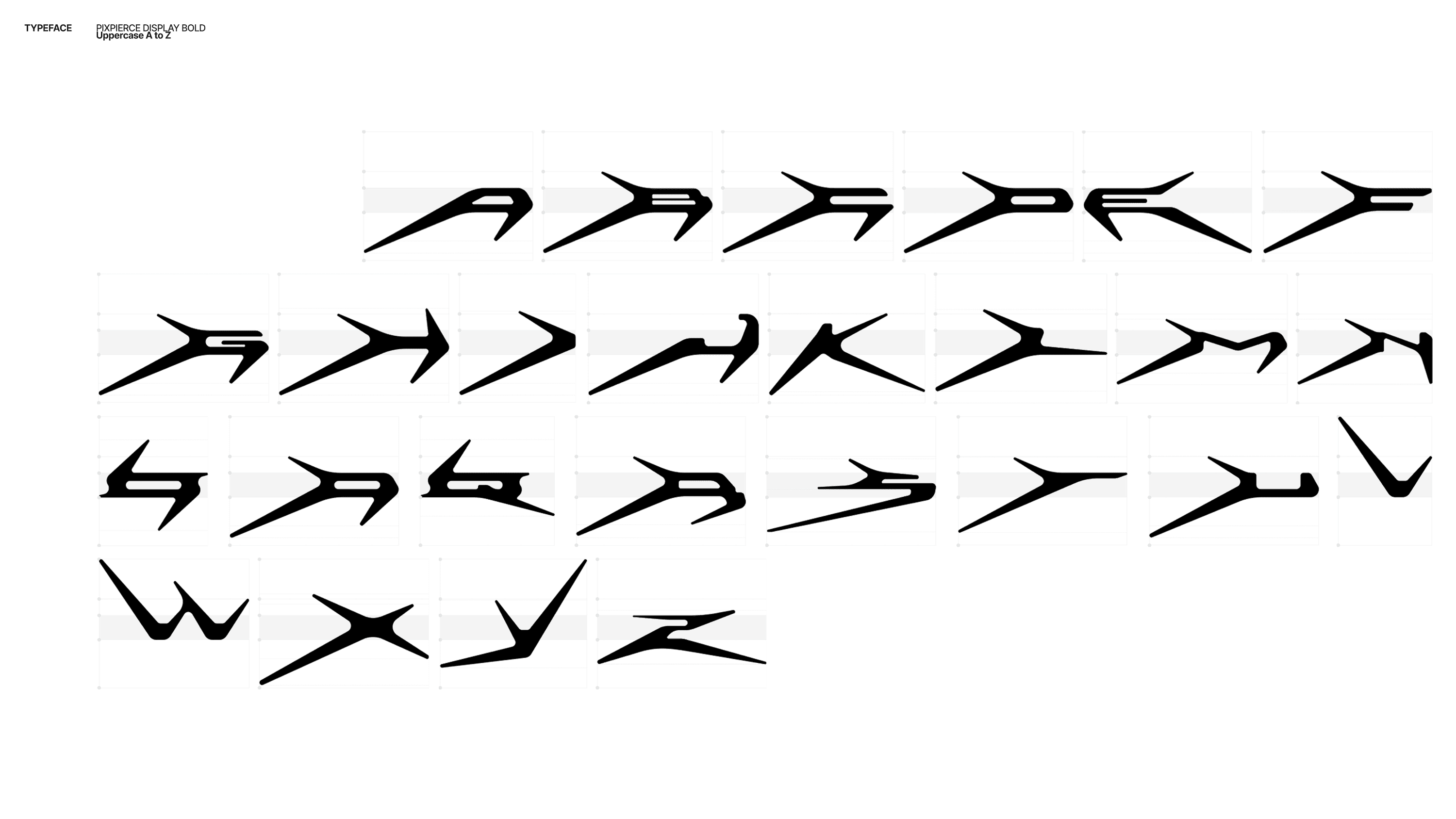
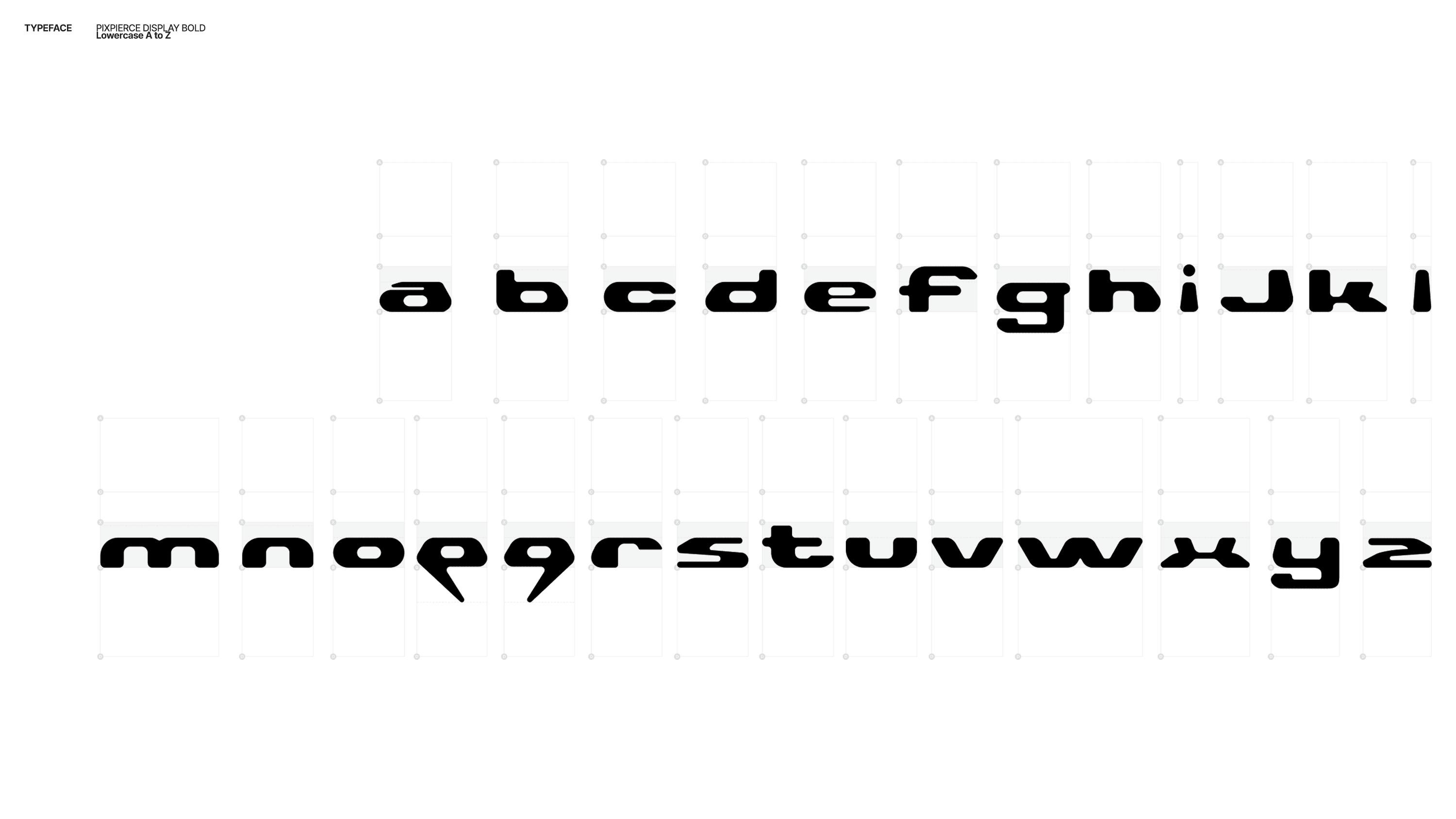
The custom typeface Pixpierce-Display Bold is an expanded logotype-based font that applies the structural logic of the lettermark. The typeface focuses on directionality and momentum rather than stable symmetry, removing unnecessary curves to emphasize the raw energy of straight lines. It is the brand asset that most directly communicates PIXPIERCE’s attitude.
Through the first step, we established PIXPIERCE’s ‘Raw honesty’ and ‘Intentional refinement’ as a coherent visual system. PIXPIERCE now positions itself as a bold tool that pierces through existing norms. Pierce the Ordinary.


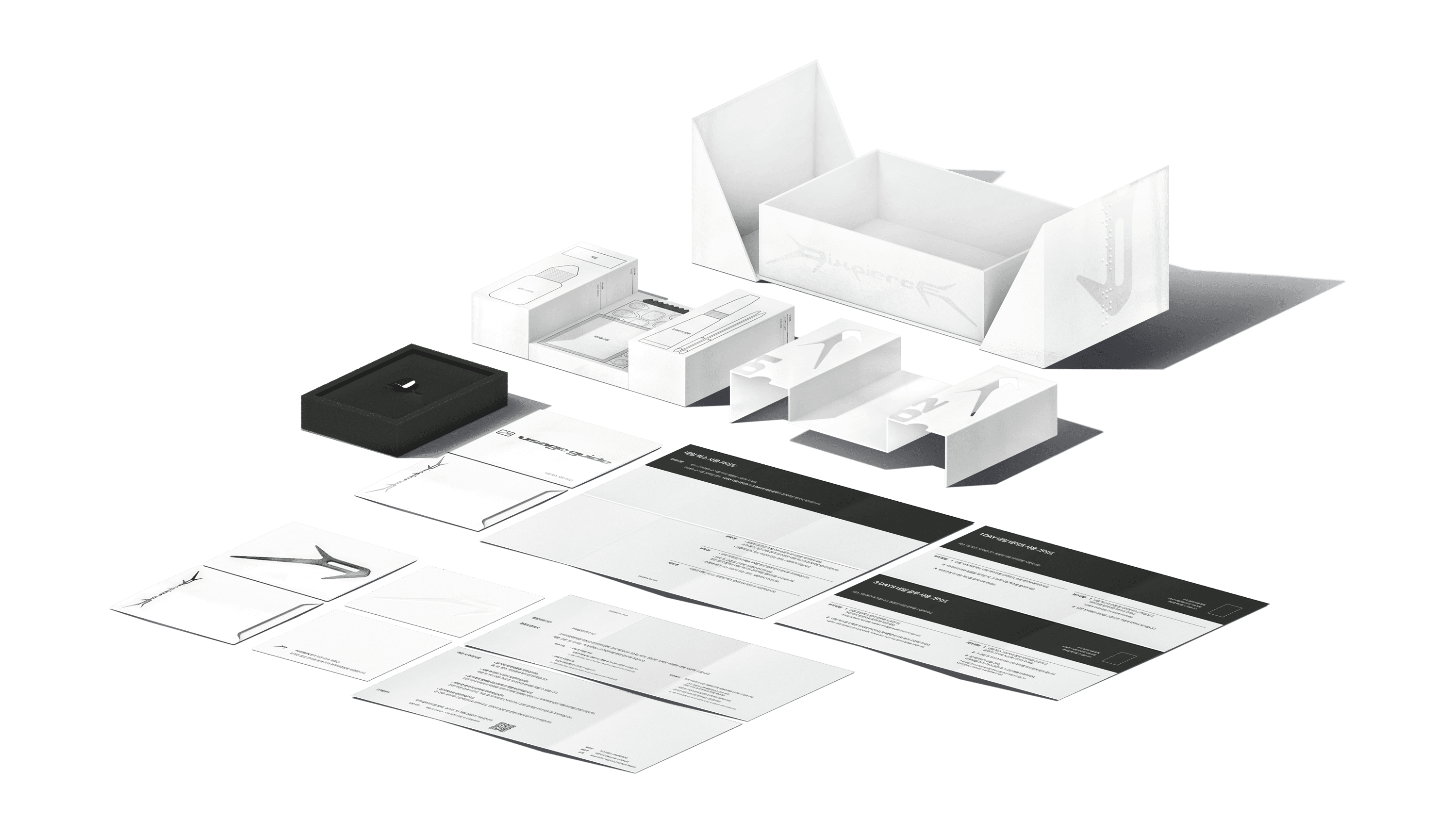
02 PACKAGE STRUCTURE & DESIGN SYSTEM
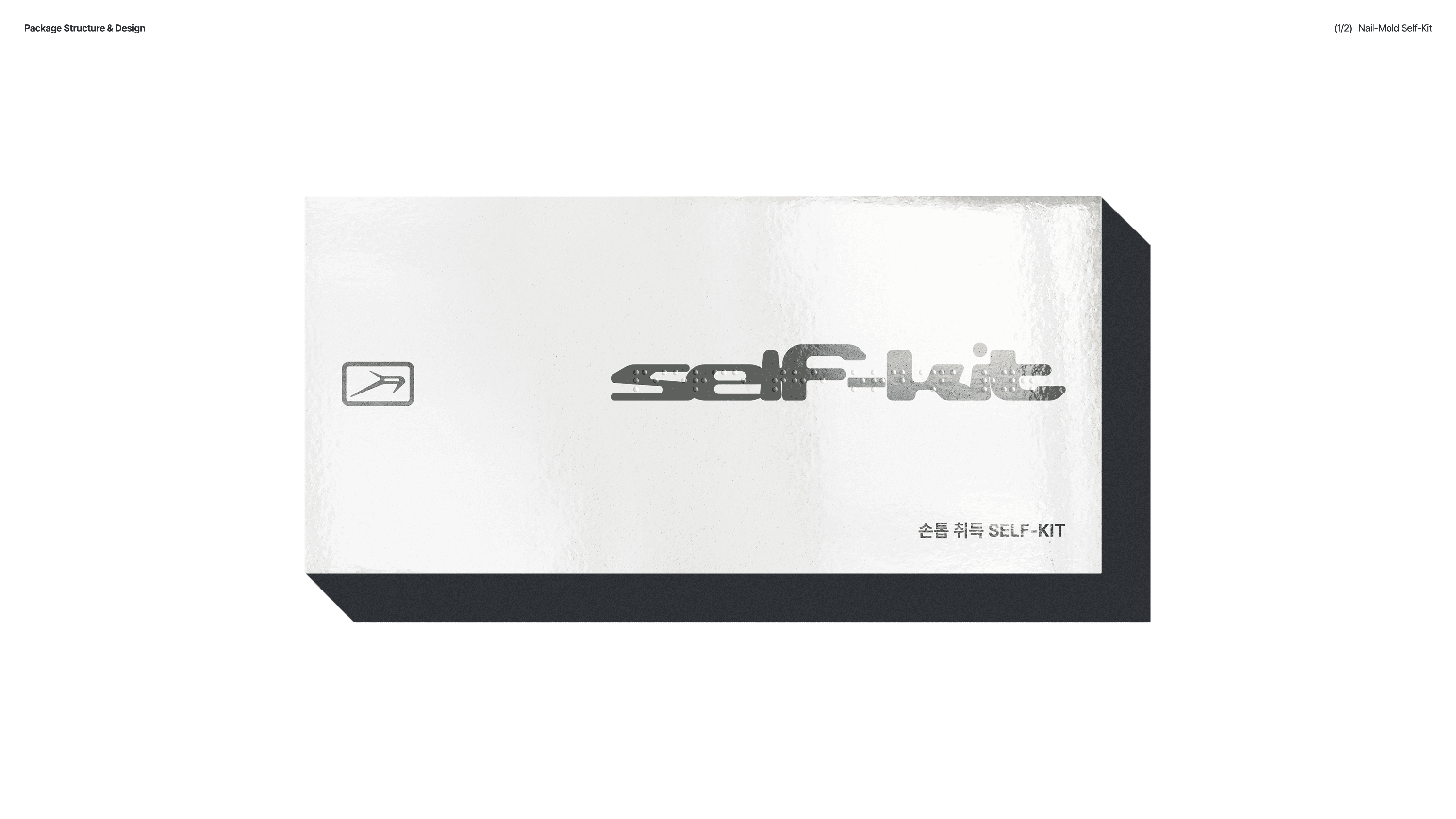
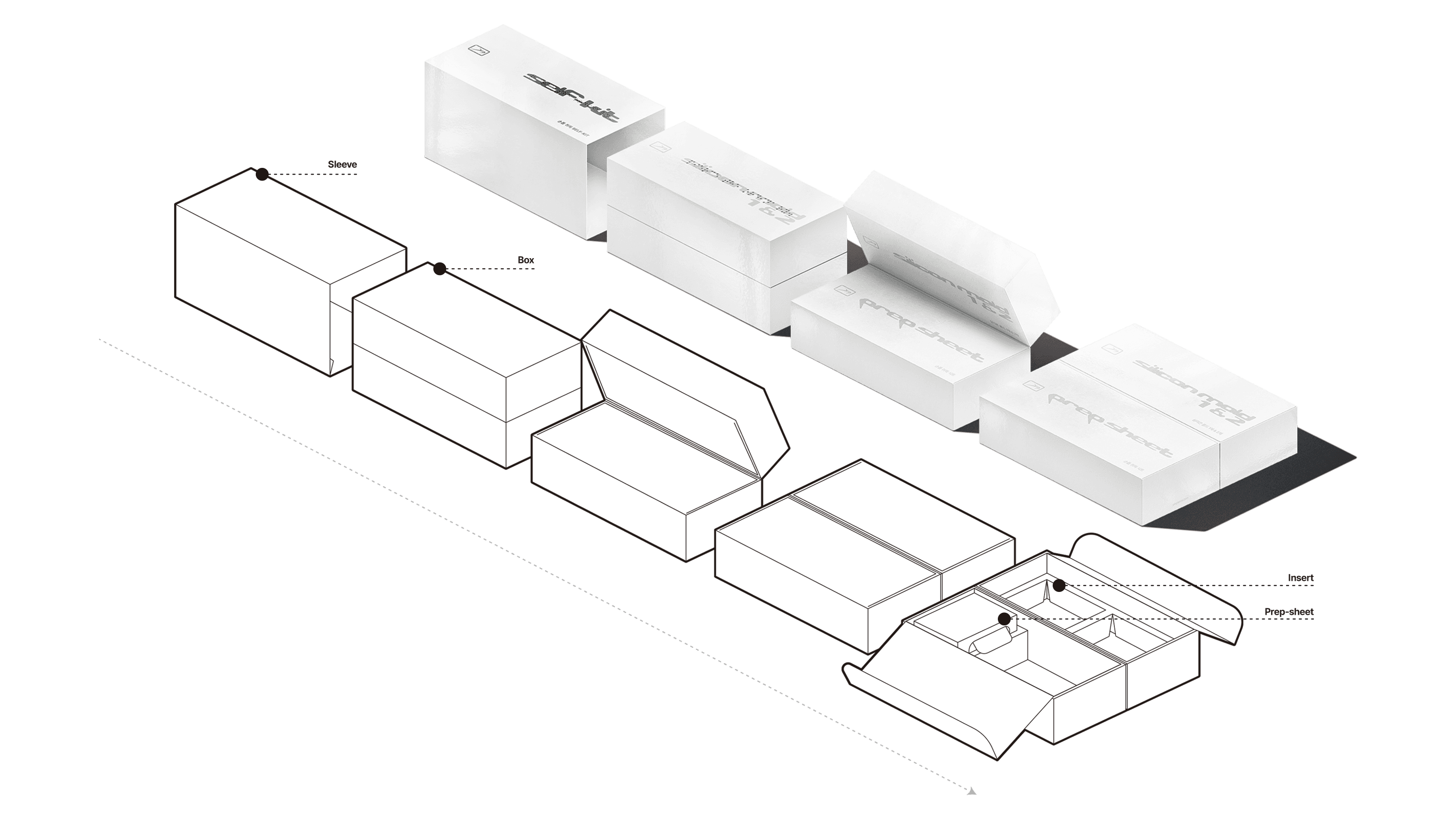
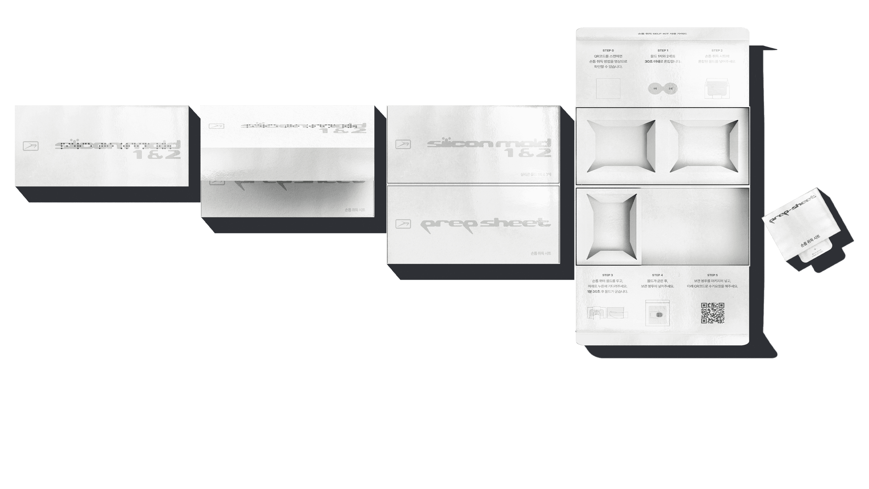
While the first step of BI and design system development deeply explored PIXPIERCE’s attitude, the second step focused on improving storage methods of existing packages and designing new structures that translate into real customer experience. The core of package system design was to utilize limited space efficiently to store all components, while allowing users to easily understand how to use them. This resulted in two types of packages. The packages received by the customer consist of a first and second package, totaling two types.
1) SELF-KIT FOR NAIL ACQUISITION
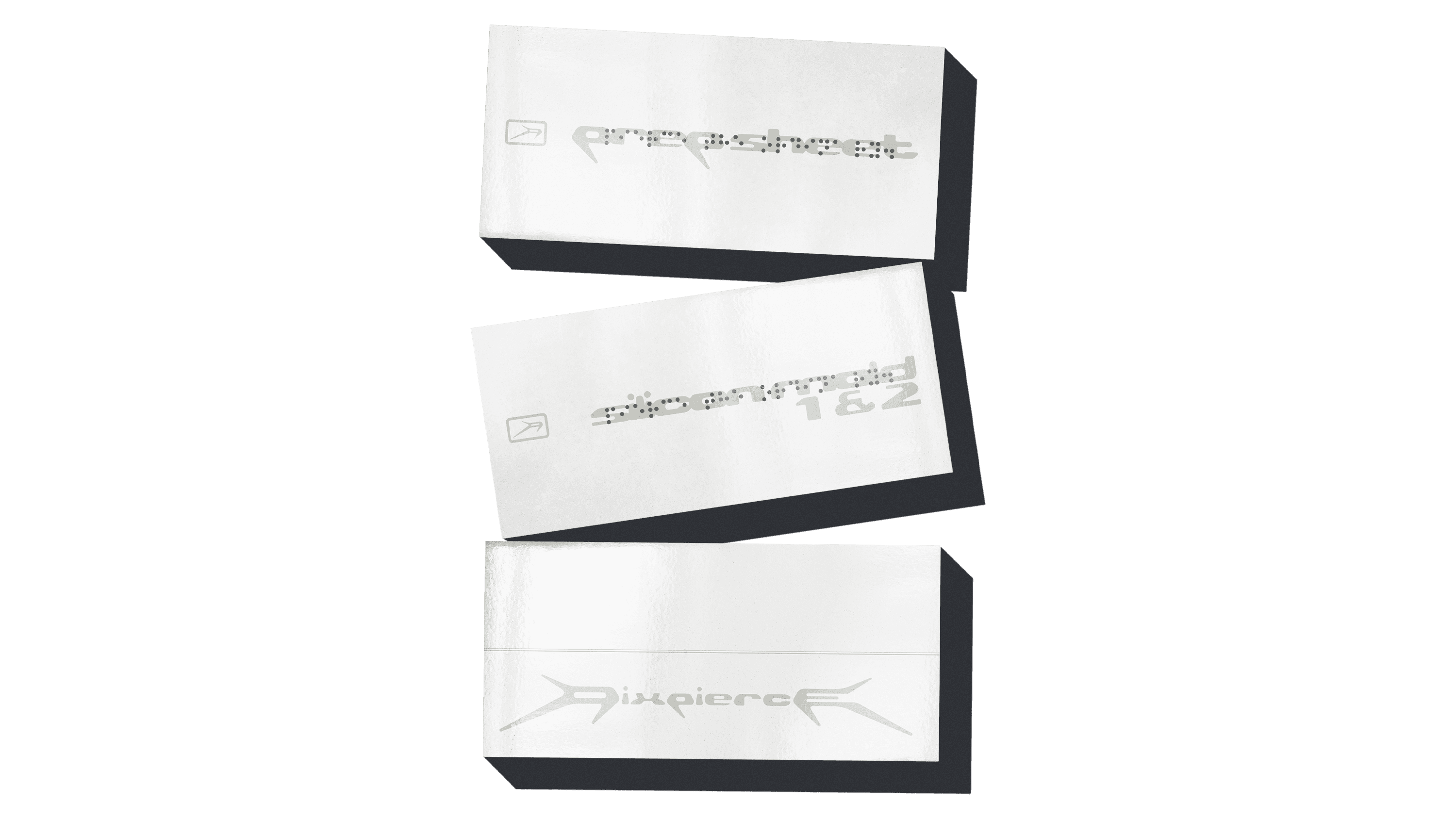
Components
Mold Part 1 & 2, Nail Acquisition Prep Sheet, Mold Storage Pouch
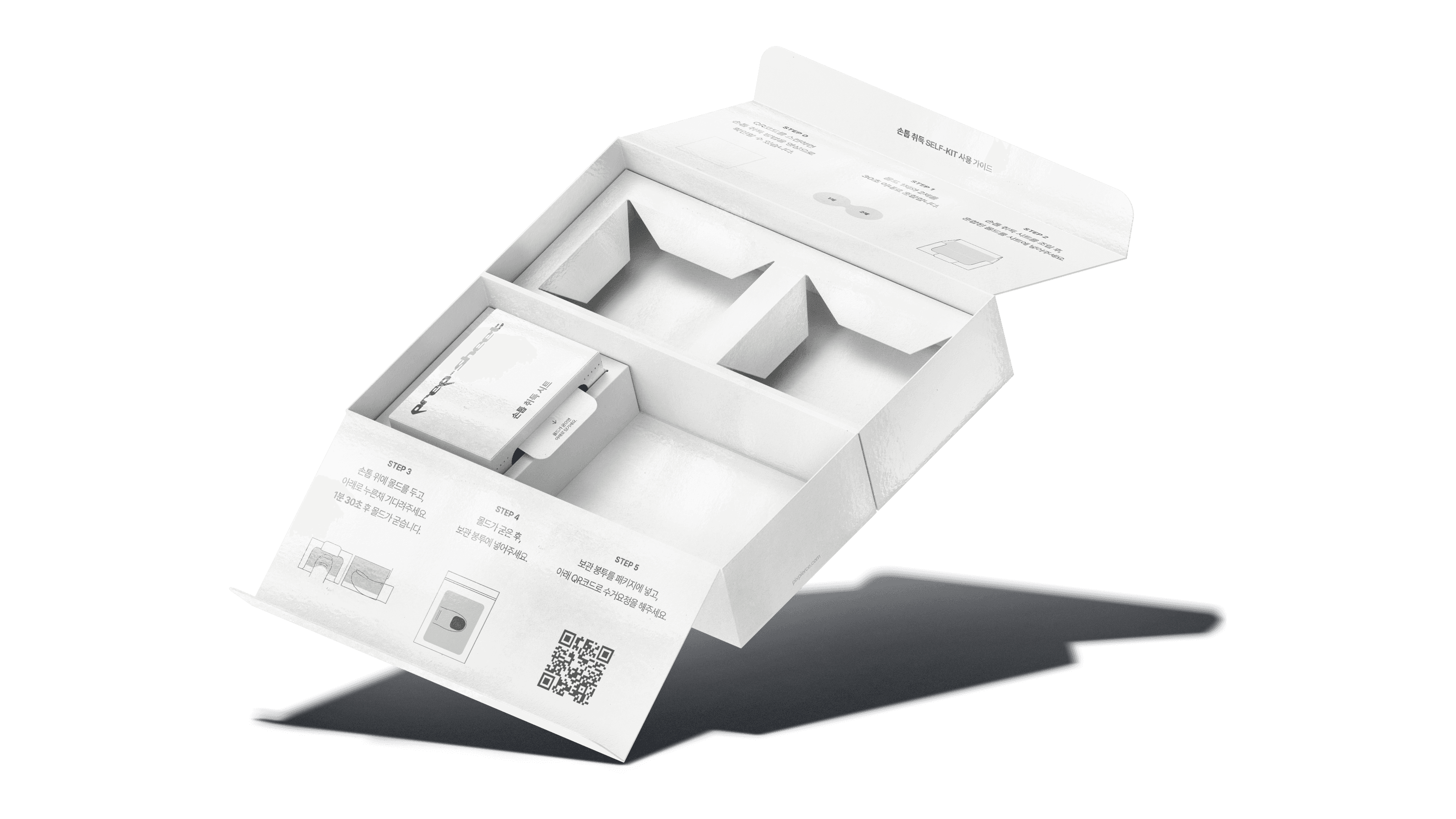
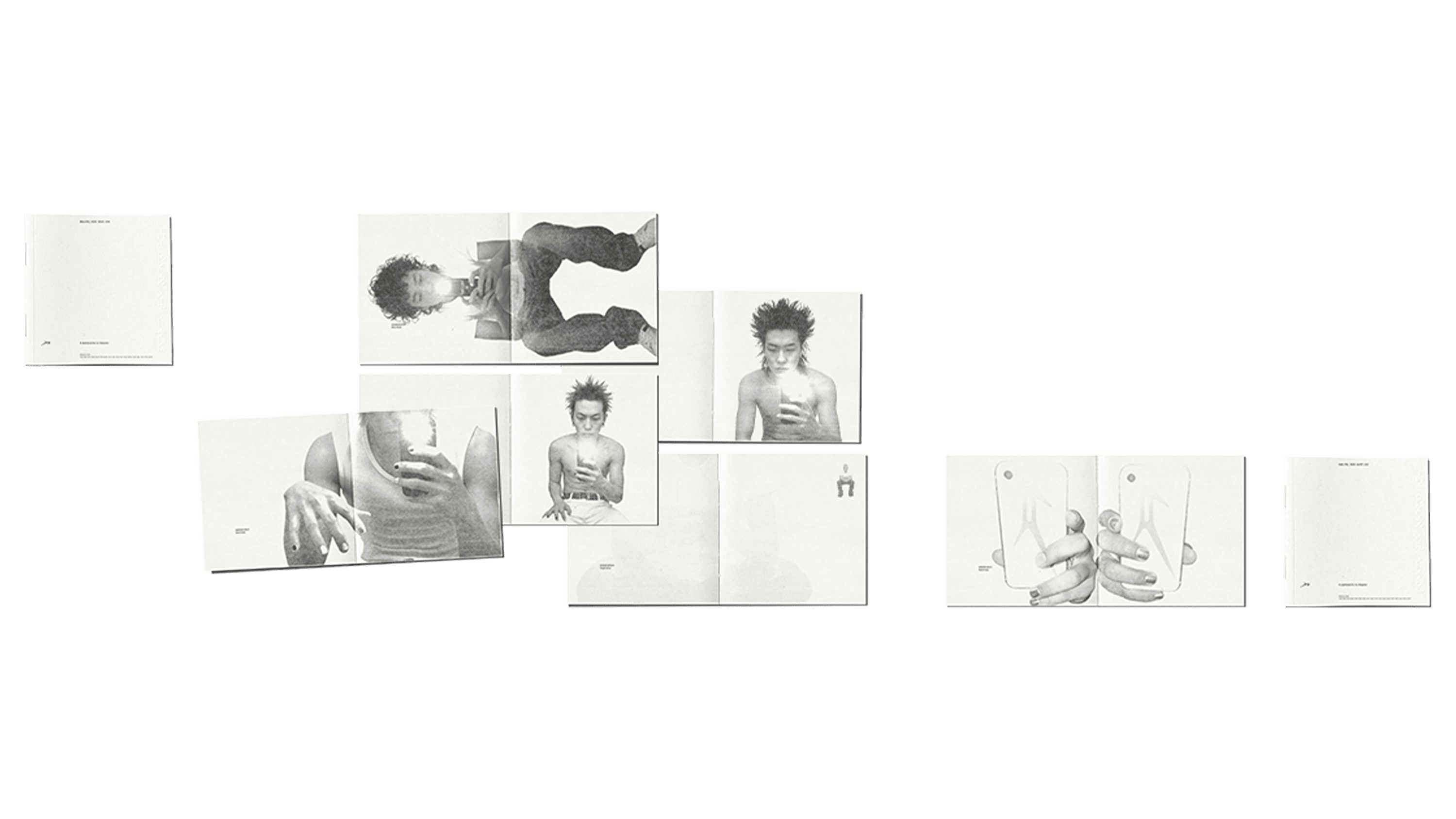
The first package is the Self-Kit, which contains materials that allow customers to capture the shape of their nails. The kit uses a multi-layered mono box combining a dual-lid structure with inserts, and the sequence is clearly designed as [Open → Check → Use]. Instead of a simple open-and-take structure, the box guides the user to follow the steps in order. Inside, the Usage Guide is printed with an intuitive layout featuring step-by-step separation, symmetrical composition, and clear illustrations. All small components are also arranged carefully to stay organized.
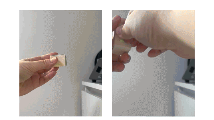
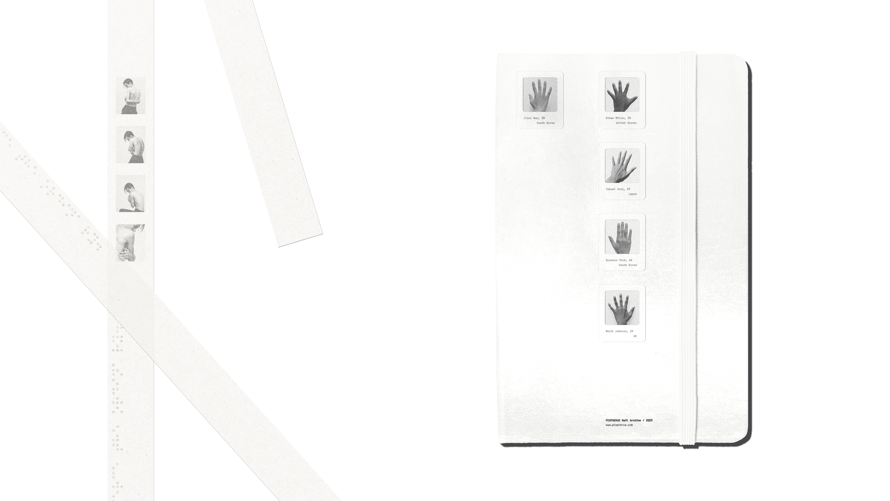
One of the components ‘the Prep-Sheet’ received particular attention. We approached this sheet as a UI (User Interface). Within an extremely small area, the key was designing a layout where the user’s flow, eye movement, and hand motion could proceed without errors. In other words, it is a compact paper interface designed with error-minimization as its purpose. Assuming that mistakes are likely during the process, the sheet was built so the user can easily understand the order in which nails should be captured. We structured information by priority and placed text, simplified icons, and illustrations together so the user can act immediately without reading long instructions. The sheet needed to function as an “Easy Doing Tool”, a simple yet functional tool that allows the user to attach and remove the nails correctly, with minimal space allowance and proper grip points. This sheet is an example of true user-based package structure development that prioritizes functionality over aesthetics.
User Flow Requirements Summary
• Compact area with appropriate mold volume
• Structure enabling the nail to be imprinted perfectly, not too deep or too shallow
• Shape allowing easy removal of the hardened mold
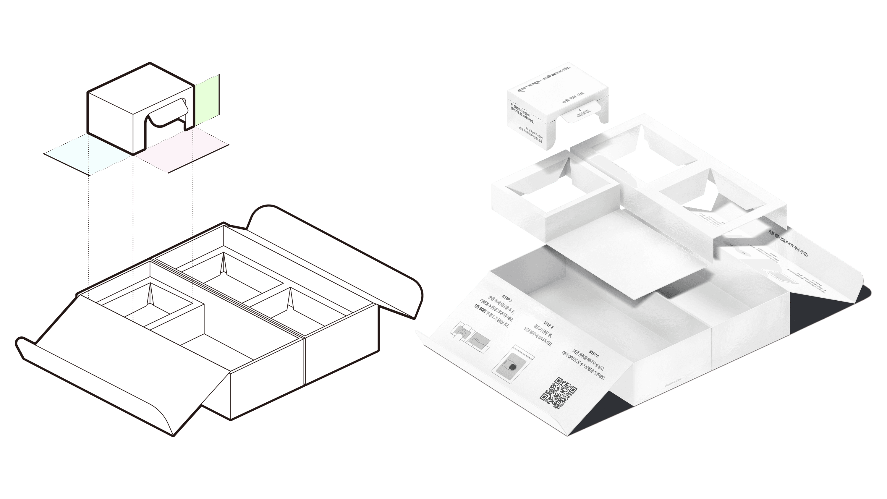
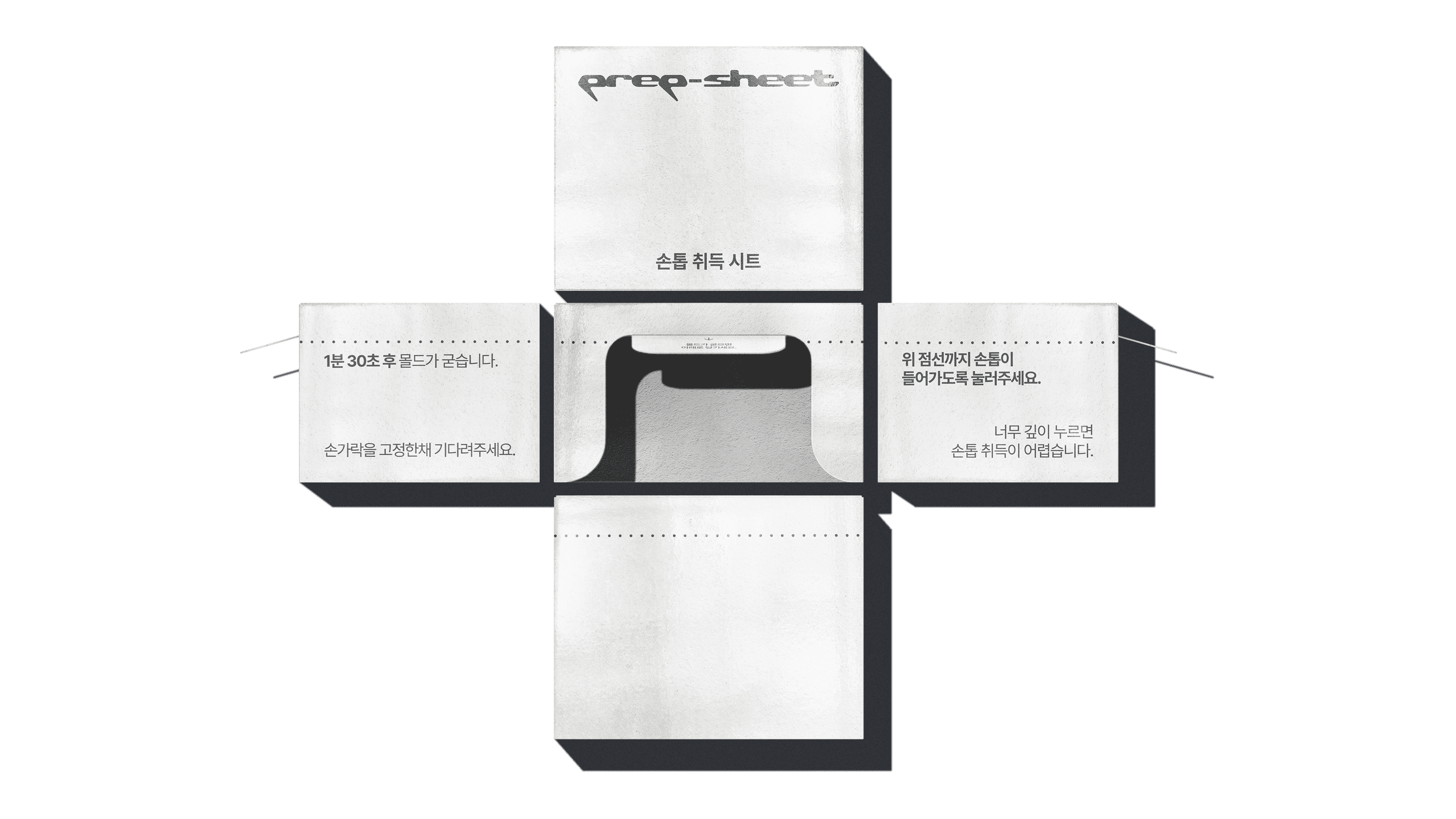
▾ STRUCTURE TEST PROGRESS OF THE PREP-SHEET
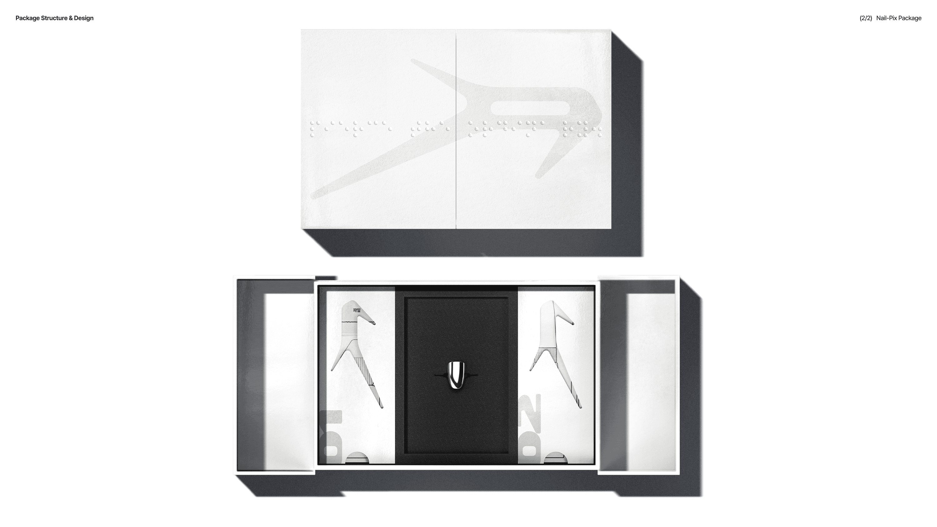
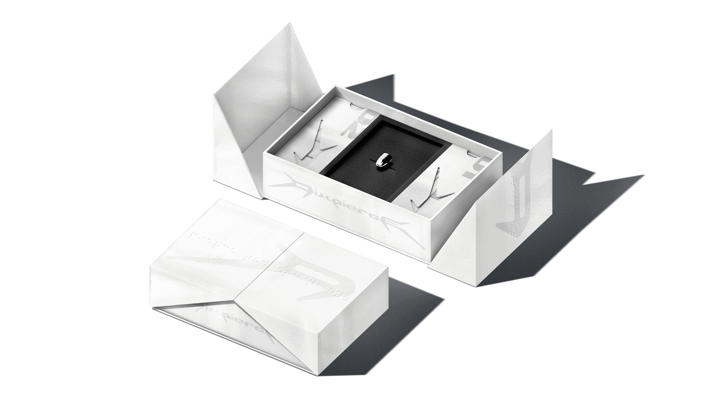
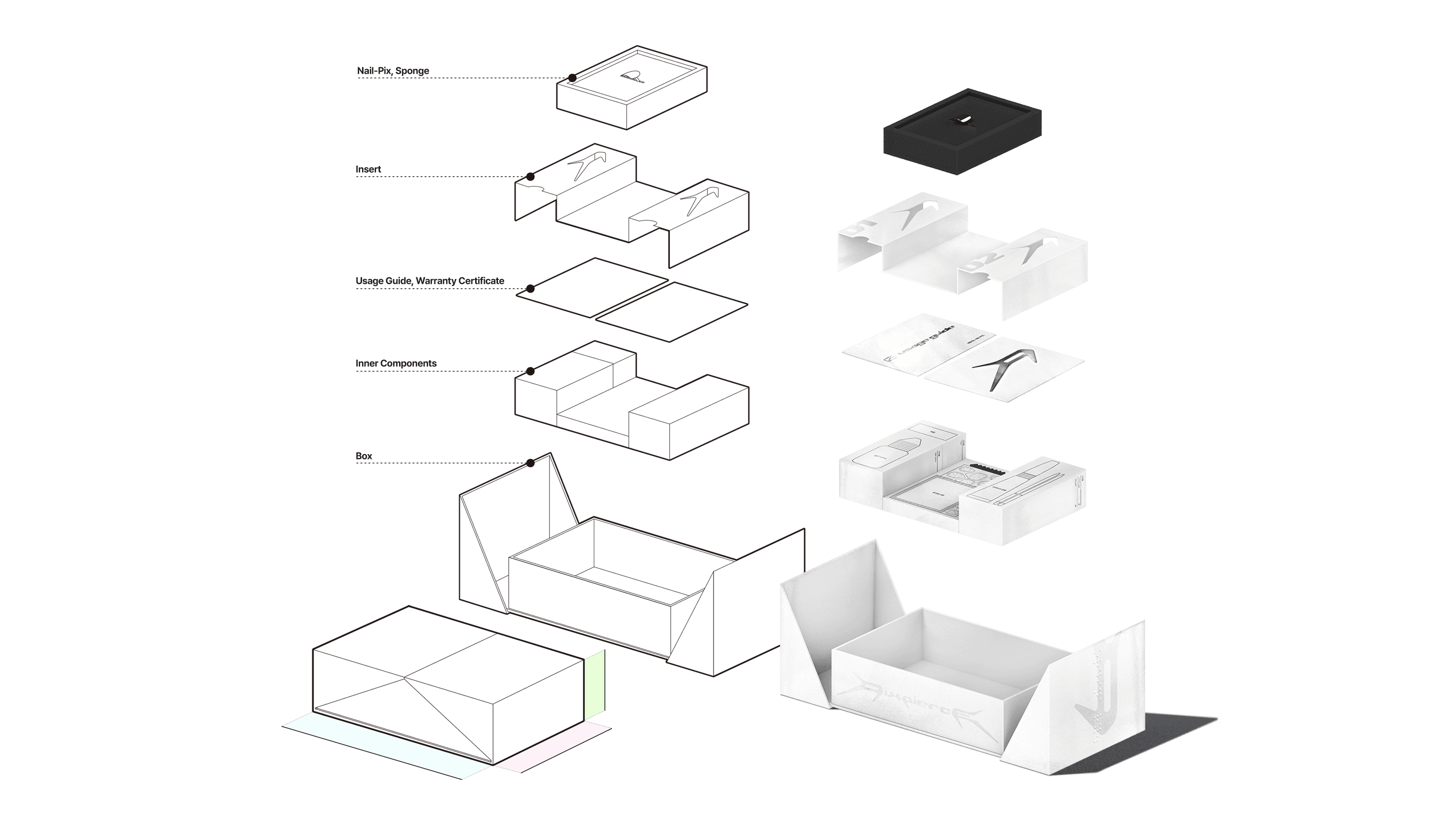
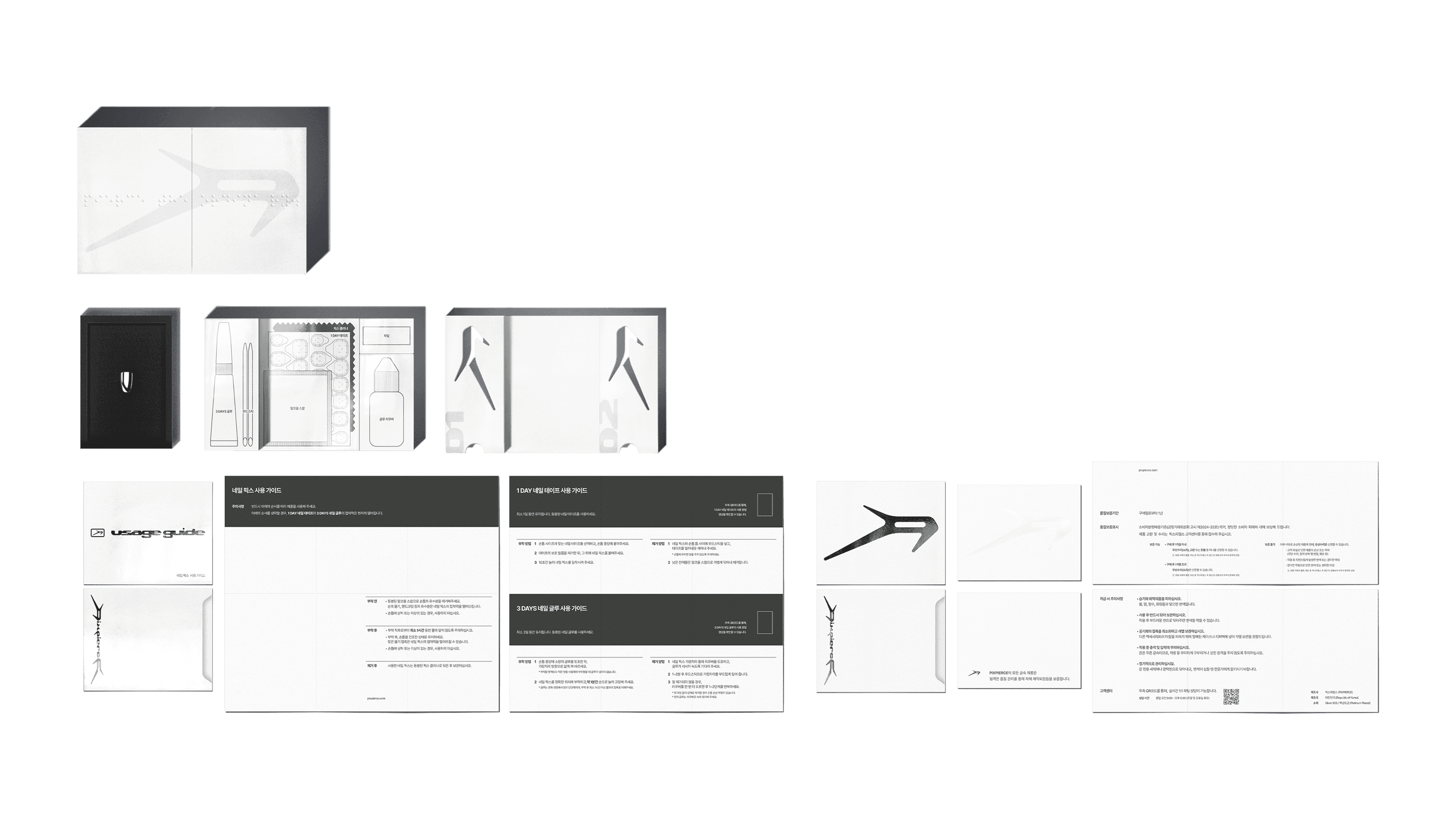
2) NAIL-PIX PACKAGE
Components
1F Usage Guide 1p, Warranty Card 1p
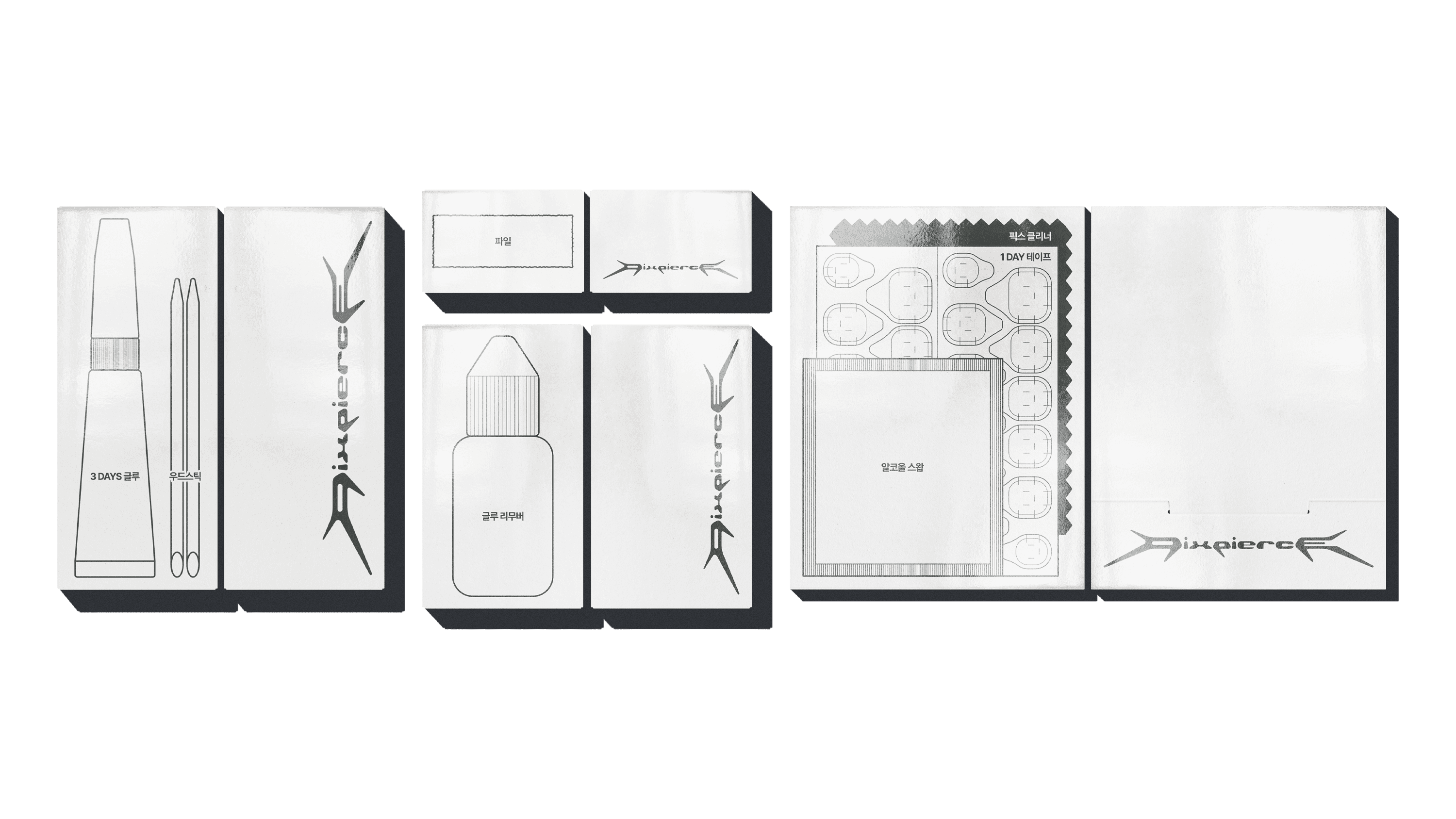
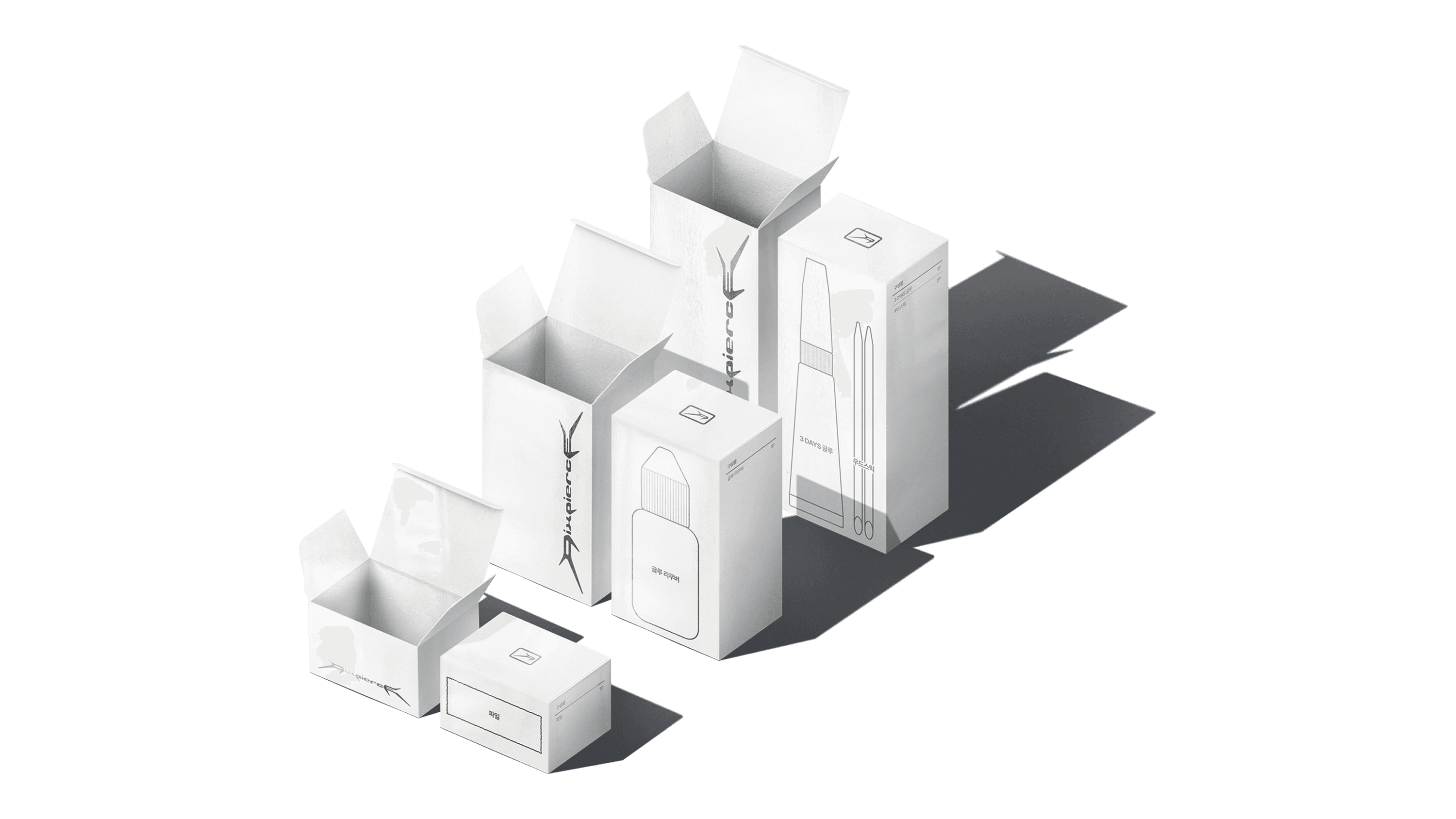
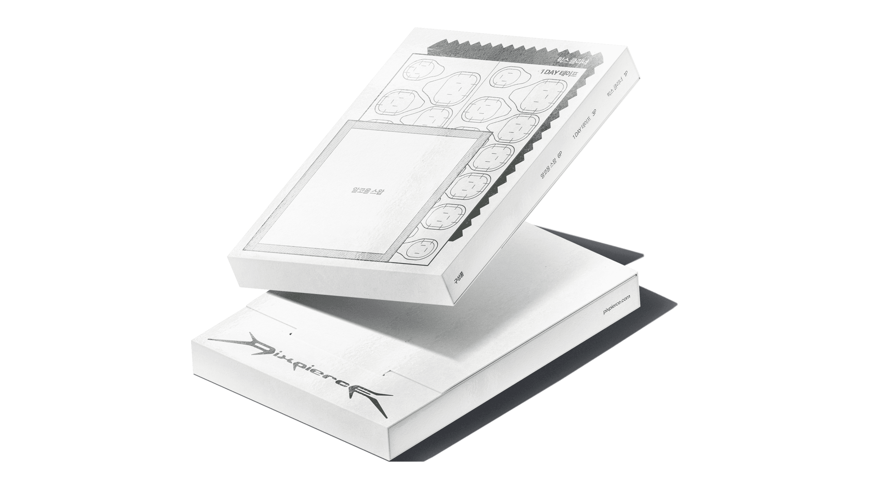
2F 7 Nail-related materials classified in 4 boxes ① 3 DAYS Glue 1p + Wood Sticks 2p ② Alcohol Swabs 3p + 1 DAY Tape 1p + Pix Cleaner 1p ③ Glue Remover 1p ④ File 1p
3F Insert + Sponge + 1 Nail-Pix
1F This layer holds the Usage Guide and the Warranty Certificate. The Usage Guide is printed on clean white paper with information arranged clearly and concisely, maintaining PIXPIERCE’s understated tone. In contrast, the Warranty Card uses a paper with a jacquard-patterned micro-embossed texture, emphasizing the visual and tactile solidity appropriate for an official certificate.
2F This layer stores four component boxes that hold the materials used to attach and remove the Nail-Pix. Each box fits precisely within the internal dimensions, and illustrations and labels are printed on the front of each box to allow users to quickly identify and take out the materials they need. The seamless, evenly aligned arrangement minimizes internal movement and withstands external impact.
3F On top of the second layer, a sheet cut in the shape of the PIXPIERCE logo is placed to distinguish between layers. Finally, the core product, the ‘Nail-Pix’ is stored here. The Nail-Pix is firmly fixed within a black velvet sponge mold, giving it a floating presence, and the sponge acts as a background color that makes the silver metal material stand out even more.
03 WEB DESIGN
In the third step, we applied the visual language and Core Values (¹Detachment, ²Ferocity, ³Intentionality) established in the PIXPIERCE BI directly to the web and mobile interfaces. The site was designed using the Korean web design platform “I’mweb,” and although the platform has certain limitations in coding and design, it can still be considered a case where the visual elements were implemented effectively.
LAYOUT SYSTEM
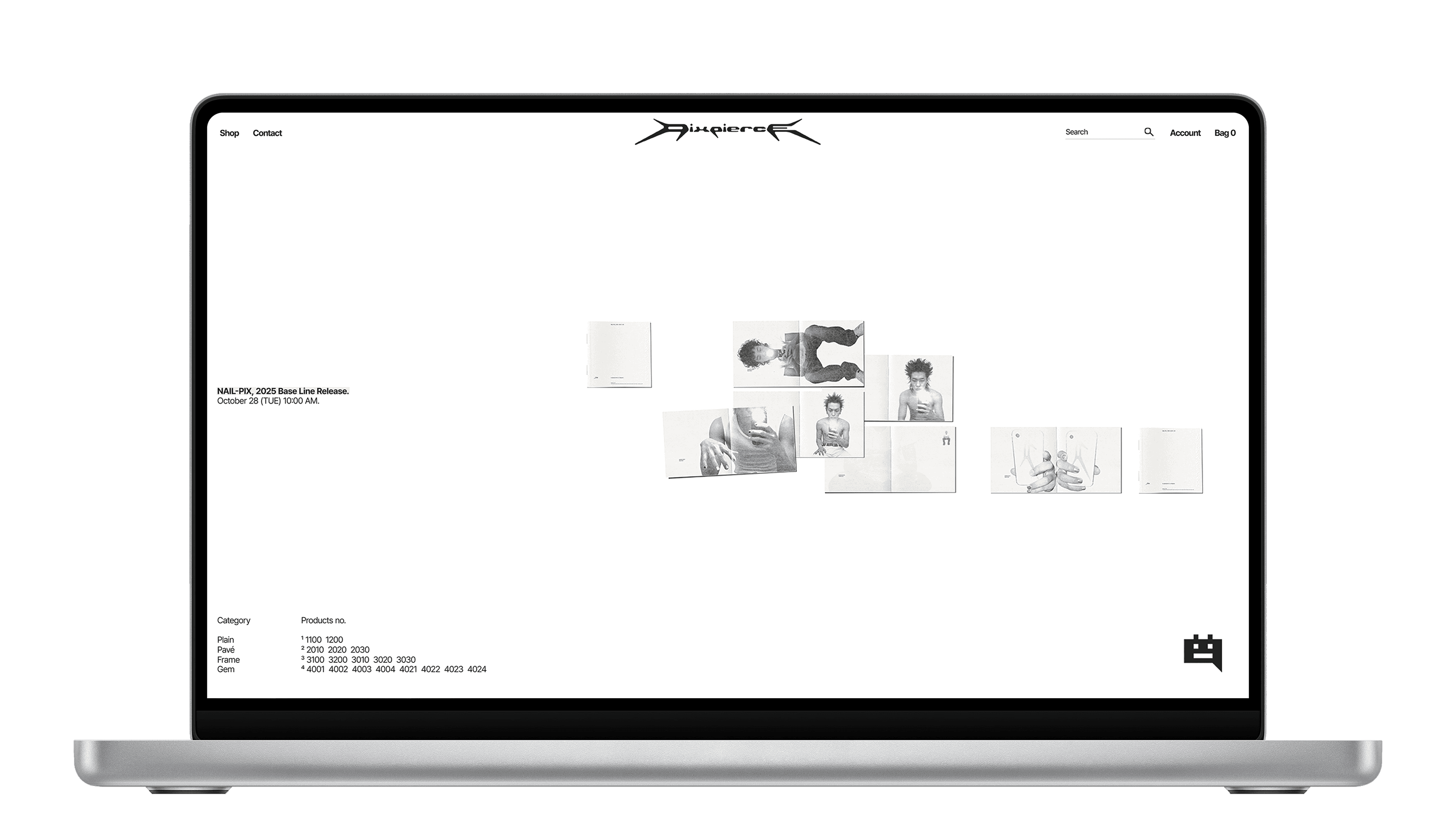
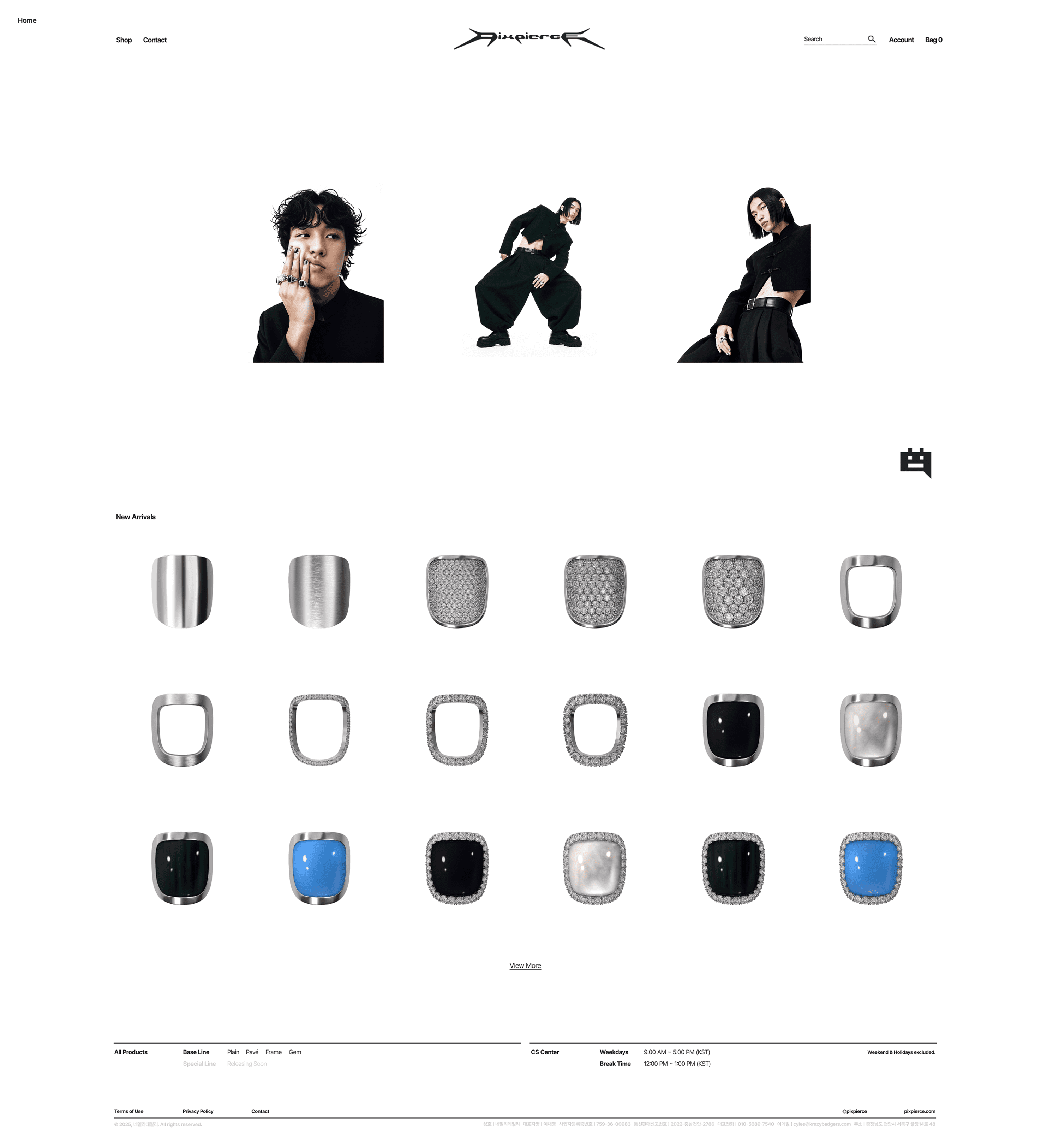
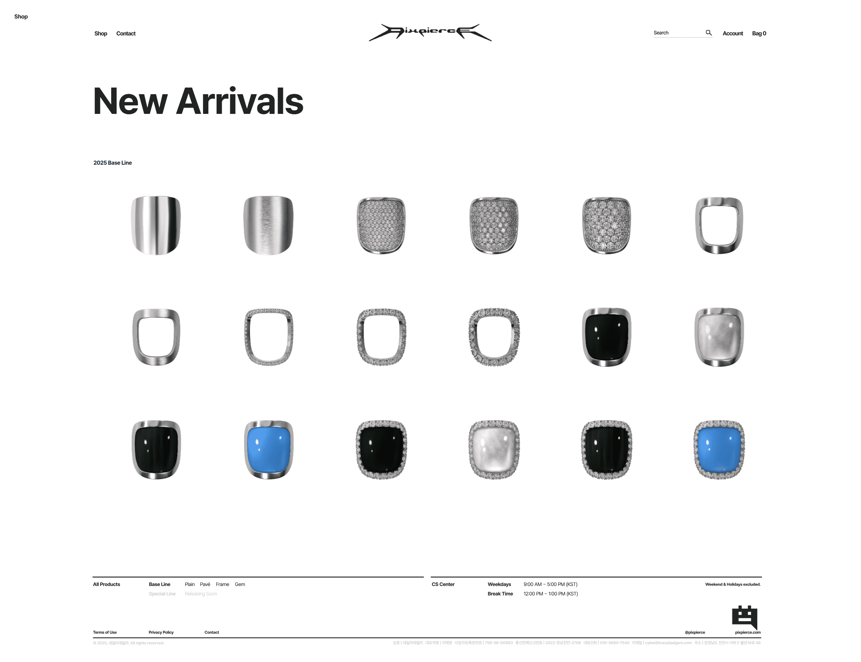
PIXPIERCE’s main pages (Home, Product, Store, Account, Order, etc.) are aligned on a standard fixed width of 1920px using a 12-column grid with an 80px gutter. The Home page consists of three sections: [Main Notice (Text) → Sub Notice (Image) → New Arrivals]. Its notable characteristics are that product images or videos do not occupy the entire screen, and the design remains minimal, centered on whitespace and typography. In particular, the first section, Main Notice, is composed mainly of text, but a hover and transition effect is applied so that a representative image expressing the brand’s aesthetic appears. This hover effect provides a sense of reward for mouse movement within the whitespace.
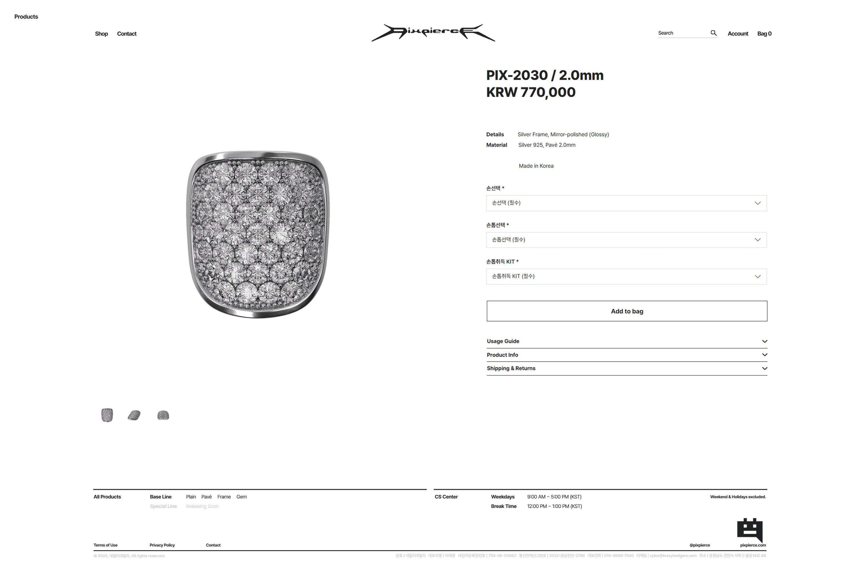
The Product Detail page is composed of a layout with thumbnails on the left and product descriptions on the right. Below the product description, information such as how to use Nail-Pix, shipping, exchanges, and refunds is organized within an accordion structure, allowing long-form content to be stored and organized in one place.
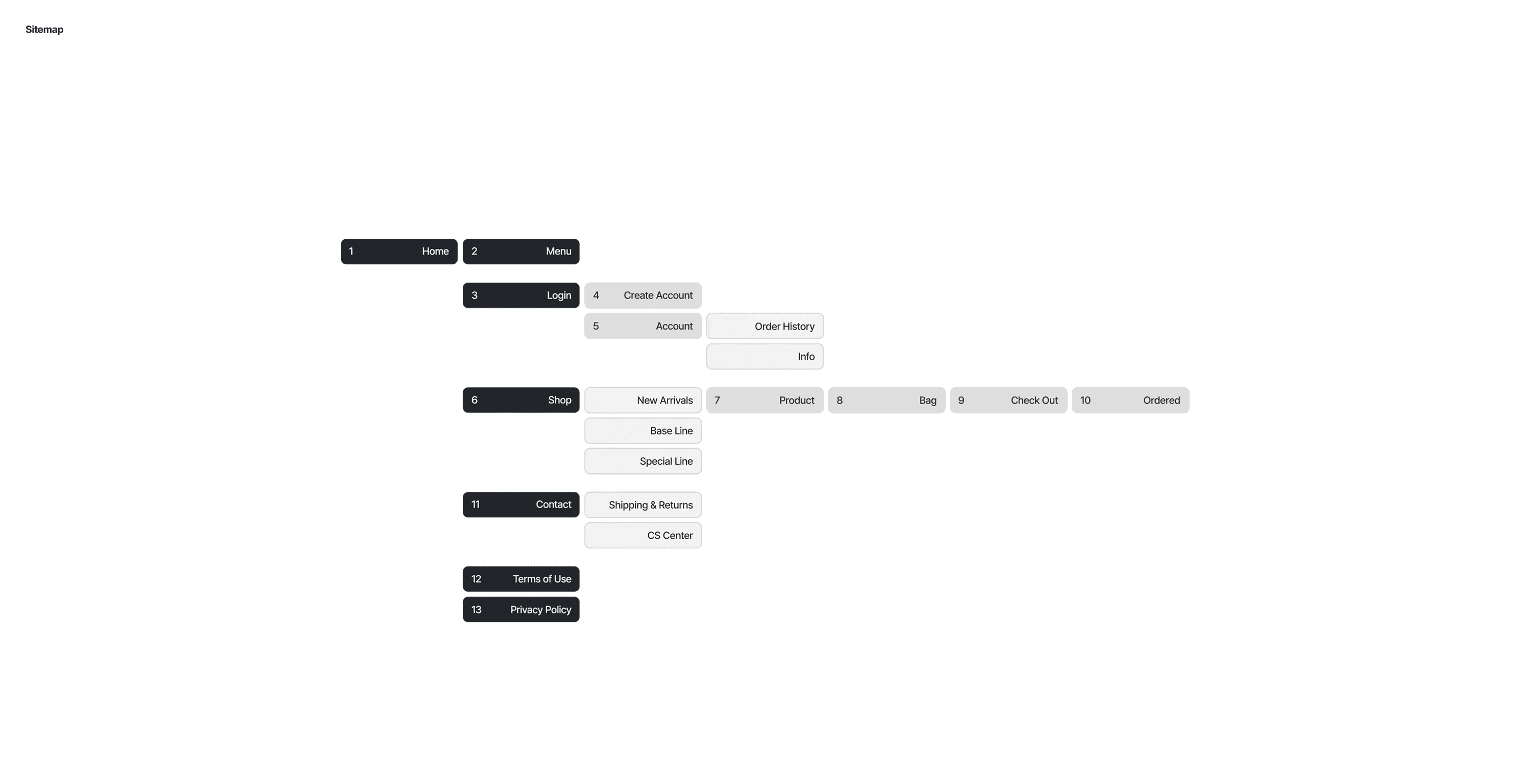
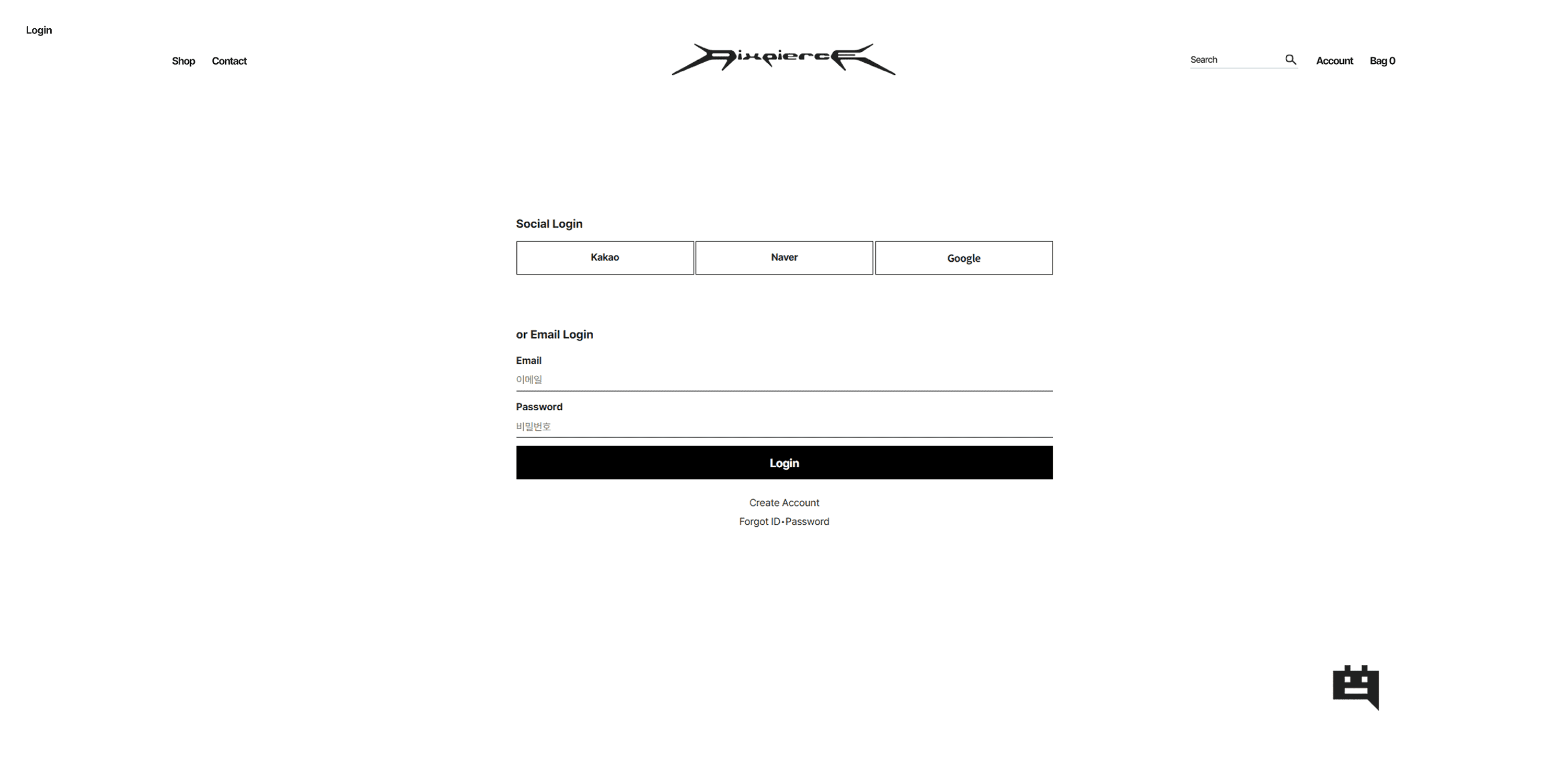
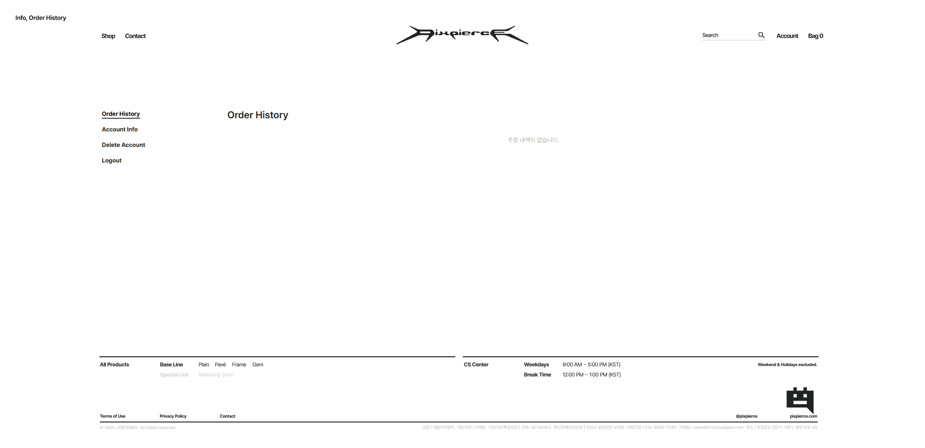
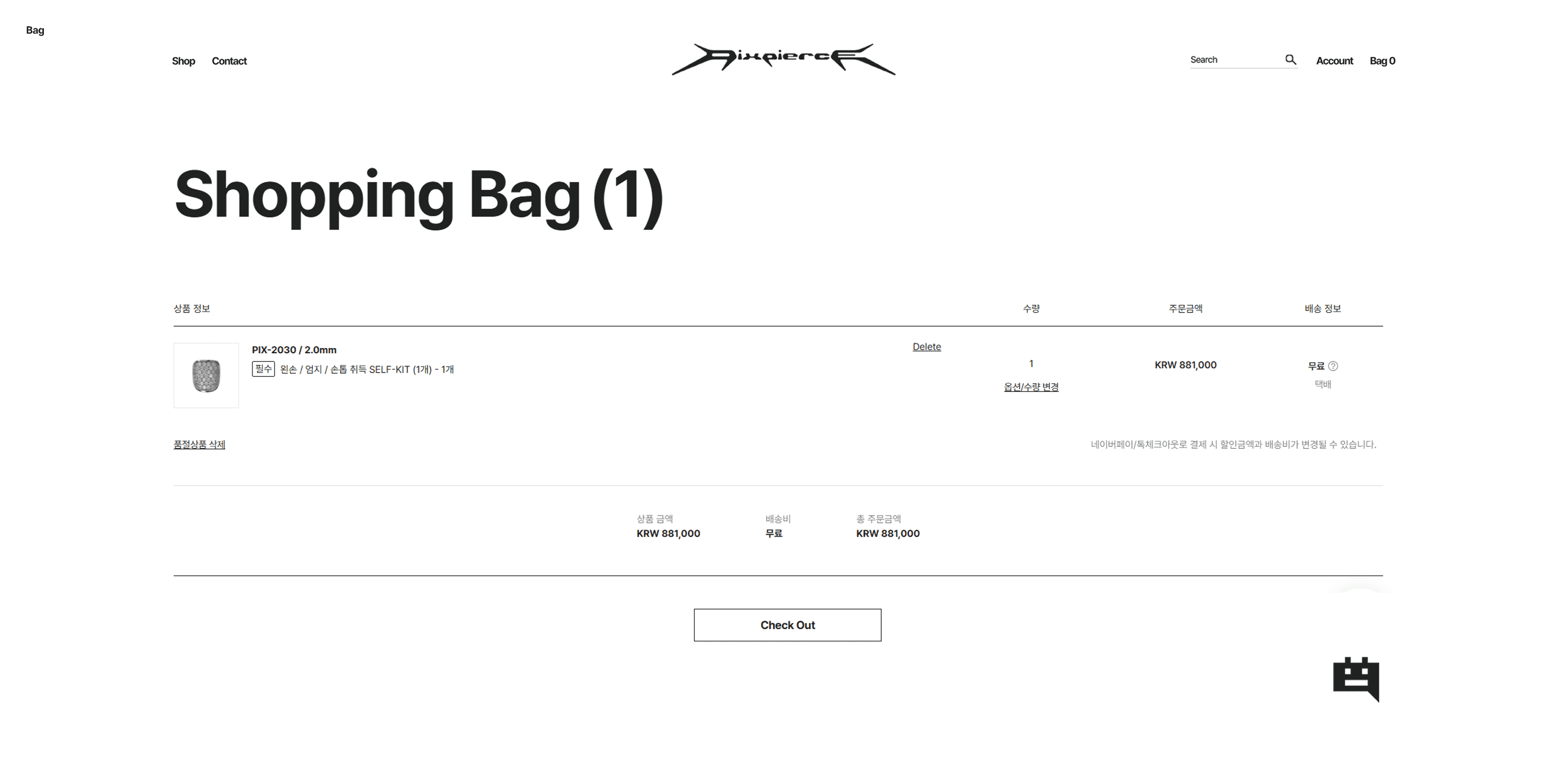
NAVIGATION & STRUCTURE
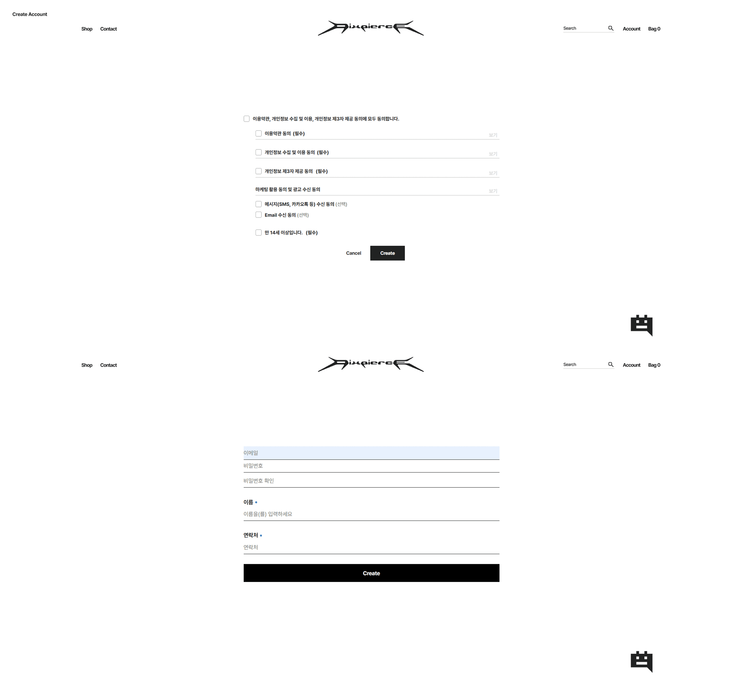
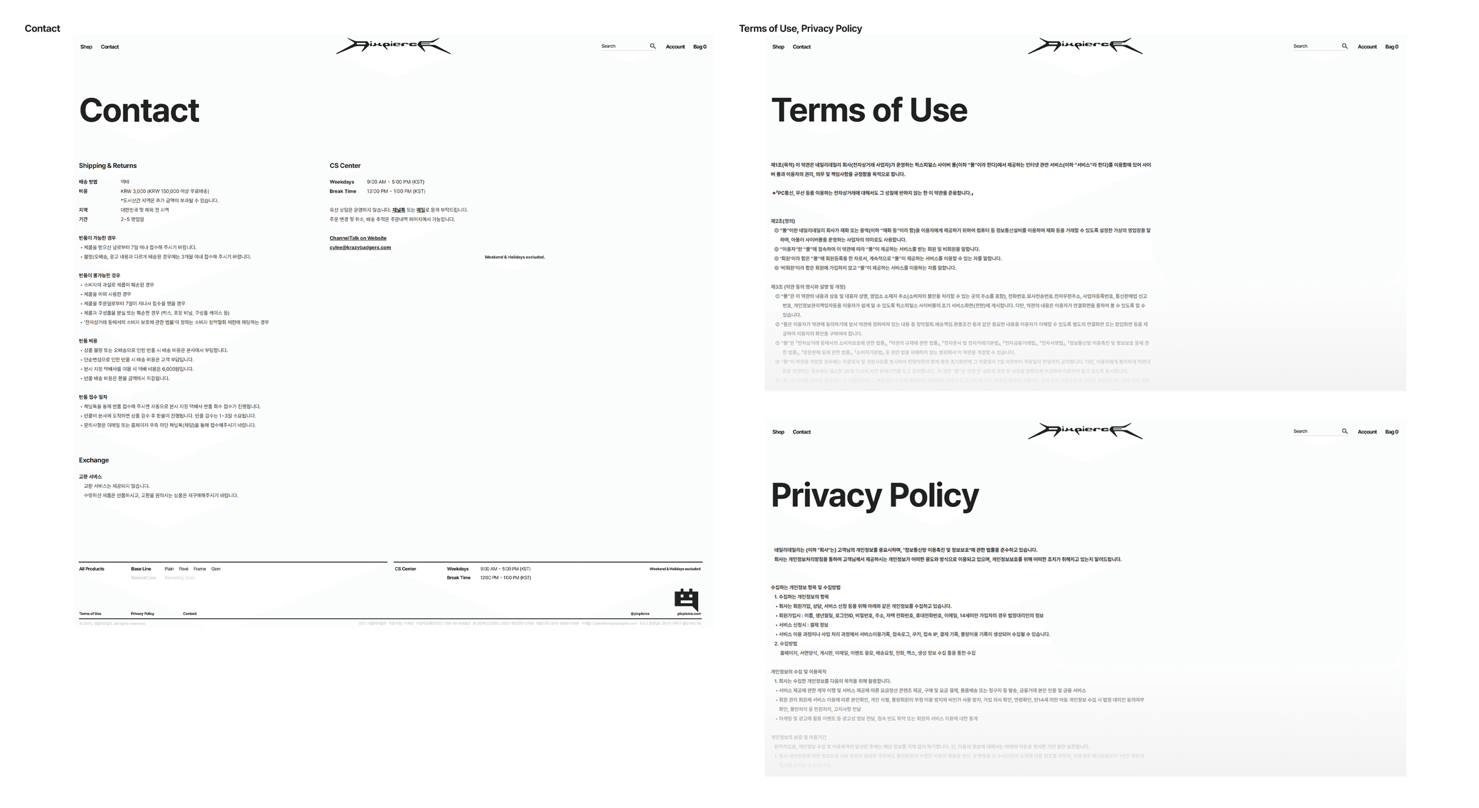
The navigation uses five top menus [Shop / Contact / Search / Account / Bag], with a direct-access structure composed of minimal subcategories. At the bottom of the webpage, the Terms of Use, Privacy Policy, and required information are arranged in a simple layout. The Terms of Use and Privacy Policy pages fully comply with e-commerce standards, while being organized in a way that does not deviate significantly from the overall design direction.
FONT & COLOR
The system font Pretendard is used throughout the site. Bold or Black is applied to headings, while body text and button areas use Regular weight to ensure readability and lightness. Font and line colors are unified in Khaki Black (#1E1E1A), which is the RGB version of the BI color system (Light Khaki – Khaki – Black Khaki). All pages use a clean white background (#FFFFFF) to maintain clarity and contrast. Another characteristic is the minimal use of color outside of product images; color is only applied in hover states, where a 10–20% tone variation appears.
04 SNS CONTENTS DESIGN
In the final step, we planned and designed SNS content that presents the PIXPIERCE BI. Since SNS serves not only as a communication channel with customers but also as the brand’s speaker, determining what to show and what to say is important. To create content that conveys not only product promotion but also the identity of PIXPIERCE, we used 3D motion videos, 3D product cuts, and printed materials. The scope of our direction is as follows.
STRUCTURE OF CONTENTS DIRECTION
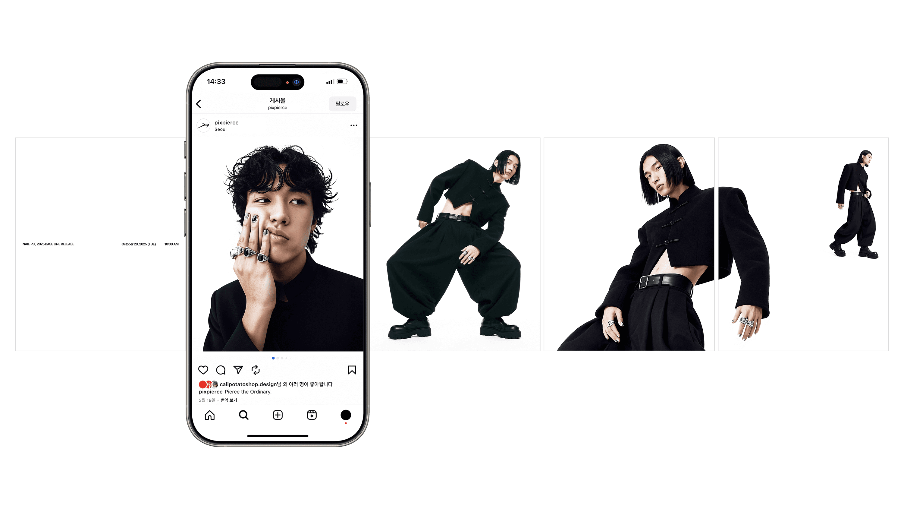
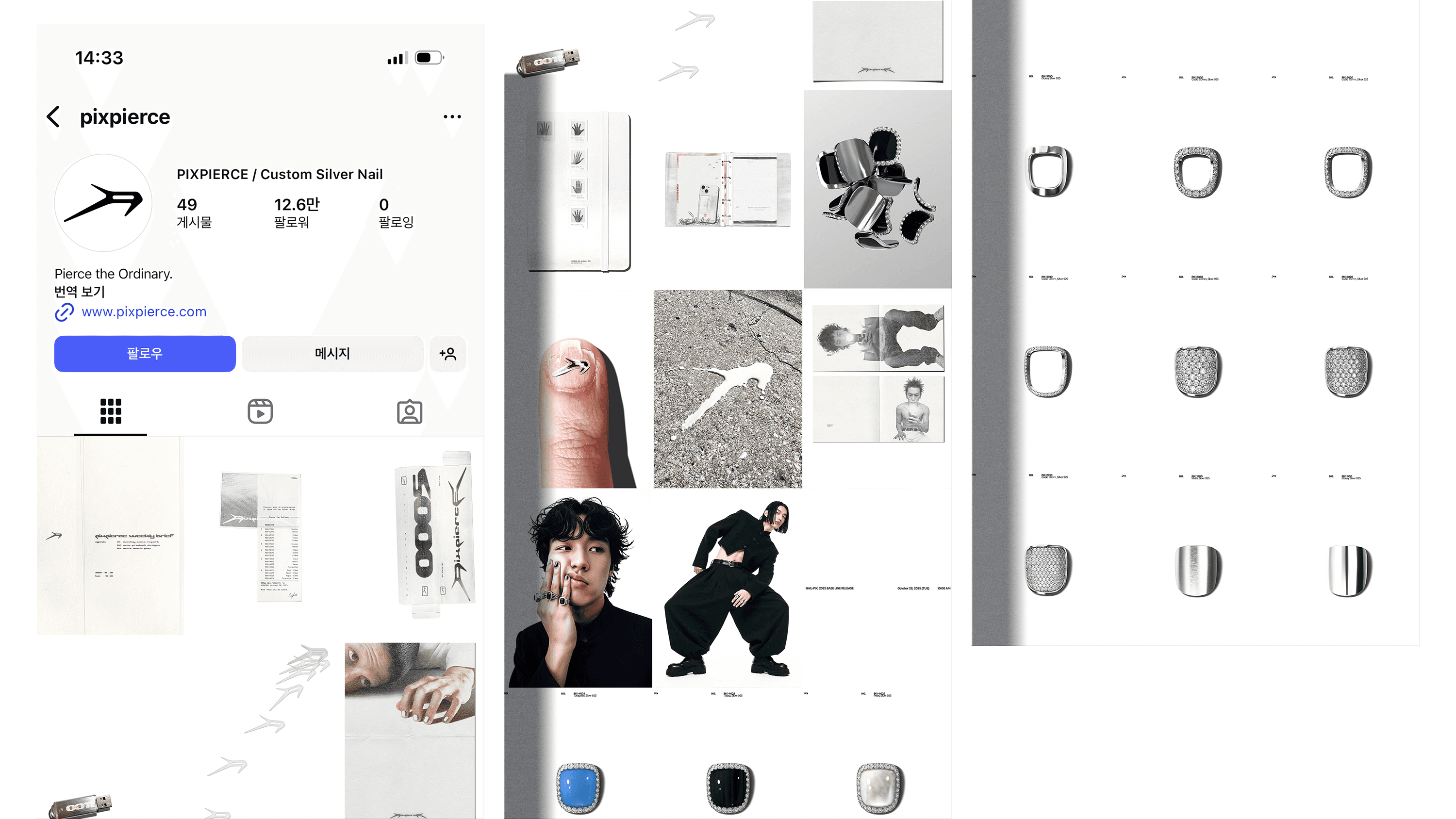
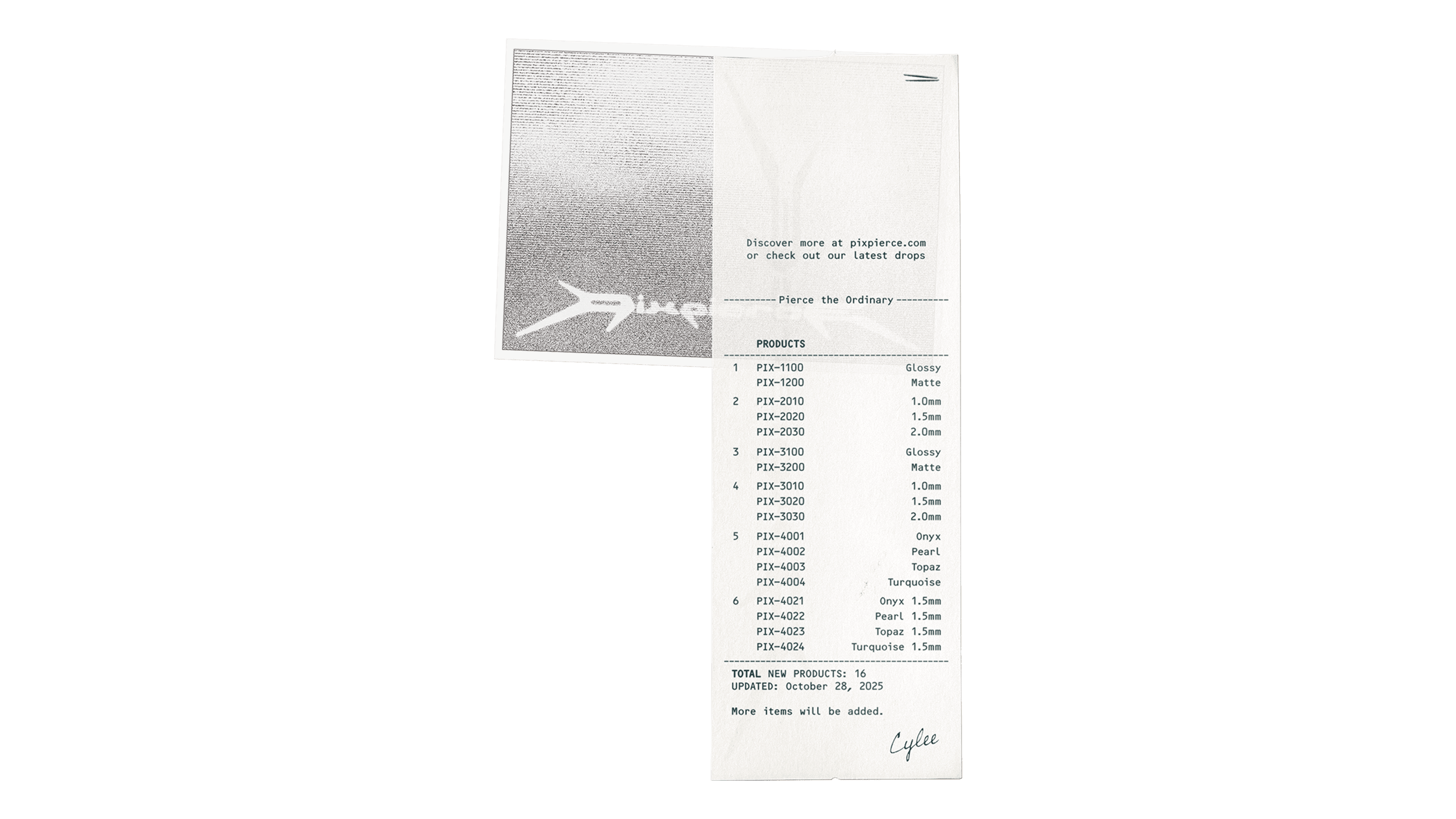
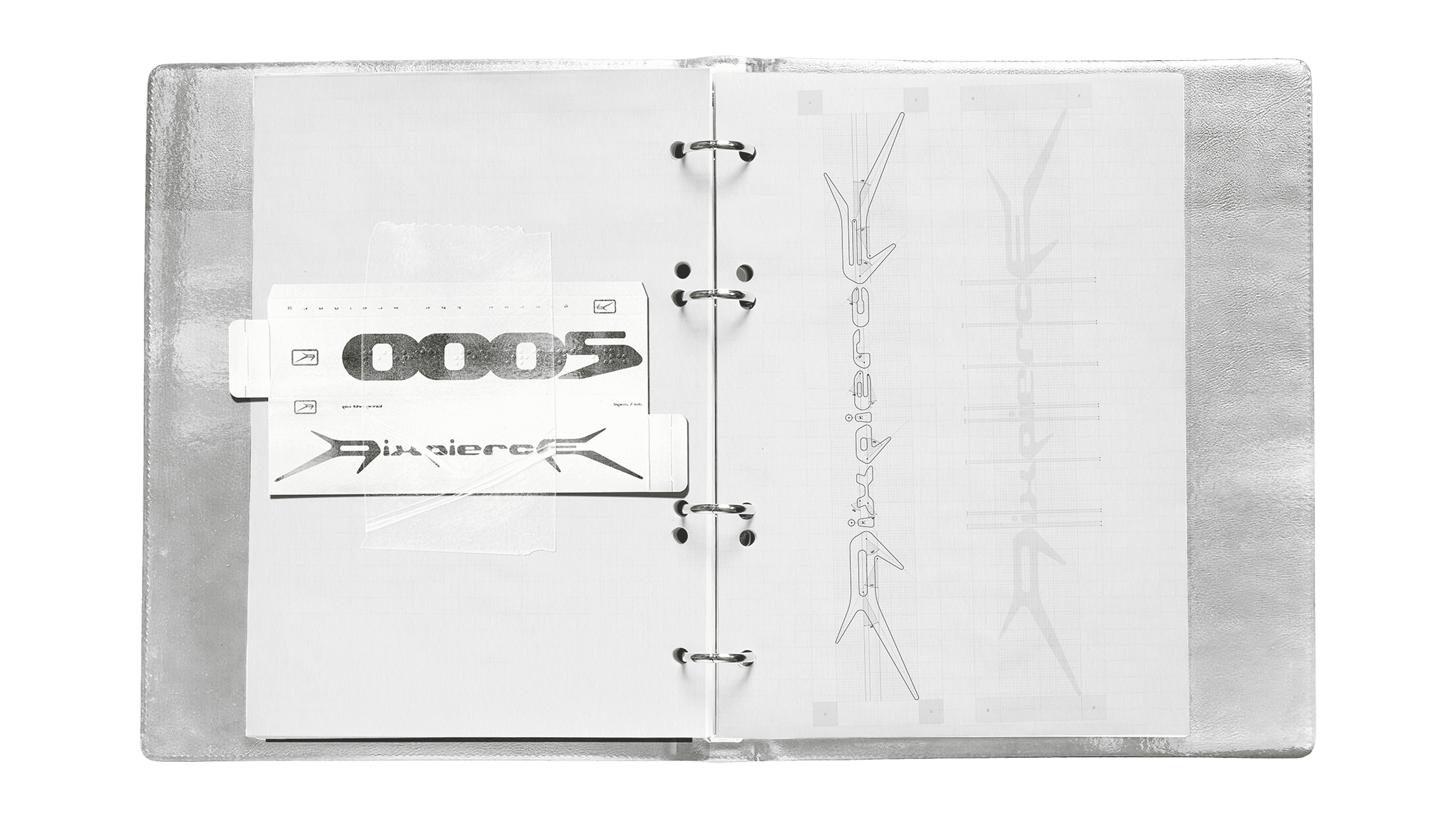
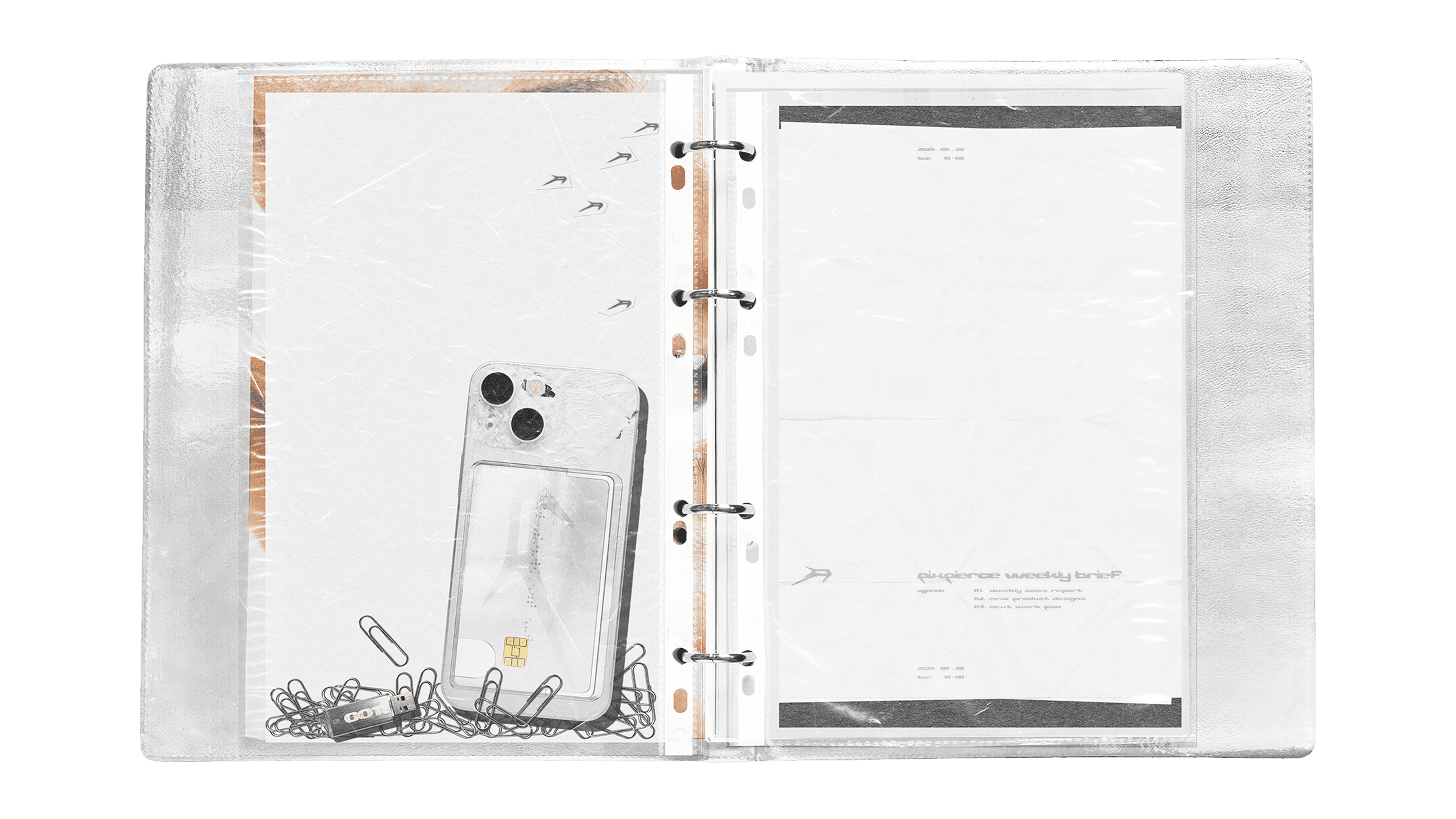
We approached the content by dividing it into three main categories: ① Product-centered, ② Lifestyle/User-centered, ③ Brand Story-centered. Although classified into different types, all content was created based on the previously established BI system. We used a unified color palette of White–Silver–Khaki Black and limited the application of the PIXPIERCE typeface and wordmark to within 5% of the overall layout. This resulted in a consistent tone and manner across the content feed. We also ensured that the early brand content did not give the impression of aggressively pushing purchases. To achieve this, we incorporated casually photographed items such as receipts, A4 files, and printed matter—an approach that brings the brand’s private, archival-like everyday moments into the content in a way that leaves a positive impression on customers.
3D SCENES
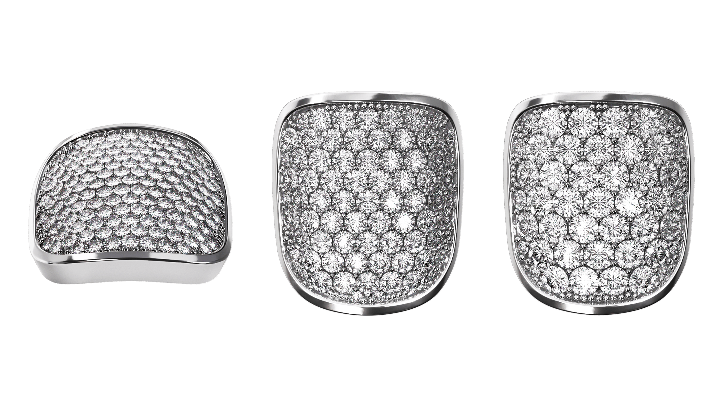
Although PIXPIERCE’s Nail-Pix is an accessory as small as a fingernail, it carries the product’s quality, meaning how sincerely PIXPIERCE can deliver a truthful product to the customer. We produced 3D rendered images that highlight the metal texture and strong reflections, and actively used them as product thumbnails. Additionally, we created short 10-second 3D motion videos, applying magnetic motion physics to show the products attracting and separating from each other. The products featured in the video are PIX-4001 Onyx and PIX-4021 Onyx 1.5mm.
AI MODEL & PHOTOS
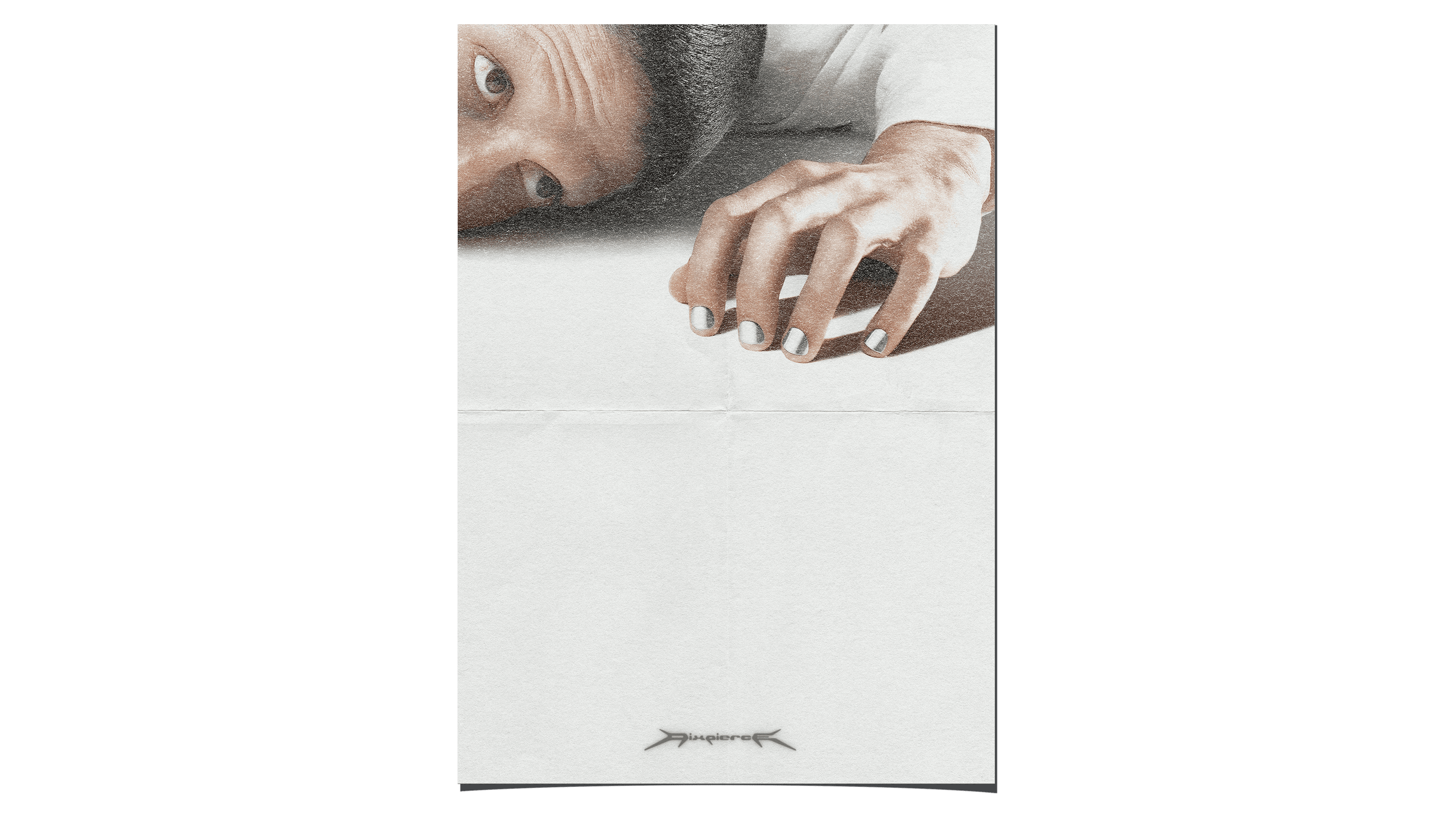
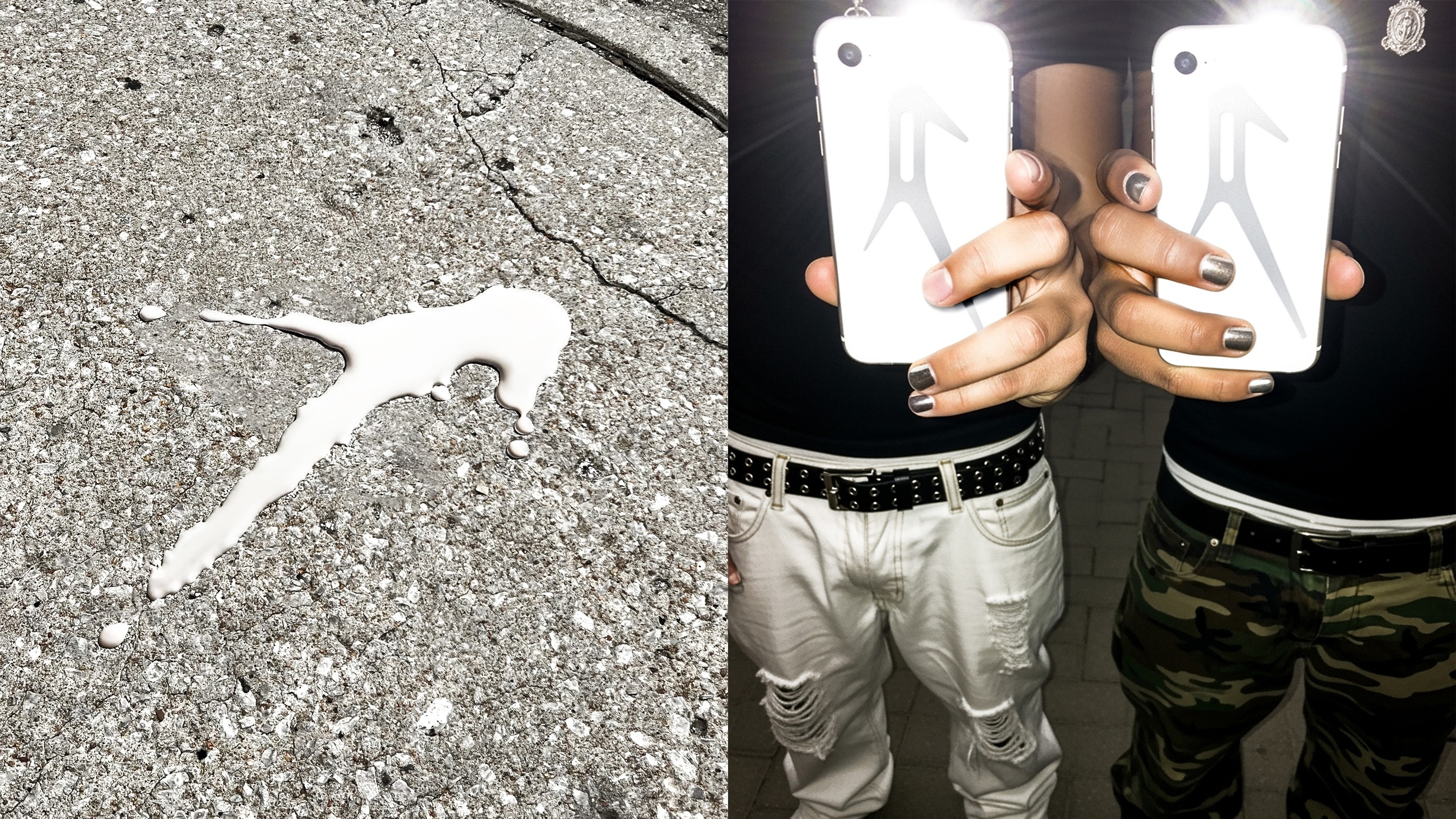
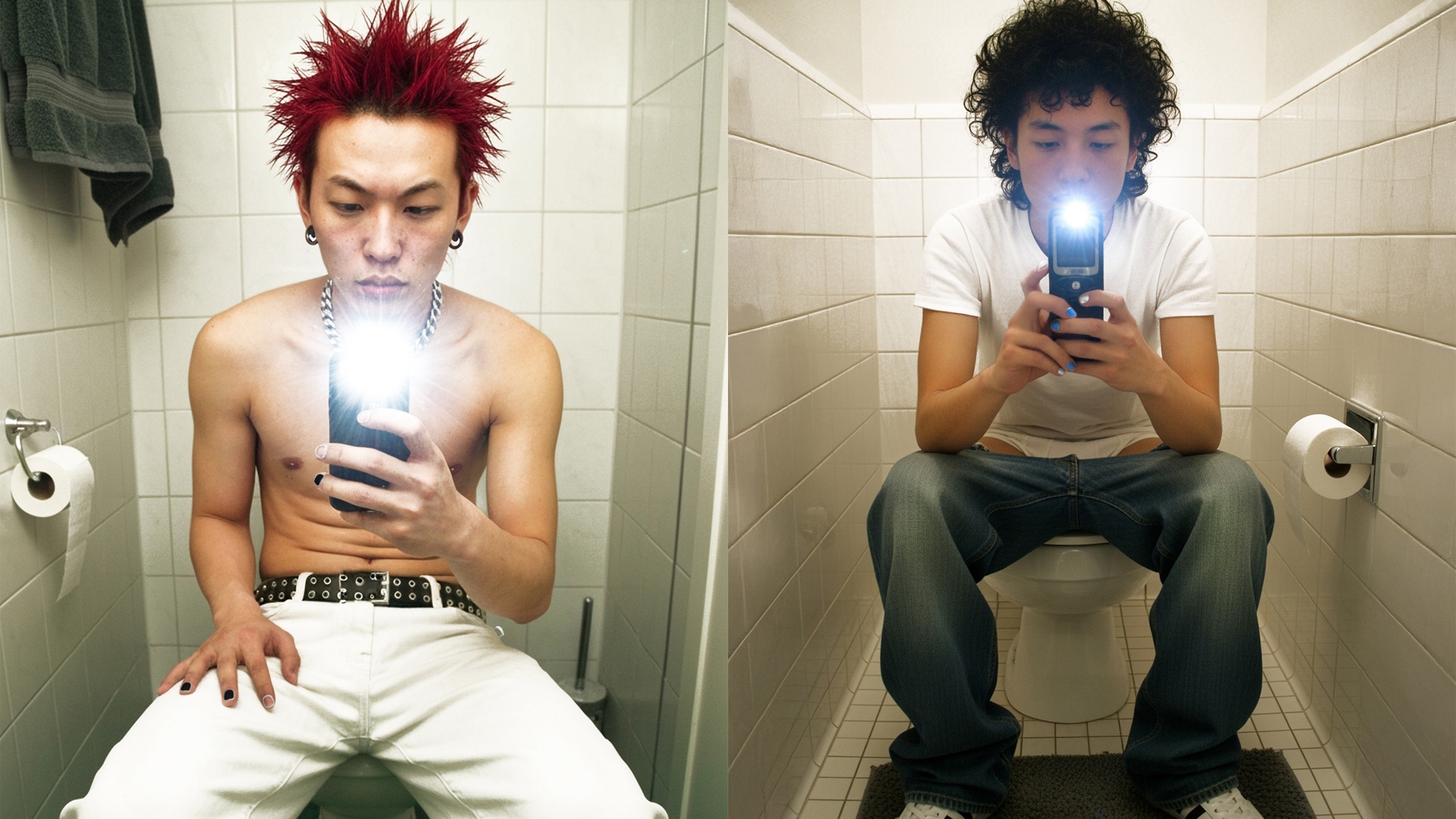
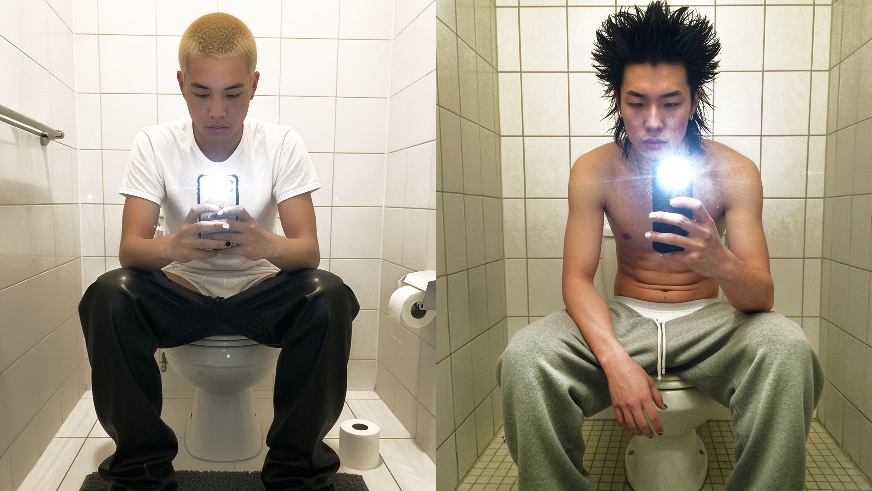
Since PIXPIERCE had not yet conducted actual product or model photography, we produced AI-generated images to propose concepts for the photoshoot. To highlight the vivid color of the stones and the metal texture, we intended scenes of a model wearing monochrome suits in a white studio background, striking dynamic poses and expressions. These cuts were used for SNS content and on the website. We also suggested additional everyday shots taken with a smartphone in a bathroom. This was intended to convey the message that wearing Nail-Pix, even in a place where no one is watching (the bathroom), is not about seeking attention from others, but about wearing accessories purely for one’s own satisfaction.
CAPTION & SOUND
With Instagram’s recent addition of sound features to its content, we were able to create an experience enjoyable both visually and aurally. Music that suits the content can draw interest, make users stay longer, and deliver deeper inspiration. For this reason, we also suggested appropriate music and captions that PIXPIERCE could use. For the 3D motion videos, we added low-frequency, bass-centered sound to convey a sensation as if the metal were vibrating. Captions were composed as short lines that indirectly reveal the intention behind the content.


OVERVIEW
This spring, we met PIXPIERCE. PIXPIERCE is a brand that aims to redefine the norms and boundaries of beauty within the unfamiliar category of men’s metal nail accessories. Based on the brand’s powerful items, we expanded its philosophy visually and built it into a functioning system.
CLIENT
YEAR
2025
SCOPE
SCOPE
2D Graphics
3D Modeling
3D Rendering
3D Scenes
3D Texture & Mapping
3D Video
Applications
Brand Assets Usage Guide
Brand Experience
Brand Identity
Brand Strategy
Consulting & Direction
Logo
Packaging
SNS Contents
Systemization of Design Assets
Typeface
Web Design
2D Graphics
3D Rendering
3D Texture & Mapping
Applications
Brand Experience
Brand Strategy
Logo
SNS Contents
Typeface
3D Modeling
3D Scenes
3D Video
Brand Assets Usage Guide
Brand Identity
Consulting & Direction
Packaging
Systemization of Design Assets
Web Design
2D Graphics
3D Texture & Mapping
Brand Experience
Logo
Typeface
3D Modeling
3D Video
Brand Identity
Packaging
Web Design
3D Rendering
Applications
Brand Strategy
SNS Contents
3D Scenes
Brand Assets Usage Guide
Consulting & Direction
Systemization of Design Assets
01 BRAND IDENTITY & DESIGN SYSTEM
BRAND PHILOSOPHY & CORE, ESSENCE
PIXPIERCE’s philosophy consists of the following: ¹Detachment (Emotional restraint), ²Ferocity (Raw honesty), ³Intentionality (Deliberate attitude). These three Core Values form the pillars of the brand and the starting point of every visual language. We divided this philosophy into the two keywords “Pierce” and “Pix(Fix),” interpreting them as the act of piercing through what is ordinary (Pierce) and the convictions one must hold (Pix). Based on this, we established the slogan “Pierce the Ordinary.”
LOGO IDEATION & DESIGN
The logo designing began with the wild character of the honey badger, which served as the foundational inspiration for PIXPIERCE at its establishment. We sketched its instinctive and aggressive movement into a three-branch linear form shaped as the letter “P,” completing an initial lettermark representing the Core Values. The coexistence of restrained curves and sharp edges compresses the brand’s slogan “Pierce the Ordinary.” into a visual form. A matching horizontal wordmark was developed accordingly, and both the initial lettermark and wordmark were designed to maintain a consistent impression across different environments.
SLOGAN
The slogan “Pierce the Ordinary” was converted into a Braille pattern and applied as embossed graphics on print materials. This approach allowed the slogan to function beyond text, extending into the tactile realm.
COLOR SYSTEM
The color system plays a crucial role in defining the brand’s impression. The palette [Light Khaki, Khaki, Black Khaki] captures the subtle balance between the coldness of silver metal and the warmth of skin. Each color was precisely divided and standardized using RGB, CMYK, and PANTONE values to ensure consistent use across print and digital environments.
TYPEFACE
The custom typeface Pixpierce-Display Bold is an expanded logotype-based font that applies the structural logic of the lettermark. The typeface focuses on directionality and momentum rather than stable symmetry, removing unnecessary curves to emphasize the raw energy of straight lines. It is the brand asset that most directly communicates PIXPIERCE’s attitude.
Through the first step, we established PIXPIERCE’s ‘Raw honesty’ and ‘Intentional refinement’ as a coherent visual system. PIXPIERCE now positions itself as a bold tool that pierces through existing norms. Pierce the Ordinary.
02 PACKAGE STRUCTURE & DESIGN SYSTEM
While the first step of BI and design system development deeply explored PIXPIERCE’s attitude, the second step focused on improving storage methods of existing packages and designing new structures that translate into real customer experience. The core of package system design was to utilize limited space efficiently to store all components, while allowing users to easily understand how to use them. This resulted in two types of packages. The packages received by the customer consist of a first and second package, totaling two types.
1) SELF-KIT FOR NAIL ACQUISITION
Components
Mold Part 1 & 2, Nail Acquisition Prep Sheet, Mold Storage Pouch
The first package is the Self-Kit, which contains materials that allow customers to capture the shape of their nails. The kit uses a multi-layered mono box combining a dual-lid structure with inserts, and the sequence is clearly designed as [Open → Check → Use]. Instead of a simple open-and-take structure, the box guides the user to follow the steps in order. Inside, the Usage Guide is printed with an intuitive layout featuring step-by-step separation, symmetrical composition, and clear illustrations. All small components are also arranged carefully to stay organized.
One of the components ‘the Prep-Sheet’ received particular attention. We approached this sheet as a UI (User Interface). Within an extremely small area, the key was designing a layout where the user’s flow, eye movement, and hand motion could proceed without errors. In other words, it is a compact paper interface designed with error-minimization as its purpose. Assuming that mistakes are likely during the process, the sheet was built so the user can easily understand the order in which nails should be captured. We structured information by priority and placed text, simplified icons, and illustrations together so the user can act immediately without reading long instructions. The sheet needed to function as an “Easy Doing Tool”, a simple yet functional tool that allows the user to attach and remove the nails correctly, with minimal space allowance and proper grip points. This sheet is an example of true user-based package structure development that prioritizes functionality over aesthetics.
User Flow Requirements Summary
• Compact area with appropriate mold volume
• Structure enabling the nail to be imprinted perfectly, not too deep or too shallow
• Shape allowing easy removal of the hardened mold
▾ STRUCTURE TEST PROGRESS OF THE PREP-SHEET
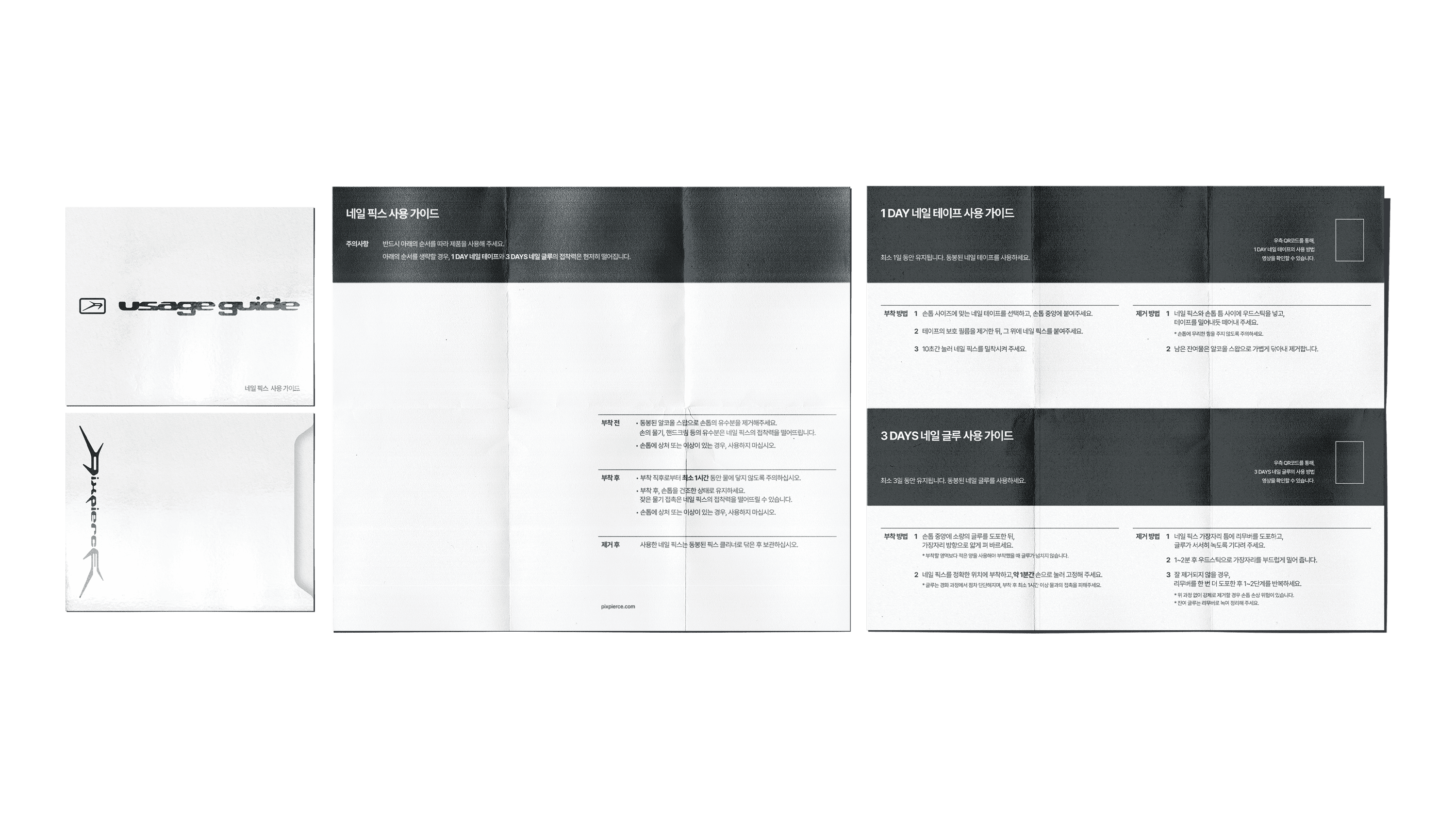
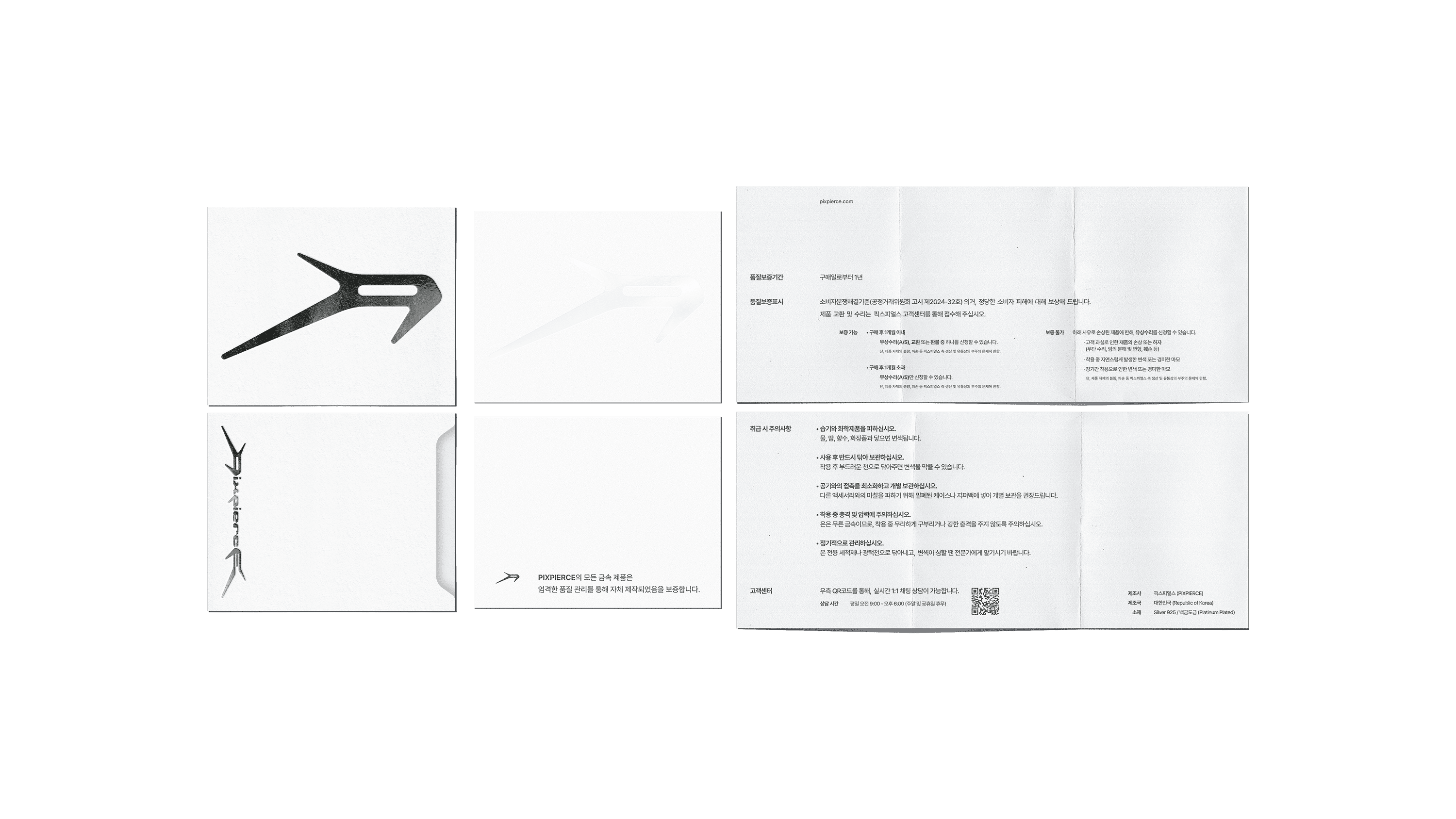
2) NAIL-PIX PACKAGE
Components
1F Usage Guide 1p, Warranty Card 1p
2F 7 Nail-related materials classified in 4 boxes ① 3 DAYS Glue 1p + Wood Sticks 2p ② Alcohol Swabs 3p + 1 DAY Tape 1p + Pix Cleaner 1p ③ Glue Remover 1p ④ File 1p
3F Insert + Sponge + 1 Nail-Pix
1F This layer holds the Usage Guide and the Warranty Certificate. The Usage Guide is printed on clean white paper with information arranged clearly and concisely, maintaining PIXPIERCE’s understated tone. In contrast, the Warranty Card uses a paper with a jacquard-patterned micro-embossed texture, emphasizing the visual and tactile solidity appropriate for an official certificate.
2F This layer stores four component boxes that hold the materials used to attach and remove the Nail-Pix. Each box fits precisely within the internal dimensions, and illustrations and labels are printed on the front of each box to allow users to quickly identify and take out the materials they need. The seamless, evenly aligned arrangement minimizes internal movement and withstands external impact.
3F On top of the second layer, a sheet cut in the shape of the PIXPIERCE logo is placed to distinguish between layers. Finally, the core product, the ‘Nail-Pix’ is stored here. The Nail-Pix is firmly fixed within a black velvet sponge mold, giving it a floating presence, and the sponge acts as a background color that makes the silver metal material stand out even more.
03 WEB DESIGN
In the third step, we applied the visual language and Core Values (¹Detachment, ²Ferocity, ³Intentionality) established in the PIXPIERCE BI directly to the web and mobile interfaces. The site was designed using the Korean web design platform “I’mweb,” and although the platform has certain limitations in coding and design, it can still be considered a case where the visual elements were implemented effectively.
LAYOUT SYSTEM
PIXPIERCE’s main pages (Home, Product, Store, Account, Order, etc.) are aligned on a standard fixed width of 1920px using a 12-column grid with an 80px gutter. The Home page consists of three sections: [Main Notice (Text) → Sub Notice (Image) → New Arrivals]. Its notable characteristics are that product images or videos do not occupy the entire screen, and the design remains minimal, centered on whitespace and typography. In particular, the first section, Main Notice, is composed mainly of text, but a hover and transition effect is applied so that a representative image expressing the brand’s aesthetic appears. This hover effect provides a sense of reward for mouse movement within the whitespace.
The Product Detail page is composed of a layout with thumbnails on the left and product descriptions on the right. Below the product description, information such as how to use Nail-Pix, shipping, exchanges, and refunds is organized within an accordion structure, allowing long-form content to be stored and organized in one place.
NAVIGATION & STRUCTURE
The navigation uses five top menus [Shop / Contact / Search / Account / Bag], with a direct-access structure composed of minimal subcategories. At the bottom of the webpage, the Terms of Use, Privacy Policy, and required information are arranged in a simple layout. The Terms of Use and Privacy Policy pages fully comply with e-commerce standards, while being organized in a way that does not deviate significantly from the overall design direction.
FONT & COLOR
The system font Pretendard is used throughout the site. Bold or Black is applied to headings, while body text and button areas use Regular weight to ensure readability and lightness. Font and line colors are unified in Khaki Black (#1E1E1A), which is the RGB version of the BI color system (Light Khaki – Khaki – Black Khaki). All pages use a clean white background (#FFFFFF) to maintain clarity and contrast. Another characteristic is the minimal use of color outside of product images; color is only applied in hover states, where a 10–20% tone variation appears.
04 SNS CONTENTS DESIGN
In the final step, we planned and designed SNS content that presents the PIXPIERCE BI. Since SNS serves not only as a communication channel with customers but also as the brand’s speaker, determining what to show and what to say is important. To create content that conveys not only product promotion but also the identity of PIXPIERCE, we used 3D motion videos, 3D product cuts, and printed materials. The scope of our direction is as follows.
STRUCTURE OF CONTENTS DIRECTION
We approached the content by dividing it into three main categories: ① Product-centered, ② Lifestyle/User-centered, ③ Brand Story-centered. Although classified into different types, all content was created based on the previously established BI system. We used a unified color palette of White–Silver–Khaki Black and limited the application of the PIXPIERCE typeface and wordmark to within 5% of the overall layout. This resulted in a consistent tone and manner across the content feed. We also ensured that the early brand content did not give the impression of aggressively pushing purchases. To achieve this, we incorporated casually photographed items such as receipts, A4 files, and printed matter—an approach that brings the brand’s private, archival-like everyday moments into the content in a way that leaves a positive impression on customers.
3D SCENES
Although PIXPIERCE’s Nail-Pix is an accessory as small as a fingernail, it carries the product’s quality, meaning how sincerely PIXPIERCE can deliver a truthful product to the customer. We produced 3D rendered images that highlight the metal texture and strong reflections, and actively used them as product thumbnails. Additionally, we created short 10-second 3D motion videos, applying magnetic motion physics to show the products attracting and separating from each other. The products featured in the video are PIX-4001 Onyx and PIX-4021 Onyx 1.5mm.
AI MODEL & PHOTOS
Since PIXPIERCE had not yet conducted actual product or model photography, we produced AI-generated images to propose concepts for the photoshoot. To highlight the vivid color of the stones and the metal texture, we intended scenes of a model wearing monochrome suits in a white studio background, striking dynamic poses and expressions. These cuts were used for SNS content and on the website. We also suggested additional everyday shots taken with a smartphone in a bathroom. This was intended to convey the message that wearing Nail-Pix, even in a place where no one is watching (the bathroom), is not about seeking attention from others, but about wearing accessories purely for one’s own satisfaction.
CAPTION & SOUND
With Instagram’s recent addition of sound features to its content, we were able to create an experience enjoyable both visually and aurally. Music that suits the content can draw interest, make users stay longer, and deliver deeper inspiration. For this reason, we also suggested appropriate music and captions that PIXPIERCE could use. For the 3D motion videos, we added low-frequency, bass-centered sound to convey a sensation as if the metal were vibrating. Captions were composed as short lines that indirectly reveal the intention behind the content.
OVERVIEW
This spring, we met PIXPIERCE. PIXPIERCE is a brand that aims to redefine the norms and boundaries of beauty within the unfamiliar category of men’s metal nail accessories. Based on the brand’s powerful items, we expanded its philosophy visually and built it into a functioning system.
CLIENT
YEAR
2025
SCOPE
SCOPE
2D Graphics
3D Modeling
3D Rendering
3D Scenes
3D Texture & Mapping
3D Video
Applications
Brand Assets Usage Guide
Brand Experience
Brand Identity
Brand Strategy
Consulting & Direction
Logo
Packaging
SNS Contents
Systemization of Design Assets
Typeface
Web Design
2D Graphics
3D Rendering
3D Texture & Mapping
Applications
Brand Experience
Brand Strategy
Logo
SNS Contents
Typeface
3D Modeling
3D Scenes
3D Video
Brand Assets Usage Guide
Brand Identity
Consulting & Direction
Packaging
Systemization of Design Assets
Web Design
2D Graphics
3D Texture & Mapping
Brand Experience
Logo
Typeface
3D Modeling
3D Video
Brand Identity
Packaging
Web Design
3D Rendering
Applications
Brand Strategy
SNS Contents
3D Scenes
Brand Assets Usage Guide
Consulting & Direction
Systemization of Design Assets
01 BRAND IDENTITY & DESIGN SYSTEM
BRAND PHILOSOPHY & CORE, ESSENCE
PIXPIERCE’s philosophy consists of the following: ¹Detachment (Emotional restraint), ²Ferocity (Raw honesty), ³Intentionality (Deliberate attitude). These three Core Values form the pillars of the brand and the starting point of every visual language. We divided this philosophy into the two keywords “Pierce” and “Pix(Fix),” interpreting them as the act of piercing through what is ordinary (Pierce) and the convictions one must hold (Pix). Based on this, we established the slogan “Pierce the Ordinary.”
LOGO IDEATION & DESIGN
The logo designing began with the wild character of the honey badger, which served as the foundational inspiration for PIXPIERCE at its establishment. We sketched its instinctive and aggressive movement into a three-branch linear form shaped as the letter “P,” completing an initial lettermark representing the Core Values. The coexistence of restrained curves and sharp edges compresses the brand’s slogan “Pierce the Ordinary.” into a visual form. A matching horizontal wordmark was developed accordingly, and both the initial lettermark and wordmark were designed to maintain a consistent impression across different environments.
SLOGAN
The slogan “Pierce the Ordinary” was converted into a Braille pattern and applied as embossed graphics on print materials. This approach allowed the slogan to function beyond text, extending into the tactile realm.
COLOR SYSTEM
The color system plays a crucial role in defining the brand’s impression. The palette [Light Khaki, Khaki, Black Khaki] captures the subtle balance between the coldness of silver metal and the warmth of skin. Each color was precisely divided and standardized using RGB, CMYK, and PANTONE values to ensure consistent use across print and digital environments.
TYPEFACE
The custom typeface Pixpierce-Display Bold is an expanded logotype-based font that applies the structural logic of the lettermark. The typeface focuses on directionality and momentum rather than stable symmetry, removing unnecessary curves to emphasize the raw energy of straight lines. It is the brand asset that most directly communicates PIXPIERCE’s attitude.
Through the first step, we established PIXPIERCE’s ‘Raw honesty’ and ‘Intentional refinement’ as a coherent visual system. PIXPIERCE now positions itself as a bold tool that pierces through existing norms. Pierce the Ordinary.
02 PACKAGE STRUCTURE & DESIGN SYSTEM
While the first step of BI and design system development deeply explored PIXPIERCE’s attitude, the second step focused on improving storage methods of existing packages and designing new structures that translate into real customer experience. The core of package system design was to utilize limited space efficiently to store all components, while allowing users to easily understand how to use them. This resulted in two types of packages. The packages received by the customer consist of a first and second package, totaling two types.
1) SELF-KIT FOR NAIL ACQUISITION
Components
Mold Part 1 & 2, Nail Acquisition Prep Sheet, Mold Storage Pouch
The first package is the Self-Kit, which contains materials that allow customers to capture the shape of their nails. The kit uses a multi-layered mono box combining a dual-lid structure with inserts, and the sequence is clearly designed as [Open → Check → Use]. Instead of a simple open-and-take structure, the box guides the user to follow the steps in order. Inside, the Usage Guide is printed with an intuitive layout featuring step-by-step separation, symmetrical composition, and clear illustrations. All small components are also arranged carefully to stay organized.
One of the components ‘the Prep-Sheet’ received particular attention. We approached this sheet as a UI (User Interface). Within an extremely small area, the key was designing a layout where the user’s flow, eye movement, and hand motion could proceed without errors. In other words, it is a compact paper interface designed with error-minimization as its purpose. Assuming that mistakes are likely during the process, the sheet was built so the user can easily understand the order in which nails should be captured. We structured information by priority and placed text, simplified icons, and illustrations together so the user can act immediately without reading long instructions. The sheet needed to function as an “Easy Doing Tool”, a simple yet functional tool that allows the user to attach and remove the nails correctly, with minimal space allowance and proper grip points. This sheet is an example of true user-based package structure development that prioritizes functionality over aesthetics.
User Flow Requirements Summary
• Compact area with appropriate mold volume
• Structure enabling the nail to be imprinted perfectly, not too deep or too shallow
• Shape allowing easy removal of the hardened mold
▾ STRUCTURE TEST PROGRESS OF THE PREP-SHEET
2) NAIL-PIX PACKAGE
Components
1F Usage Guide 1p, Warranty Card 1p
2F 7 Nail-related materials classified in 4 boxes ① 3 DAYS Glue 1p + Wood Sticks 2p ② Alcohol Swabs 3p + 1 DAY Tape 1p + Pix Cleaner 1p ③ Glue Remover 1p ④ File 1p
3F Insert + Sponge + 1 Nail-Pix
1F This layer holds the Usage Guide and the Warranty Certificate. The Usage Guide is printed on clean white paper with information arranged clearly and concisely, maintaining PIXPIERCE’s understated tone. In contrast, the Warranty Card uses a paper with a jacquard-patterned micro-embossed texture, emphasizing the visual and tactile solidity appropriate for an official certificate.
2F This layer stores four component boxes that hold the materials used to attach and remove the Nail-Pix. Each box fits precisely within the internal dimensions, and illustrations and labels are printed on the front of each box to allow users to quickly identify and take out the materials they need. The seamless, evenly aligned arrangement minimizes internal movement and withstands external impact.
3F On top of the second layer, a sheet cut in the shape of the PIXPIERCE logo is placed to distinguish between layers. Finally, the core product, the ‘Nail-Pix’ is stored here. The Nail-Pix is firmly fixed within a black velvet sponge mold, giving it a floating presence, and the sponge acts as a background color that makes the silver metal material stand out even more.
03 WEB DESIGN
In the third step, we applied the visual language and Core Values (¹Detachment, ²Ferocity, ³Intentionality) established in the PIXPIERCE BI directly to the web and mobile interfaces. The site was designed using the Korean web design platform “I’mweb,” and although the platform has certain limitations in coding and design, it can still be considered a case where the visual elements were implemented effectively.
LAYOUT SYSTEM
PIXPIERCE’s main pages (Home, Product, Store, Account, Order, etc.) are aligned on a standard fixed width of 1920px using a 12-column grid with an 80px gutter. The Home page consists of three sections: [Main Notice (Text) → Sub Notice (Image) → New Arrivals]. Its notable characteristics are that product images or videos do not occupy the entire screen, and the design remains minimal, centered on whitespace and typography. In particular, the first section, Main Notice, is composed mainly of text, but a hover and transition effect is applied so that a representative image expressing the brand’s aesthetic appears. This hover effect provides a sense of reward for mouse movement within the whitespace.
The Product Detail page is composed of a layout with thumbnails on the left and product descriptions on the right. Below the product description, information such as how to use Nail-Pix, shipping, exchanges, and refunds is organized within an accordion structure, allowing long-form content to be stored and organized in one place.
NAVIGATION & STRUCTURE
The navigation uses five top menus [Shop / Contact / Search / Account / Bag], with a direct-access structure composed of minimal subcategories. At the bottom of the webpage, the Terms of Use, Privacy Policy, and required information are arranged in a simple layout. The Terms of Use and Privacy Policy pages fully comply with e-commerce standards, while being organized in a way that does not deviate significantly from the overall design direction.
FONT & COLOR
The system font Pretendard is used throughout the site. Bold or Black is applied to headings, while body text and button areas use Regular weight to ensure readability and lightness. Font and line colors are unified in Khaki Black (#1E1E1A), which is the RGB version of the BI color system (Light Khaki – Khaki – Black Khaki). All pages use a clean white background (#FFFFFF) to maintain clarity and contrast. Another characteristic is the minimal use of color outside of product images; color is only applied in hover states, where a 10–20% tone variation appears.
04 SNS CONTENTS DESIGN
In the final step, we planned and designed SNS content that presents the PIXPIERCE BI. Since SNS serves not only as a communication channel with customers but also as the brand’s speaker, determining what to show and what to say is important. To create content that conveys not only product promotion but also the identity of PIXPIERCE, we used 3D motion videos, 3D product cuts, and printed materials. The scope of our direction is as follows.
STRUCTURE OF CONTENTS DIRECTION
We approached the content by dividing it into three main categories: ① Product-centered, ② Lifestyle/User-centered, ③ Brand Story-centered. Although classified into different types, all content was created based on the previously established BI system. We used a unified color palette of White–Silver–Khaki Black and limited the application of the PIXPIERCE typeface and wordmark to within 5% of the overall layout. This resulted in a consistent tone and manner across the content feed. We also ensured that the early brand content did not give the impression of aggressively pushing purchases. To achieve this, we incorporated casually photographed items such as receipts, A4 files, and printed matter—an approach that brings the brand’s private, archival-like everyday moments into the content in a way that leaves a positive impression on customers.
3D SCENES
Although PIXPIERCE’s Nail-Pix is an accessory as small as a fingernail, it carries the product’s quality, meaning how sincerely PIXPIERCE can deliver a truthful product to the customer. We produced 3D rendered images that highlight the metal texture and strong reflections, and actively used them as product thumbnails. Additionally, we created short 10-second 3D motion videos, applying magnetic motion physics to show the products attracting and separating from each other. The products featured in the video are PIX-4001 Onyx and PIX-4021 Onyx 1.5mm.
AI MODEL & PHOTOS
Since PIXPIERCE had not yet conducted actual product or model photography, we produced AI-generated images to propose concepts for the photoshoot. To highlight the vivid color of the stones and the metal texture, we intended scenes of a model wearing monochrome suits in a white studio background, striking dynamic poses and expressions. These cuts were used for SNS content and on the website. We also suggested additional everyday shots taken with a smartphone in a bathroom. This was intended to convey the message that wearing Nail-Pix, even in a place where no one is watching (the bathroom), is not about seeking attention from others, but about wearing accessories purely for one’s own satisfaction.
CAPTION & SOUND
With Instagram’s recent addition of sound features to its content, we were able to create an experience enjoyable both visually and aurally. Music that suits the content can draw interest, make users stay longer, and deliver deeper inspiration. For this reason, we also suggested appropriate music and captions that PIXPIERCE could use. For the 3D motion videos, we added low-frequency, bass-centered sound to convey a sensation as if the metal were vibrating. Captions were composed as short lines that indirectly reveal the intention behind the content.